Nomad rebrands UK pet care giant Pets at Home
The gem in the somewhat depressing crown of many a grey-tinged retail park, Pets at Home is something of an unsung UK pet care hero: not just the Toys 'R' Us of all-things-domestic animals, but for many, a fun day out, veterinary provider, insurer and more.
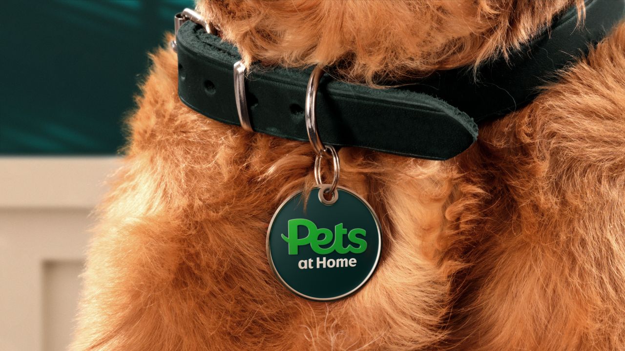
Now boasting more than 450 UK stores, Pets at Home's evolution has seen it become the nation's biggest pet care brand. But in doing so, through its numerous sub-brands across veterinary care, grooming, insurance, a foundation that helps pets in need, and a host of services, the overall identity had become muddied and slightly confusing.
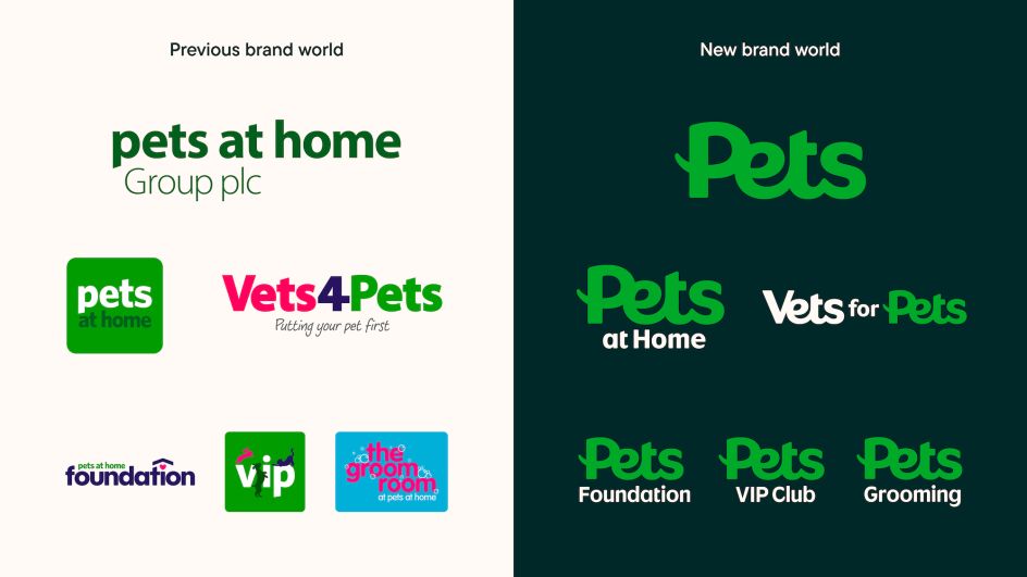
"The varied identities, naming and brand experience created confusion, and a lack of recognition back to the master brand," says London-based design studio Nomad, which started working with Pets at Home in August last year. "The previous Pets at Home was made from a group of sub-brands, sister companies and services. Although part of the same family with the same strong values, the varied identities, naming and brand experience created no recognition back to the primary Pets at Home brand."
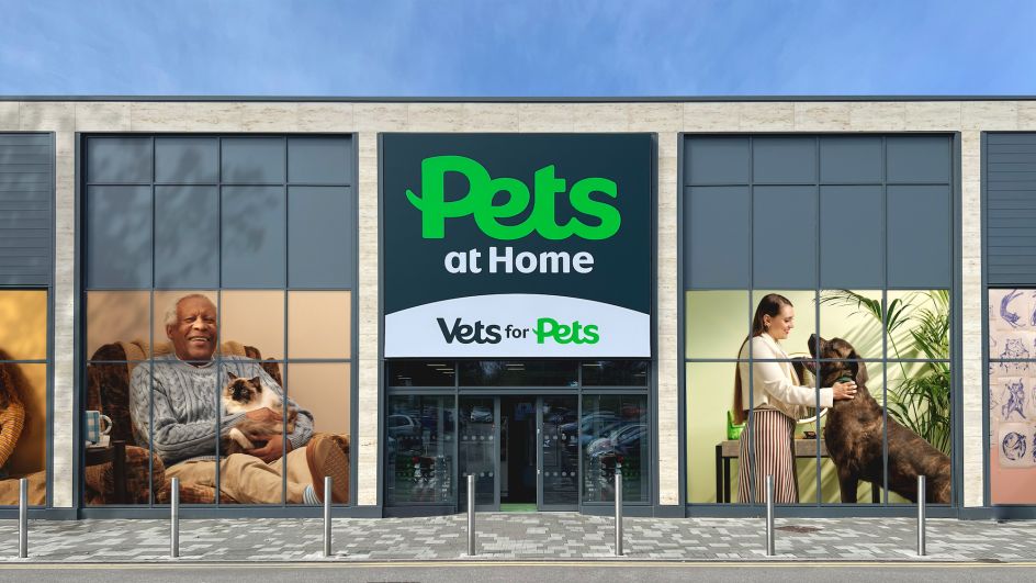
Nomad worked closely with Pets at Home head of brand Cath Ryan throughout the project. "As soon as the name Pets at Home was mentioned in the studio, we were all hooked," says Nomad creative director Ash Watkins. "It was so clear that this was a huge opportunity to transform an organisation of this size and give it the branding it deserves."
The new identity aimed to unite Pets at Home and its family of pet care brands under one visual identity and one "immersive brand experience". It is structured around the word 'Pets', "a brand name whose simplicity is its superpower and doubles down on its purpose of always doing what is best for pets and pet owners," says Nomad.
"It seems too simple to be true, but everything they do really is for the good of pets," Watkins adds. "It allowed the retail arm to remain as 'Pets at Home' and the vets to be renamed from Vets4Pets to 'Vets for pets', after that it gave license to bring all the sub-brands together in a really cohesive way: Pets Grooming, Pets VIP Club, Pets Foundation. It allows the brand to expand their services out into the future while keeping a really tight system."
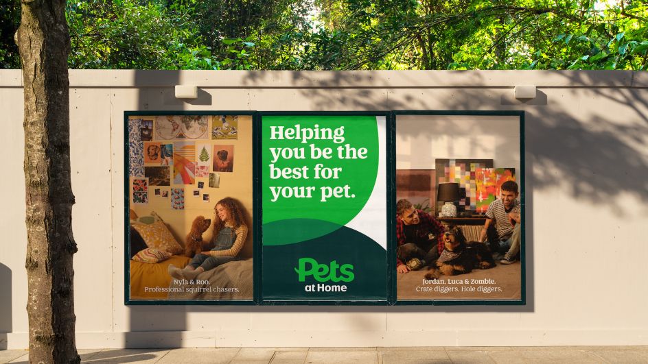
The studio created a new Pets logo that's bold and legible and which acts as the "anchor point" for the sub-brands in order to make them "stronger together". Since there are so many channels that make up the brand world, the new Pets system had to be very flexible but very simple.
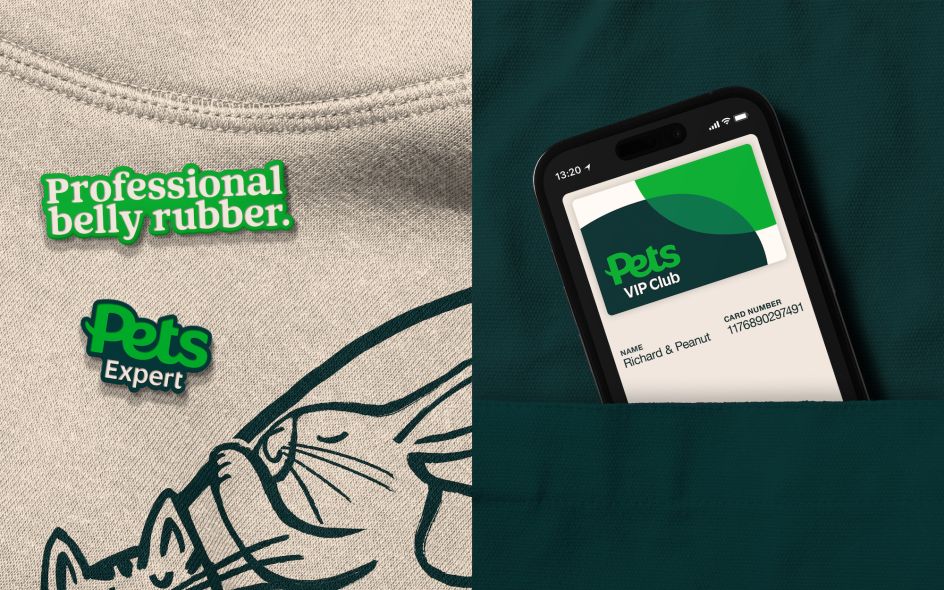
As such, the new brand system uses basic graphic forms based on paw and fingerprint shapes "inspired by the connection of people and their pets," says Nomad. "Hugging, playing or simply being by each other's side to create framing devices, distinctive layouts and bold textures."
Ryan adds that the idea of a "community of pets and pet owners" was important to the rebrand and that the new identity had to make the brand world easier for consumers to navigate.
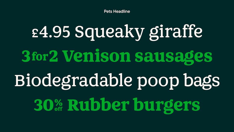
The new wordmark uses a specially commissioned typeface, Pets Headline, which Nomad developed with font foundry Colophon. This carries through across every channel in the Pets brand world. "By focusing on a careful balance between being expressive and feeling trusted, the typeface is fit for everything Pets, from weekly promotions through to clinical care advice," says Nomad. Colophon also created another typeface which is used for the sub-branding logos and shares many of the same design properties as the Pets logo so that the two typefaces can work side by side.
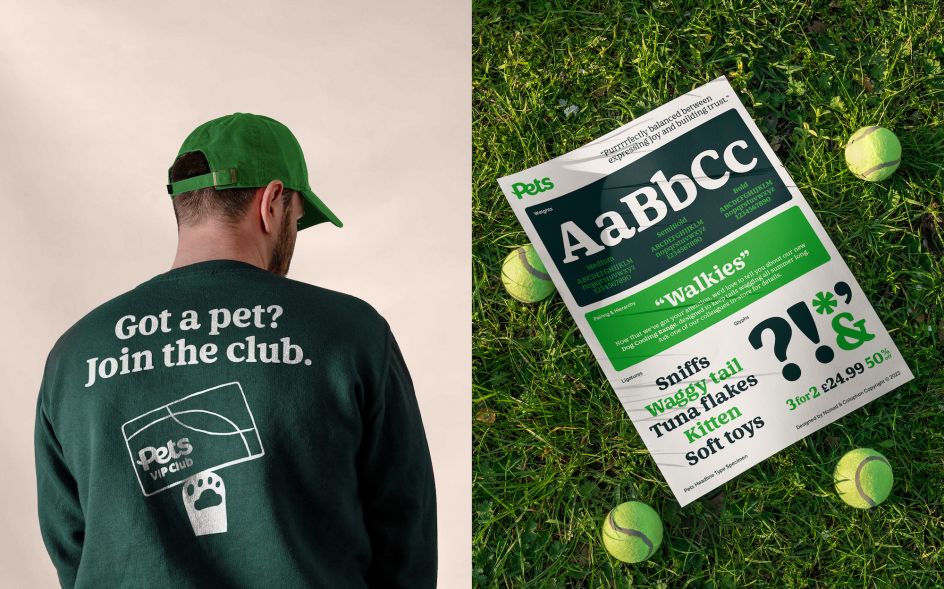
The recognisable Pets at Home green was refreshed to make it feel more modern while retaining the brand's heritage. "We are the nation's most trusted pet care business, and we have so much equity in our brand," says Ryan. "The green plays a huge role within this. We wanted to retain this whilst modernising our palette, making Pets green and more iconic rather than our background colour."
A series of illustrations by Hannah Warren was commissioned in order to add "unexpected humour to the customer journey," says Watkins.
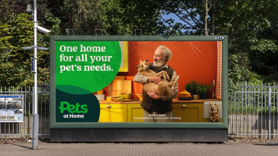
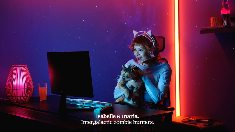
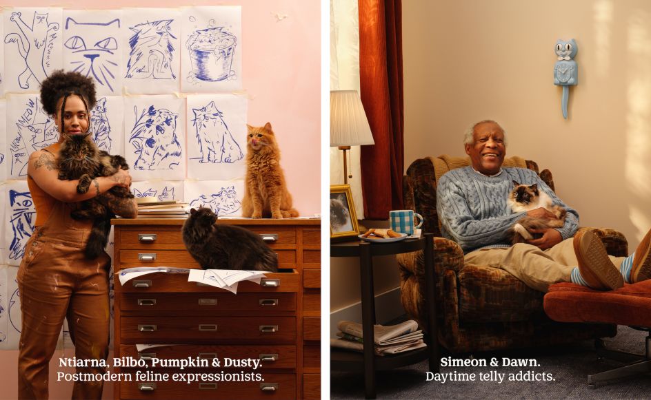
Nomad also worked to introduce new suites of photography. The first photoshoot looked to capture "incredible pet-owner relationships" and was shot and art directed by Roo Lewis. More than 1,000 people applied to participate in the shoot, and ten were chosen from those. "We found so many incredible pairings: people who looked like their pet, people who had pets you'd never expect of them and pairings that simply made us smile," says Watkins.
"I'm not going to lie when I say that meeting dozens and dozens of dogs in a single day made me think I have the best job in the world. Shot by Roo Lewis, the art direction is designed to amplify what makes the relationship between the pet and owner special."
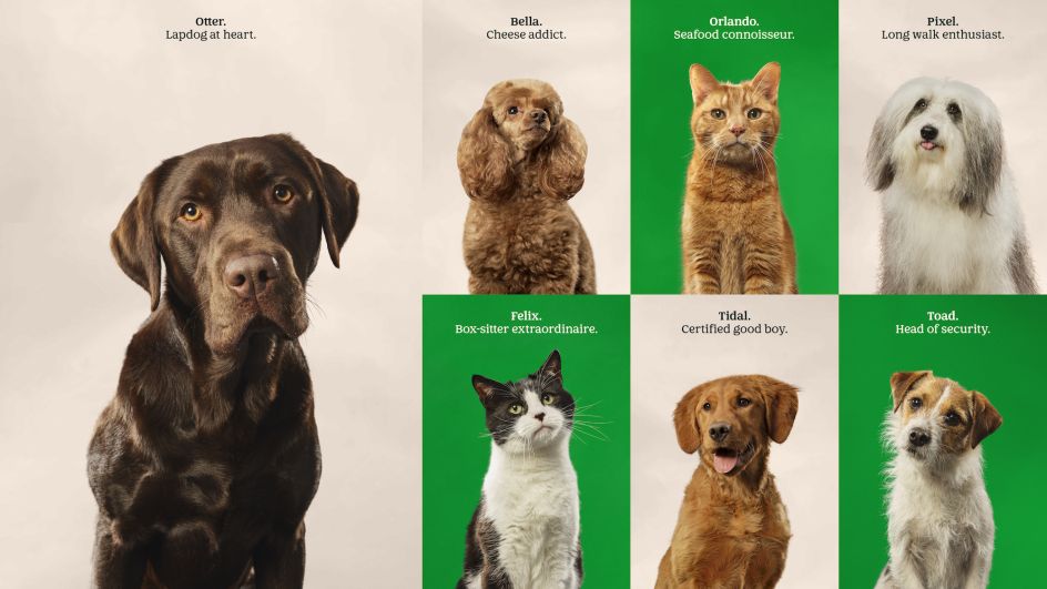
The pet portraits were shot by Liz Seabrook and aimed to bring out each animal's personality as an antidote to the usual style of emotionless stock photography seen across many pet care brands.
The main challenge in the branding project was finding the "right balance between joy and trust," says Watkins. "We had to find a look and feel that could do justice to the happiness that pet ownership brings, but also work for the more serious side, like when pets are unwell or life after pet ownership."
He continues, "It was amazing to watch a brand of this size, which lives in the hearts and minds of many people in the UK, transform before our eyes… You rarely have the opportunity to change so much about such a big brand."


 by Tüpokompanii](https://www.creativeboom.com/upload/articles/58/58684538770fb5b428dc1882f7a732f153500153_732.jpg)

 using <a href="https://www.ohnotype.co/fonts/obviously" target="_blank">Obviously</a> by Oh No Type Co., Art Director, Brand & Creative—Spotify](https://www.creativeboom.com/upload/articles/6e/6ed31eddc26fa563f213fc76d6993dab9231ffe4_732.jpg)


