Playful branding for new country club summons the spirit of Caddyshack
Crafting a visual identity for Picklewood, a first-of-its-kind pickleball club and restaurant, was a tricky proposition. Local agency People People explain how they went about it.
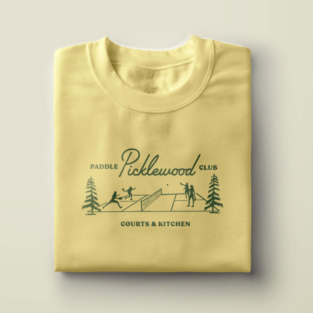
In case you didn't know, Pickleball is a paddle sport enjoyed by millions worldwide. A cross between tennis, badminton, and table tennis, it's played on a badminton doubles-sized court using paddles and a hollow plastic ball with holes – also known as a wiffle ball.
Founded in 1965 on Bainbridge Island, WA, pickleball has quickly become the fastest-growing sport in the USA. Now, the fine folk of Seattle are getting Picklewood, a first-of-its-kind pickleball club and restaurant founded in collaboration with renowned restaurateur Ethan Stowell.
Opening in the summer of 2025, Picklewood's flagship location in Seattle's SODO neighbourhood has pickleball for all, with high-end hospitality and courtside food and drinks. And they turned to local creative website agency People People to define and create a memorable brand and visual identity.
Concept, research and influences
People People's principal and founder, Sara Green, explains the thinking behind the redesign. "Picklewood is a destination for everyone, whether they're an avid pickleball enthusiast or if they've never picked up a paddle," she explains. "So we wanted to flip the idea of a stereotypical country club on its head.
"To accomplish this, we eschewed exclusivity and pretentiousness and instead aimed to create an identity that feels welcoming, inclusive and fun while tipping our visor to classic athletic club tropes. From the midcentury script typography to the playful supporting illustrations and colour palette to the custom plaid and argyle patterns, everything is designed with tongue-in-cheek. It's pickleball, after all."

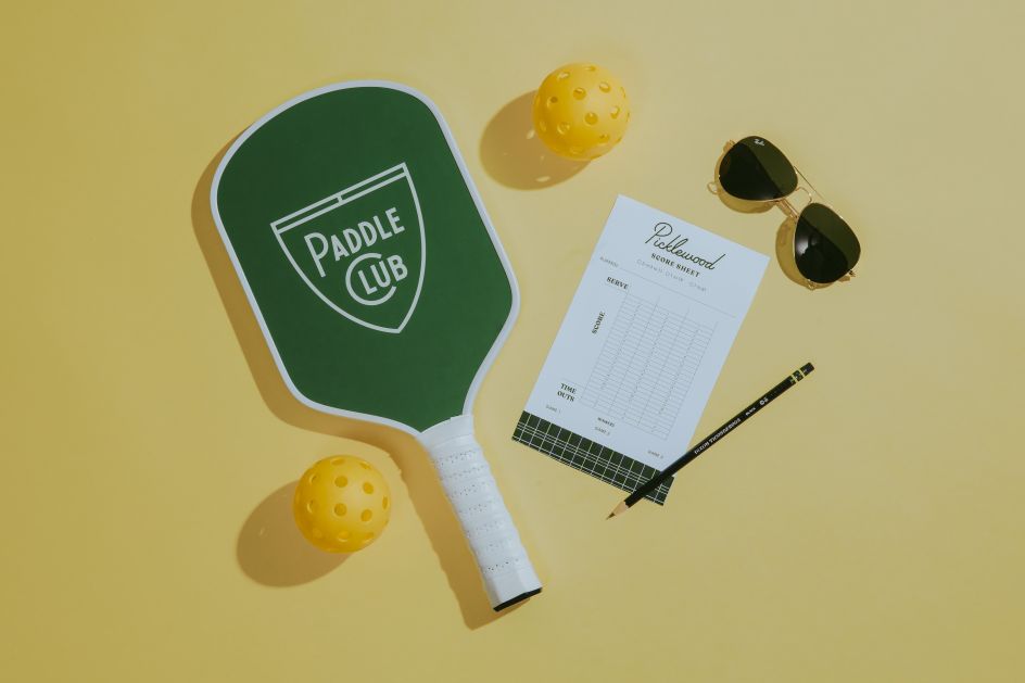

In researching for the project, the team did a deep dive into the archives of retro athletic club branding, from tennis to golf to polo, and found it a treasure trove of inspiration. Eventually, they zeroed in on colours, patterns, and iconography styles that evoked the preppy country club aesthetic. "While we did embrace cues from the past," notes Sara, "we wanted Picklewood to simultaneously look forward with a fresh and modern feel by imbuing a dash of edginess and good humour throughout the brand."
The final designs also incorporated influences from the 1980 American sports comedy Caddyshack and Wes Anderson's more recent movies.
"Caddyshack embodies both the era and sense of humour that we aimed to weave in throughout Picklewood's brand," explains Sara. "Caddyshack's country club Bushwood provided some inspiration for Picklewood's name. The wardrobe lent itself to plaid and argyle patterns. And the gopher from the film inspired Picklewood's woodchuck mascot.
"Wes Anderson, meanwhile, is a master at blending old and new," she adds. "Picklewood takes a page from Wes Anderson's playbook with the way it nods to the past while feeling fresh and creative."
Brand positioning and visual concepts
People People collaborated closely with co-founders Nathan Talbot and Ethan Stowell throughout the entire creative process. They began with brand positioning, taking a look at the competitive landscape not only of pickleball facilities in the Pacific Northwest but also those that are popping up across the country. With pickleball being the fastest-growing sport in the US, all parties wanted to ensure that the brand stood out among the crowd.


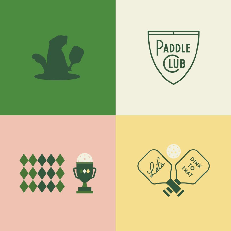
"Picklewood is aiming to be the first pickleball/dining destination in the Seattle market, so it felt natural to have a nod to the Northwest baked into the concept," Sara says. "The name Picklewood was selected for its country club tropes, while 'Pickle' doesn't take itself too seriously, and the suffix 'wood' planted it in the PNW landscape.
"People People presented visual identity concepts that played with the 'anti-country club' vibe, and Nathan and Ethan were fully supportive of leaning into our team's creative instincts as we struck a balance between classic, edgy and playful. Whether it was an illustration of a fork sticking into a pickleball or a photo of a pickleball splashing into a pint of beer, we looked for ways to communicate the intersection of sport and hospitality."
Visual identity
The primary logos, paddle designs, and supporting graphics all work together to define the brand's vintage identity with nods to classic court colours and sports references. The studio created a full branding package, serving up retro aesthetics courtside and beyond.
People People's design sets the tone for every space at Picklewood. With eye-catching moments, the courts and restaurant feature bold exterior signage and floods of colour. The lobby and pro shop mimic a classy, traditional country club with a wink to the playfulness of an amateur pickleball game. Courtside walls, a beer garden, and a restaurant backed by Ethan Stowell feature People People's refined colour palette with prominent patterns and warm wood finishes.


From the beginning, Picklewood's founders were dedicated to working with People People to establish strong brand guidelines to help inform decision-making throughout all phases of concept development. As such, the visual identity finds its way into the physical space and interior design choices, such as custom wallpaper featuring 'Picklewood Plaid', green and clay Pantone colour-matched courts, and green and white patio umbrellas in the beer garden.
Picklewood's Pro Shop, meanwhile, will carry custom merchandise from paddles to branded apparel. The lobby will feature decors such as thrifted trophy cases, pickleball memorabilia, a visual timeline honouring the sport's 50-year history, including fun facts and portraits of its founders, and other quirky art for an eclectic yet curated feel.
Picklewood's colour palette will be on full display throughout the complex. This includes custom-matched court colours (green and clay), interior/exterior paint colours, custom paddles, and apparel available for purchase featuring Picklewood branding and custom plaid and argyle patterns.
"We hope folks will see the Picklewood as an inviting place to have fun and connect with friends over pickleball, a pint, and some shared plates," says Sara. "The brand is meant to break down barriers that are often experienced at traditional country clubs where membership is required.
"We hope the playfulness of the name, the look and feel, and the atmosphere will shine through: Picklewood is all about having fun. By putting our own spin on throwback athletic motifs throughout all aspects of the brand, Picklewood takes on a timeless look and feel that should resonate with people of all generations."


 by Tüpokompanii](https://www.creativeboom.com/upload/articles/58/58684538770fb5b428dc1882f7a732f153500153_732.jpg)


 using <a href="https://www.ohnotype.co/fonts/obviously" target="_blank">Obviously</a> by Oh No Type Co., Art Director, Brand & Creative—Spotify](https://www.creativeboom.com/upload/articles/6e/6ed31eddc26fa563f213fc76d6993dab9231ffe4_732.jpg)


