Praline creates new 'elevator pitch' website and branding for architecture and design practice Softroom
London-based studio Praline has redesigned the branding and website for architecture and design practice Softroom.
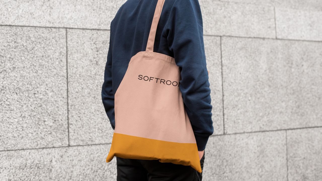
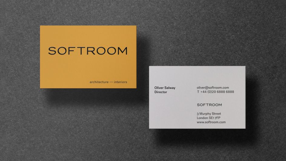
Praline worked closely with the practice's directors on the new visual identity and website, which brings to life and showcases Softroom's work across hospitality, commercial, cultural spaces and large-scale retail projects.
"Softroom's previous website lacked impact and personality," says Praline. "They needed to effectively communicate who they are, how they stand out, and technical achievement."
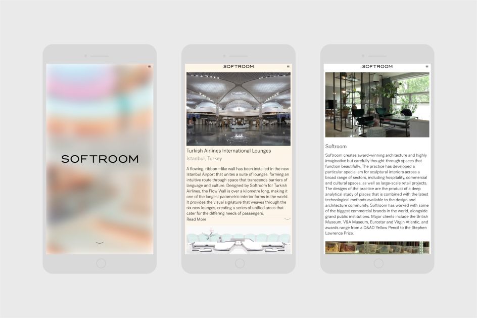
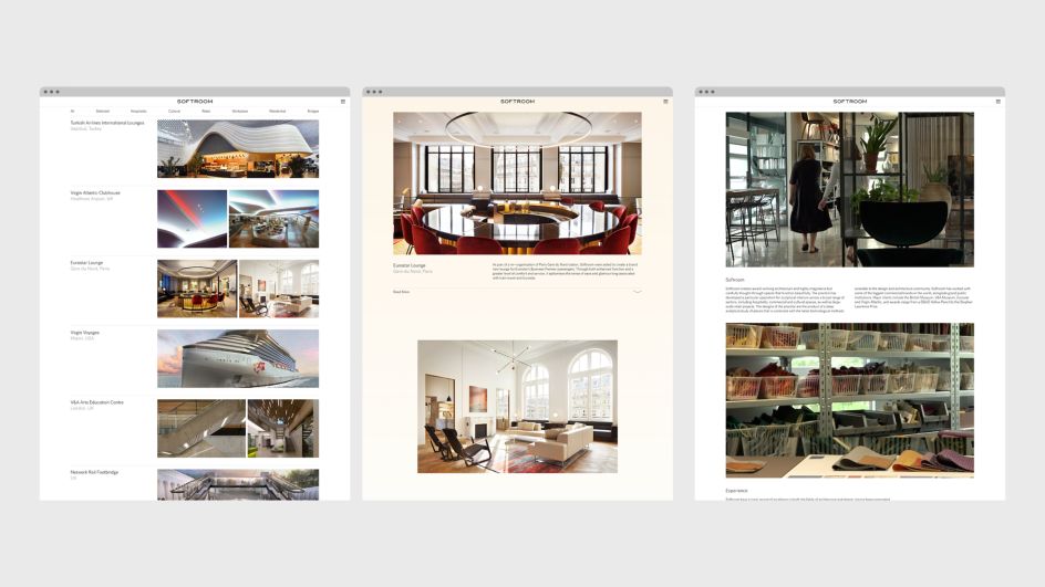
The redesigned online platform takes a very novel approach to site design; aiming to set Softroom apart from its competitors by creating what the studio terms an "elevator pitch" homepage which "shows Softroom in a nutshell." It was designed to "show the practice's experience, capability and quality at first glance, and to be shown to potential new clients, online and in-person," Praline explains.
"Curating the projects on the website to support the defining values of the practice, we could display the work more dynamically to enrich the user experience and deepen the appreciation for what's been achieved."
The idea is that this dynamic approach works alongside the identity design to create a sense of openness and elegance throughout all interactions with the Softroom brand.
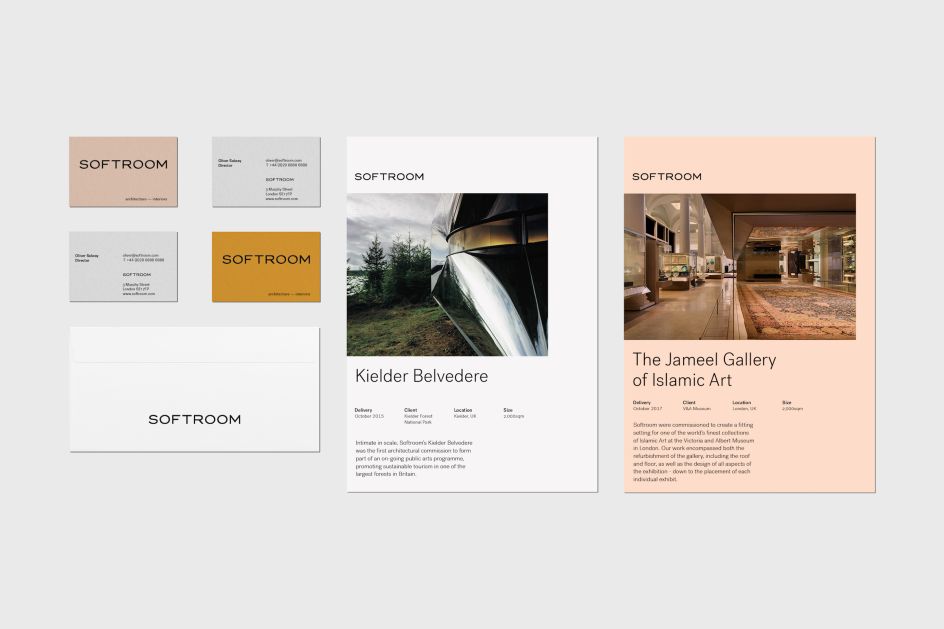
The new logo, for instance, features a wider font with strong foundations, chosen to help convey a sense of self-assurance and generosity.


 by Tüpokompanii](https://www.creativeboom.com/upload/articles/58/58684538770fb5b428dc1882f7a732f153500153_732.jpg)


 using <a href="https://www.ohnotype.co/fonts/obviously" target="_blank">Obviously</a> by Oh No Type Co., Art Director, Brand & Creative—Spotify](https://www.creativeboom.com/upload/articles/6e/6ed31eddc26fa563f213fc76d6993dab9231ffe4_732.jpg)


