Pop art-inspired designs by Thirst Craft in a juicy new identity for Brooklyn Brewery's Hazy IPA
Glasgow studio Thirst Craft has just launched a new identity and packaging design for the world-famous Brooklyn Brewery's new Hazy IPA, combining two of New York's icons: pop art and beer.
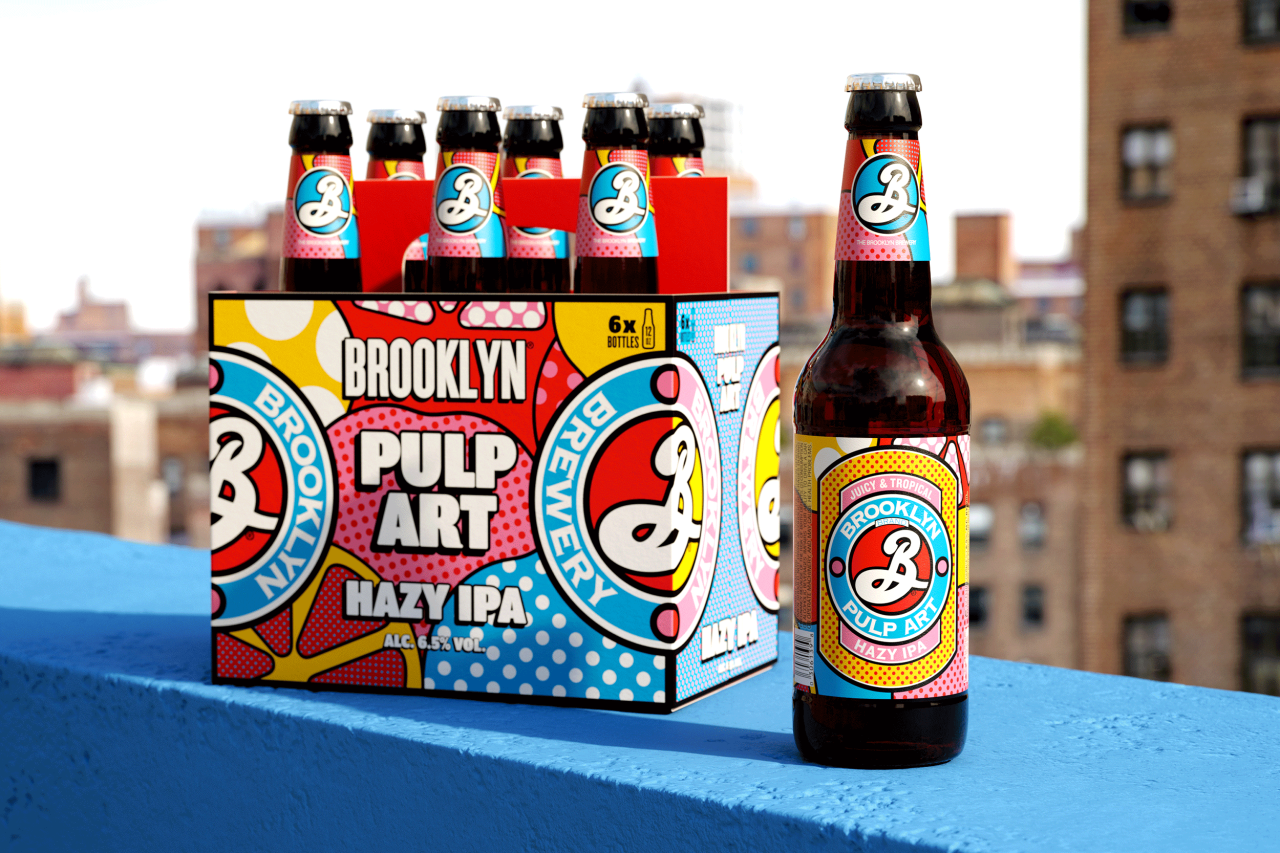
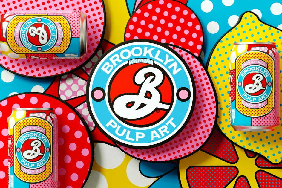
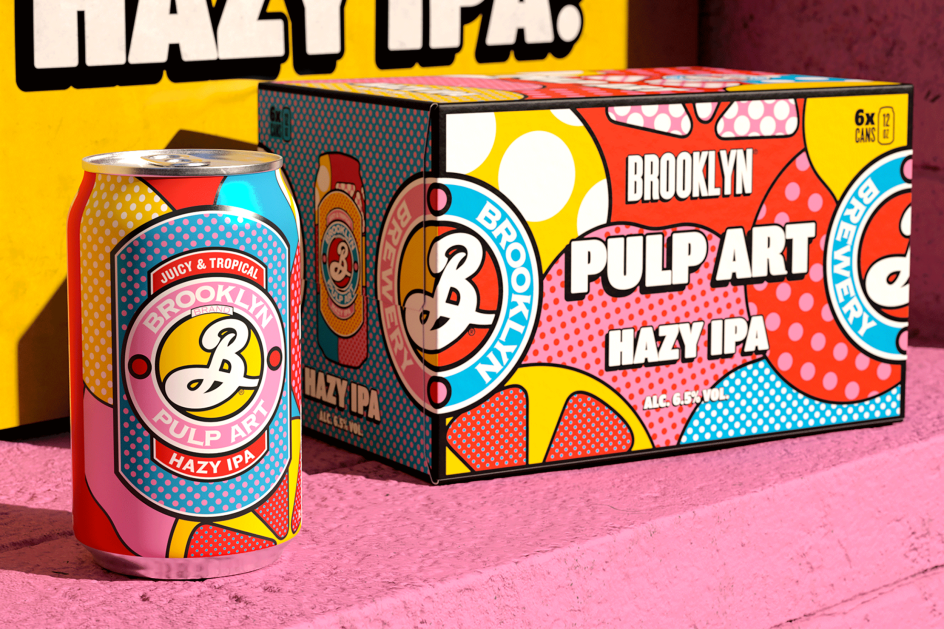
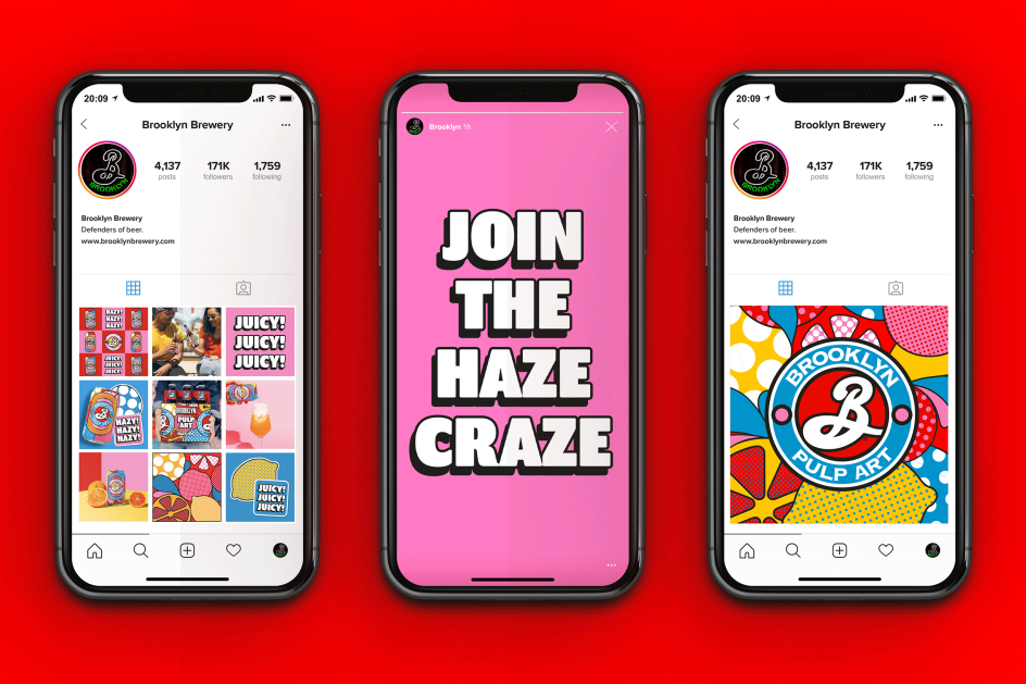
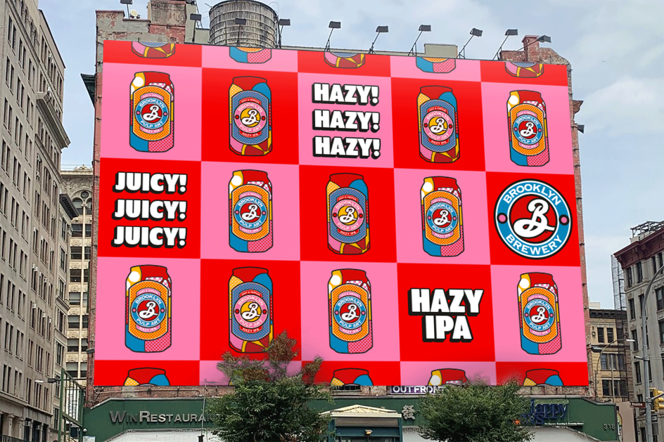
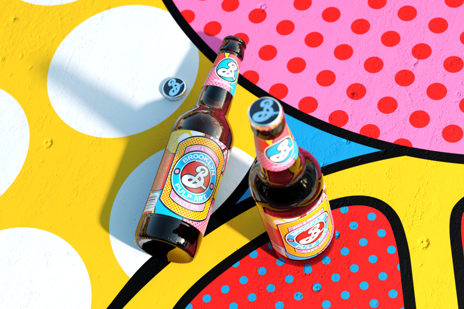
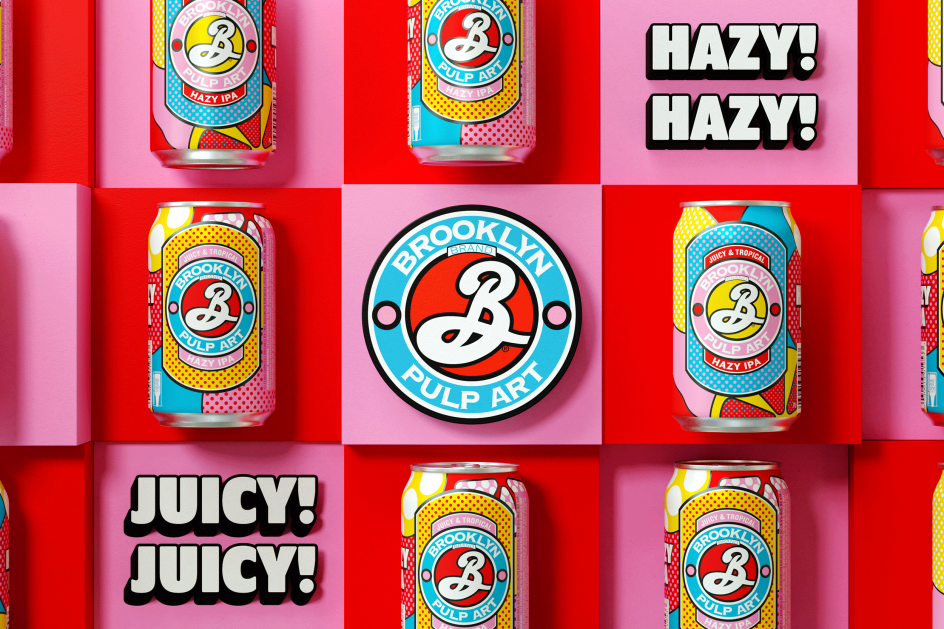
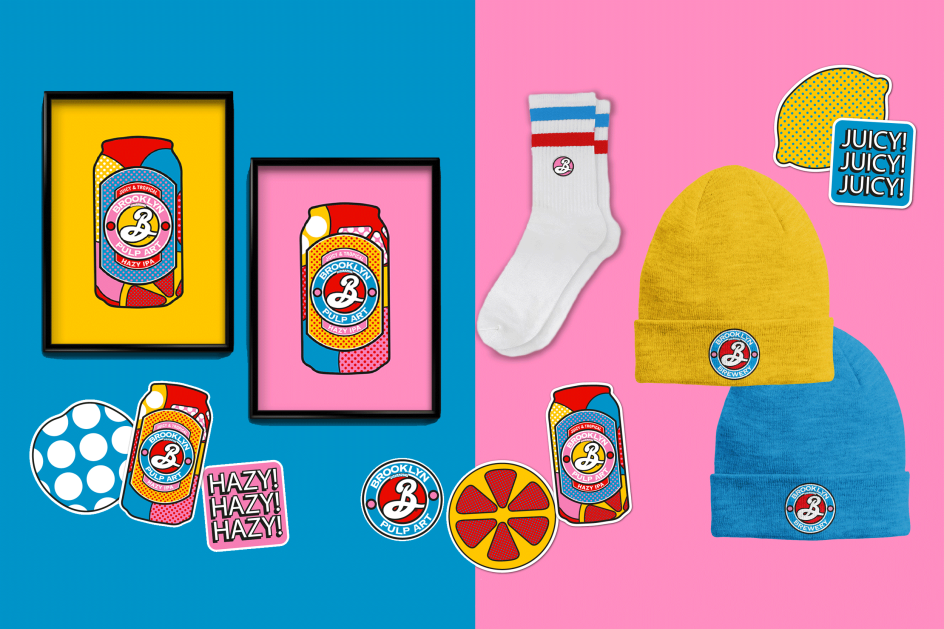
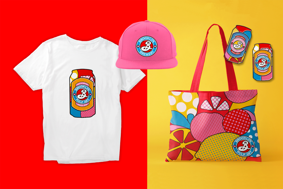
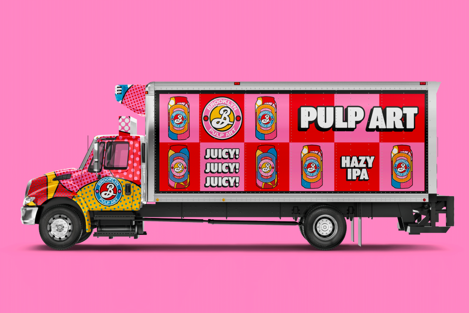
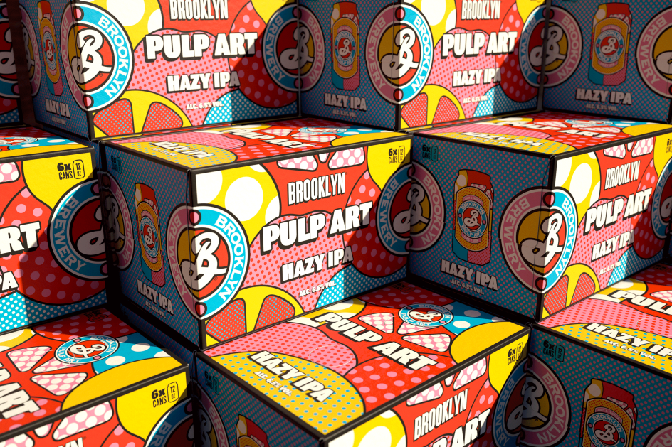
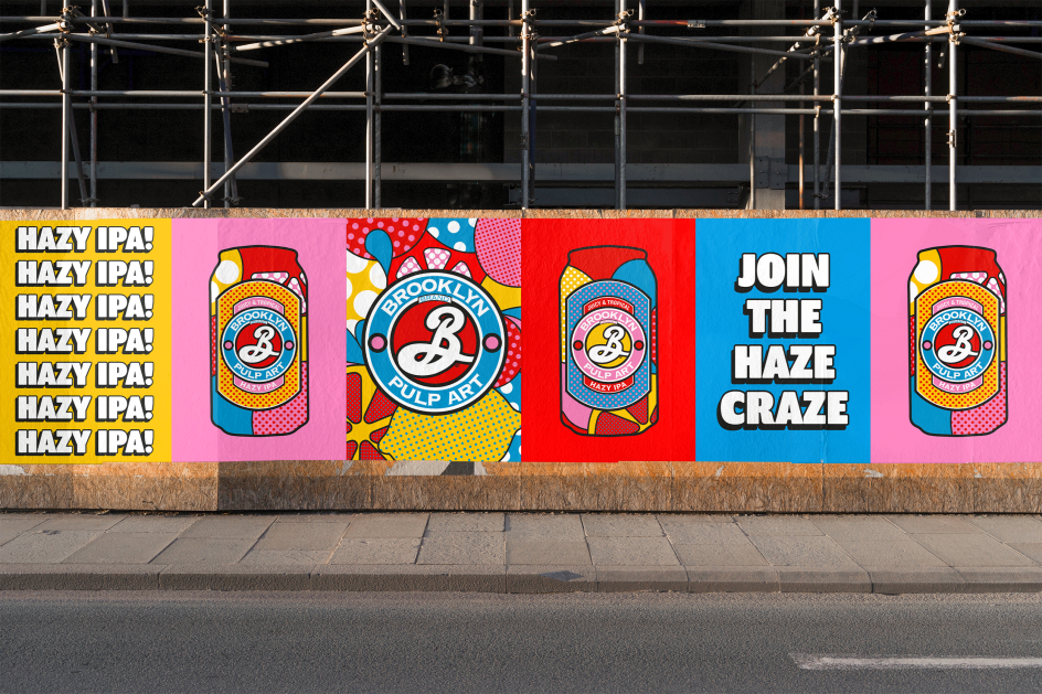
Brooklyn Pulp Art features the famous Brooklyn badge but with a juicy pop-art makeover, using Lichenstein's signature style of thick black lines, clashing colours and a healthy number of polka dots. A bold background pattern matches the beer's bold flavour palette with bunches of stylised fruit. While striking secondary patterns, "in-your-face" typography and a liberal use of exclamation points feature on repeat again and again across packaging, products, advertising and social media platforms and campaigns.
For when we're allowed to fully emerge from our homes, branded spaces with super-sized fruit segments and bold graphics will let you step straight into Brooklyn's Pulp Art world. "Contrasting textures, vibrant poster walls and playful patterns see the versatile spaces almost become art installations themselves," as Thirst puts it.
"To us and the world, Brooklyn has never been just another brewery," says Matt Burns, Thirst's creative director and founder. "It's a true product of its neighbourhood: spirited, creative, authentic. So we knew when we got this brief, it could never be 'just another' hazy IPA. We needed to give it the Brooklyn twist. When we landed on the name 'Pulp Art', we saw the opportunity to mash up two New York icons. One wanted to democratise art, the other wanted to democratise Hazy IPAs, it was a perfect match. With such a strong core idea, we could have so much fun with the brand. And we did."


 by Tüpokompanii](https://www.creativeboom.com/upload/articles/58/58684538770fb5b428dc1882f7a732f153500153_732.jpg)


 using <a href="https://www.ohnotype.co/fonts/obviously" target="_blank">Obviously</a> by Oh No Type Co., Art Director, Brand & Creative—Spotify](https://www.creativeboom.com/upload/articles/6e/6ed31eddc26fa563f213fc76d6993dab9231ffe4_732.jpg)




![This Place [of Mine]](https://www.creativeboom.com/upload/articles/23/2331189f3bcf02994d10c5081cc0748a1369c5ce_732.png)
