Redo's design for Misha Nikatin's new website features a virtual art gallery for 'lonely people'
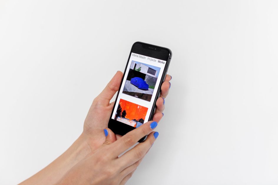
Moscow-based studio Redo Bureau is behind the design for visual artist Misha Nikatin's glorious new identity and website, which resembles an "endless canvas" and aims to create the illusion of a "never-ending wall" of a museum exhibition.

Scrolling from left to right, you can easily browse through Misha's latest artworks against a pleasing monochrome backdrop, with seemingly no fixed endpoint in sight. It was deliberately designed this way to "keep up with his prolific workload" – something the artist is renowned for.
Alongside the fresh online portfolio, Redo has developed a virtual gallery named Days of Lonely People, which is an attempt to "document the trials and tribulations of self-isolation" with featured artworks that pay tribute to the famous series 'Projects for a Lonely Person' by Viktor Pivovarov.
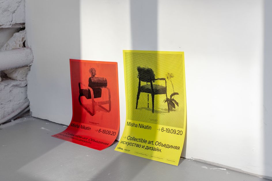
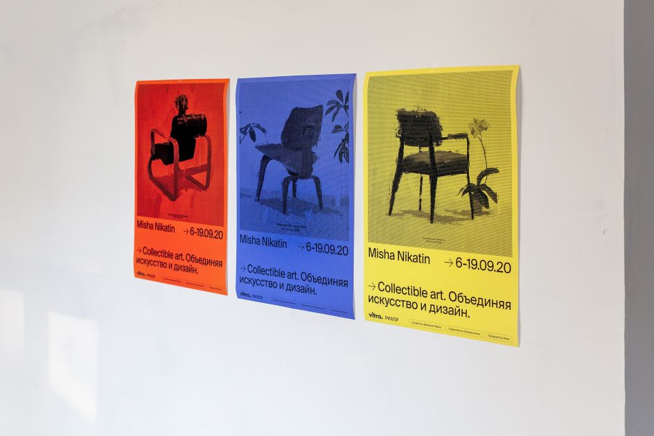
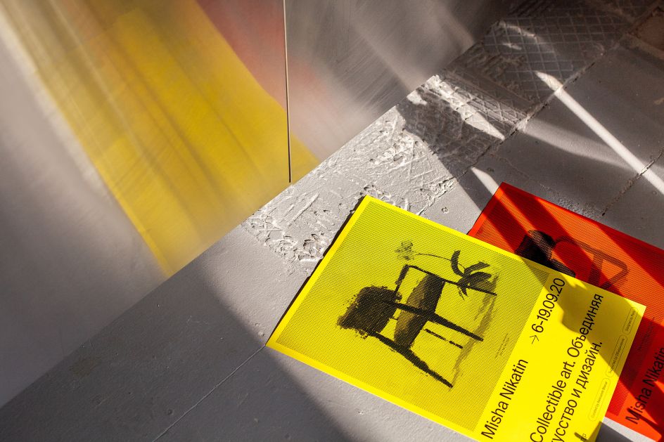
With the classic Suisse Int'l as the chosen typeface throughout, the web design translates into a wider, modernist-inspired identity full of primary colours and clean typography, which we see demonstrated in Redo's visuals for Misha's latest in-the-flesh exhibition and collaboration with Vitra, 'Collectible Art. Merging Art and Design'. We're talking show brochure, posters, and banners that decorated the facade and walls of the Richter Hotel in Moscow where the event took place earlier this year.
See the website for yourself at mishanikatin.com.


 by Tüpokompanii](https://www.creativeboom.com/upload/articles/58/58684538770fb5b428dc1882f7a732f153500153_732.jpg)


 using <a href="https://www.ohnotype.co/fonts/obviously" target="_blank">Obviously</a> by Oh No Type Co., Art Director, Brand & Creative—Spotify](https://www.creativeboom.com/upload/articles/6e/6ed31eddc26fa563f213fc76d6993dab9231ffe4_732.jpg)


