Reduced to the Max: Kevin Krautgartner captures architecture in its simplest form
Is there anything more satisfying than minimalist photographs of buildings? I'm talking clean, sharp lines, candy colours and an expanse of blue skies. The type of imagery your Instagram account could only dream of hosting.
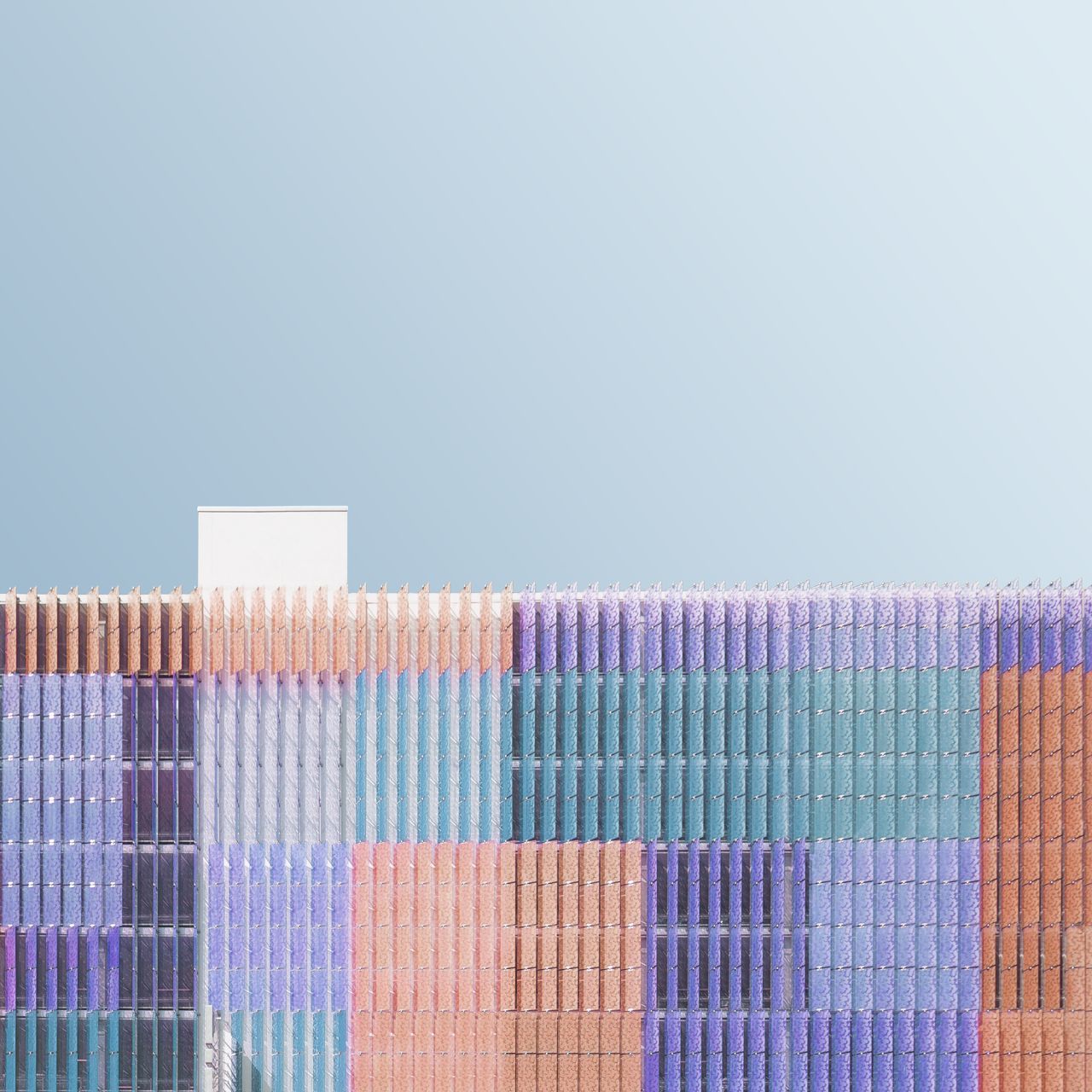
Via Creative Boom submission. All images courtesy of the artist
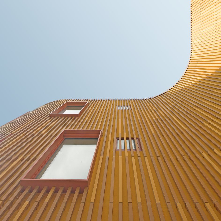
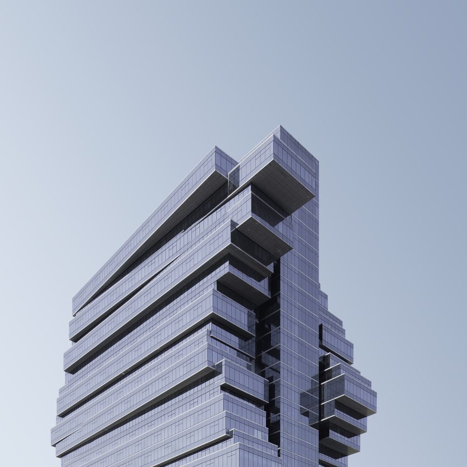
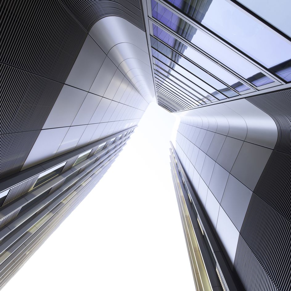
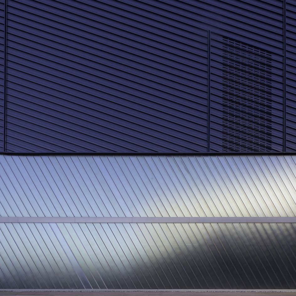
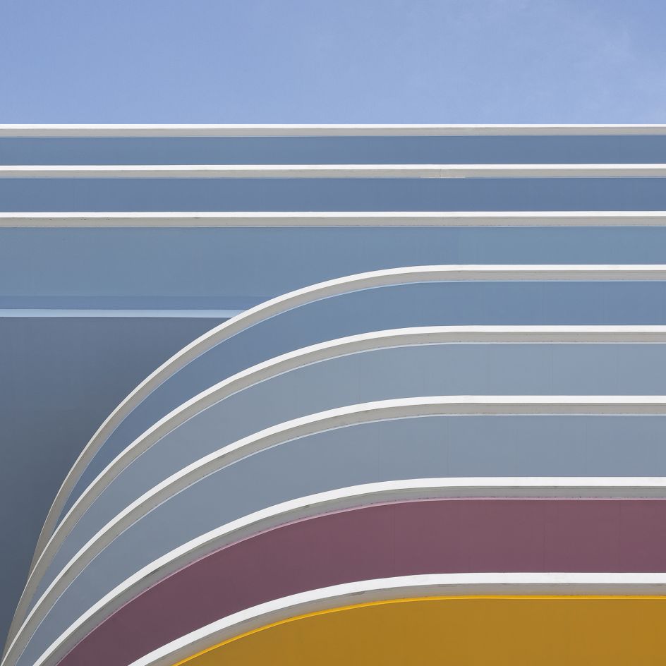
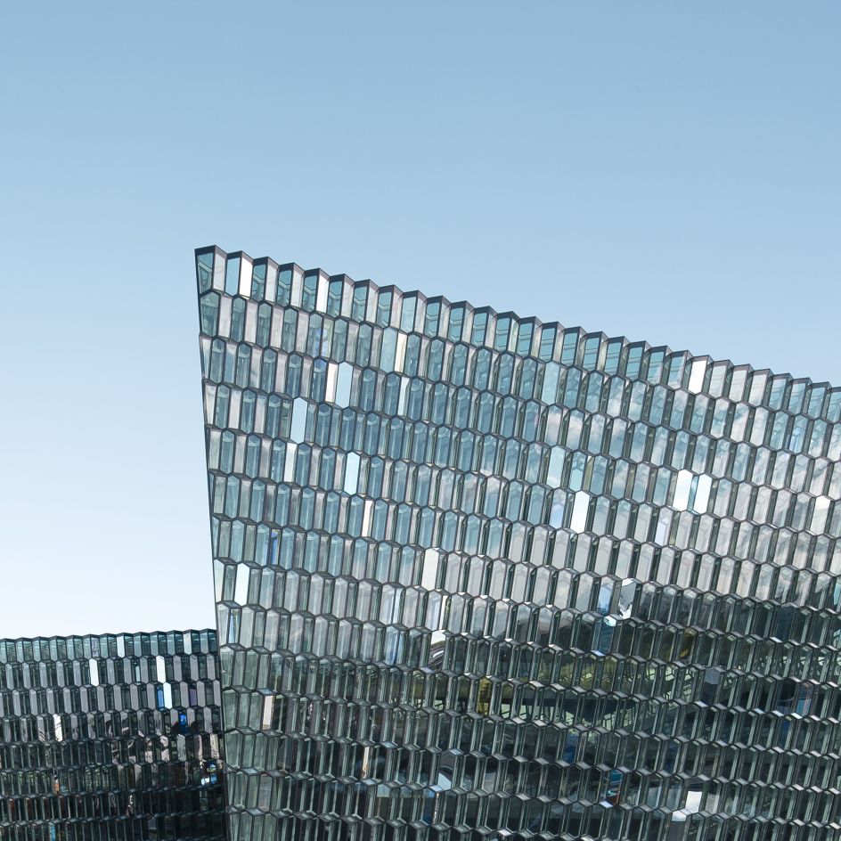
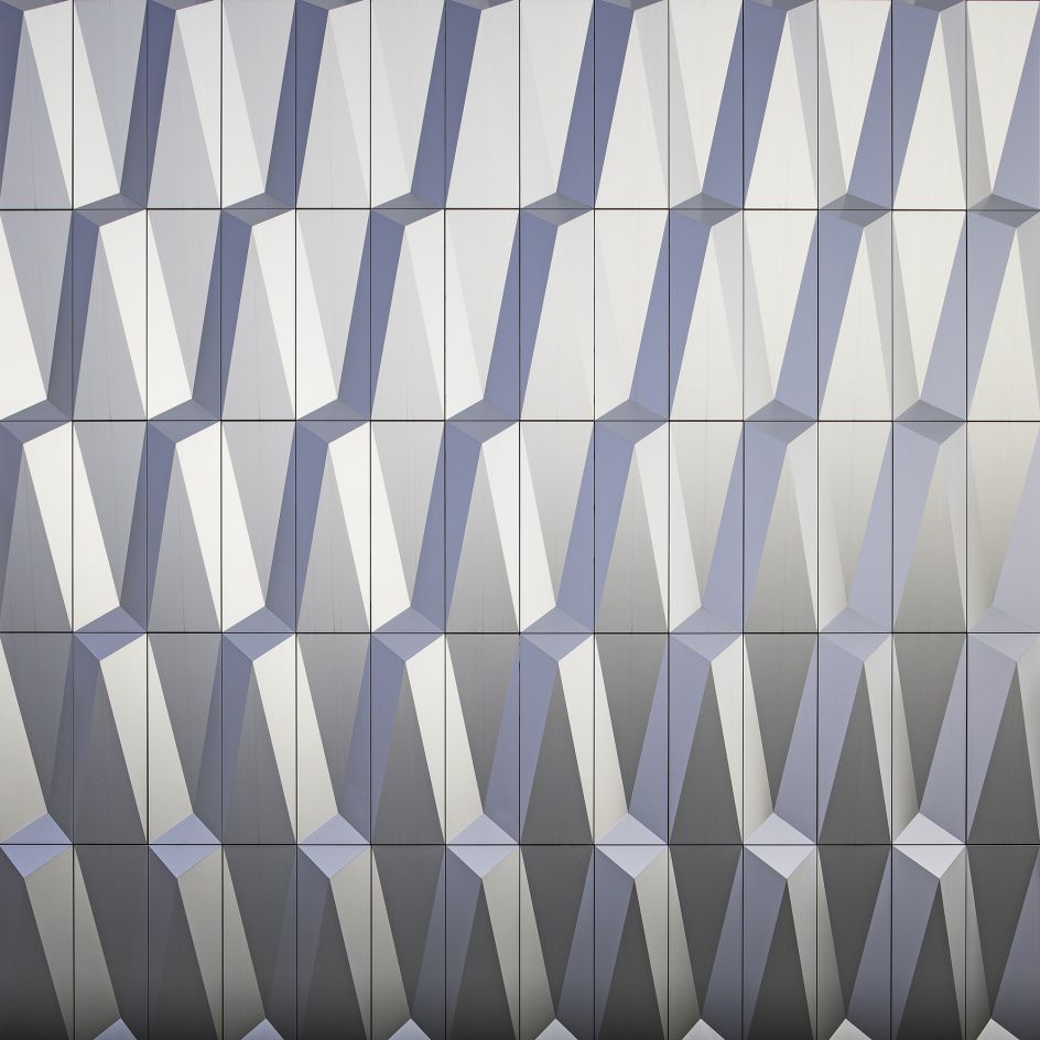
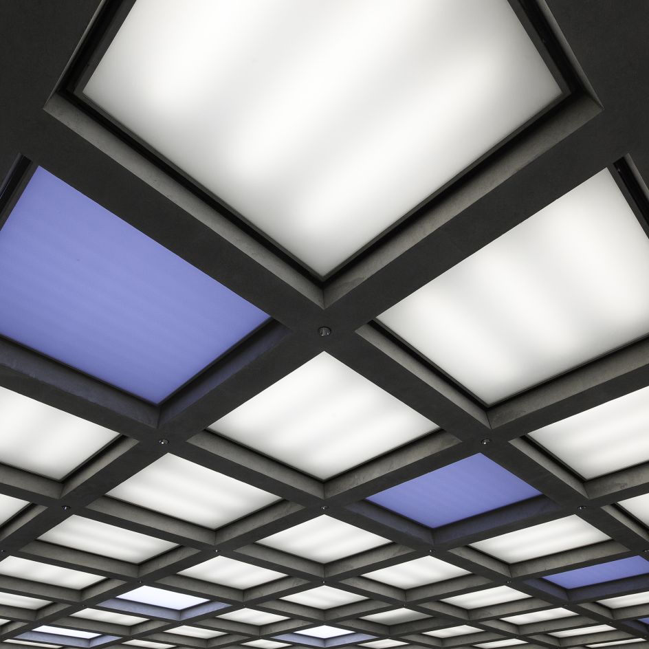
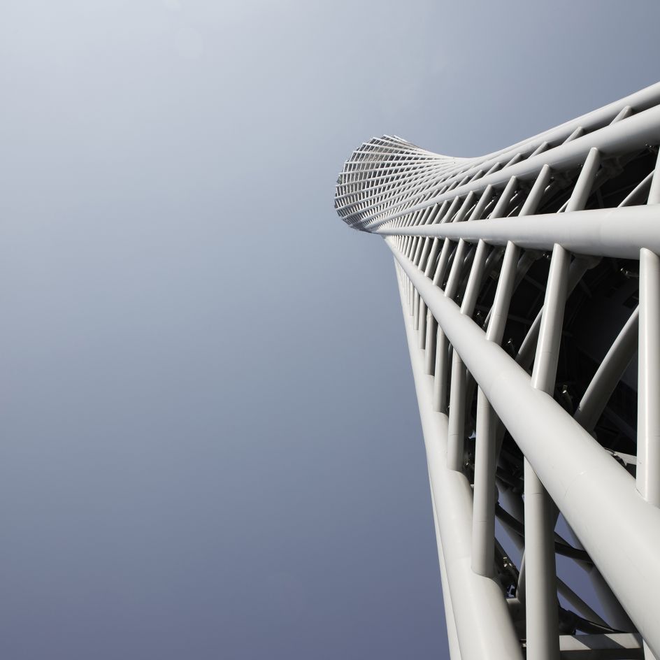
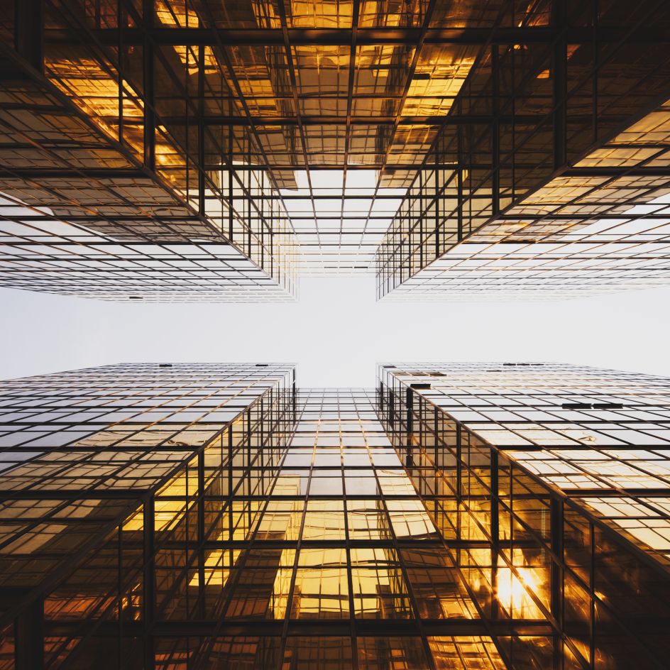
When it comes to this genre, Kevin Krautgartner is nailing it. His series Reduced to the Max, features fragments of architectural delights from the various cities he's visited.
He explains: "Heavily influenced by graphic design, colour and symmetry, my work shows textures and form structures of modern architecture, mostly shot from centered angles.
"Focusing on minimalism and vibrant colours, I'm constantly trying to create a new view of contemporary buildings. Simple is good. When I'm shooting I always try to get to the point where there is nothing left to take away."
If this appeals as much to you as it does to us, visit kevinkrautgartner.com.


 by Tüpokompanii](https://www.creativeboom.com/upload/articles/58/58684538770fb5b428dc1882f7a732f153500153_732.jpg)

 using <a href="https://www.ohnotype.co/fonts/obviously" target="_blank">Obviously</a> by Oh No Type Co., Art Director, Brand & Creative—Spotify](https://www.creativeboom.com/upload/articles/6e/6ed31eddc26fa563f213fc76d6993dab9231ffe4_732.jpg)


