Retro inspired branding for The Penny Drop Cafe by Pop & Pac
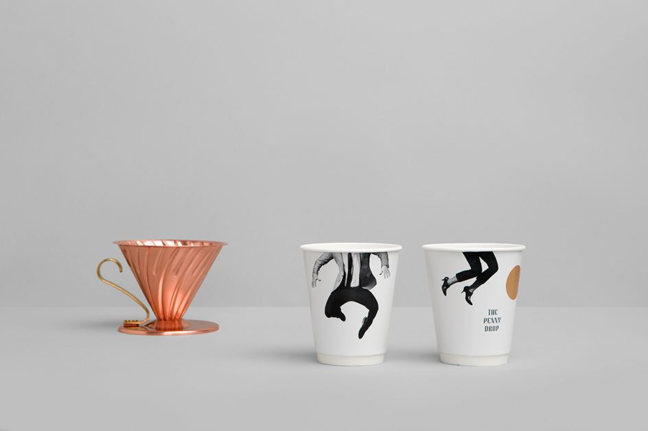
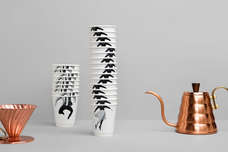
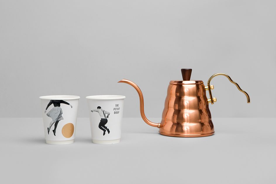
This chic, retro-inspired branding was created by the clever lot at Melbourne-based agency, Pop & Pac, for The Penny Drop Cafe.
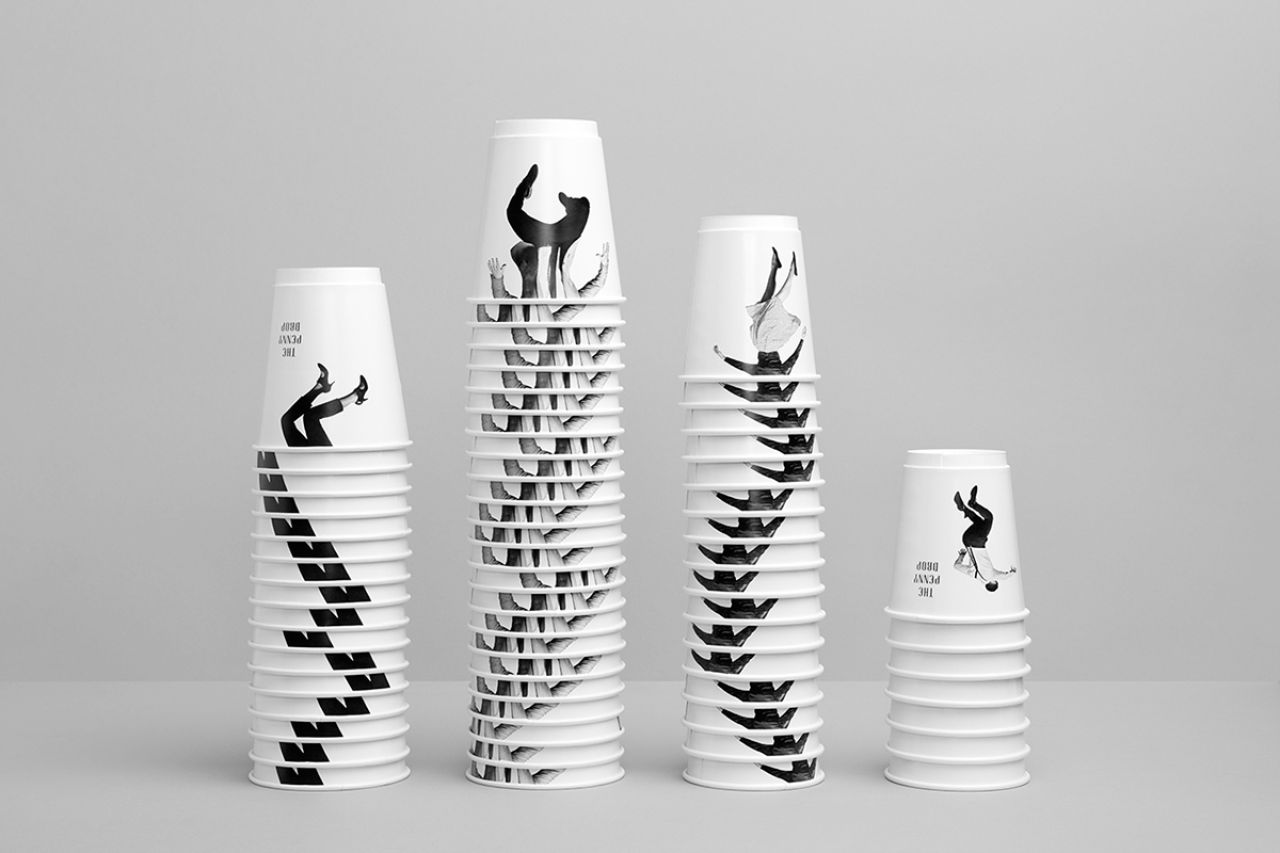
Offering a "new perspective on food and coffee" to the Box Hill area, the desire to bring a sense of “Brunswickness” to the “Chinatown of the East”, informed the project from start to finish.
The team explains: "Inspired by the site’s context, a name and conceptual vision was developed by the graphic design team for an experience not before seen in this area of Melbourne’s East.
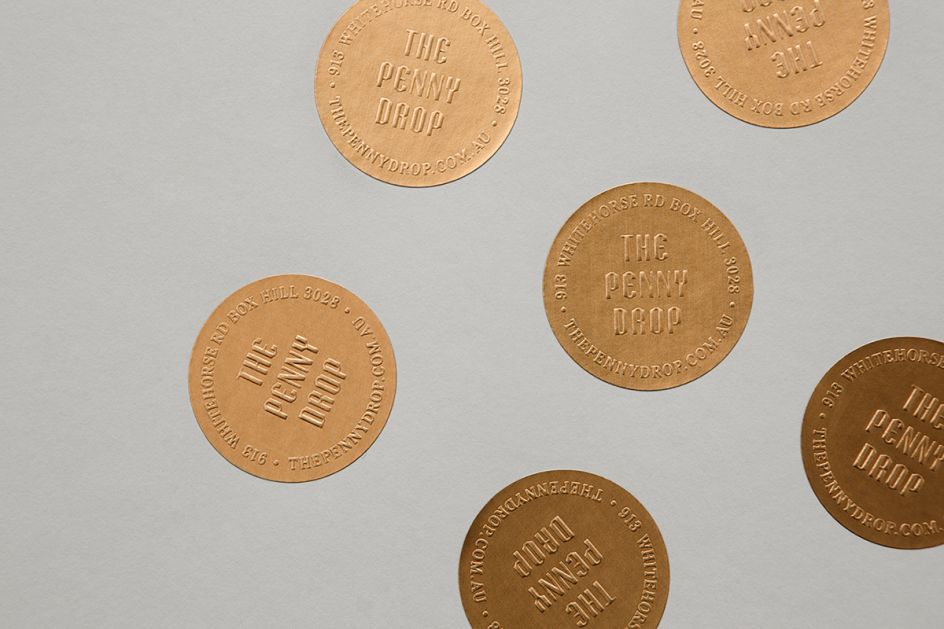
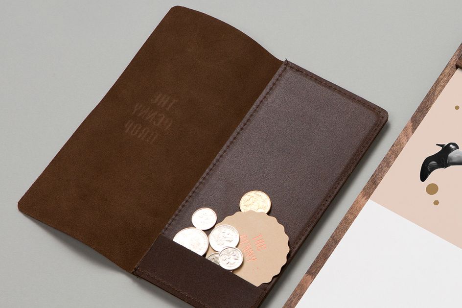
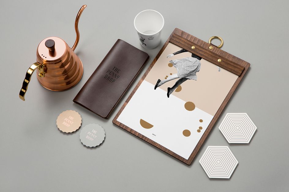
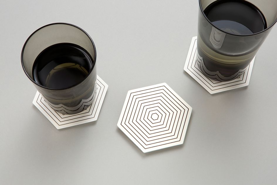
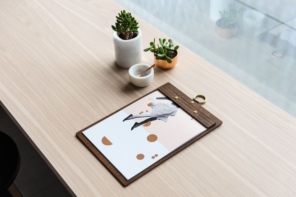
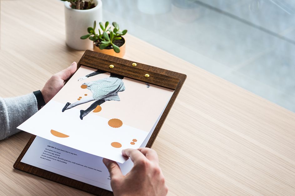
"Pennies provide inspiration throughout; evident in brass menu finishes, the shapes of business cards and coasters, and use of circular elements.
"Bill folders are reinterpreted as leather wallets. The result is a comprehensive suite of collateral, including custom typeface, menus, coffee cups, stickers, hoarding and signage."
Discover more at www.pop-pac.com.
Via Behance


 by Tüpokompanii](https://www.creativeboom.com/upload/articles/58/58684538770fb5b428dc1882f7a732f153500153_732.jpg)


 using <a href="https://www.ohnotype.co/fonts/obviously" target="_blank">Obviously</a> by Oh No Type Co., Art Director, Brand & Creative—Spotify](https://www.creativeboom.com/upload/articles/6e/6ed31eddc26fa563f213fc76d6993dab9231ffe4_732.jpg)


