Saffron launches new identity and announces studio openings in Berlin and San Francisco
To mark its 15th birthday, global design agency Saffron has unveiled a new identity and website. The new-look aims to better align with the agency's "new spirit," according to Saffron's executive creative director, Gabor Schreier.
"We were born as a company with a strong consulting component, with a formal, serious posture/attitude and an equally plain and discrete identity, but we have evolved into a much more creative, disruptive, innovative and digital consulting company and we want to reflect all of this in our new image.”
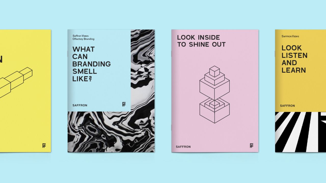
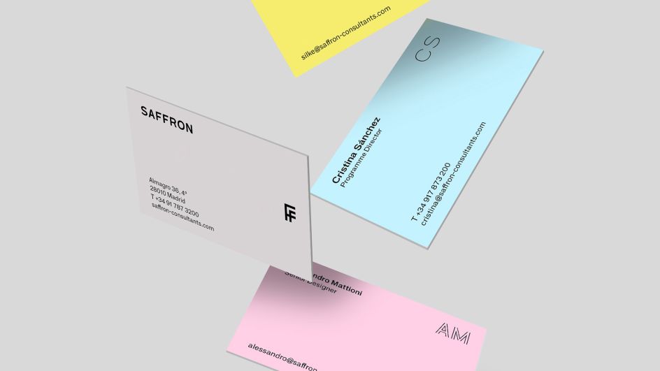
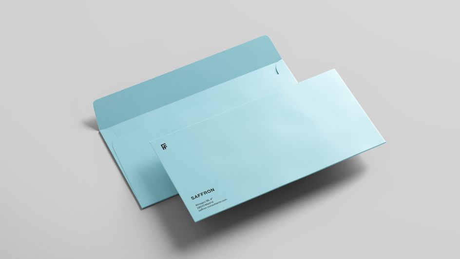
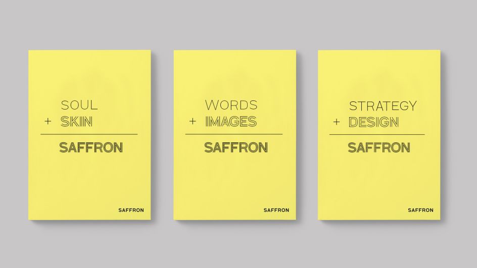
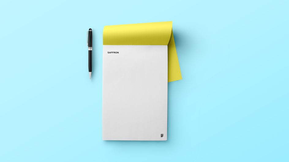
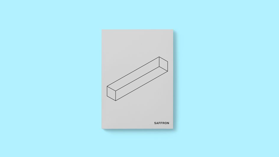
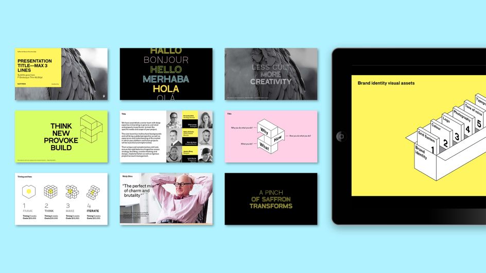
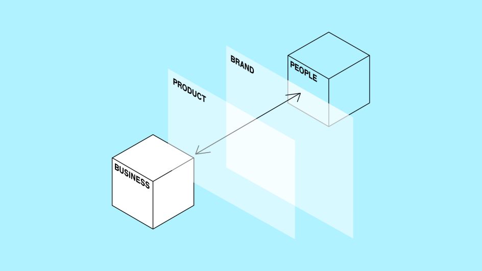
This new image is built up through the introduction of a new series of four typographic styles and a new set of black outline graphic symbols, shown across touchpoints including online platforms and physical stationery, like business cards. An isometric illustration aims to "generate a dynamic and digital visual universe."
As you'd expect from the name, Saffron's main brand colour was and still is yellow, but the agency says that in the new look it's "toned down a bit." Saffron explains, "For the new identity, the colour palette is expanded with blue, green, orange and pink pastel tones, which allow for richer compositions. These pastel tones let black stand out in any composition, capitalising on it and making it the foundation of the entire visual system."
Saffron was founded in 2001 by Jacobo Benbunan and Wally Olins (1930-2014), with offices in London, Madrid, Istanbul, Mumbai, Melbourne, São Paulo and now San Francisco and Berlin. Its client list includes Akzo Nobel, City of London, A1 Telekom Austria, ASDA, British Council Arts and Doha Film Institute.




 by Tüpokompanii](https://www.creativeboom.com/upload/articles/58/58684538770fb5b428dc1882f7a732f153500153_732.jpg)


 using <a href="https://www.ohnotype.co/fonts/obviously" target="_blank">Obviously</a> by Oh No Type Co., Art Director, Brand & Creative—Spotify](https://www.creativeboom.com/upload/articles/6e/6ed31eddc26fa563f213fc76d6993dab9231ffe4_732.jpg)


