Seiichi reveals the technique behind his peculiarly textural illustrations
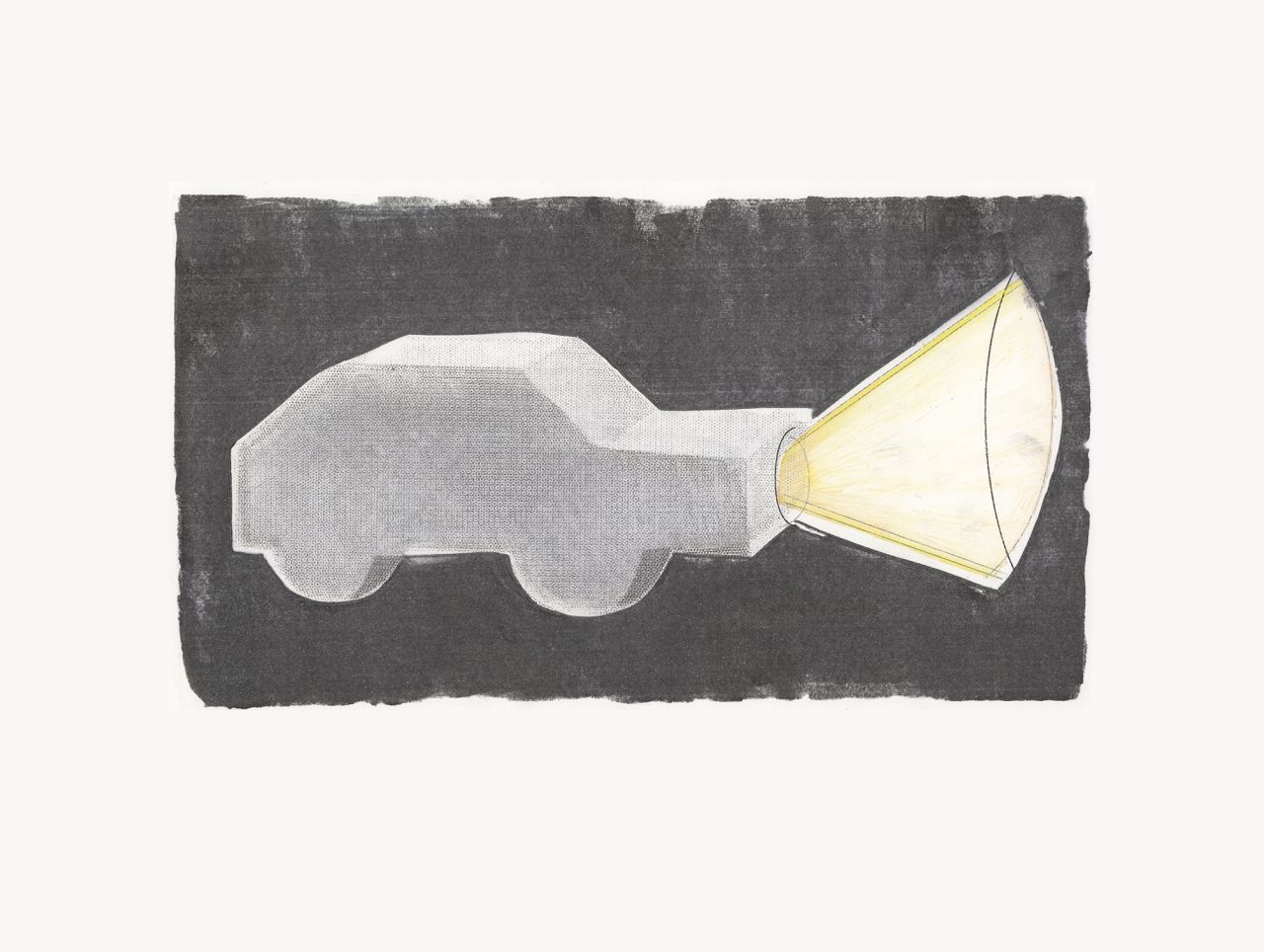
One day, Seiichi accidentally spilt airbrush paint cleaning liquid onto his desk. It was a beautiful accident and a technique he now adopts throughout all of his work.
© Seiichi
With a portfolio that's distinctively his own, you might be surprised to hear that the Japan-based illustrator Seiichi only started drawing three years ago. In fact, it was after winning an award at a leading Japanese illustration competition that he first started dabbling in the medium, which resulted in "more and more requests" for his work and, therefore, an expanding portfolio. And before this, he studied textiles at the Chelsea College of Art in London, followed by a return to Japan to start working as a full-time textile designer. This textile experience becomes ever-so apparent throughout his work – it's quaint, bold and could be easily seen in magazines, books and fabrics.
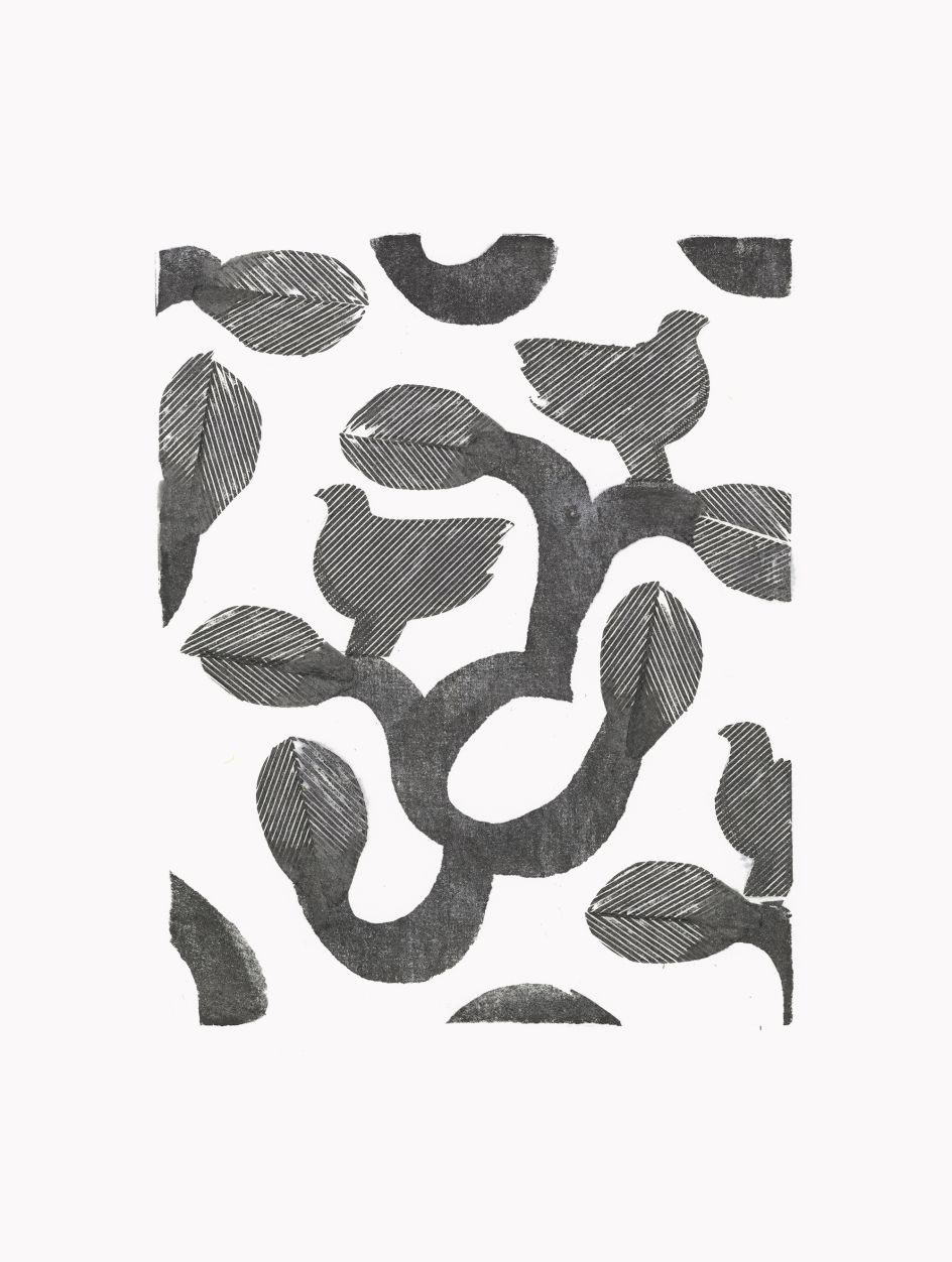
In terms of where he gets his inspiration, Seiichi explains that he has a great love for sequential patterns, "from traditional designs such as William Morris to the graphically strong and colourful designs of street fashion brands." Then there are artist greats like David Hockney and his "own fashion" that completely inspires the work of Seiichi. "I also like the forms of children's toys and Christmas ornaments. There are so many things that inspire me, but in general, I like clean and bright things."
© Seiichi
© Seiichi
© Seiichi
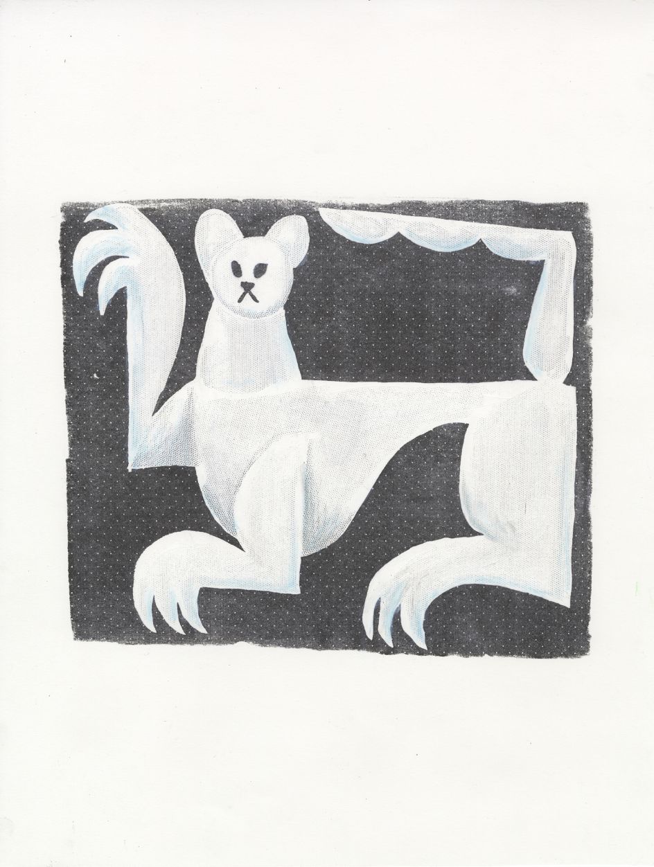
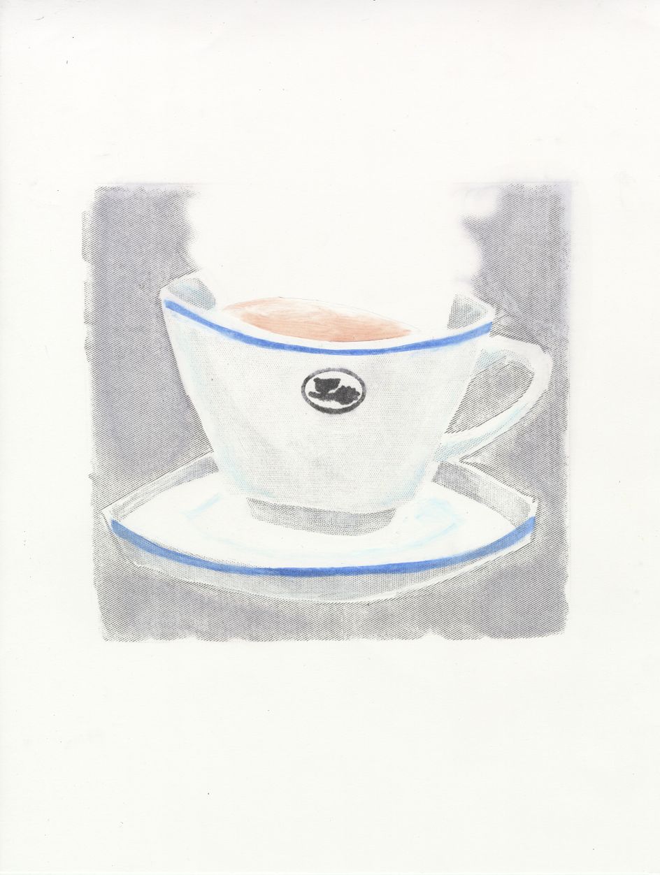
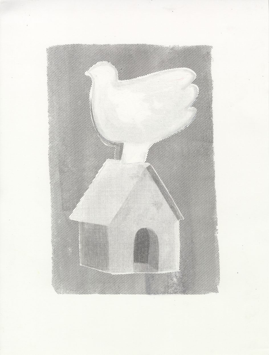
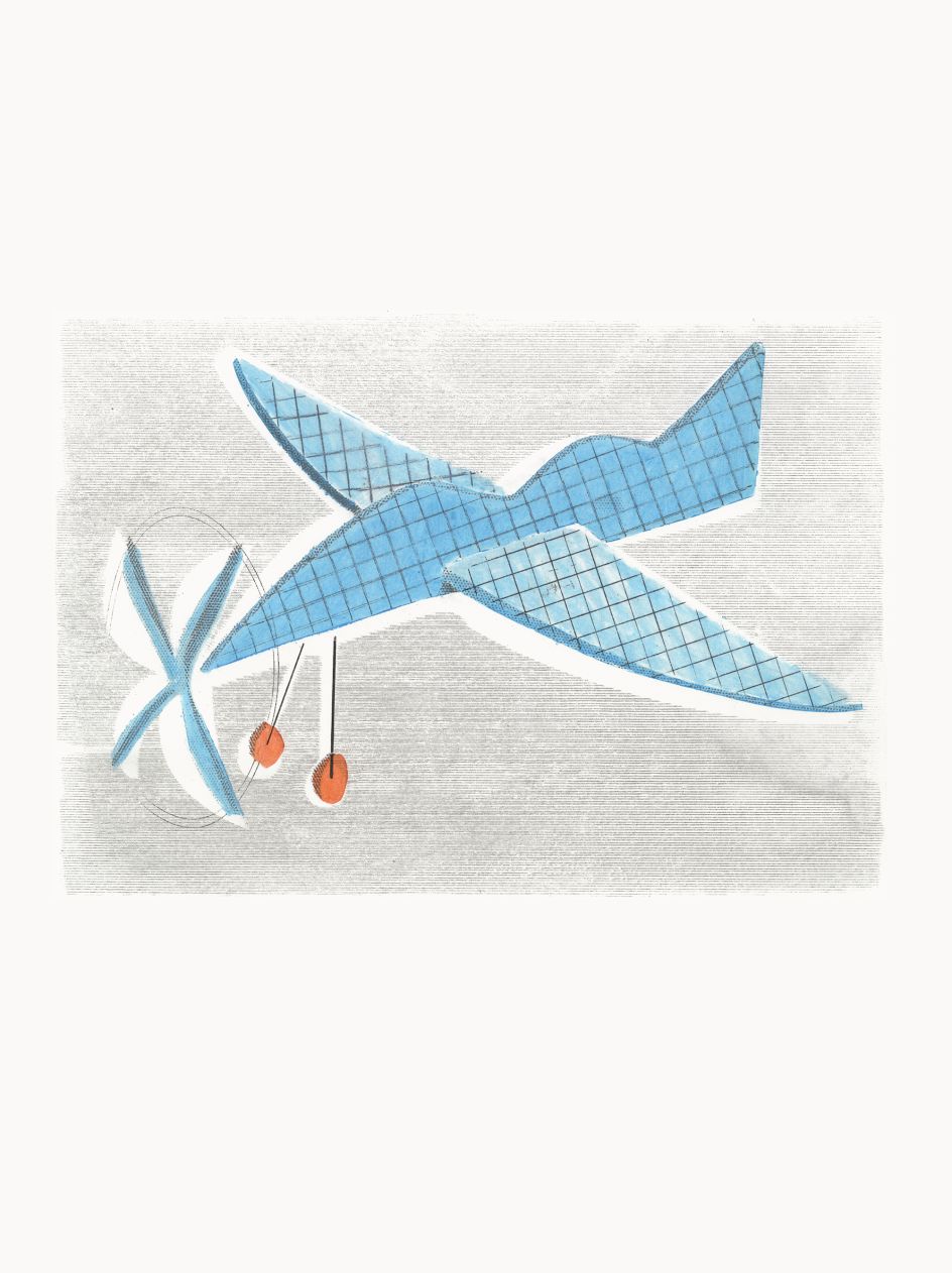
With these influences in tow, Seiichi is able to mould his own unique style – that which is naive and playful just as much as it is crisp and clean. He makes his pieces by way of "accidental discovery", which happened one day as he spilt some airbrush paint cleaning liquid onto his desk and "hurriedly" wiped it up with a piece of paper. "Then, what was printed on the paper was transferred to the desk," he recalls. A beautiful accident, and he's been using cleaning liquid to create his imagery ever since.
In one of Seiichi's recent artworks, a unicorn is presented on the page in a strikingly monochrome splash of grey. This creature, alongside horses, are two signature motifs for the illustrator. "This is because I received an award the first time I submitted an illustration of the same design of a horse to a competition," he says. And when it's not the four-legged animal, he'll otherwise turn towards toys and Christmas ornaments, which are the other two favourite motifs he likes to draw from. "I would like to use these designs to create 3D objects in ceramic and glass."
© Seiichi
© Seiichi
© Seiichi
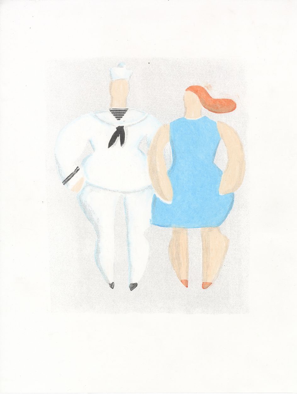
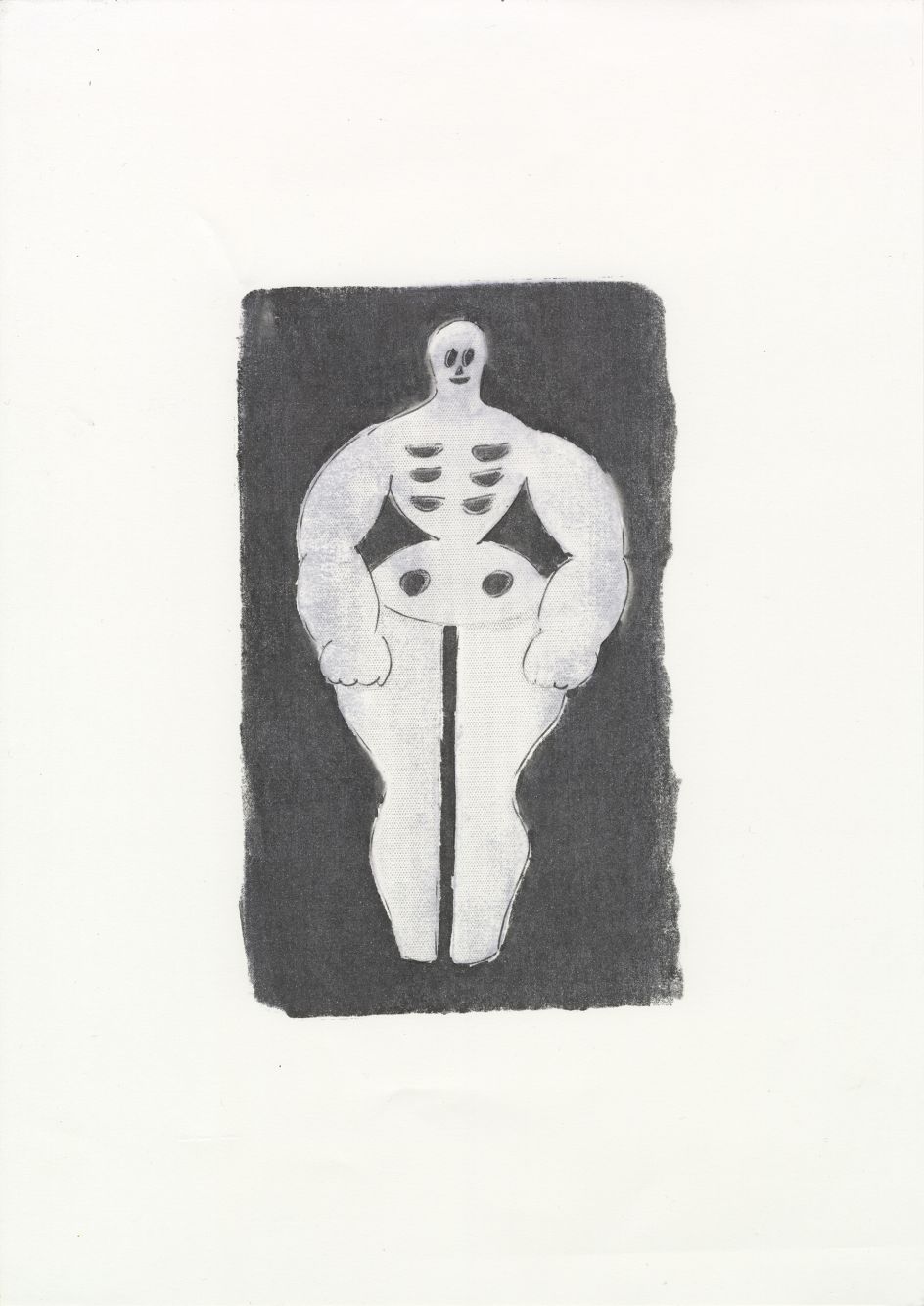
Elsewhere, Seiichi has illustrated the more human form: a sailor. Another regular motif of his, he says, "I am very attracted to the cleanliness of the sailor's uniform. I am also drawn to the simple shapes of mass-produced toys created by omitting details for various reasons such as cost, so when I design the form of a person, I try to omit details as if I were designing a mass-produced toy. For example, I wonder if this form would be dangerous if it got into a child's mouth."
You can easily see Seiichi's illustrative work being transferred into the physical world of toys – and textiles, for that matter – as the lines, shapes and contours are effortlessly smooth and connected. It gives off a textural, tactile feel that almost feels as if it were a physical object by origin. But would Seiichi have achieved such a quality if it weren't for the accidental tumble with cleaning liquid? We like to think so. "When designers and other people in the industry see my work, they are often interested in the texture that my unique technique brings," he says. "I am very particular about the texture of my paintings."
© Seiichi


 by Tüpokompanii](https://www.creativeboom.com/upload/articles/58/58684538770fb5b428dc1882f7a732f153500153_732.jpg)


 using <a href="https://www.ohnotype.co/fonts/obviously" target="_blank">Obviously</a> by Oh No Type Co., Art Director, Brand & Creative—Spotify](https://www.creativeboom.com/upload/articles/6e/6ed31eddc26fa563f213fc76d6993dab9231ffe4_732.jpg)


