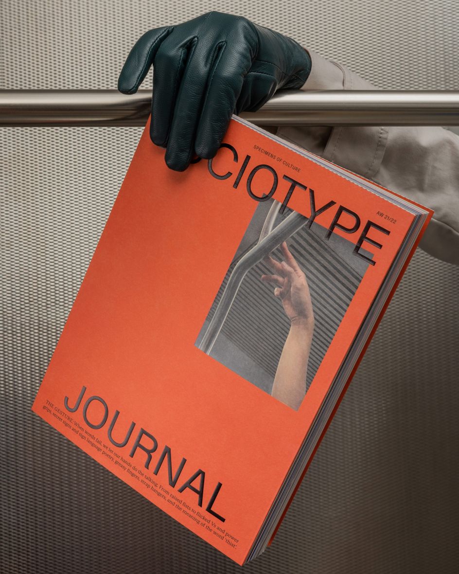
Random but very considered, each issue of Sociotype Journal is designed themed on a single type family
It's always interesting to hear of the different branches that grow out of a studio's practice. For Socio, on one branch, it's a brand design agency that's been running for 18 years. On another, it's a fairly recently launched design-led type foundry named Sociotype, now in its second issue.
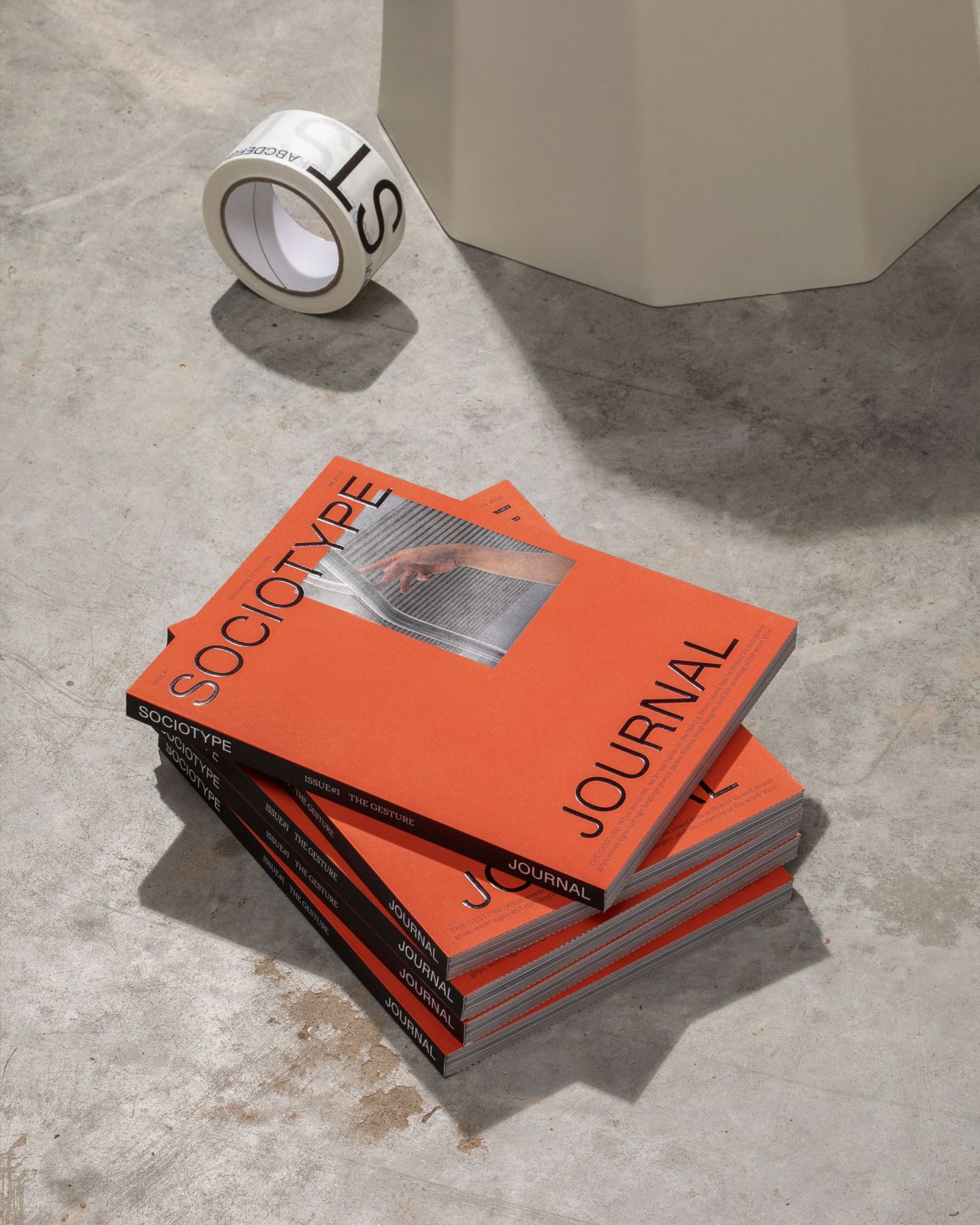
Led by a small team, the studio decided to launch its own journal as both a way of sharing interesting ideas as well as a type specimen in itself – a means of showing the type the studio has been designing and releasing through the foundry.
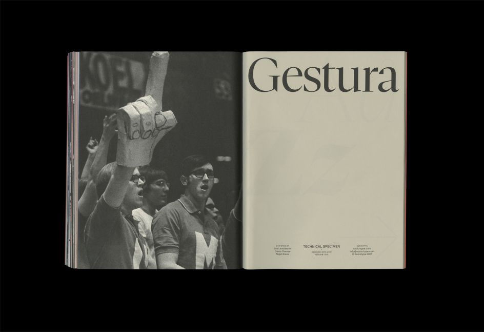
"In fact, the idea first came about from a discussion about how we could make a better form of type specimen," says Nic Carter, creative director and editor of the journal. "We love specimens, and we have shelves full of them in the studio. But having put in so much hard work to create the two type families that we launched the foundry with (Gestura, which features in issue #1 of the Journal, and Rework, which will feature in issue #2), we felt that a conventional specimen would sell them a little short." In a nutshell, the team wanted to create a more "active experience" for the viewer to interact with their type specimens. "If there's one thing the journal stands for, it's active communication: words to be read and ideas to be engaged with, rather than just type to be looked at."
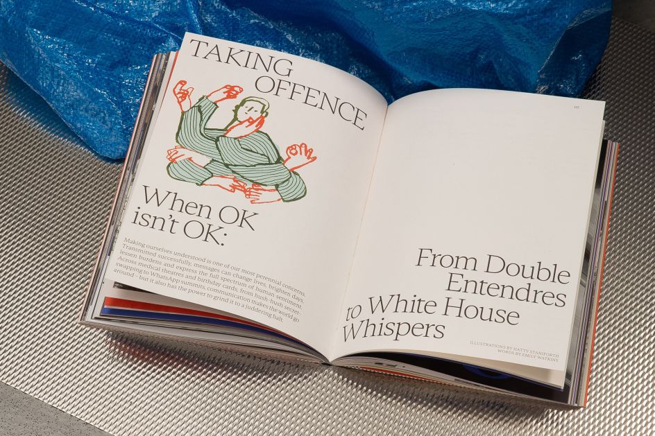
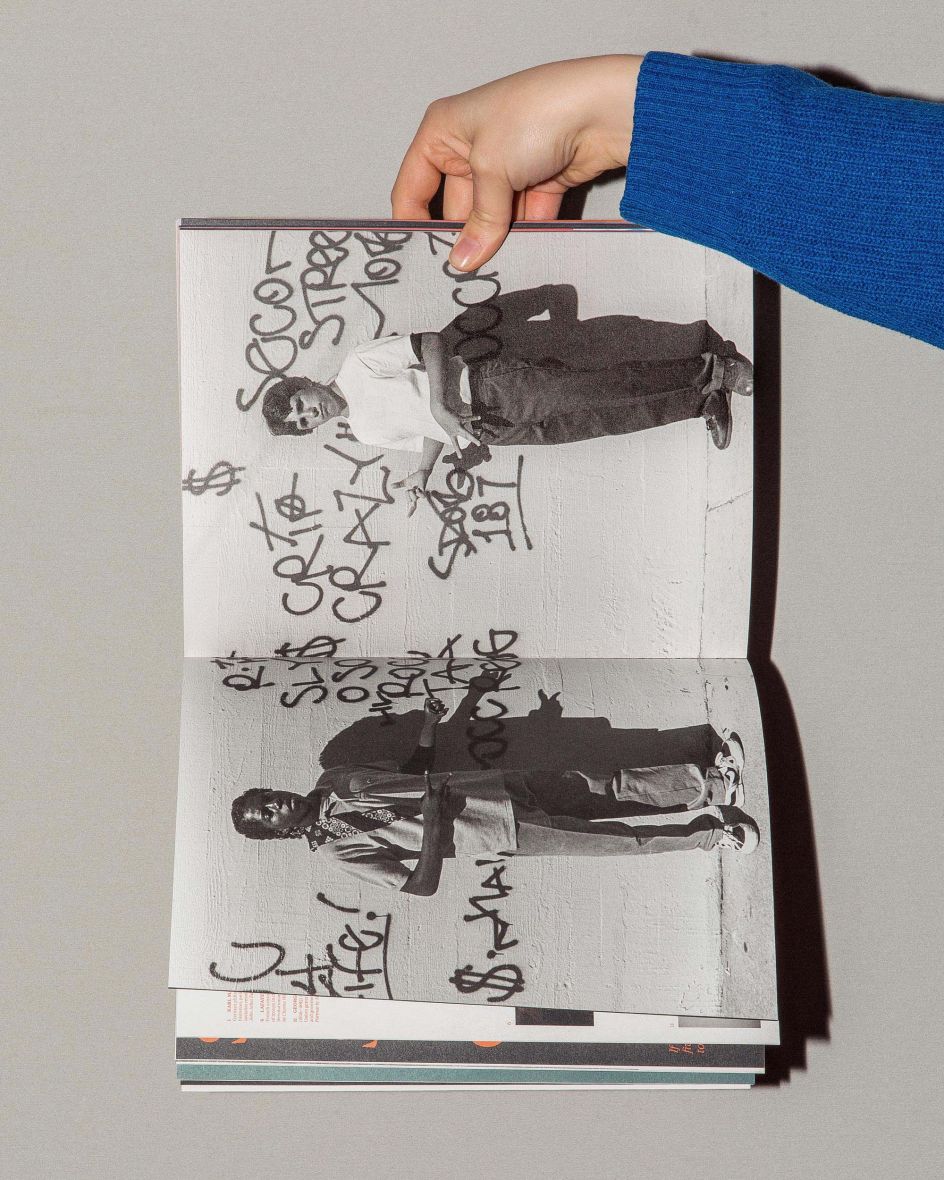
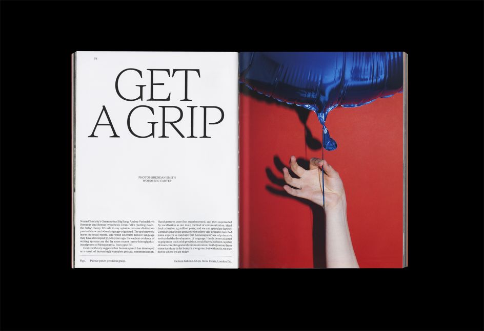
With each issue, there will be a typeset in a single type family designed by Sociotype. Each theme will be characterised by the type family. For issue one, The Gesture, the journal was inspired by "calligraphic qualities of our serif, Gestura", adds Nic. As a result, the issue delves into non-verbal communication, the "fidgeting hands of New York subway commuters", and NASA's 30-year-old gestural VR program.
Meanwhile, the second issue does it a little different as it features the Mole Man of Hackney coming "head-to-head" with Elon Musk; an essay on secret signs; the Queen "rubbing shoulders" with Napoleon; Easy Jet flight attendants and "Crips gang members". Nic adds: "We use the line' specimens of culture' on the cover. That's a terrible pun, but it's a pretty accurate reflection of our approach: picking up things that we find intriguing and arranging them together for comparison and contrast." This randomness becomes apparent throughout the considered page of the new issue, where bold and brash graphics are paired with the more mellow. Everything is intentional and designed with purpose.
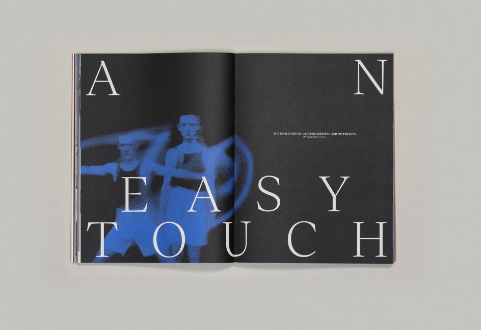
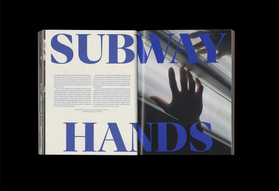
Besides Nic, the other masterminds behind the journal, studio and foundry are co-creative director Nigel Bates, co-editor Henrietta Thompson, editorial designer Alicia Mundy, type designer Joe Leadbeater and in-house photographer Brendan Smith. That's not forgetting James Cramp (co-founder of Socio), who helps balance the books. "As a small team, we all inevitably have to wear many hats to make it happen," adds Nic.
But clearly, they're doing something right, and their plans for the future prove just that. "I'd say we're looking to raise questions rather than provide answers. Perhaps some articles will prompt readers to do their own research? We certainly hope to provoke thought and discussion. That returns to the function of the Journal as a type specimen: that we're attempting to offer an active reading experience rather than a passive one.



 by Tüpokompanii](https://www.creativeboom.com/upload/articles/58/58684538770fb5b428dc1882f7a732f153500153_732.jpg)


 using <a href="https://www.ohnotype.co/fonts/obviously" target="_blank">Obviously</a> by Oh No Type Co., Art Director, Brand & Creative—Spotify](https://www.creativeboom.com/upload/articles/6e/6ed31eddc26fa563f213fc76d6993dab9231ffe4_732.jpg)


](https://www.creativeboom.com/upload/articles/33/338139d9b84270ce4759dc143351c1d6462028f0_732.jpg)

