SomeOne helps RNID to launch a bold new look as charity reverts to historic name
The Royal National Institute for Deaf People has unveiled its fresh new look today in a bid to reach more deaf people and those with hearing loss and tinnitus.
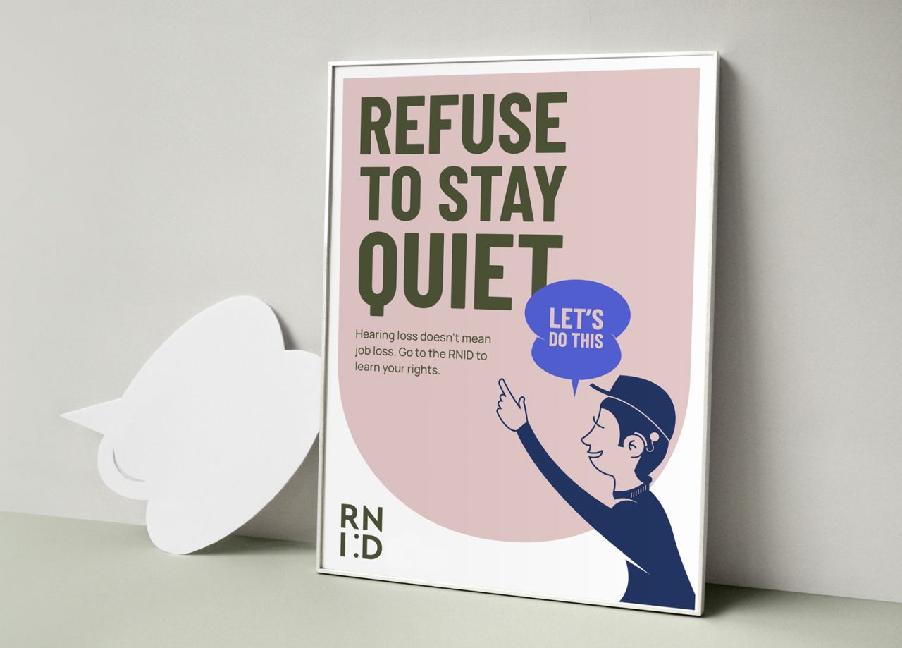
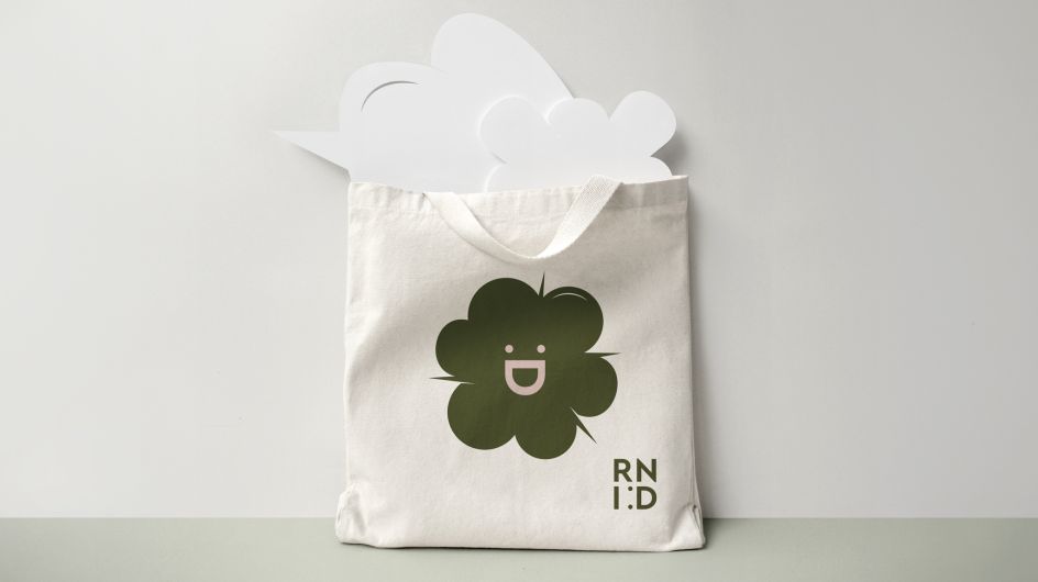
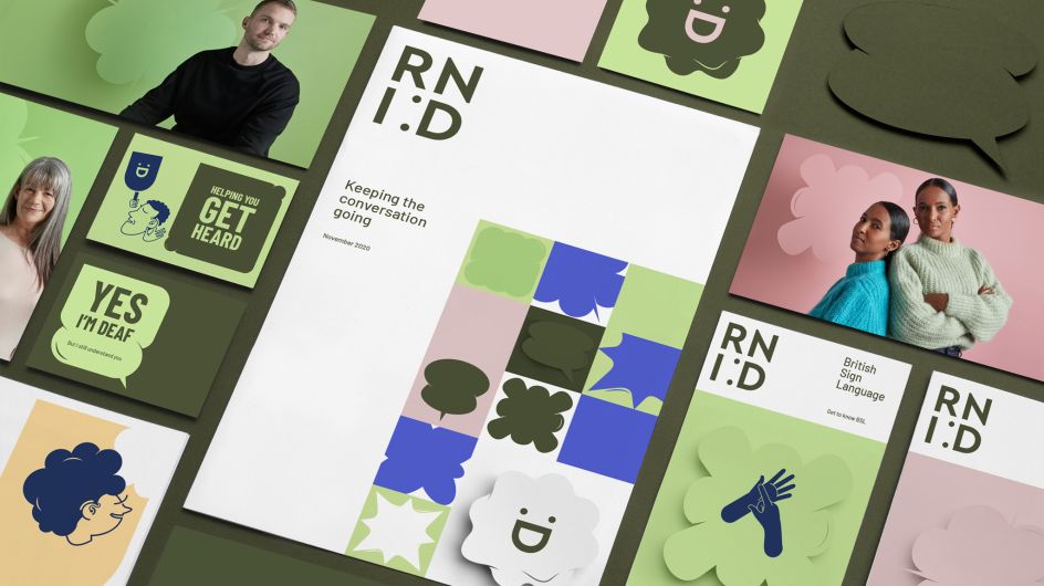
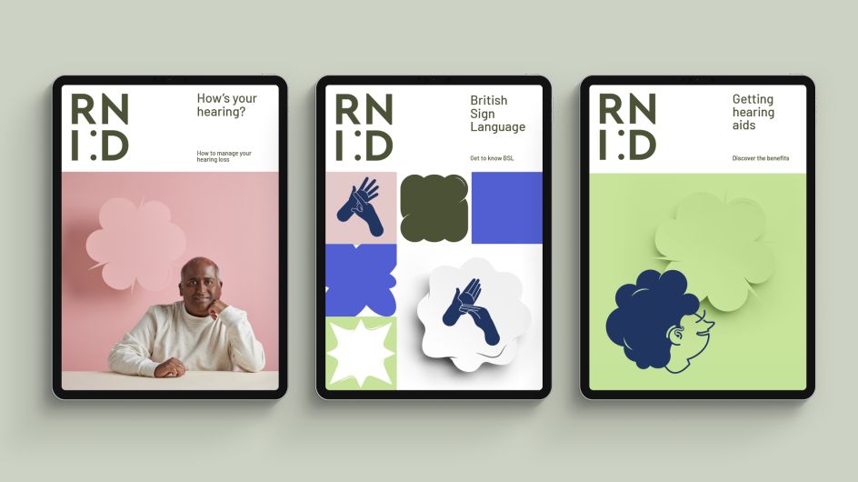
Designed by London branding agency SomeOne in collaboration with Dan Dufour, and the charity's in-house design team, the identity includes a new wordmark, logo, fonts, colour palette, illustrations, tone of voice and photography.
It comes just after the charity announced it was changing to its original name of RNID after a decade as Action on Hearing Loss. Research had found that the previous name was much-loved, preferred and better recognised.
Cheryl Hughes, head of brand for the charity, said: "The new brand identity is focused on positivity and aims to show supporters that the charity is united, creative and want change. The logo incorporates a 'smiley D' to reinforce our positivity and to celebrate diversity.
"We might be over a century old, but it doesn’t mean we're stuffy and formal, in fact, quite the opposite. We want to show people that we are dynamic and responsive and inspire the belief that together we can create a fully inclusive society."
In a first for the charity, RNID is preparing to publish its new 'tone of voice' guidelines on its website to encourage deaf people to help shape the language the charity uses.
Michael Wilkinson, digital director, said: "Culture and language are constantly evolving and we want to make sure we reflect that in the way we speak as a brand. That's why we're going to be publishing our tone of voice publicly and inviting people to help shape its future direction."
The new tone of voice has been adapted to appear "more conversational, impactful and less formal" and will use "plain English to communicate with communities, rather than for them".
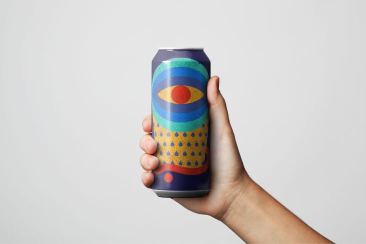
Elsewhere, a "radically reconsidered" wordmark brings charm to the category with a smile at its heart. A progressive and unusual colour system avoids the hard punches of primary palettes. A new tone of voice combines with a unique illustrative style to help differentiate and aid storytelling.
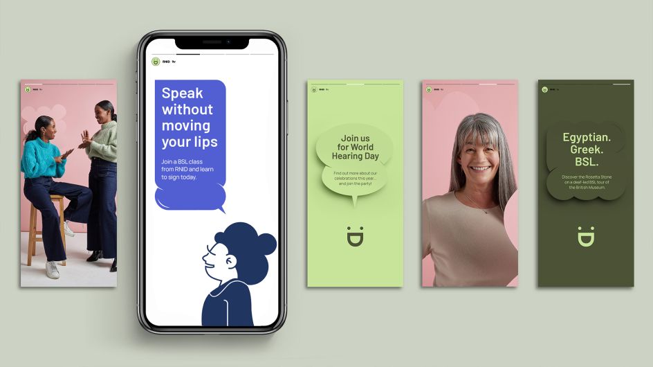
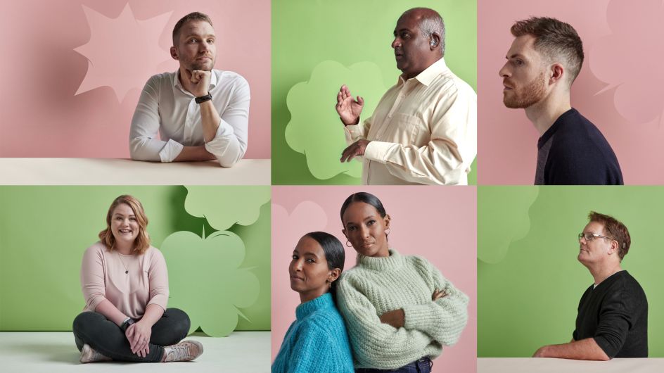
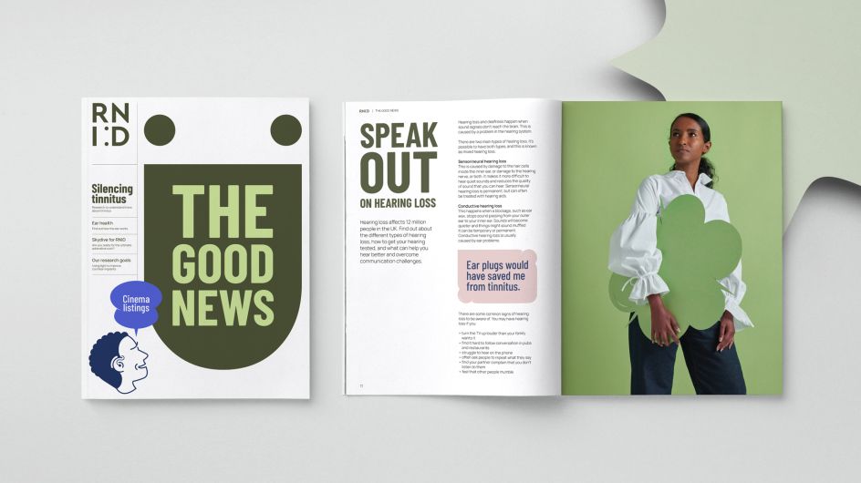
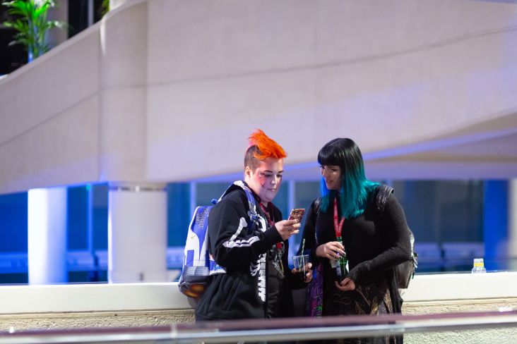
Fresh new 'speech bubble' icons project the charity's unique personality, while vibrant new photography and illustrations reflect the full range of people supported by the charity including those with cochlear implants and hearing aids.
"Our focus throughout this project has been to make us a strong, modern brand with a recognisable identity that makes us more relevant and allows us to reach more people," adds Hughes. "Strengthening our brand is vital for us to deliver our fundamental purpose and make an even bigger difference to the 1 in 5 adults in the UK who are deaf or have hearing loss and the 1 in 8 adults, like me, who have tinnitus."
The new brand launched earlier this week and will be rolled out over the coming year.


 by Tüpokompanii](https://www.creativeboom.com/upload/articles/58/58684538770fb5b428dc1882f7a732f153500153_732.jpg)


 using <a href="https://www.ohnotype.co/fonts/obviously" target="_blank">Obviously</a> by Oh No Type Co., Art Director, Brand & Creative—Spotify](https://www.creativeboom.com/upload/articles/6e/6ed31eddc26fa563f213fc76d6993dab9231ffe4_732.jpg)


