Stav Assis blends graphic design and illustration to create simple yet playful artwork
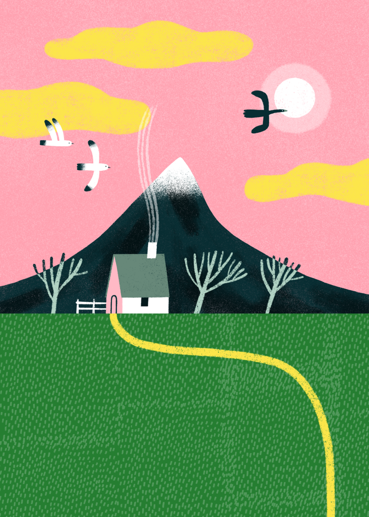
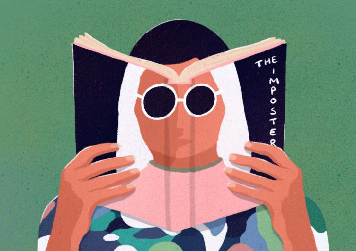
See the world through the eyes of Tel Aviv-based illustrator and graphic designer Stav Assis in his bright, geometric artwork that playfully warps the rules and imagery of the world around him.
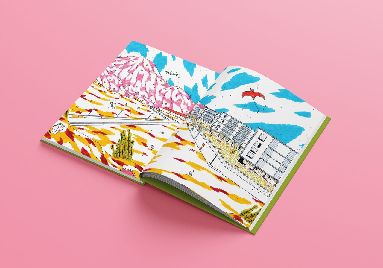
Simplicity is at the heart of Stav's artwork. But it's not a reductive simplicity that does away with charm and character. Instead, his simplicity is carefully calculated to deliver impact and humour. Taking his lead from artists such as Henri Matisse, Pablo Picasso, and Frans Masereel – each master of simplicity in their own way – Stav aims to follow in their footsteps by creating illustrations and designs that effortlessly extract truth via their deceptive complexity.
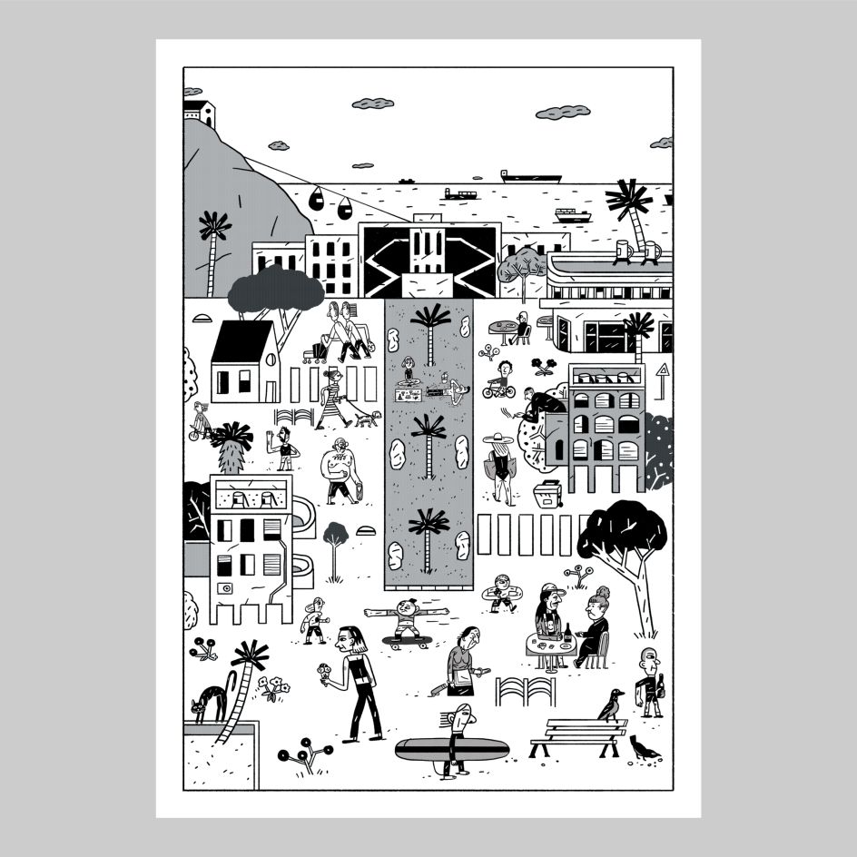
This isn't to say his work, which appears in picture books, editorials, posters, comics and more, is hung up on intellectual considerations. The subjects of his art range from cycling sharks to his beloved dogs, revealing that Stav is more than comfortable expressing his playful side. "I often tend to rely on geometric shapes and straight lines, but on the other hand, I love playing with perspective, coming up with funny characters and using vivid colour work," he tells Creative Boom.
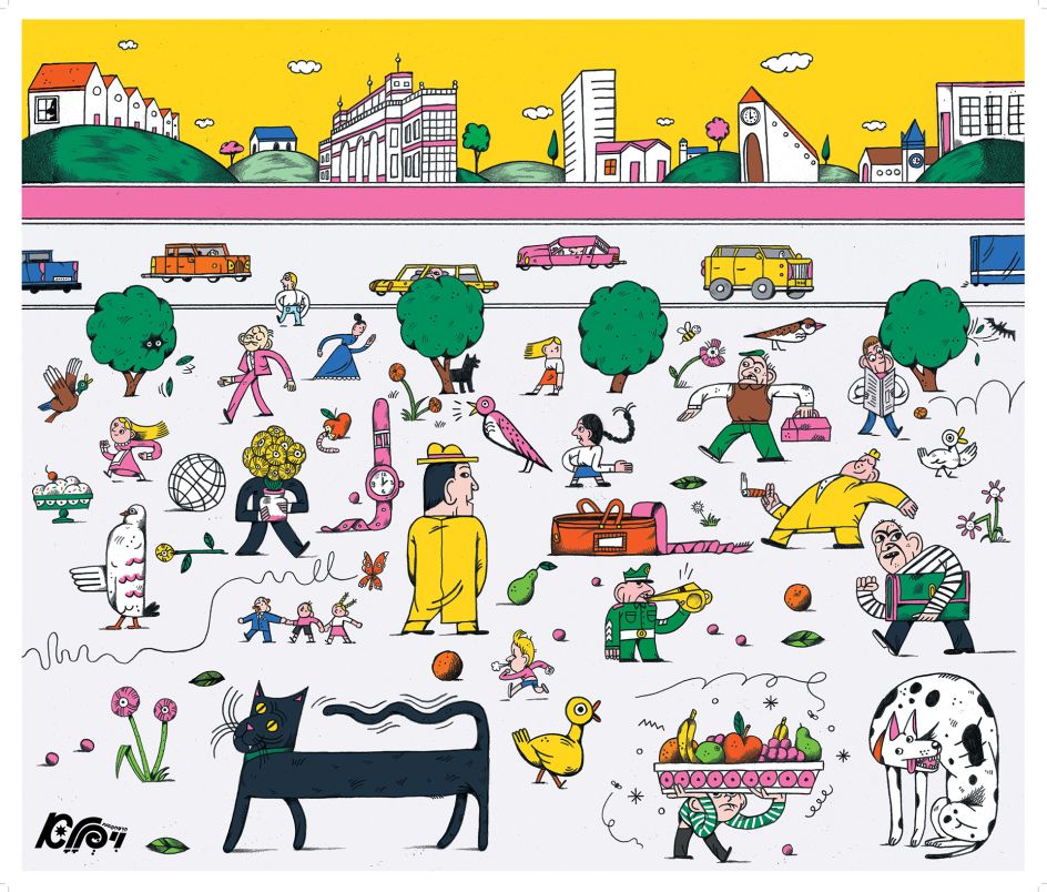
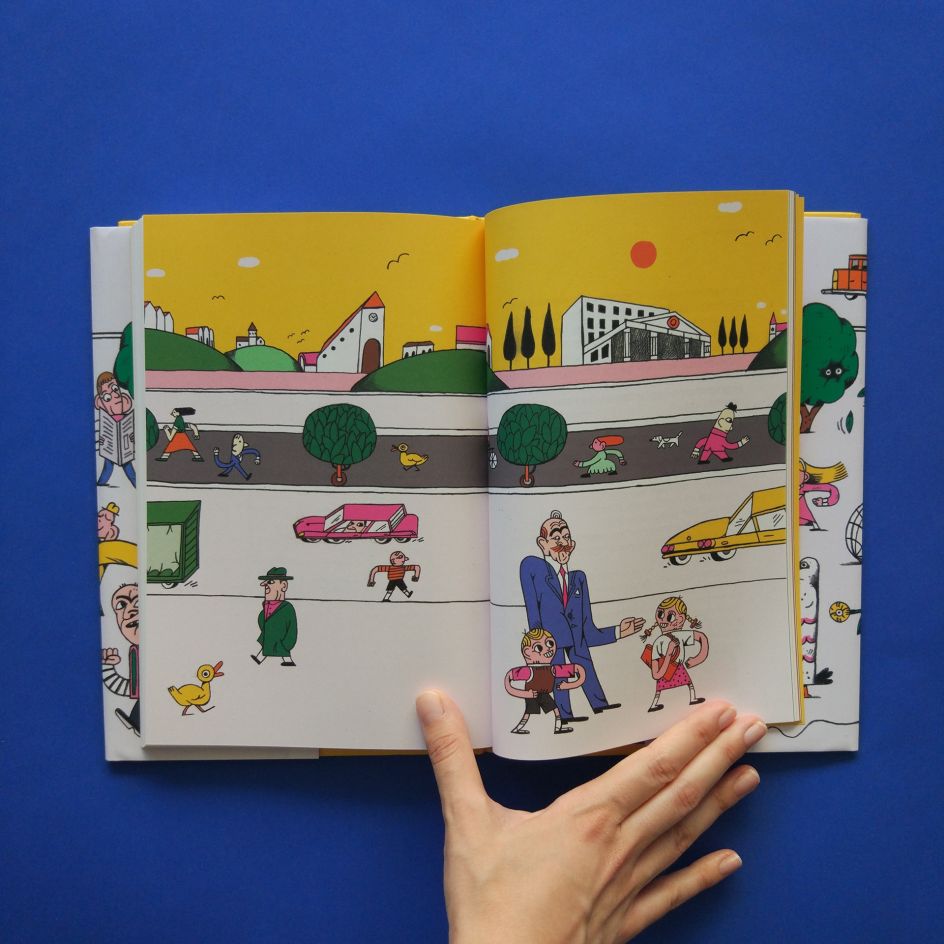
Stav's unique eye for form and colour has developed from an early age, as he claims to have been drawing and illustrating ever since he can remember himself. After lending his talents to studying and working as an architect in Tel Aviv, he realised that his true passion lay in illustration. "I decided to return to my student days and study illustration in the visual communication department at Shenkar college," he adds. "Today, I am a freelance illustrator and have been working with all sorts of clients (book publishing, graphic design studios, hi-tech industry and magazines)."
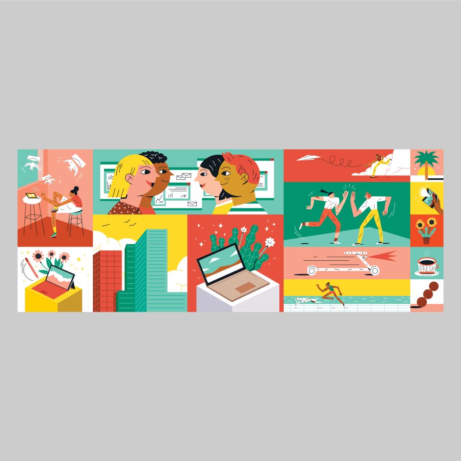
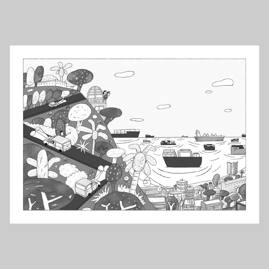
During these studies, Stav established a strong basis in graphic design, which can clearly be seen in the composition of his illustrations. Even organic subjects such as the sea and dogs are rendered with form and colour at the forefront and in a way that transcends conventional representation. Speaking of how the two disciplines work together, he explains: "I think they complete each other into something greater, each of them brings a different aspect to the visual communication field."
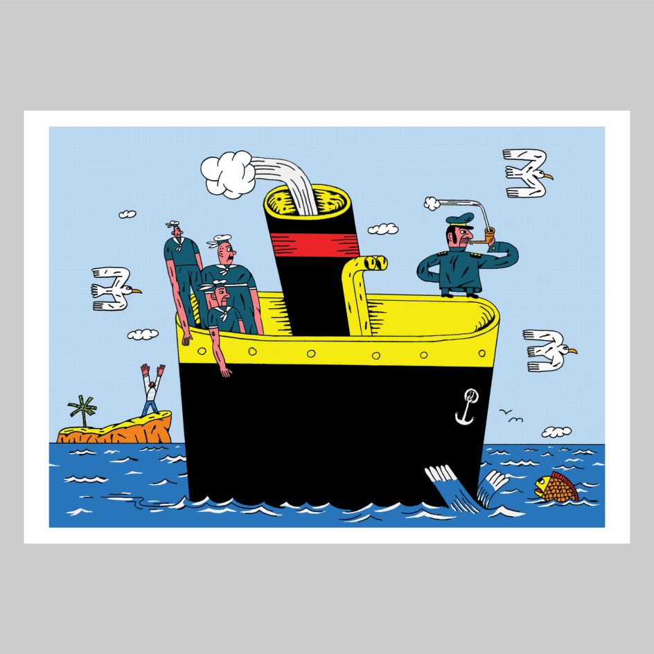
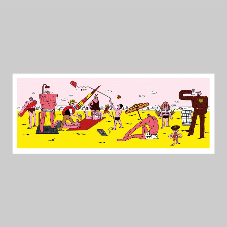
Blending these skills allows Stav to create strange and funny characters with distinctive appearances, including soldiers on the lookout, a suspicious-looking spy, or a seaside scene populated with outlandishly proportioned holidaymakers. When creating these characters, Stav has a few go-to approaches in mind. "I always try to stretch the normal figure proportions and make different versions of the same character until I find something that I like," he says. "I also try to get inspired as much as possible from other artists and get new ideas."
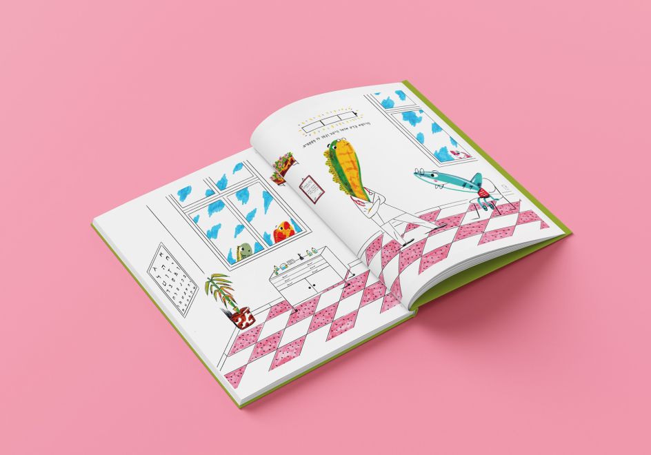
For his first job as a picture book illustrator, Stav was tasked with drawing Rish Rish the shark, a unique denizen of the deep who traverses the ocean on a bicycle. Stav admits to finding the commission stressful but exciting as it pushed his talents as an illustrator. Having not approached the task of drawing for a storybook before, he decided to tackle it methodically.
"Before I started illustrating, I read the story and thought about my perspective on it," he explains. "I tried to figure out the obvious things to illustrate and what I could say as an illustrator. I also thought about: what would be the side stories. What is being said between the lines that are worth illustrating?"
Besides form, colour is another key component Stav brings to his illustrations. And given how confidently he uses them in his work, it's a surprise to learn that he always struggles with colours. "Sometimes I make multiple versions of the same illustration and change the colours to see which version is the best one," he says.
"I try to understand the right atmosphere I want the illustration to have. I take the theme of colours as another informative element in my works. My colour palettes come from all sorts of inspirations but mainly from practising in matching colours to one another."
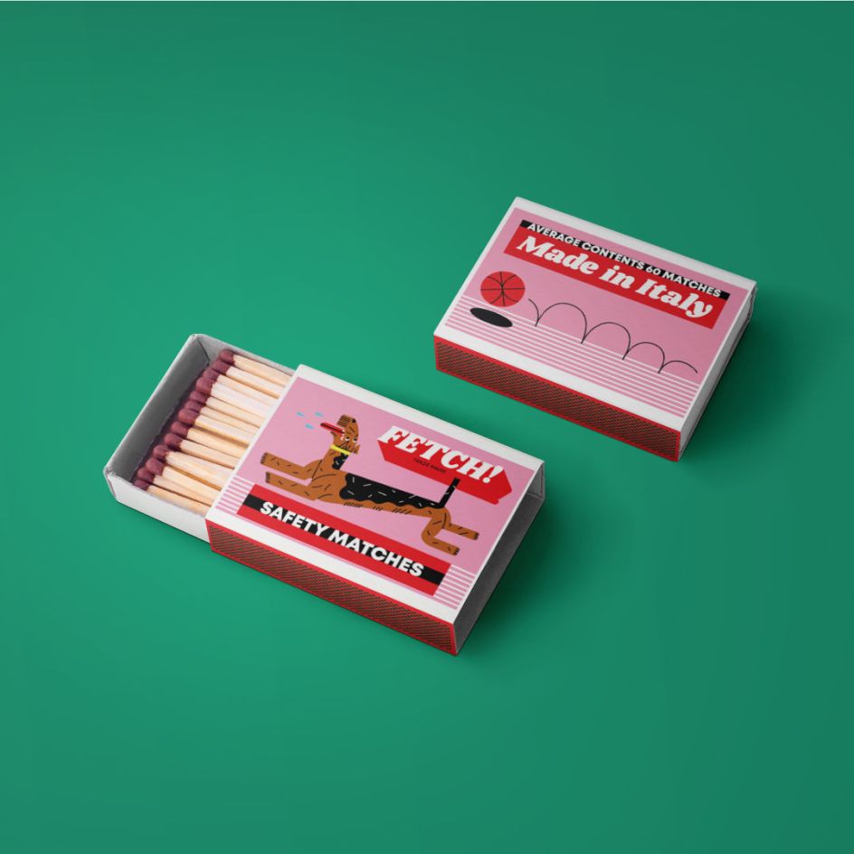
Perhaps the best example of Stav's work is his matchbox series, FETCH! Created purely as a personal project, these concept products not only combine his passions for illustration and design but are also centred around his biggest love of all: dogs. Yet despite owning two Belgian Malinois himself, Stav chose to experiment with different breeds as he draws his own a lot.
"I wanted to make a small and memorable product, such as a matchbox, and give it some bold branding and illustrations, something very simple yet colourful and playful," he says. "I am really happy with how it turned out and hope to make it a real brand people can buy someday."


 by Tüpokompanii](https://www.creativeboom.com/upload/articles/58/58684538770fb5b428dc1882f7a732f153500153_732.jpg)

 using <a href="https://www.ohnotype.co/fonts/obviously" target="_blank">Obviously</a> by Oh No Type Co., Art Director, Brand & Creative—Spotify](https://www.creativeboom.com/upload/articles/6e/6ed31eddc26fa563f213fc76d6993dab9231ffe4_732.jpg)


