Mucho rebrand breathes new life into 92-year-old free festival in San Francisco
How do you keep a festival's old-time associations while making it relevant to a modern audience? Mucho's rebranding of the Stern Grove Festival is a textbook example of how to do it right.
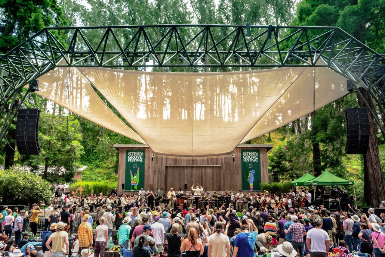
"If you're going to San Francisco, be sure to wear some flowers in your hair," went the classic 1967 song by Scott McKenzie. But while more than half a century has passed since then, the hippy vibe in California's chillest city remains alive and well. It's certainly evident in the spirit of Stern Grove Festival, a series of free concerts featuring world-renowned artists from various genres, for 10 Sundays throughout the summer.
Founded in 1938, Stern Grove is the oldest music festival in San Francisco. Based in the heart of the city in a eucalyptus grove, it's an amazing opportunity to enjoy top-quality music for young and old. But it needed to bring its image into line with the modern day.
So the organisers approached global design agency Mucho for a brand refresh that would help appeal to a younger audience, be flexible enough to work with any genre of music, and establish the festival as a world-class event.
Background
The background behind the event is quite fascinating. The 33-acre location, Sigmund Stern Recreation Grove (aka Stern Grove), was originally purchased by Rosalie M. Stern, the daughter of a rich businessman, and gifted it to the City in 1931.
Marvelling at the Grove's natural acoustics, Mrs. Stern determined that the site would be preserved as a park where the public could enjoy admission-free music, dance and theatre performances.
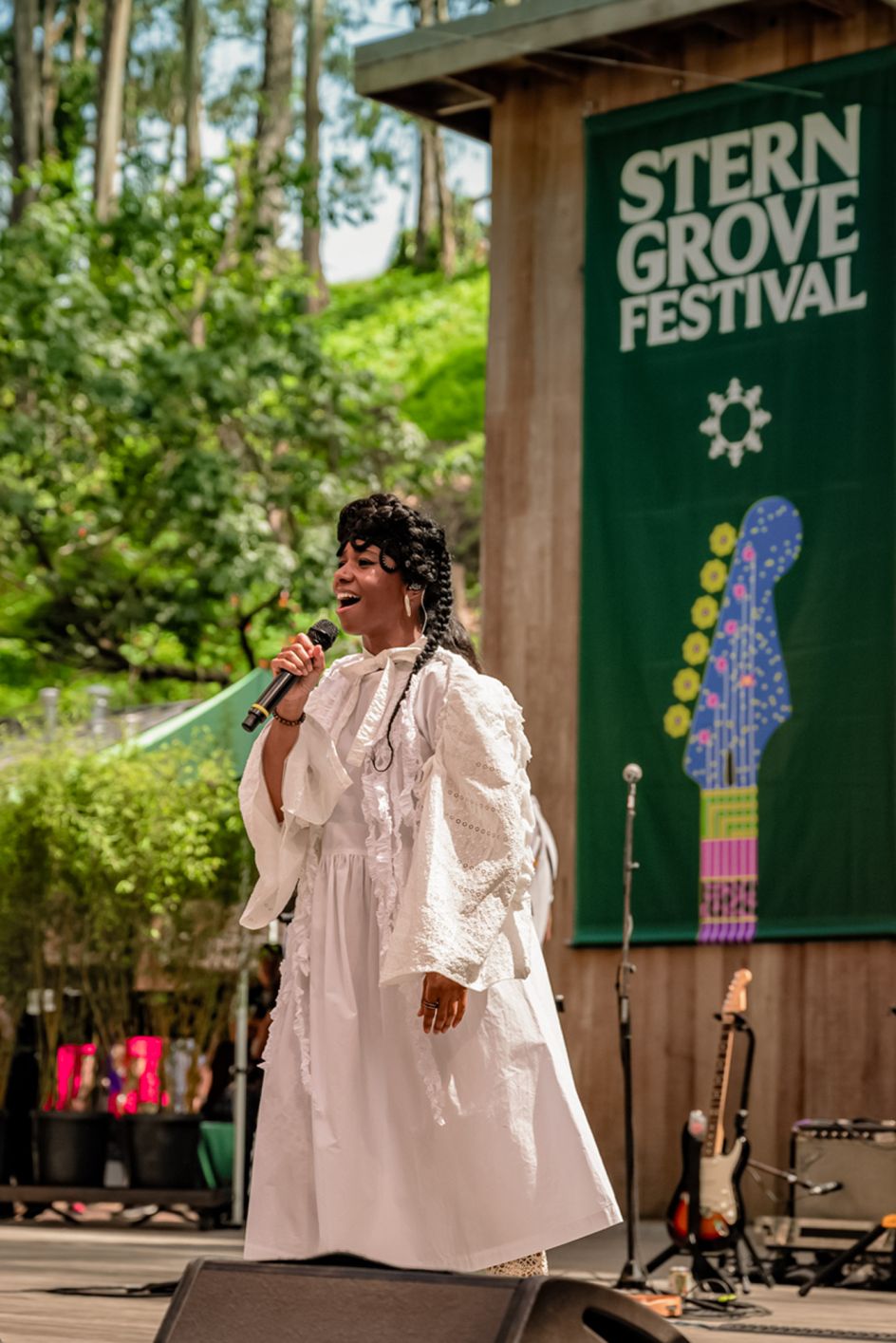
Today, Stern Grove, a natural amphitheatre surrounded by giant eucalyptus, redwood and fir trees, is one of Northern California's favourite concert sites, presenting both established and exciting new artists to thousands of attendees each year.
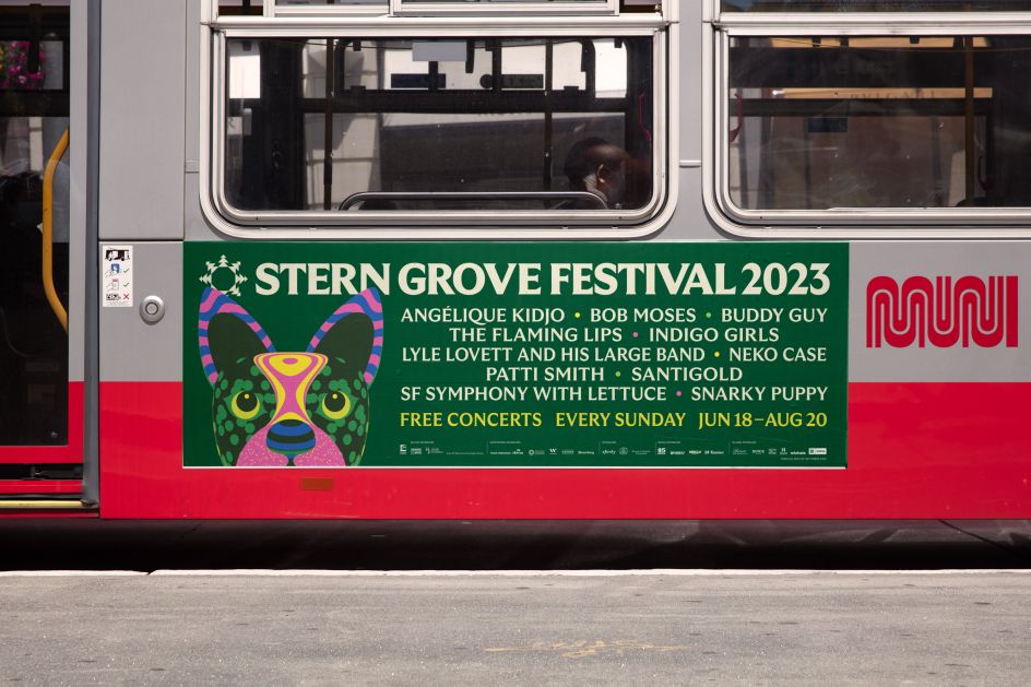
This year's lineup included Snarky Puppy with Isaiah Sharkey, Indigo Girls & Neko Case, Santigold with Ogi, Lyle Lovett And His Large Band with Andrew St, Angelique Kidjo with Jupiter & Okwess, SF Symphony with Lettuce, Bob Moses with Neil Frances, Buddy Guy with Eric Gales, Patti Smith with Bob Mould and The Flaming Lips.
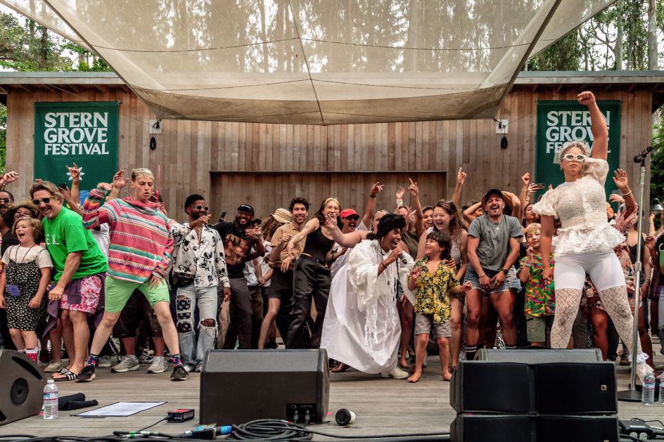
In keeping with Rosalie's original vision, the wide selection of performers reflects the festival's commitment to exceptional programming and serving diverse audiences. The event is known for its relaxed vibe, as family and friends gather to picnic and enjoy performances in a natural setting.
The brief
The festival had a loyal following from an older generation and a look and feel of the hippy culture. But there was a danger of becoming dated. And so Mucho – a global strategy, branding, packaging and graphic design studio founded in 2002 with offices in San Francisco, Barcelona, Melbourne and Paris – was approached to create a more modern, fresher, globally appealing identity for the festival that would attract younger audiences.
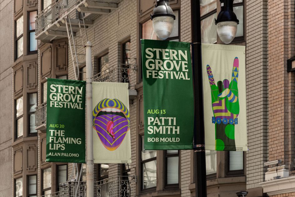
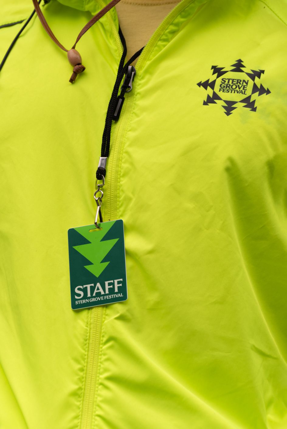
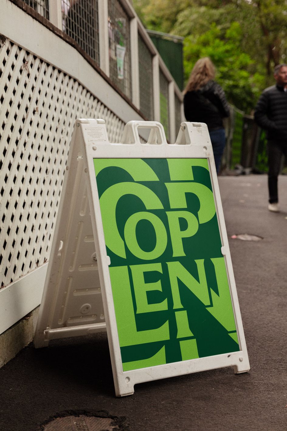
However, Mucho had to strike a careful balance here. The new identity couldn't alienate the already established ethos and audience it has appreciated over the years. If they could square this circle, it would allow Stern Grove to approach more modern artists and even expand into new music genres and different types of events in the future.
Symbol
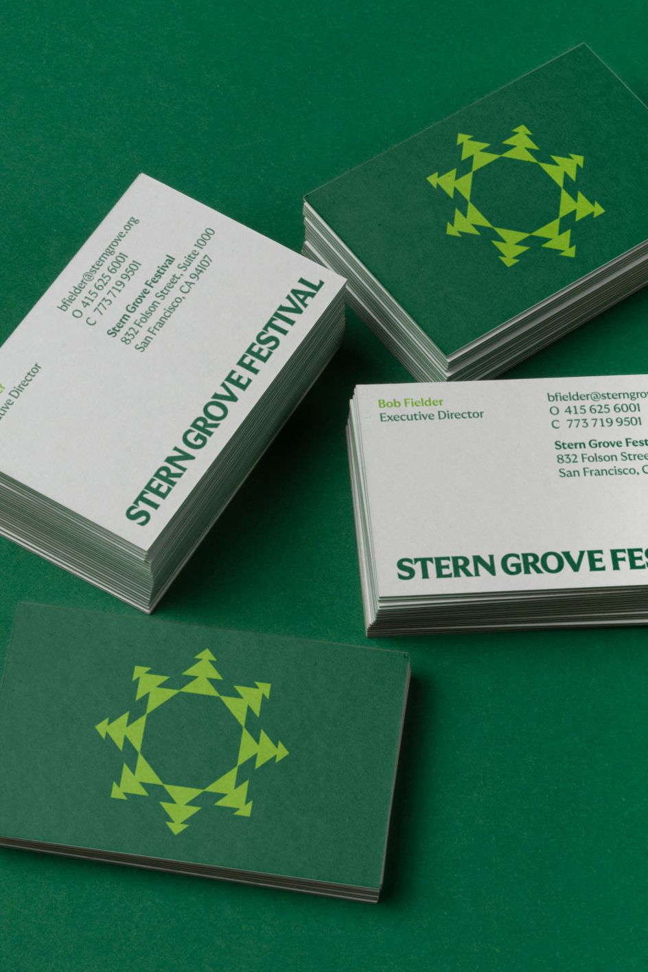
Mucho wanted to establish a brand identity that was modern, fresh and flexible, but more importantly, something that only Stern Grove could truly own. One of the most spectacular aspects of this festival is its location. Nestled and surrounded by Eucalyptus trees, concertgoers line up early in the morning to grab their favourite spots between the trees, adding to the grounded, community feel of the event. For this reason, the team opted to create a symbol based around a simple tree icon.
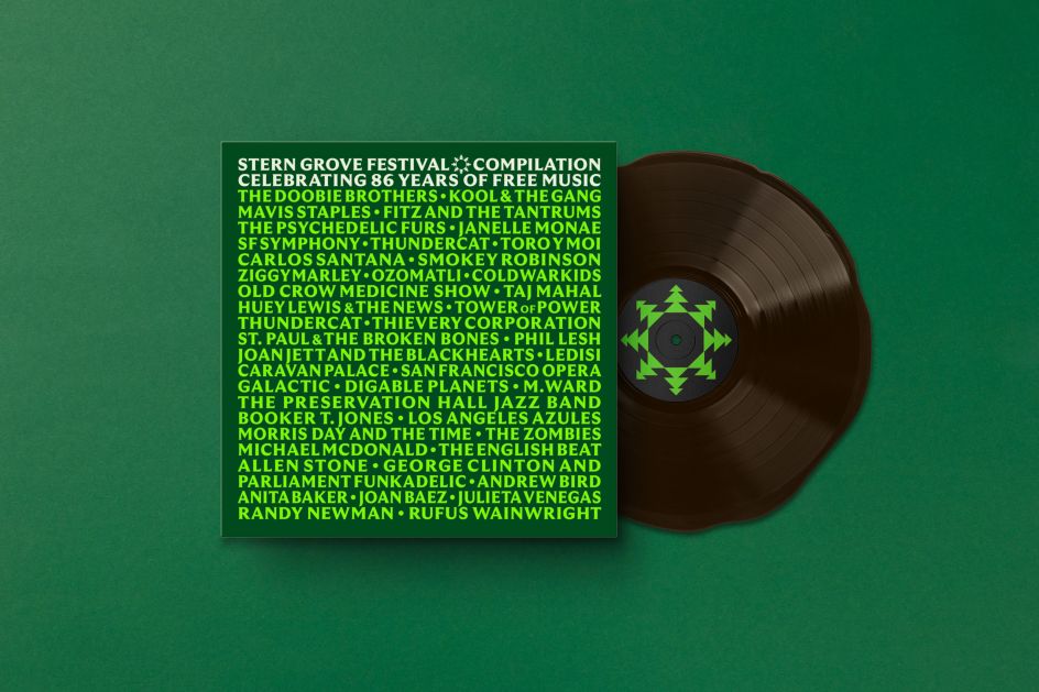
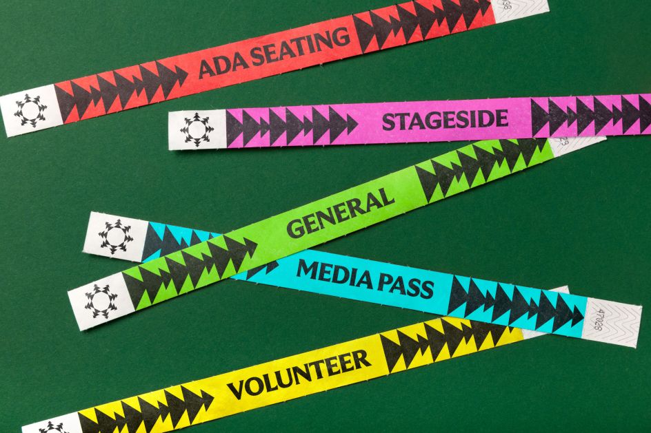
"A great symbol needs to communicate something memorable and unique about the brand," explains creative director Rob Duncan. "In this case, it's the location that's unique and the fact that since 1938, the Stern Grove Festival has created a passionate community within San Francisco. A simple tree icon is rotated to represent a grove, a community and a vibrating graphic device which can be animated and cropped to represent sound while working with multiple music genres."
The symbol was brought to life as a circular graphic equaliser, reacting to any type of music. Mucho worked with design, motion and branding studio Thru to create a web application whereby any music could be played, and the symbol would react.
In future, they envision large digital screens behind each performer, including live interaction with the brand.
Design elements
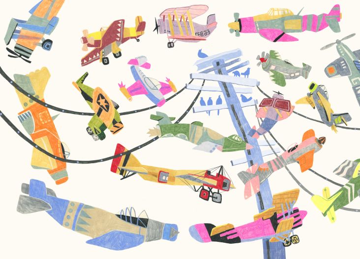
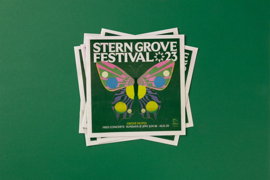
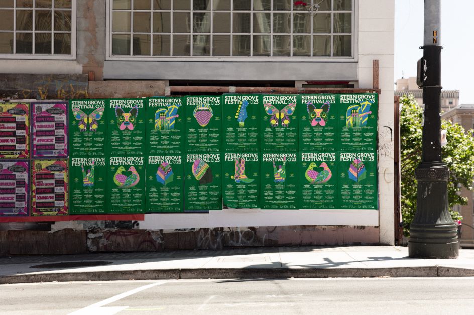
Along with the central symbol, an evergreen suite of elements was developed to be maintained every year, including a new typeface, a primary colour palette, signage, grids and layouts. However, this design system is anything but monolithic. To allow flexibility in the system and to give each year its own identity, different illustrators can be commissioned to create artwork and a yearly secondary colour palette.
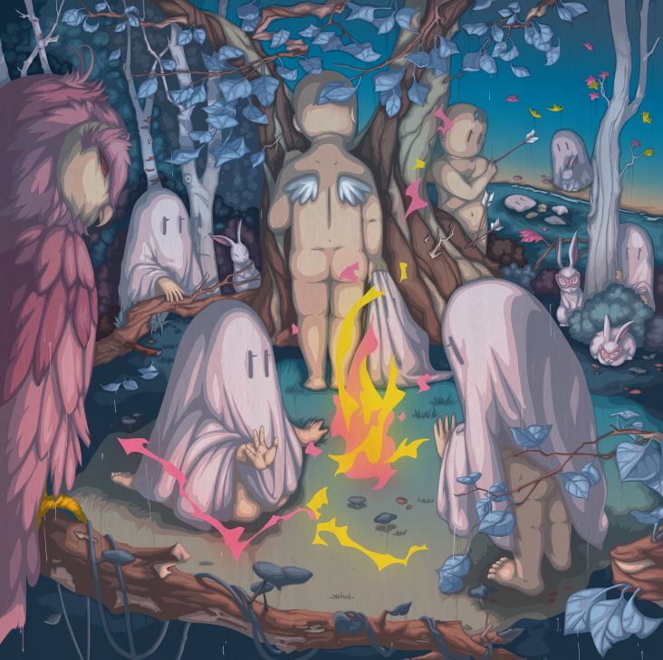
For 2023's event, Mucho worked with the illustrator Karan Singh to create a suite of imagery related to each artist and the overall theme of nature and the outdoors.


 by Tüpokompanii](https://www.creativeboom.com/upload/articles/58/58684538770fb5b428dc1882f7a732f153500153_732.jpg)


 using <a href="https://www.ohnotype.co/fonts/obviously" target="_blank">Obviously</a> by Oh No Type Co., Art Director, Brand & Creative—Spotify](https://www.creativeboom.com/upload/articles/6e/6ed31eddc26fa563f213fc76d6993dab9231ffe4_732.jpg)


