Studio Blackburn rebrands a 'letterbox-friendly' home brewery kit, and it's not what you'd expect
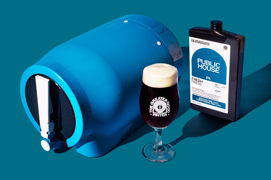
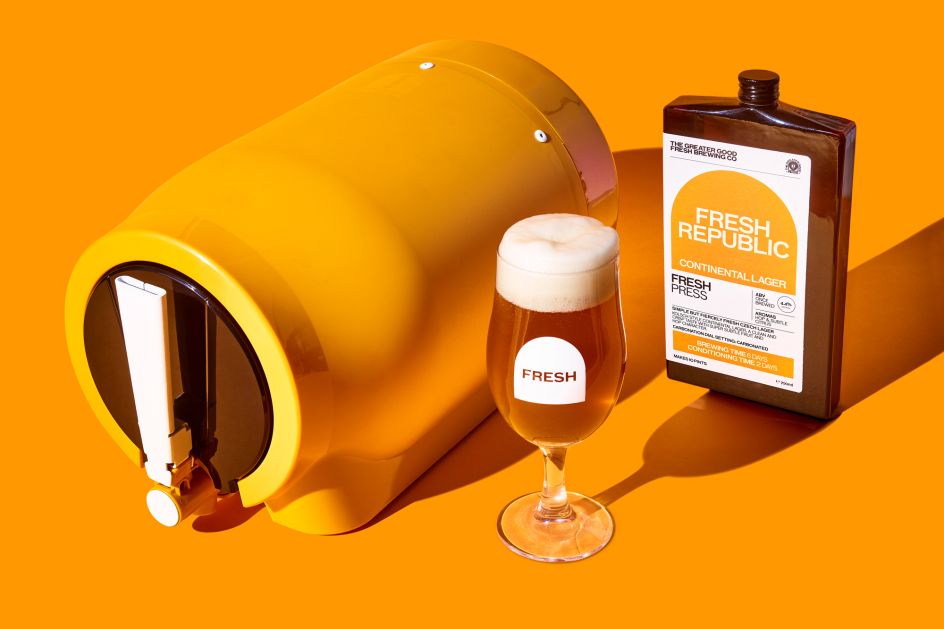
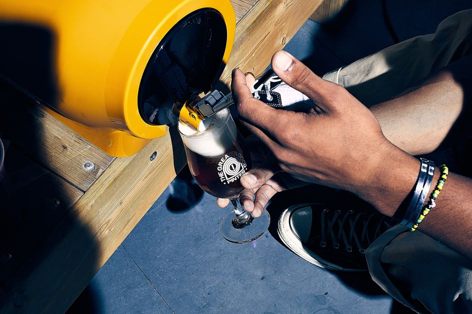
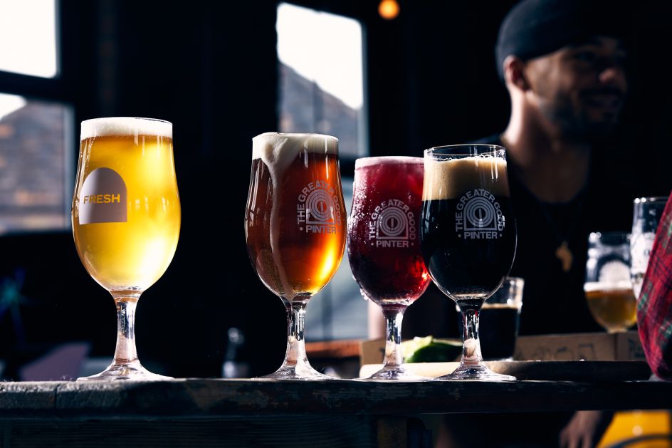
London creative agency Studio Blackburn has designed a new identity and packaging suite for The Greater Good Fresh Brewing Co, the company behind the revolutionary 'Pinter' – a world-first innovation that allows you to brew 10 pints of fresh beer or cider, all from the comfort of home.
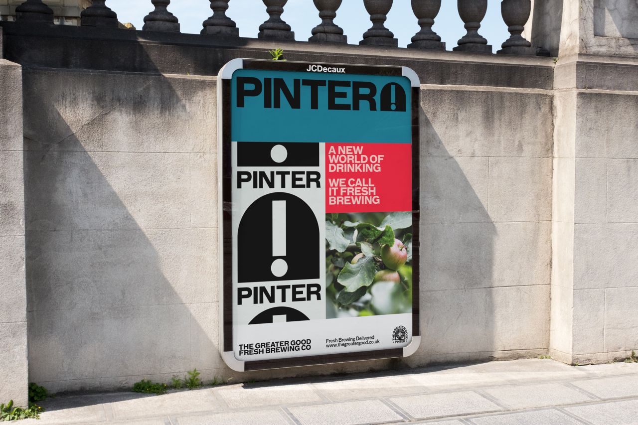
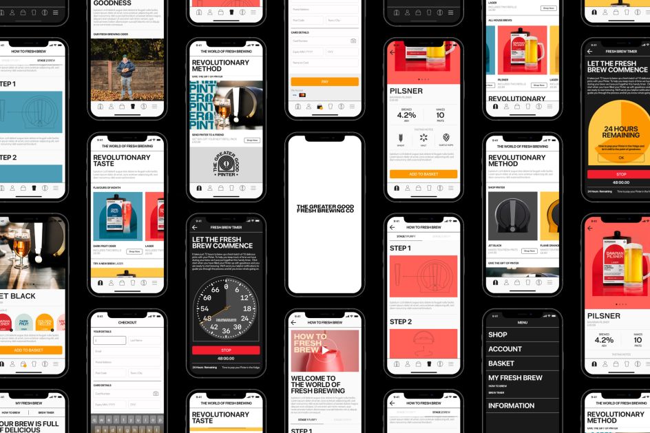
As it's affordable, sustainable and most importantly, tastes incredible, it was quite an interesting brief for the studio, which has Ralph Broadbent and Alex Dixon as its founders. Tasked with revitalising the entire brand and creating an "impactful" identity for the 'Pinter', they had to create something that was reflective of the company, its innovation and the quality of its products.
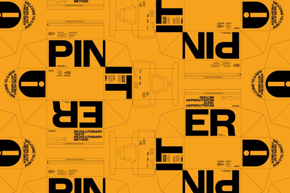
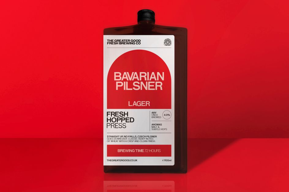
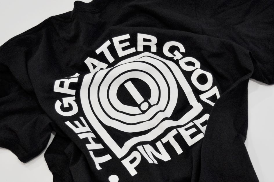
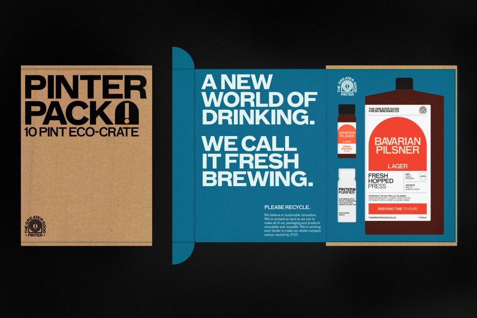
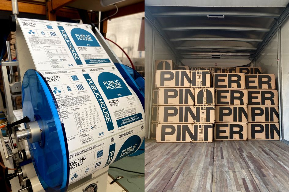
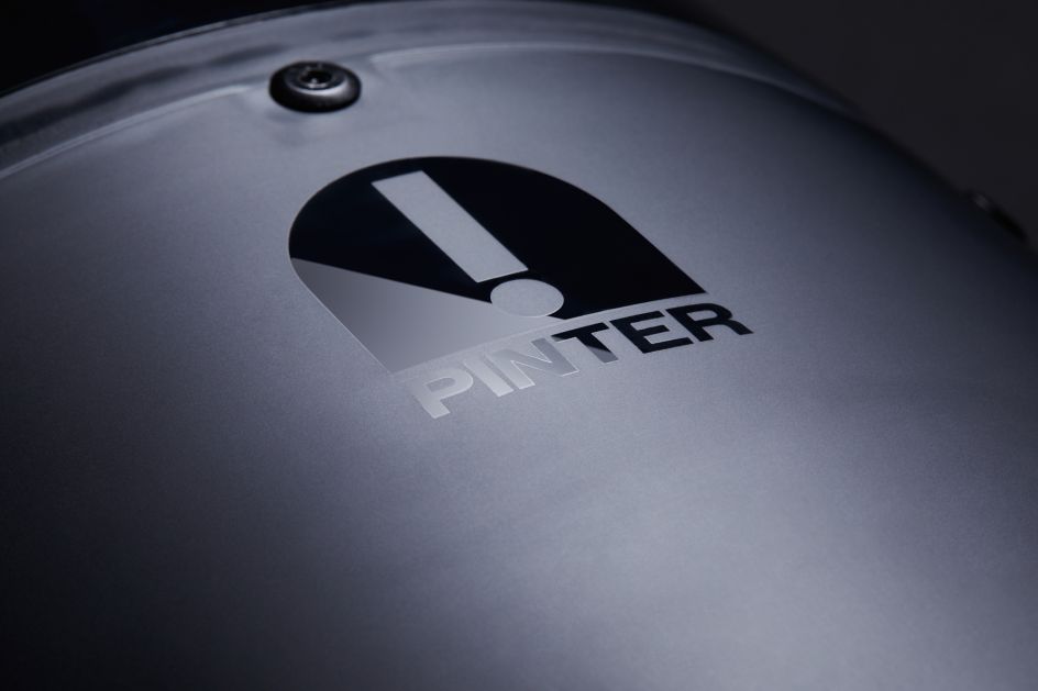
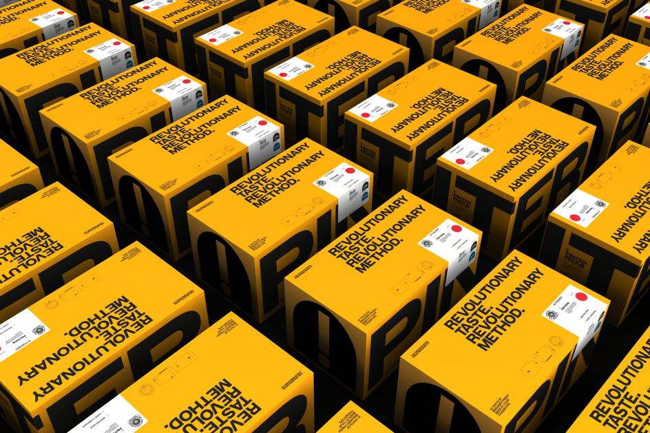
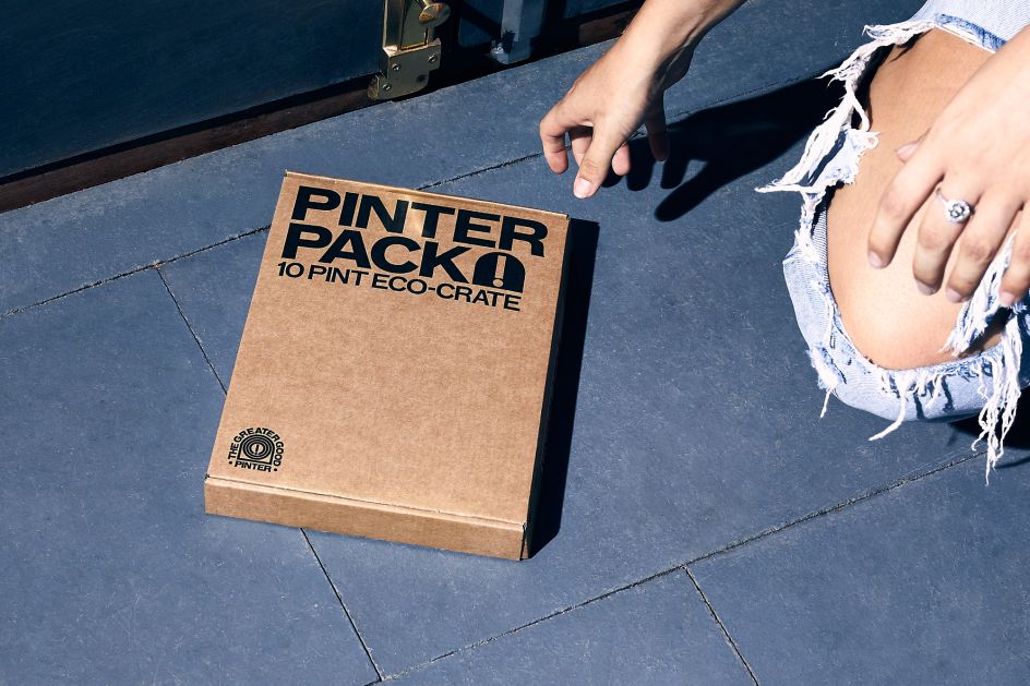
With a fresh logo, typography, colour palette and more, Studio Blackburn also created a typographic emblem and wordmark, based around an exclamation mark (more on this later). Packaging-wise, it looked at everything from the small bottles of yeast to the Pinter unit itself. (Once a customer has their Pinter, they simply order more refill packs of ingredients, which arrive in a custom-designed "letterbox-friendly" box.)
Back to the exclamation mark, which proved a winner with the packaging design. As Mark Jones, a senior designer at Studio Blackburn, explains: "We utilised the face of the product for its logo. When we realised the handle could be distilled down to an exclamation mark it was all systems go."
"The Pinter is truly a world-first," says Head of Studio, Paul Blackburn. "Never before could you brew fresh beer at home from around four days and enjoy a genuinely great tasting draught pint. Our design challenge was to effectively define an entirely new category in the world of brewing – conveying the freshness of the end product and innovative technology that delivers it. This was coupled with the very practical requirements of bespoke packaging – including a 700ml bottle of Fresh Press that fits through your letterbox."


 by Tüpokompanii](https://www.creativeboom.com/upload/articles/58/58684538770fb5b428dc1882f7a732f153500153_732.jpg)


 using <a href="https://www.ohnotype.co/fonts/obviously" target="_blank">Obviously</a> by Oh No Type Co., Art Director, Brand & Creative—Spotify](https://www.creativeboom.com/upload/articles/6e/6ed31eddc26fa563f213fc76d6993dab9231ffe4_732.jpg)


