Team's rebrand of The Bronx Museum has a surprising hero element
New York City's The Bronx Museum has a bold new visual identity and brand strategy by Brooklyn-based design studio, Team, centred around an unlikely hero element: the 'the'.
Credit: Team/The Bronx Museum
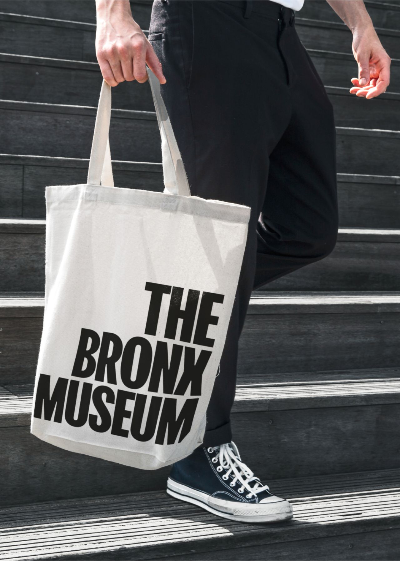
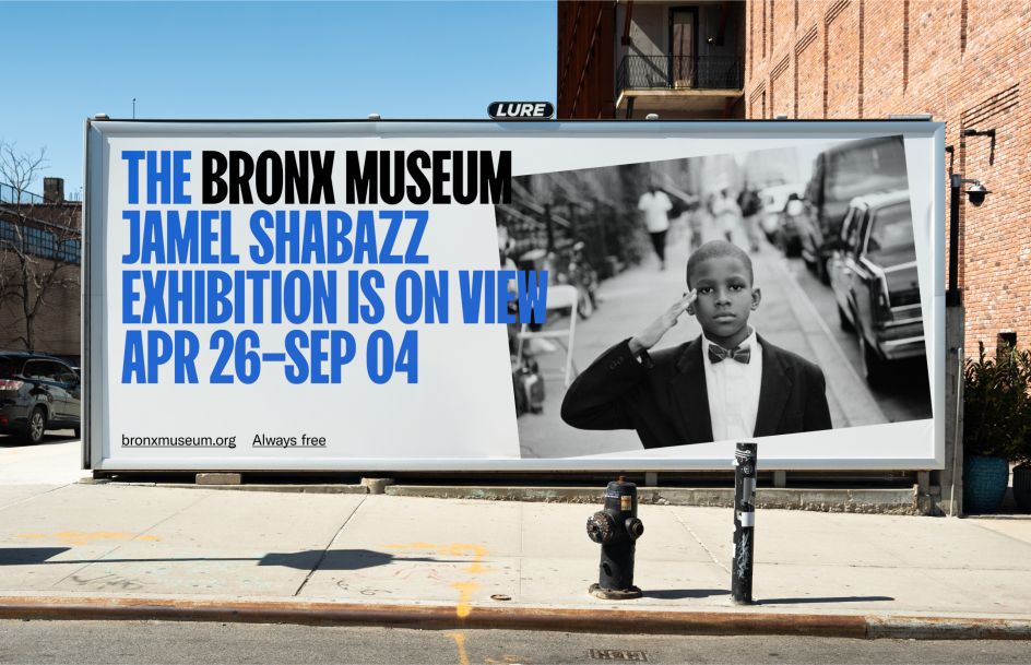
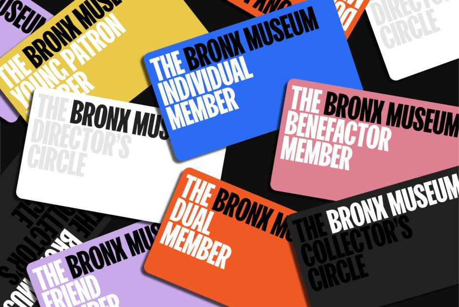
The Bronx is the only borough with 'The' in its name, an ownable differentiator that reflects the essence of its community – bold, unapologetic, and proud. The new identity embraces this article as a confident declaration of the institution's acclaimed history and vision. While the brand's typographic framework embeds the museum's name – 'the' included – directly into its exhibitions, programs, and experiences.
The launch of the museum's new identity and website coincides with its 50th anniversary and with the reveal of new schematic plans for The Bronx Museum's $26 million renovation, designed to increase accessibility by the award-winning architecture firm, Marvel.
Team brought The Bronx Museum's mission to the fore with a new brand identity – including a new logo, visual identity, tonality, messaging, and website – focused on the community it serves, capturing the culture, spirit, and tenacity of The Bronx.
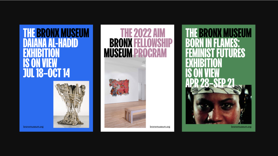
Credit: Team/The Bronx Museum
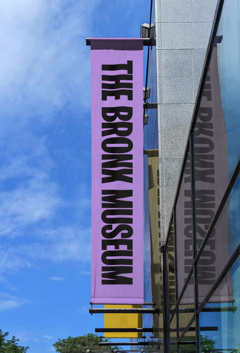
Credit: Team/The Bronx Museum
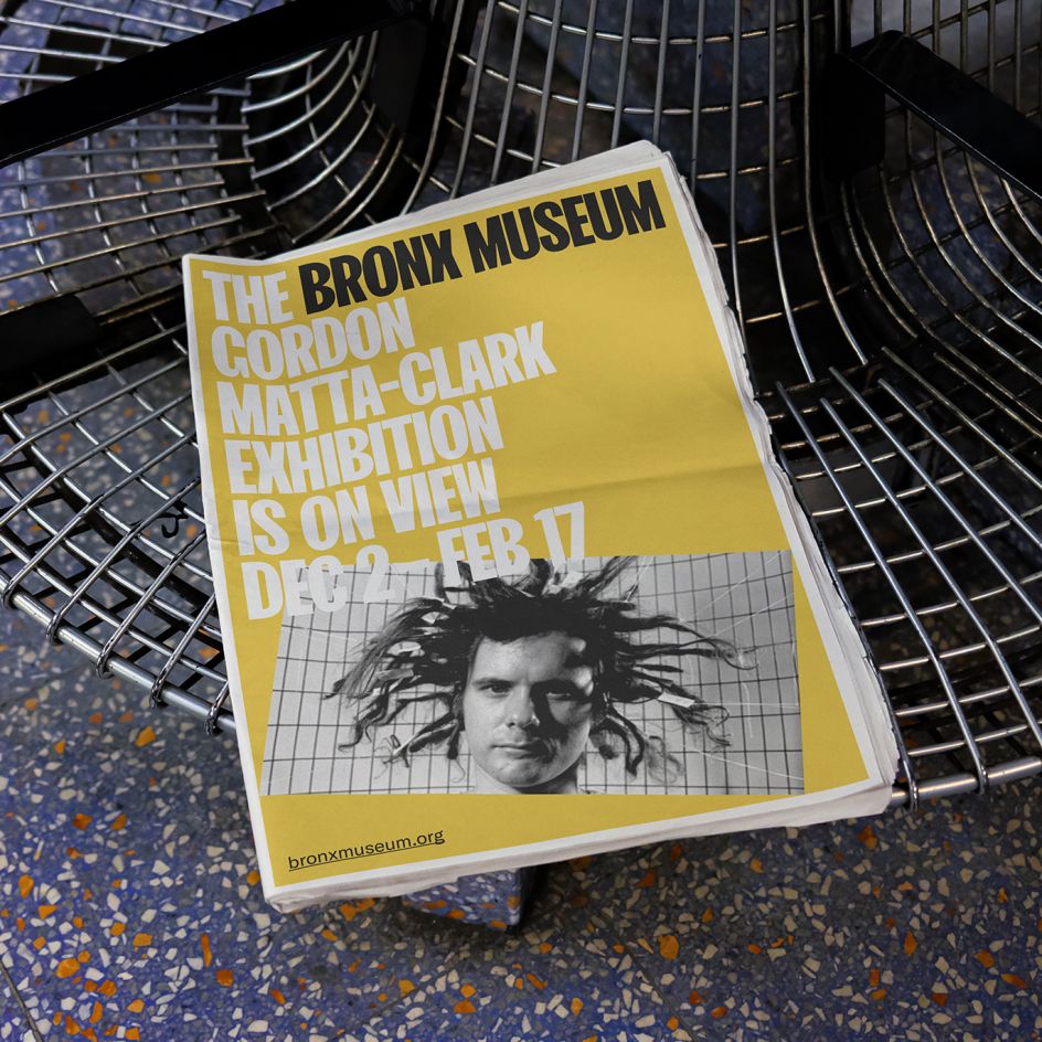
Credit: Team/The Bronx Museum
Combined, the new identity, website, and renovation will work together to further The Bronx Museum's mission to champion artists who are not typically represented within museums and amplify the museum's ability to educate, engage and provide a critical gathering space for the communities it serves.
"The Bronx Museum is the only contemporary art museum in New York City that offers free admission," Team co-founder Amy Globus told Creative Boom. "But to be a real contender on the NYC museum scene, The Bronx Museum needed a strategy and identity that elevated the incredible programming and unique experience it offers."
Team, who has worked with cultural and corporate clients ranging from Louisville's Speed Museum to Pfizer, was brought on to design the rebrand following a past successful partnership with The Bronx Museum in 2019. Then, the studio designed and co-hosted the inaugural Bronx Museum of the Arts Ball, positioning the museum as "the crossroad where artists, local residents, and national and international visitors meet."
Team's Globus is also an artist in her own right, so Team's relationship with The Bronx Museum is particularly special. "I'm very passionate about making art accessible, and The Bronx Museum is doing incredible work in that area. We've given them the visual and strategic tools they need to highlight the quality of their amazing programming and show the museum off as the destination it is."
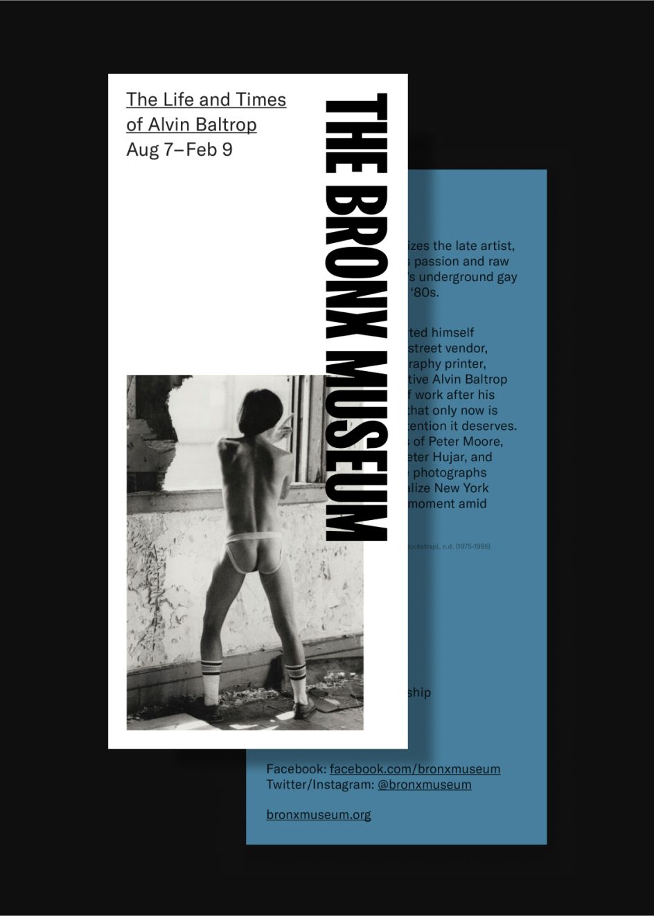
Credit: Team/The Bronx Museum
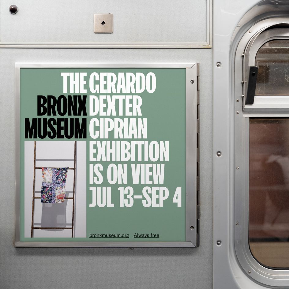
Credit: Team/The Bronx Museum
Not only was it essential for the new brand to communicate the museum's role in the community as a free cultural resource to the public and its dedication to showcasing under-represented artists, but it was also essential for the brand to help position The Bronx Museum as a worthwhile destination for New Yorkers at large.
To do this, Team drew out one stunningly simple ownable aspect that helps The Bronx Museum stand out to locals and New Yorkers from other boroughs. "The concept hinges around the fact that The Bronx is the only borough that uses the word 'the'," Team co-founder John Clark told Creative Boom. The 'the' flexes across many applications, making a ubiquitous article ownable, engaging, and bold. Like the 'the' itself, The Bronx Museum is ready and deserving to stand out from the crowd – and the new identity by Team captures that perfectly.
The new brand's bold sans serif type also pays homage to the borough's place in culture, from the origins of hip hop's visual language in The Bronx to the signage of its historic community centres. The visual identity further complements this approach by embracing colour – in all its breadth, fortitude, and joy.
Credit: Team/The Bronx Museum
Credit: Team/The Bronx Museum
It's a fresh, bold, contemporary brand for a contemporary art museum - and a stark improvement to what came before. But The Bronx Museum's new brand is also much more than a fresh coat of paint – it's a functional overhaul. With a new toolkit at its disposal, the museum will, for the first time, indeed be able to make the most of everything it has to offer and communicate its programming with the same boldness that its new look has in droves.
And just as the new renovations will provide broader public access to the museum, so too will The Bronx Museum's new website, also designed by Team. The new platform will offer a bilingual user experience with Spanish translations. It will also prominently display The Bronx Museum's rich archival material for wider public access.
It's a design that puts its money where its mouth is - claiming the space and attention the museum has always deserved and elevating it to claim even more space and attention in the future as its reputation and physical site grow.


 by Tüpokompanii](https://www.creativeboom.com/upload/articles/58/58684538770fb5b428dc1882f7a732f153500153_732.jpg)


 using <a href="https://www.ohnotype.co/fonts/obviously" target="_blank">Obviously</a> by Oh No Type Co., Art Director, Brand & Creative—Spotify](https://www.creativeboom.com/upload/articles/6e/6ed31eddc26fa563f213fc76d6993dab9231ffe4_732.jpg)


