Elmwood future-proofs The AA with bold rebrand that meets drivers' evolving needs
Global brand and design consultancy Elmwood has worked with drivers' services company The AA to create a bold, forward-facing identity which keeps up with the ever-changing demands of motorists and highlights the company's diverse range of offerings.

A trusted friend of drivers across the UK since 1905, The AA is a familiar and reassuring presence when breakdowns occur, and you need roadside assistance. Currently, The AA helps out some 14 million members and counting, but with the needs and nature of motorists radically changing, it was felt that its brand had to move with the times.
Recent innovations in the world of driving include new tech models and a huge spike in electric vehicle ownership. It's a radical change for a sector that has largely remained the same for decades. The AA was keen to reaffirm its position as the leading motoring authority for both existing customers and a new generation of drivers.

Outside of securing a sense of brand awareness, The AA was also keen to increase awareness of its overall services. As well as offering breakdown assistance, The AA also provides insurance packages, driving schools, accident assistance, and service and repair facilities. Home insurance, travel insurance and personal loans are also covered by The AA, which Elmwood's new identity emphasises.
At the heart of the rebrand is the idea of 'Always Moving'. It was felt that this phrase captured The AA's "inherent spirit of life in movement" and served as a guiding star when modernising the company overall. "As driver's worlds evolve, The AA needs to evolve", says Will Harrison, Group Brand Director at The AA.
"As part of our 'Always Ahead' brand re-positioning and 'It's OK, I'm with The AA' marketing campaign, we have worked with the talented team at Elmwood to evolve The AA's brand identity – visual, sonic and tone of voice – to reflect the modern and relevant brand for drivers that we are, giving them unshakeable confidence now and for the future with products and services for whatever driving stage or situation they are in."
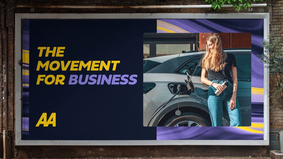
Fortunately for The AA, the brand had a strong foundation to build on. Its yellow and black identity is already recognised positively by motorists, meaning Elmwood needed to refine these assets to appeal to a broader audience instead of working from the ground up.
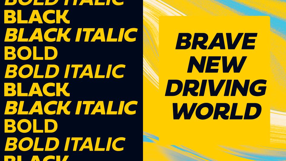
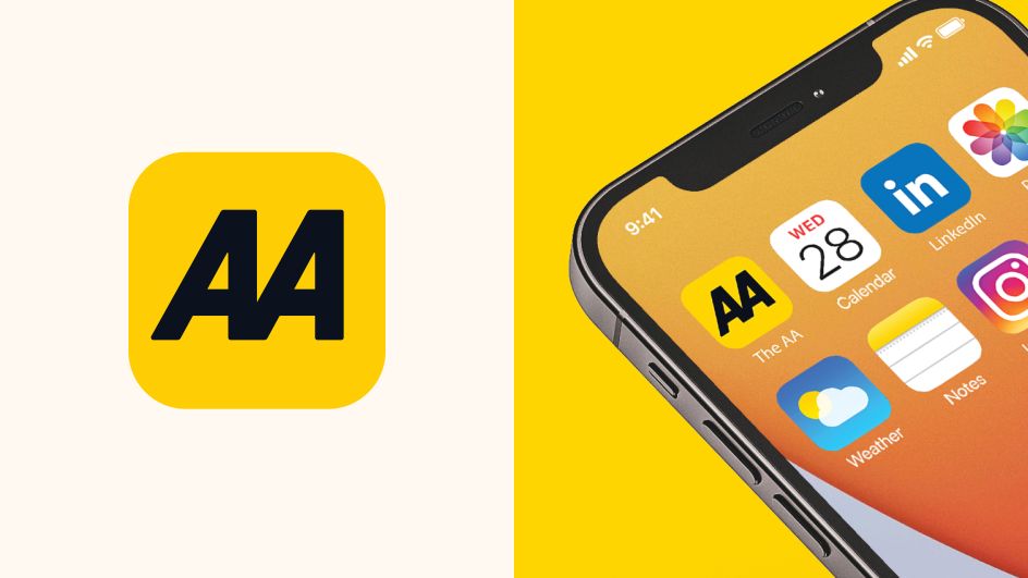
The AA brand logo is a neat shorthand of the rebrand and what needed to be achieved. Thanks to its striking yet clear design, it was already trusted by UK audiences. Rather than reinventing it, the existing elements were refined and made bolder. This was accomplished by rounding off and softening the edges in order to create that desired sense of motion, as well as making it appear more friendly and giving it a "digital-ready" feel. These elements were also incorporated into AA Sans and an updated typeface based on the logo.
It's not just the shape of the lettering which has been gifted a subtle revision. The black of the wordmark has become a deeper and richer colour, while the yellow has been given a vibrancy bump, making The AA brand look more brave.
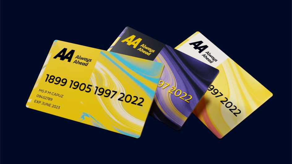
Meanwhile, the secondary colour palette runs with the theme of momentum by incorporating elements that reflect different times of the day. From crisp, bright sunrises to deeper evening hues, these colours communicate the idea that The AA offers 24-hour support and further tell the story of the brand's progression.
With multiple arms of The AA business to cater to, both driving and non-driving, Elmwood created three separate "identity pillars" for them to work with. Each comes equipped with its own set of different colour patterns, images and illustration principles, meaning that they can appear distinctive while remaining cohesive to the overall AA brand.
Topping off the rebrand is a concept for the refreshed AA uniforms. Staying true to the established design principles of the new identity, these uniforms have been imagined with trust, functionality, and a need to meet ever-changing demands in mind.
"Our partnership with The AA has been a real highlight of the year for the Elmwood team," concludes Paul Waters, senior account director at Elmwood. "The AA had big ambitions and gave us the licence and freedom to be bold in our design approach.
"The result is a more dynamic and future-facing brand that will resonate with consumers of all ages and help to open up emerging and exciting opportunities for the business. We're so proud of what we've achieved together through this partnership to date."


 by Tüpokompanii](https://www.creativeboom.com/upload/articles/58/58684538770fb5b428dc1882f7a732f153500153_732.jpg)


 using <a href="https://www.ohnotype.co/fonts/obviously" target="_blank">Obviously</a> by Oh No Type Co., Art Director, Brand & Creative—Spotify](https://www.creativeboom.com/upload/articles/6e/6ed31eddc26fa563f213fc76d6993dab9231ffe4_732.jpg)


](https://www.creativeboom.com/upload/articles/a1/a1be57bc5ec32ca3cd9b95b8b6e12d299d66f35c_732.jpg)
