The designer behind Supersonic Festival reveals his manic 72-hour deadlines and how he found inspiration in a 'shoebox full of crap'
I reckon graphic designer and illustrator David Hand might be sneaking in a few extra hours each day compared to the rest of us.
As well as graphic design and illustration, he’s also in a few different bands, he’s a dad, and he’s also been running a pub for the last year.
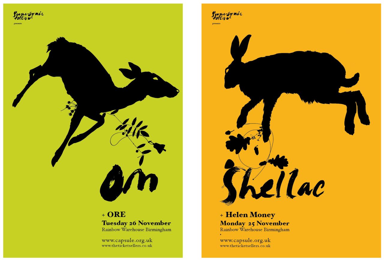
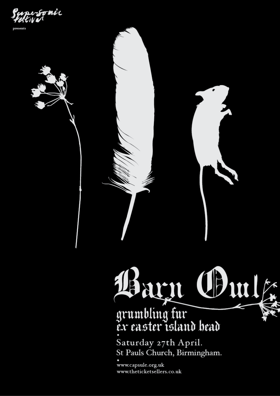
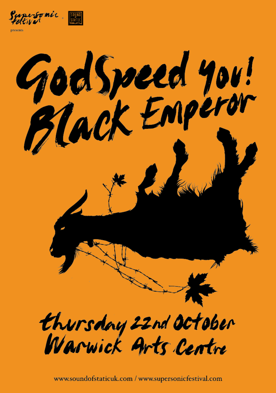
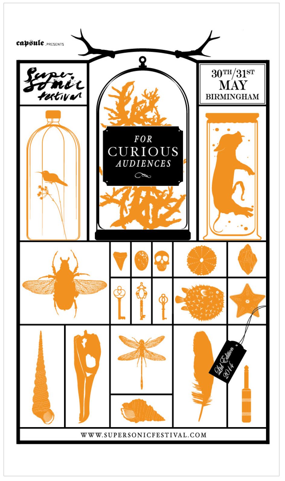
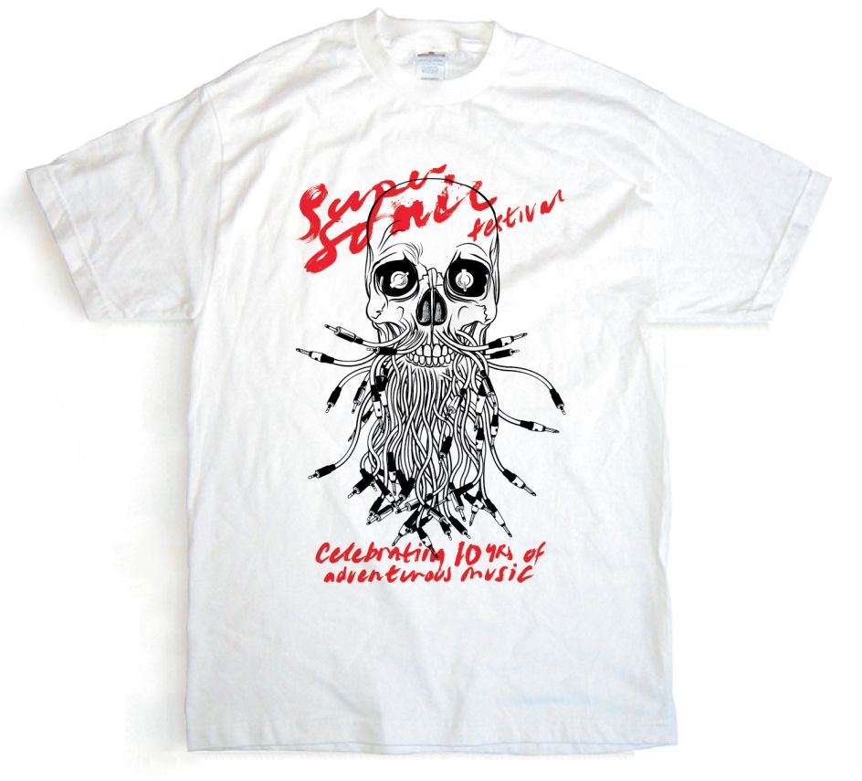
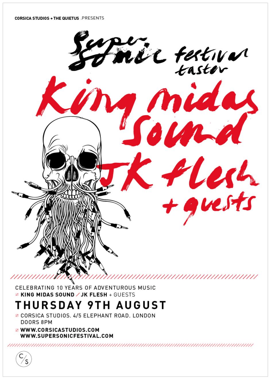
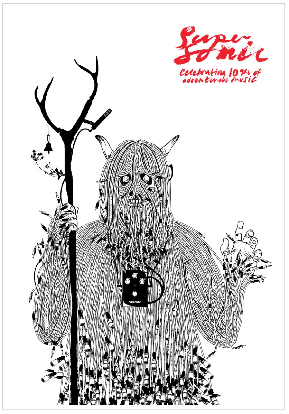
Today though we’re focusing on his rather lovely work for Supersonic Festival, a brilliant little event in Birmingham this weekend (16 - 18 June) which celebrates some of the best adventurous music and sound happening today. Such a commission was pretty much a dream come true for Hand when he began working with the festival in 2012 for its tenth-anniversary branding.
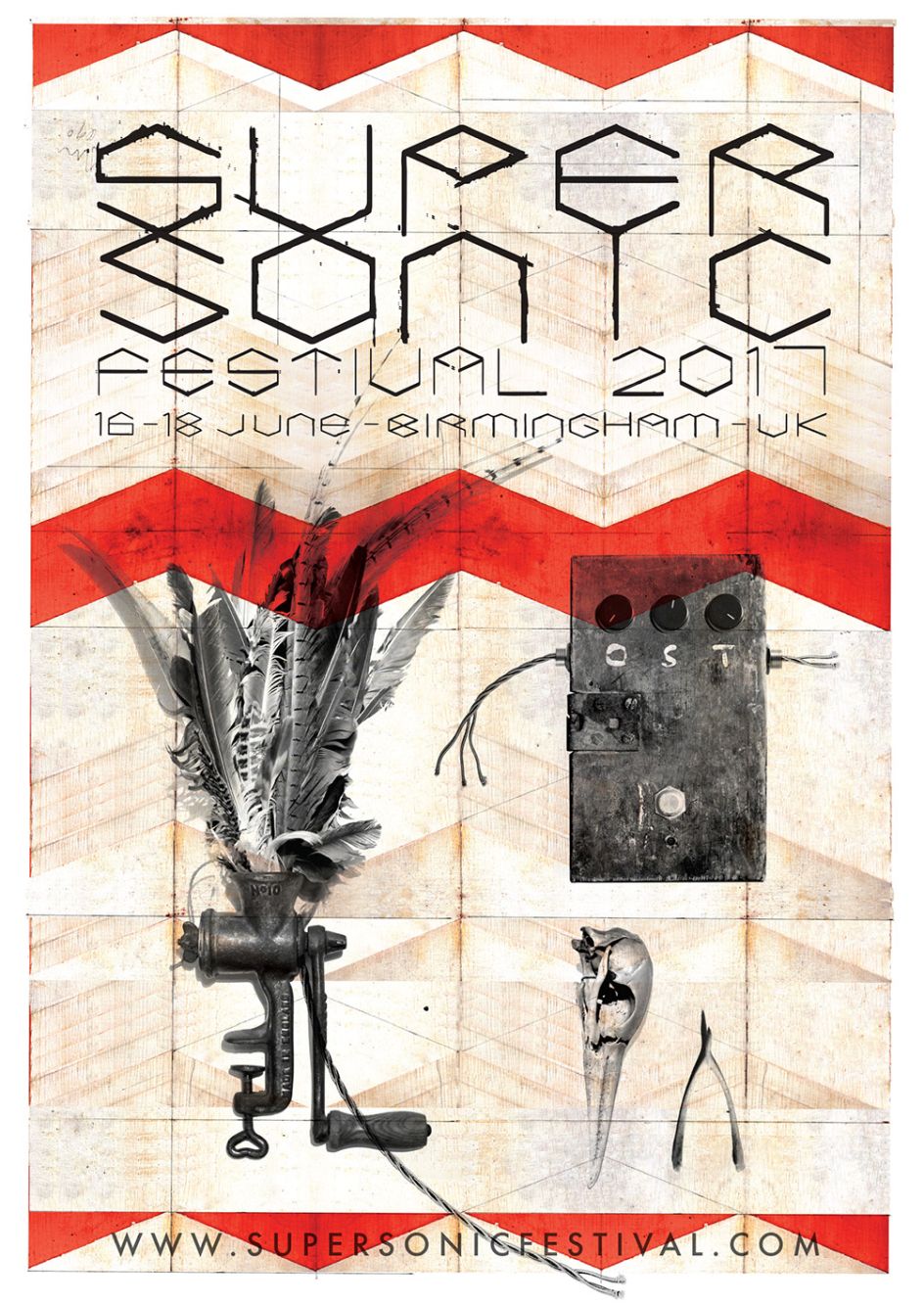
Since then, he’s created designs for the festival each year, with every event using a slightly different look and feel as well as a bespoke suite of images and typography. The one thing that has been consistent, he says, is the inevitable scramble to meet a deadline. “Every year we say ‘next year we’ll work on it a month before the festival’ but what I love about Supersonic is that even though it’s quite big now there’s still such a DIY ethic,” says Hand, “so this year was again a Thursday evening panic, Friday morning it’s like ‘ok we’ve got this’ then you go until Monday morning.” For the 2017 edition, Hand created a hand-drawn (no pun intended) typographic system and used a zigzag background rendered in a wood-like texture. “I kind of wanted something more hands-on and textural,” he says. “I had the idea of a sign painting project I’d been working on over the last year and tried to amalgamate that. It ended up with a textural painted background, kind of like industrial signage in a weird hand painted way.” His own type sits alongside a version of Futura that’s been spaced to create a disquieting and unusual spin on the system font.
The images used on posters are from Hand’s own photographs of strange objects and folkloric artefacts. One is a meat grinder, oddly juxtaposed with pretty feathers, that the designer had clamped to the side of his computer, despite the fact he’s a vegetarian. “It’s been overflowing as my daughter kept putting feathers into it,” Hand explains. “I photographed that one night and thought, ‘that’s what it’s meant to do!’”
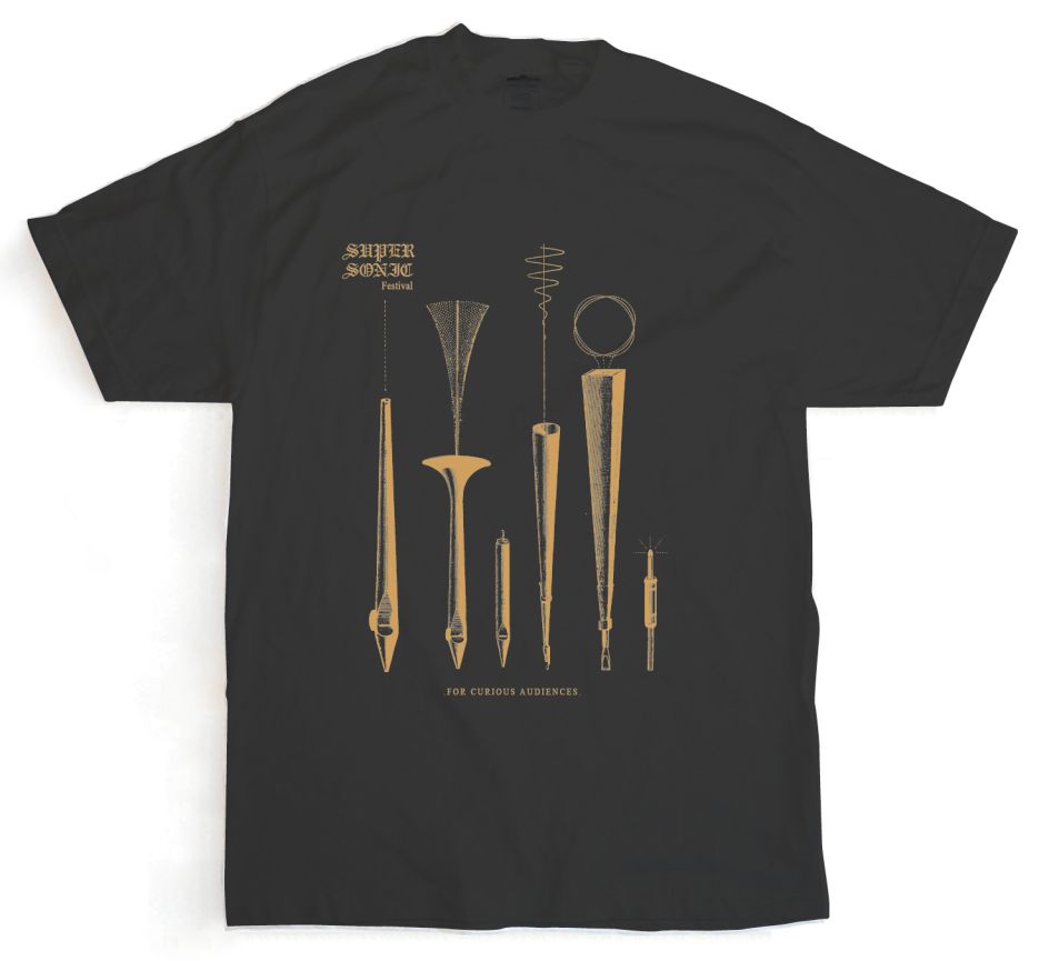
Hand’s designs are used across all the usual festival accoutrements, from guides to signs, line-up posters, and merch. For 2017, there’s a special addition to the merch stand in the form of little metal badges in the shape of a wishbone. “When my granddad died I found it in a little shoebox of crap,” Hand explains. “I kept it for ages, and now that’s one of the main images on one of the designs. I did a pewter cast and made them into little badges that are totally unbranded.”


 by Tüpokompanii](https://www.creativeboom.com/upload/articles/58/58684538770fb5b428dc1882f7a732f153500153_732.jpg)

 using <a href="https://www.ohnotype.co/fonts/obviously" target="_blank">Obviously</a> by Oh No Type Co., Art Director, Brand & Creative—Spotify](https://www.creativeboom.com/upload/articles/6e/6ed31eddc26fa563f213fc76d6993dab9231ffe4_732.jpg)


