The iconic Rockefeller Center building in New York just got new branding
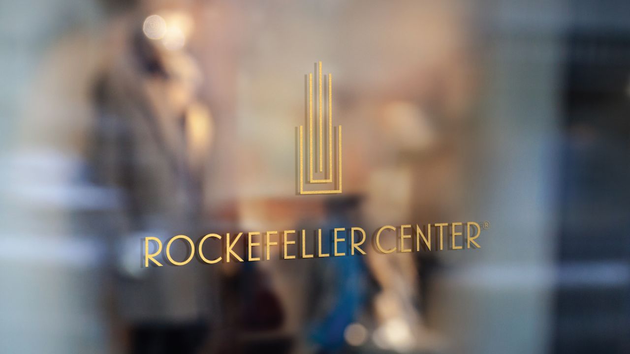
Marketing agency Known has created the new branding for an iconic NYC landmark, the Rockefeller Center. The distinctive tower was built around a century ago during the Great Depression and, according to Known, was designed to be the "ultimate urban campus".
As well as the new visual identity, the Center is undergoing large-scale transformations in terms of usage: Known says that Tishman Speyer, owner of Rock Center, is "innovating for the future while remaining the Center's deeply rooted legacy of culture, community, commerce, and green spaces."
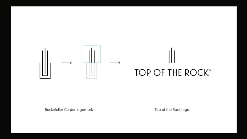
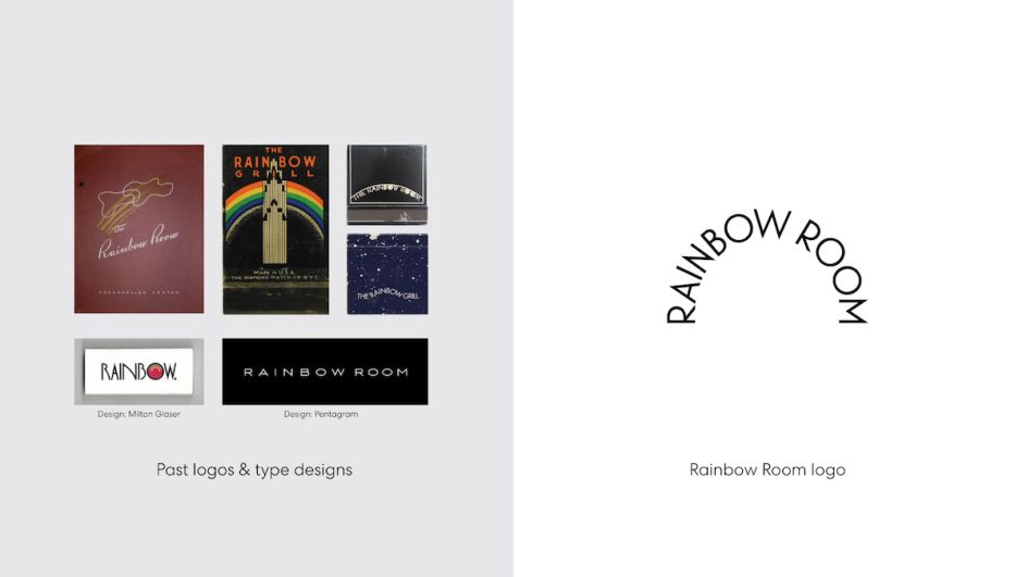
The redesigned logo and other branding elements were directly inspired by the campus' Art Deco style architectural forms to honour the site's history. A new typographic system, graphic elements and colour palettes were introduced to "transport the visual language of Rockefeller Center" into the future.
"Rockefeller Center has always represented the power and potential of culture, community and human achievement," says Ross Martin, President at Known. "Today, it stands tall as a global beacon of resilience, hope and innovation, open to all."
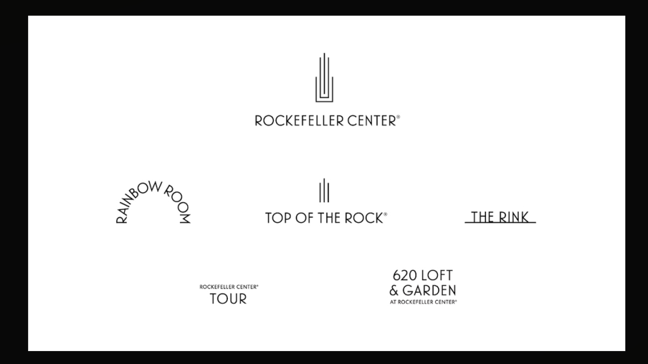
Michaella Solar March, managing director and chief marketing officer at Tishman Speyer, adds that the look is "dynamic and modern while respectful of the past, and inspired by the materials, architecture and free public artwork found throughout this one-of-a-kind campus."
The new identity designs are launching alongside the first new campaign in more than seven years for Top of the Rock – the building's 70th-floor viewing decks area. The video and the photography-based campaign aims to "capture the essence... emotion and feeling" of the Rockefeller Center experience.
Over the coming year, the Rockefeller Center's Concourse and building lobbies will be redeveloped, alongside a new skating rink, food and beverage sellers and the roof-based Radio Park, which sits on top of the Radio City Music Hall.


 by Tüpokompanii](https://www.creativeboom.com/upload/articles/58/58684538770fb5b428dc1882f7a732f153500153_732.jpg)


 using <a href="https://www.ohnotype.co/fonts/obviously" target="_blank">Obviously</a> by Oh No Type Co., Art Director, Brand & Creative—Spotify](https://www.creativeboom.com/upload/articles/6e/6ed31eddc26fa563f213fc76d6993dab9231ffe4_732.jpg)


