The Museum of Broken Relationships: Branding project for LA's weirdest new museum
The Museum of Broken Relationships is an entity that first came to life as a temporary exhibition that travelled around the globe. It wasn't until 2010 that The Museum of Broken Relationships got its bricks and mortar version in Zagreb, Croatia. 2016 marked the inauguration of its Los Angeles branch, located right in the pulse of the city of dreams and broken hearts, a popular and strategic location that communicates the universality of the museum’s theme.
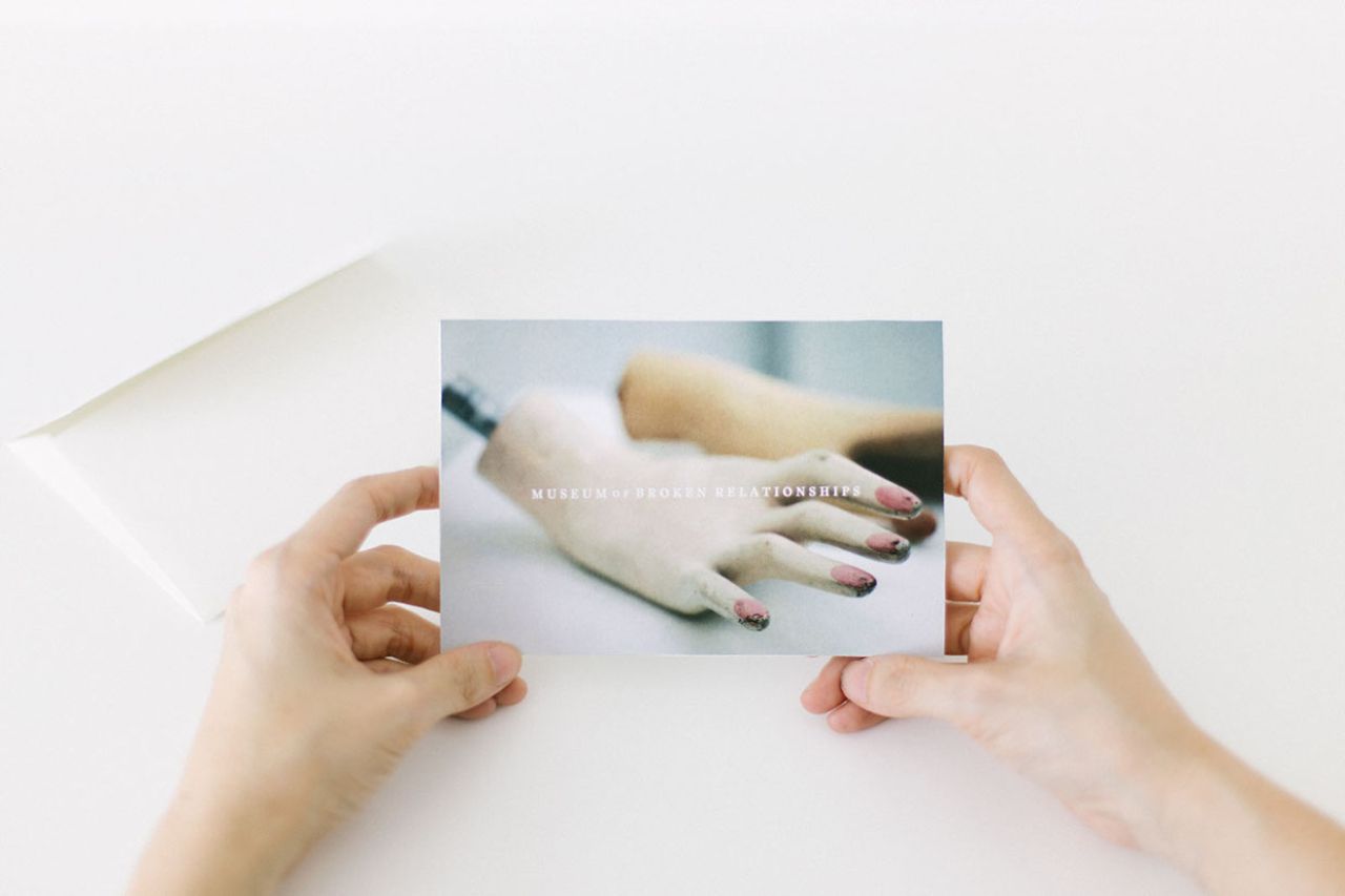
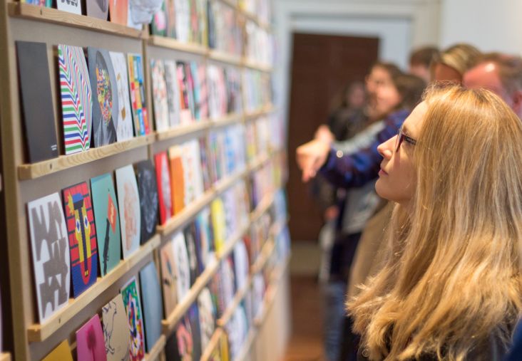
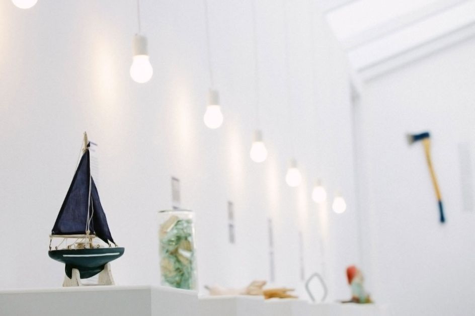
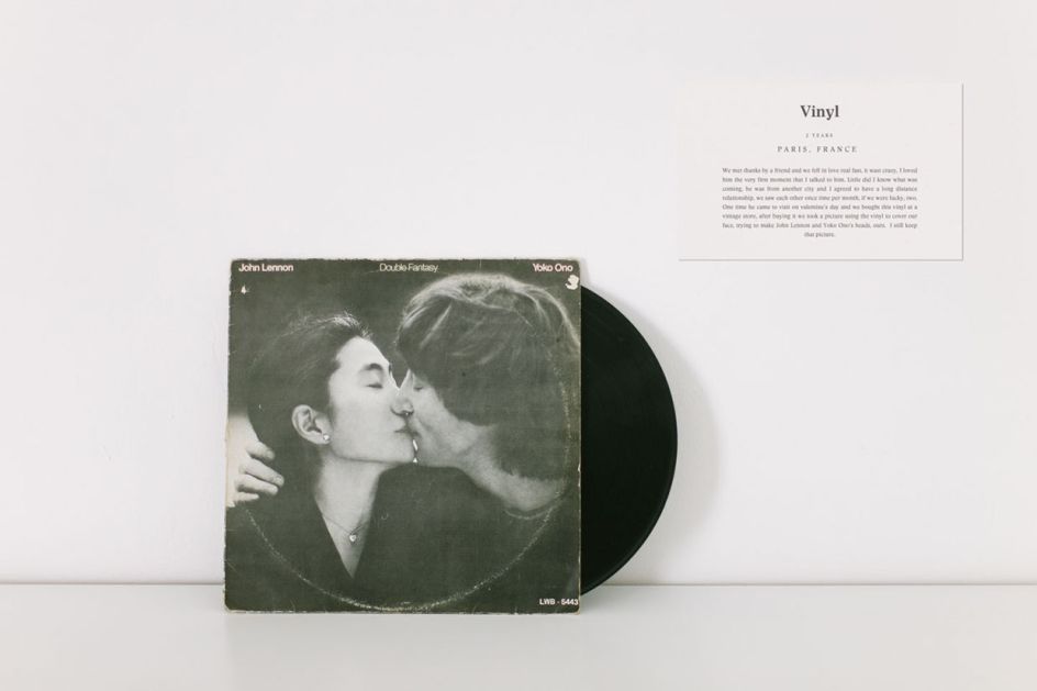
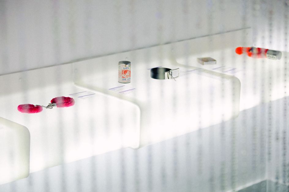
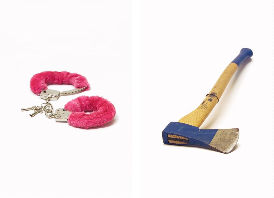
The museum showcases a collection of items, each one telling a very personal relationship story, allowing the owner to express his or herself, and get some much-needed closure, while provoking feelings of empathy and nostalgia on those viewing his or her piece.
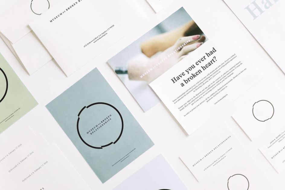
New York-based design firm Savvy Studio was chosen to rebrand the museum to fit the lifestyle and culture of a North American audience without sacrificing the raw emotional essence of the original identity.
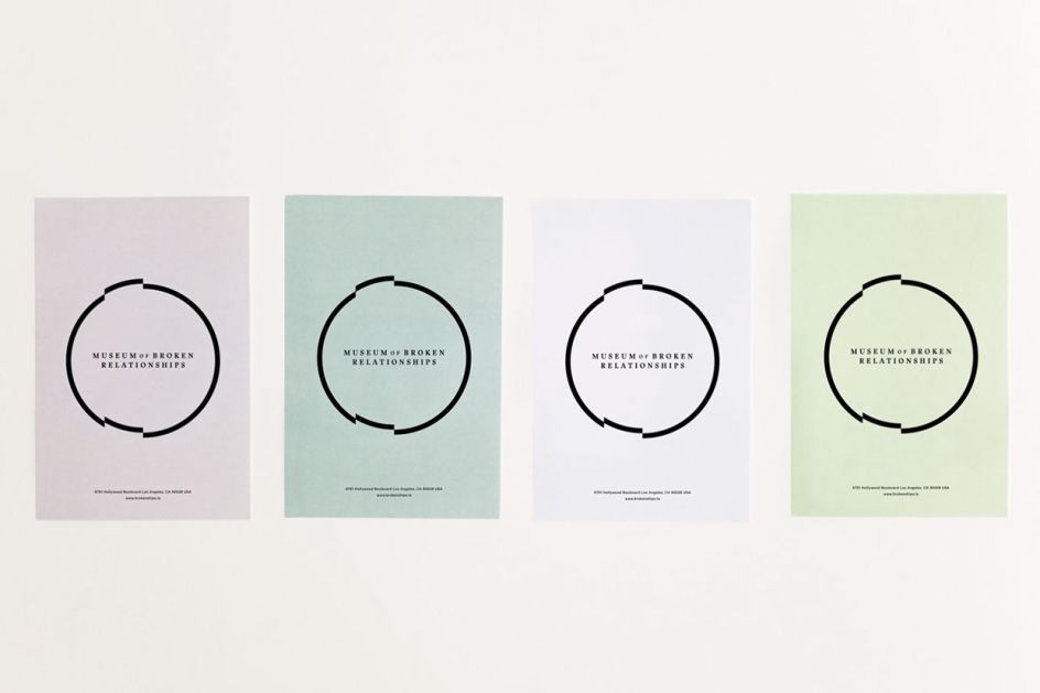
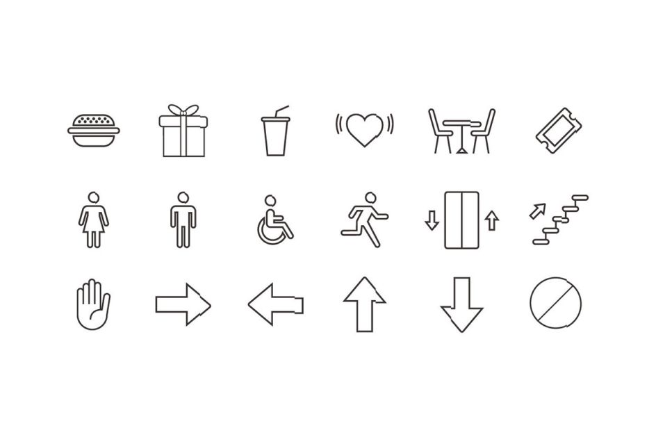
Savvy explained: "The branding's structure is based on three brand values: familiarity, basic emotions, and high aesthetic value. These values were defined based on the universality of the subject, the museum's location and cultural context, as well as our own philosophy as a design studio.
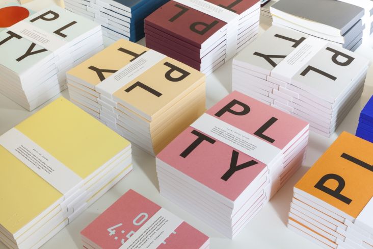
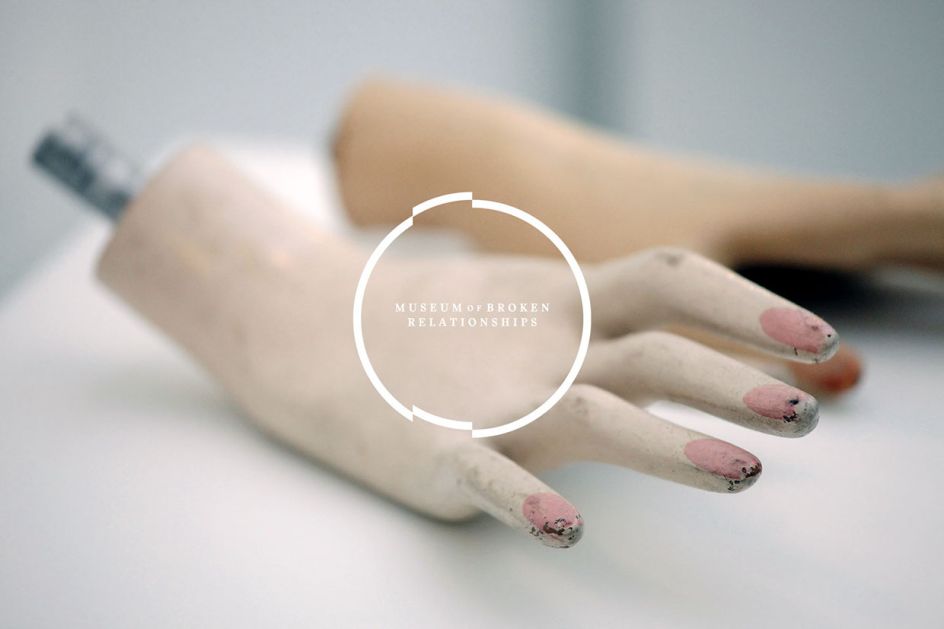
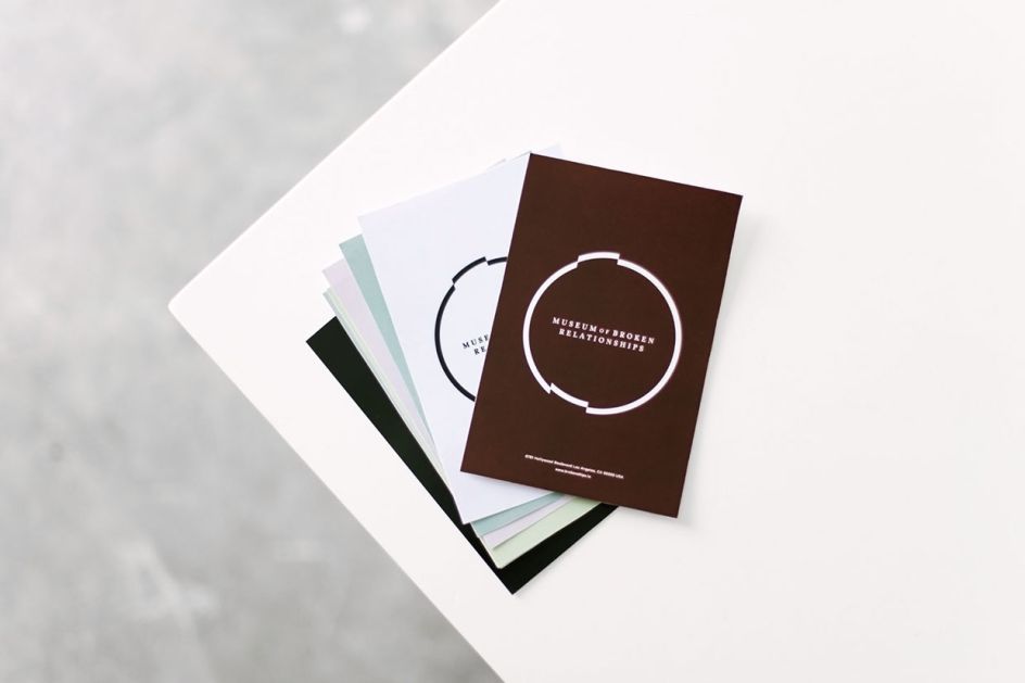
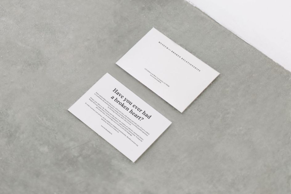
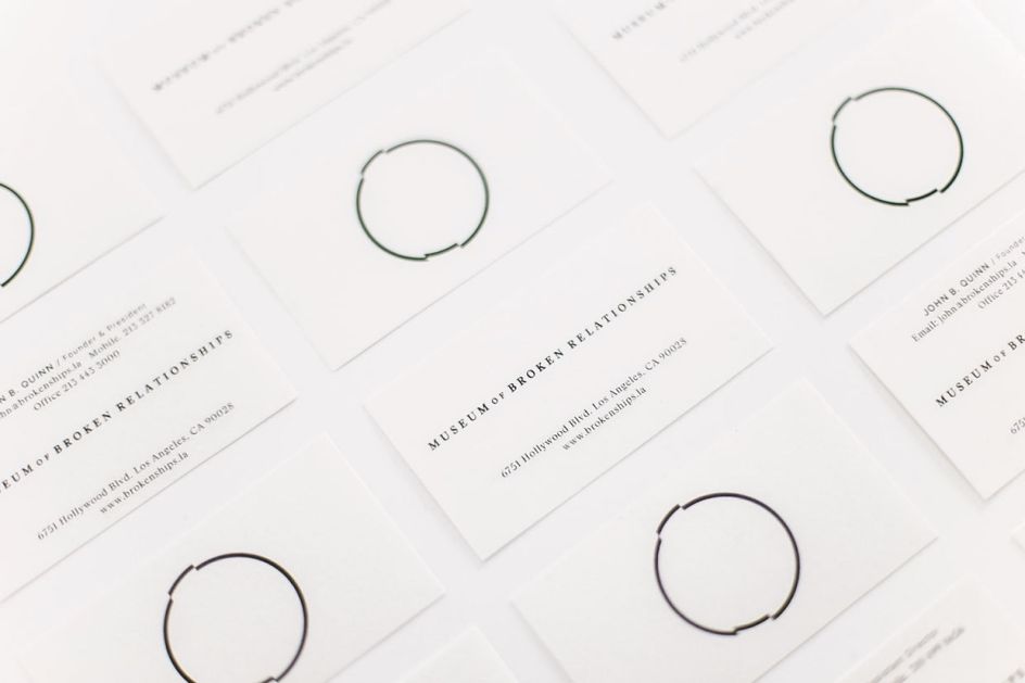
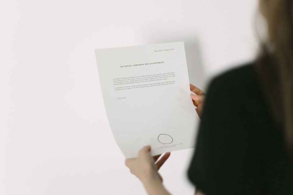
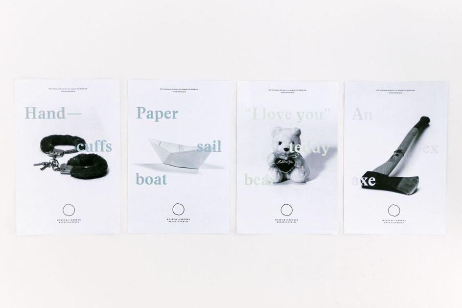
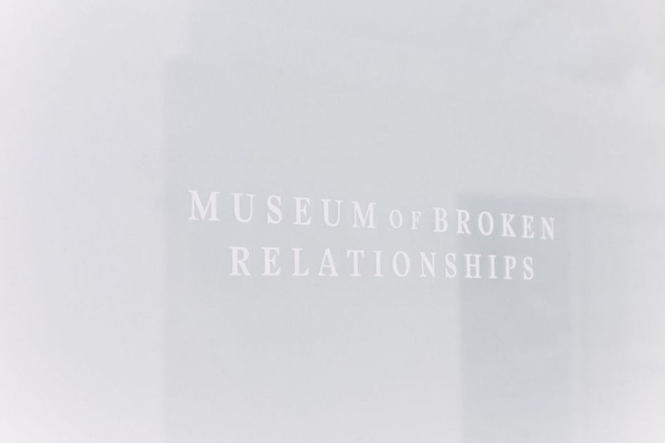
"The logotype expresses simply and abstractly the feeling of being broken and out of place. It’s the break of a cycle, of continuity and harmony. The printed material, together with its desaturated coloured paper, photographs and typographic selection conveys a sense of nostalgia and intimacy that roils the viewer, making them feel intrusive by delving into other's personal lives."
Via Behance | All images courtesy of Savvy Studio


 by Tüpokompanii](https://www.creativeboom.com/upload/articles/58/58684538770fb5b428dc1882f7a732f153500153_732.jpg)


 using <a href="https://www.ohnotype.co/fonts/obviously" target="_blank">Obviously</a> by Oh No Type Co., Art Director, Brand & Creative—Spotify](https://www.creativeboom.com/upload/articles/6e/6ed31eddc26fa563f213fc76d6993dab9231ffe4_732.jpg)


