Green Ideas: Tom Etherington's Penguin covers find an original beauty in the climate crisis
Tom Etherington is a designer at Penguin Press and the art director of the bi-annual inspirational magazine, The Happy Reader. For his latest project with Penguin, Tom was tasked with creating cover designs for a series of 20 classic books that cover the environmental movement and the climate crisis.
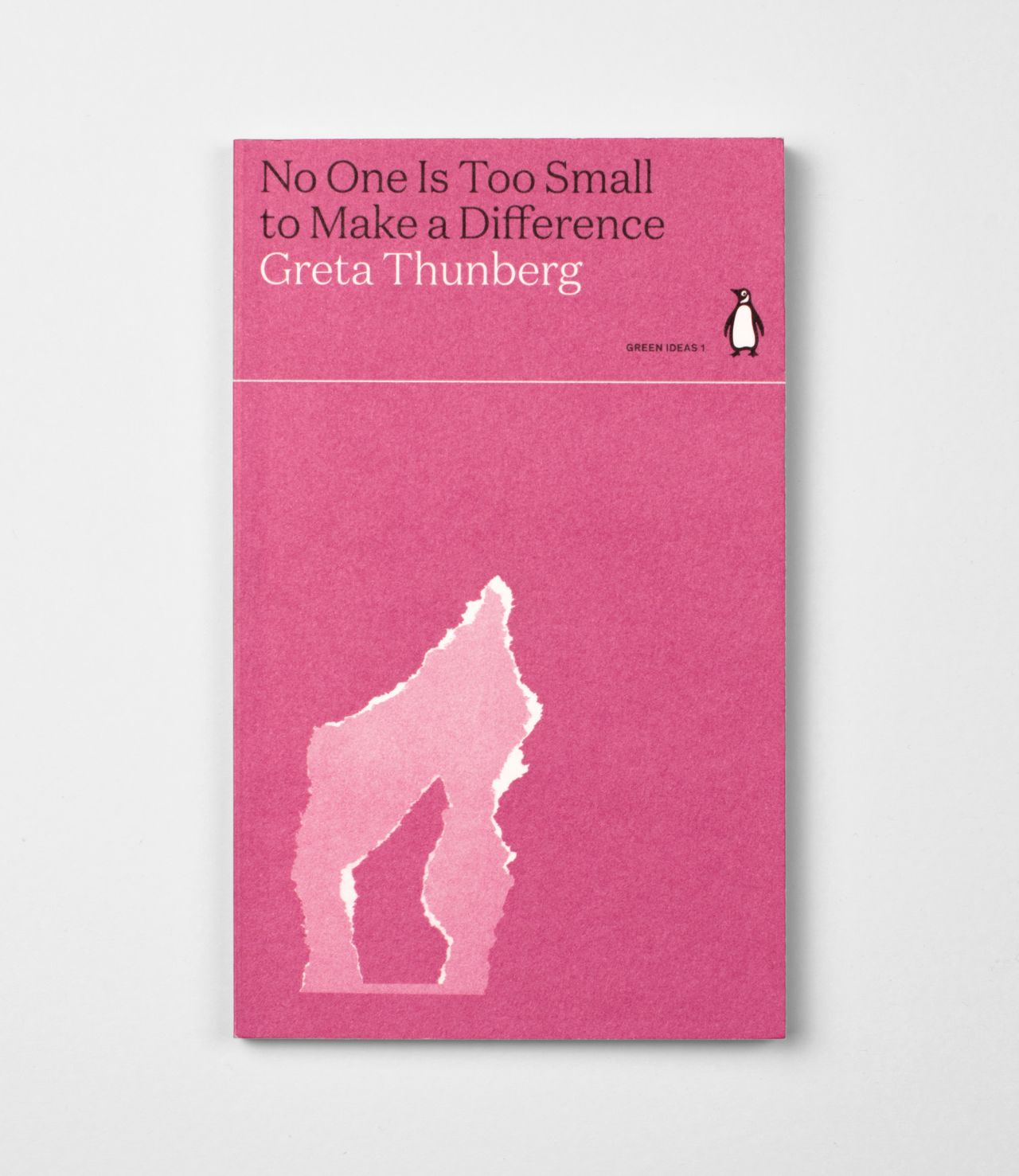
Called Green Ideas, the new series of Penguin books brings together top titles related to the environment, including No One Is Too Small To Make A Difference by Greta Thunberg. And with Glasgow's Cop26 summit just around the corner, it's a timely release about an issue that sadly isn't going anywhere. But how does any creative tackle the enormity of a topic such as climate change?
As with all books in Penguin Press, Tom explains that the Green Ideas covers began life as a discussion between himself, his art director Jim Stoddart, the heads of marketing, the editor, and the managing director of the publishing house. A brief was then whipped up, and thanks to his text-based cover for the Greta Thunberg book on its original release, the project went to Tom.
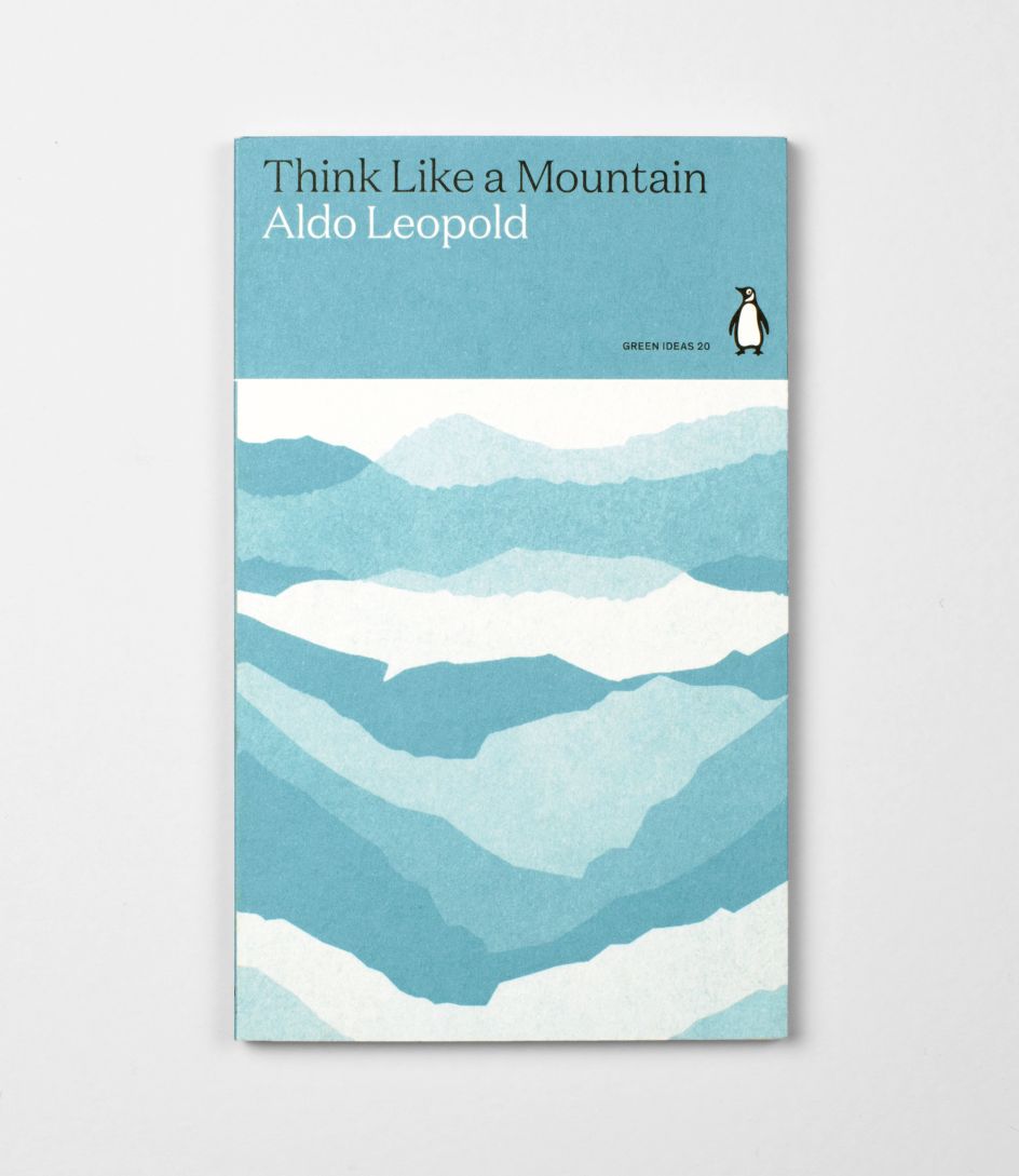
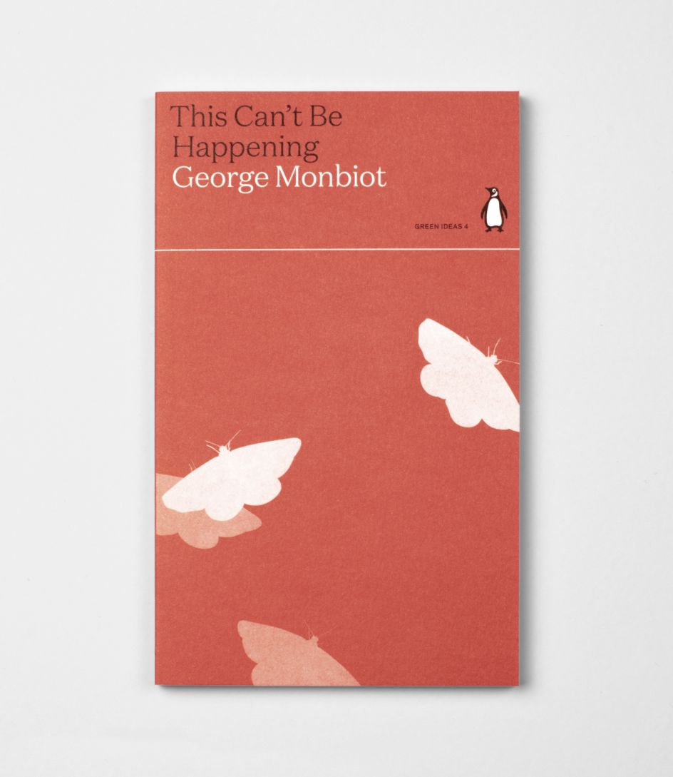
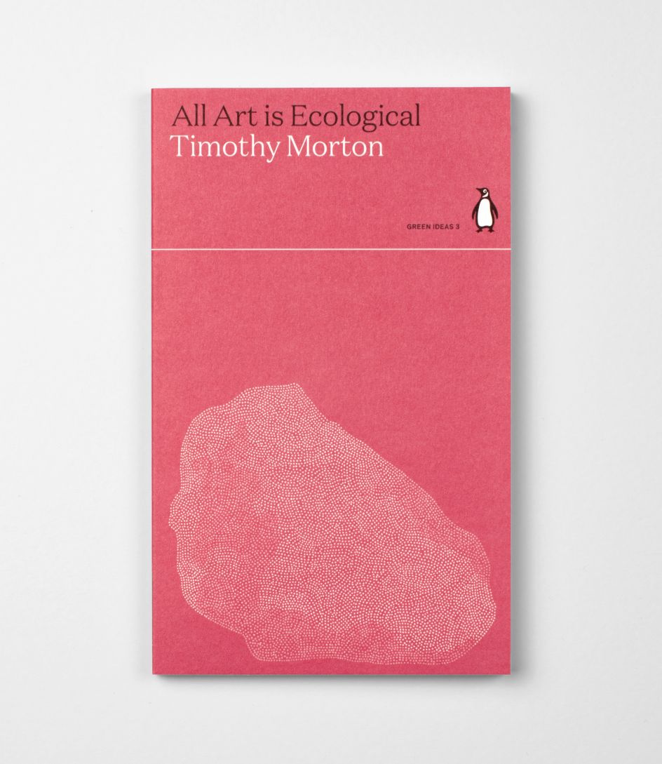
"The brief was fairly open. It changed and meandered a lot throughout the project," Tom tells Creative Boom. "The final brief was to focus on the beauty of the natural world, so I looked into shapes and patterns created by nature – from leaves to mountain ranges."
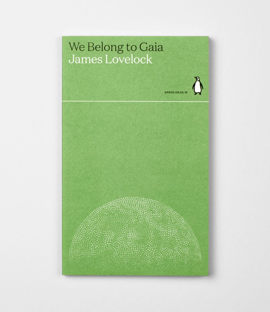
It proved to be a clever approach. The climate crisis is such a weighty issue that making it visually appealing could risk undermining the message in the books' pages or come across as disrespectful. "I think that was the reason we all struggled with the brief," Tom explains. "How do you make a cover that appeals to the casual reader while also reflecting the sometimes bleak issue that is the climate crisis? I don't think anyone wants to see any more planets on fire visual metaphors."
He adds: "Creating covers that focus on the beauty of nature is a more positive way to position this series. The people buying these books will be passionate about the natural world."
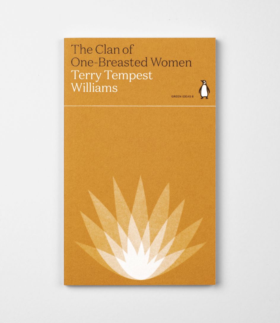
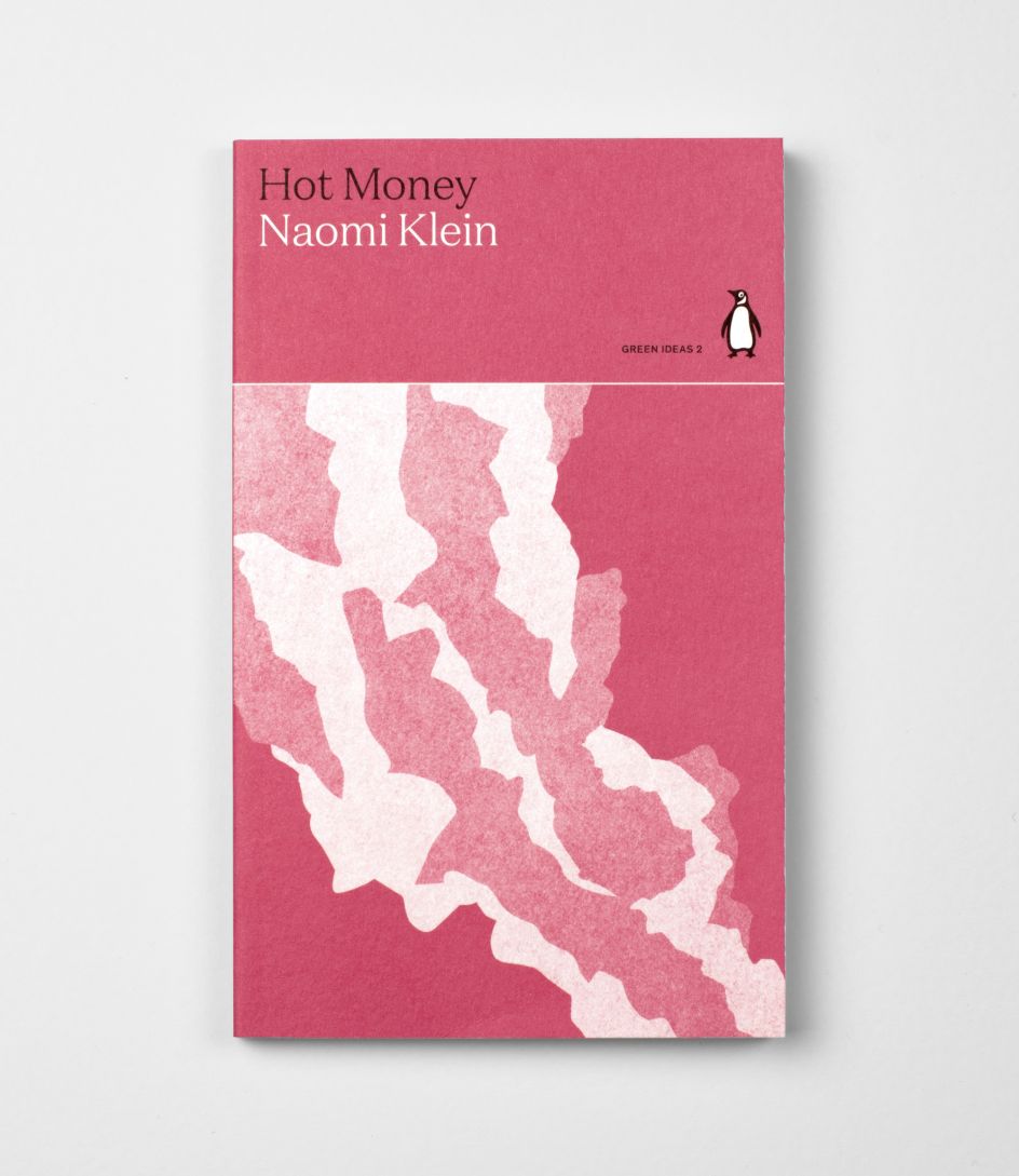
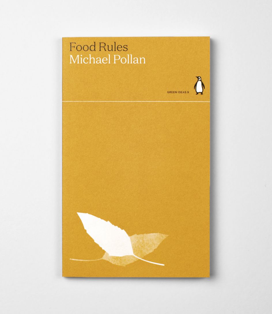
This beauty takes the form of branches, leaves, rocky crags, and silhouettes of creatures, all beautifully positioned on soft coloured backgrounds. "Some of the covers are very straightforward – a leaf, a stick – others are more graphic – lines representing acid rain, bars representing water filling a dam. I think for the more graphic ones, having an organic, warm line helps them sit better within the series."
When lined up in order, though, the spines of these books underline the overall theme of climate change as their colours move from a cool blue through to an intense, burning crimson. It's a subtle and smart design choice that lives up to Penguin's design heritage and ties into Tom's other design influences, such as Romek Marner, John McConnell and John Sewell. However, he's equally inspired by the other brilliant designers in his department.
"Jim, our art director, always talks about moving things forward," adds Tom. "I hope these covers feel distinctly Penguin while not being nostalgic or retro."
Browse the entire Green Ideas collection and buy the set here.



 by Tüpokompanii](https://www.creativeboom.com/upload/articles/58/58684538770fb5b428dc1882f7a732f153500153_732.jpg)


 using <a href="https://www.ohnotype.co/fonts/obviously" target="_blank">Obviously</a> by Oh No Type Co., Art Director, Brand & Creative—Spotify](https://www.creativeboom.com/upload/articles/6e/6ed31eddc26fa563f213fc76d6993dab9231ffe4_732.jpg)


