Trustpilot's new visual identity embraces the vast constellation of user reviews
Independent creative company Barkas has overhauled the look and feel of Trustpilot by making genuine user reviews the star of its new visual identity.
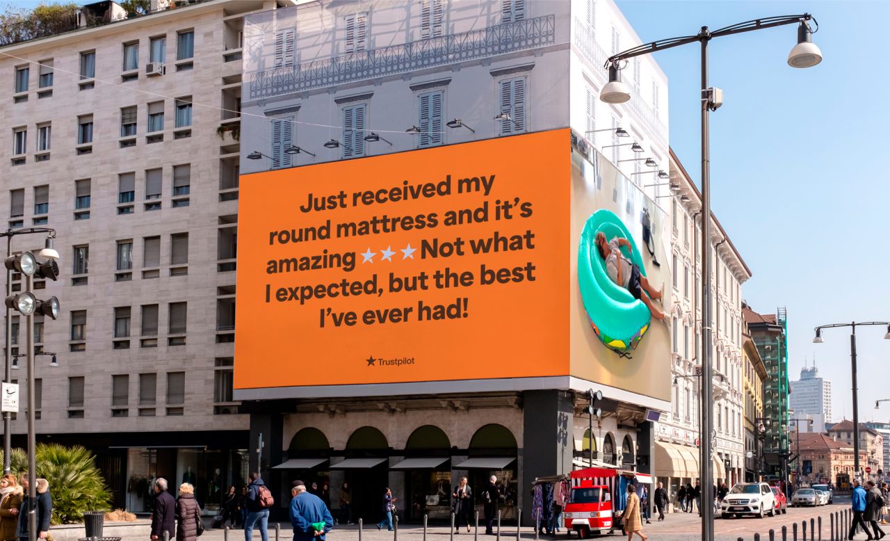
Since being founded in 2007, the Danish review website Trustpilot has become an easy and reliable way for users to share their feedback on purchases and experiences. You're likely familiar with its star rating system, which offers a quick and simple way for consumers to tell businesses just how happy – or not – they are with their services.
And while everyone always wants a five-star experience, the nuance and negatives within these reviews offer just as much valuable insight as the most glowing of appraisals. And it's this diverse spectrum of experiences that form the basis of Barkas's recently-unveiled visual overhaul of Trustpilot.
Built on the idea that trust isn't created in a vacuum, Barkas leaned into the fact that Trustpilot's relationship with its users is transactional. Not everyone leaves glowing five-star reviews for every client, and that's okay, so why should Trustpilot downplay that? By embracing some of the more bizarre and sometimes upset reviews, Trustpilot can stay neutral without being bland and corporate.
To reflect this diversity of opinion in its new branding, Trustpilot is no longer just red or green. Instead, it now reflects a broader range of in between colours that consider the mildly disgruntled to the good-but-not-amazing reviews that many genuine users leave.
This also helps Trustpilot to set itself apart from the pack. Green is an industry classic for reviewing platforms – after all, it carries such heavy positive connotations – but with oranges, reds, and yellows under its belt, Trustpilot shows it offers something unique.
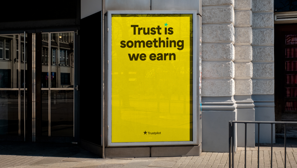
Not everything associated with the previous identity has been jettisoned, though. Helvetica Neue is still in place as the company's typographical anchor, providing both a sense of consistency and brand legacy. However, the typeface is now partnered with Trustpilot Display, which Barkas claims adds a "valuable splurge of distinctiveness." This more personable typeface will ideally suit campaigns and marketing efforts where a sense of identity trumps day-to-day review impartiality.
"In order to make all communication more relatable and personal, we wanted to bring in a human yet powerful display typeface," says Morten Rosendal, senior designer at Barkas.
"A custom weight from Blazetype was defined to create Trustpilot Display. A friendly, fun and funky yet highly readable display typeface that is trustworthy for all good and bad reviews – and all the ones in between."
And just as Trustpilot's approach to reviews is unbiased – whether companies may prefer otherwise or not – its new identity takes a similar approach to images, all of which appear honest and unedited. Featuring situations that capture "authentic human emotion and relatable experiences", these images sourced directly from employees and collaborators show friends eating pizza at the beach and a man relaxing on an inflatable ring.
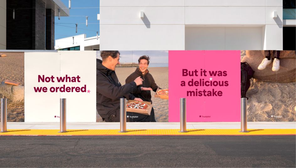
Tying all these elements together is the image of the Trustpilot star itself. Described by Barkas co-founder Mike Wittrup as "fundamental" to the brand's identity, this symbol acts as a signal of trust between users and the platform. And by putting it at the forefront of the new look, the company can take ownership of the star icon itself.
"In the spirit of championing human experiences, we personified the iconic star and allowed it to express itself outside of the logo," explains Amira Azmi, senior designer at Barkas. "The star gets to bend the rules a bit – it can rotate to a certain degree for added playfulness, and it can add so many more layers of emotion in the reviews, both in typography and motion."
To reinforce the connection between the platform and its users, Trustpilot also waded through the 167 million reviews left on the site since its original launch. Funny, angry and downright surprising excerpts were selected to feature prominently in the new identity, driving home the concept that Trustpilot champions these sometimes overlooked messages.


 by Tüpokompanii](https://www.creativeboom.com/upload/articles/58/58684538770fb5b428dc1882f7a732f153500153_732.jpg)

 using <a href="https://www.ohnotype.co/fonts/obviously" target="_blank">Obviously</a> by Oh No Type Co., Art Director, Brand & Creative—Spotify](https://www.creativeboom.com/upload/articles/6e/6ed31eddc26fa563f213fc76d6993dab9231ffe4_732.jpg)


