Universal Favourite rebrands men's online health clinic Mosh to appear 'comforting'
Sydney-based design studio Universal Favourite is behind the brand refresh for Mosh, an online health clinic led by experts who are helping men with issues across sex health, hair loss, skincare, and mental health.
Backed by Tinder's co-founders Sean Rad and Justin Mateen, the Australian start-up needed to create a real bond with its male audience, as research has shown that they're generally reluctant to seek help.
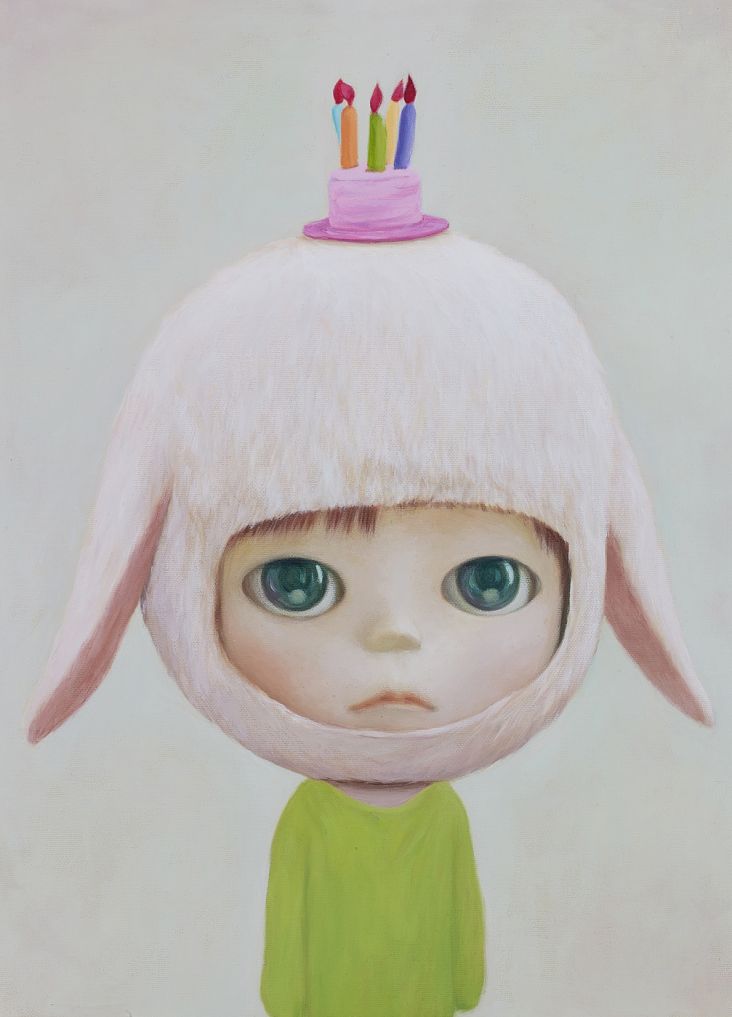
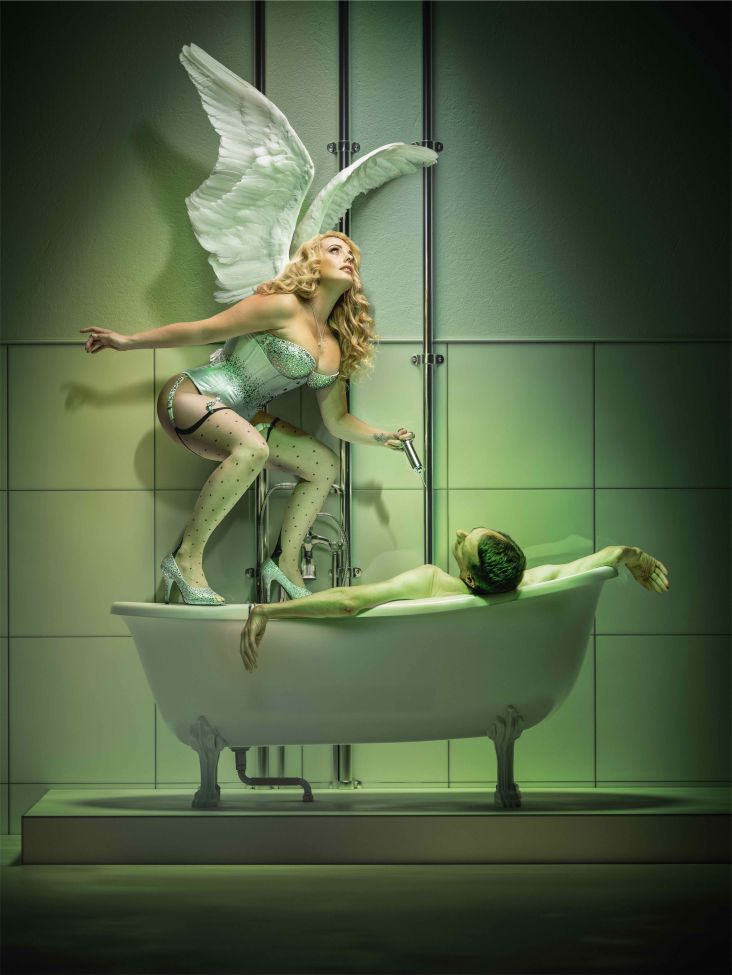
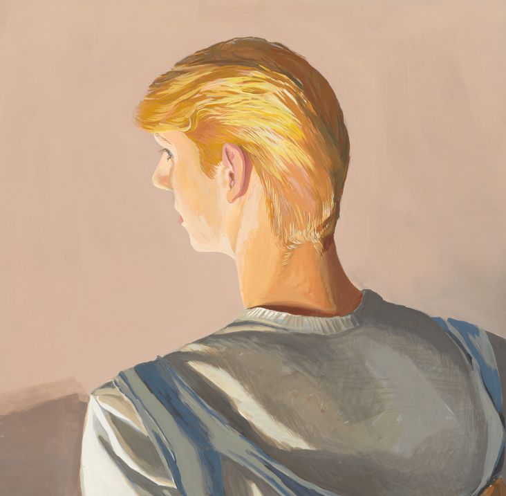
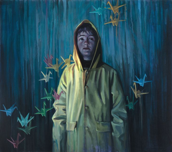
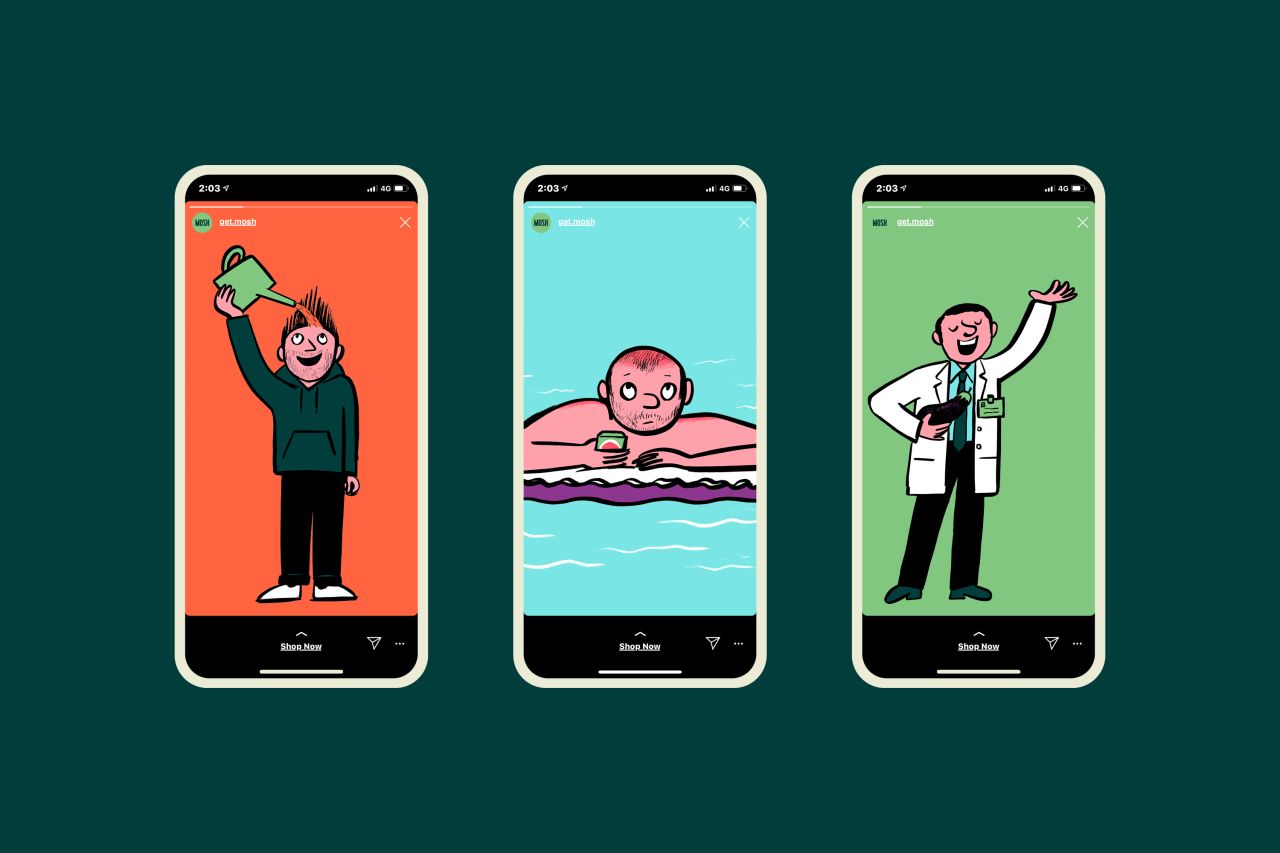
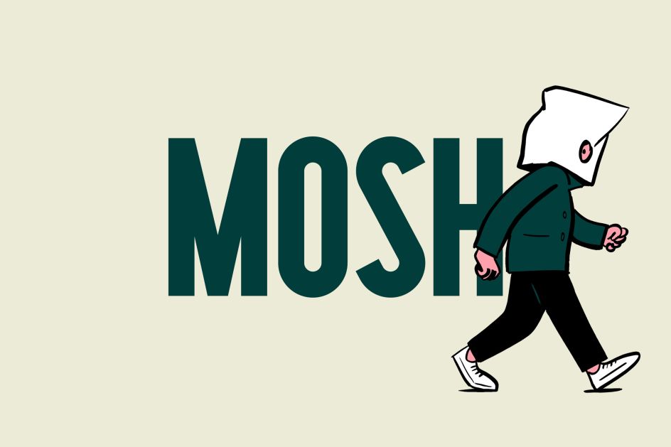
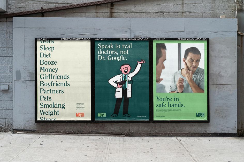
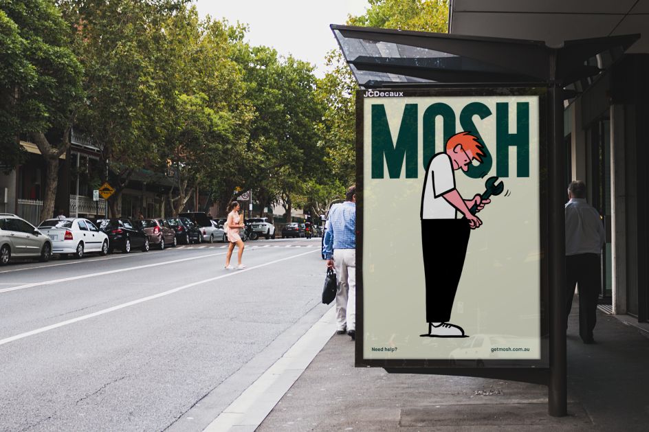
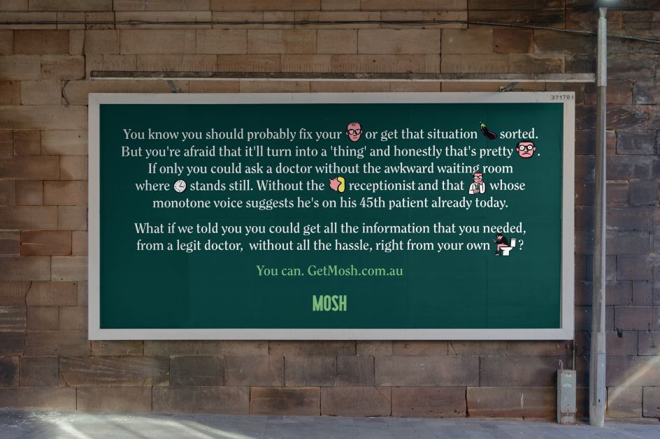
Mosh found in its research that people, men especially, take comfort from editorial publications – they have "inherent trust, integrity and authority". Taking cues from The New York Times Magazine and The New Yorker, Universal Favourite commissioned Mark Long to create a series of illustrations. "Each one conveys the sensitive, sometimes awkward, health issues men face with an informative softness," says studio founder and creative director, Dari Israelstam. "The illustration style feels intellectual yet witty, which allows the brand to appear approachable and comforting."
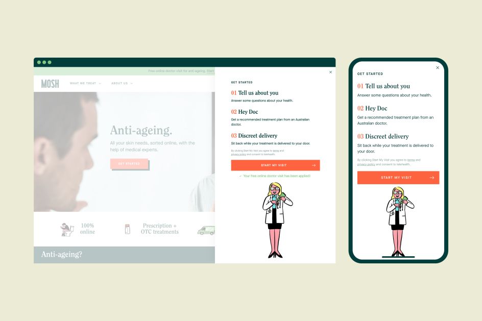
These illustrations also play an important role in the website design, making the information more "digestible". "As an educational and reliable resource for men's health information and care, the website reaffirms the brand's underlying premise that knowledge is power and their health is in their hands," Dari adds.
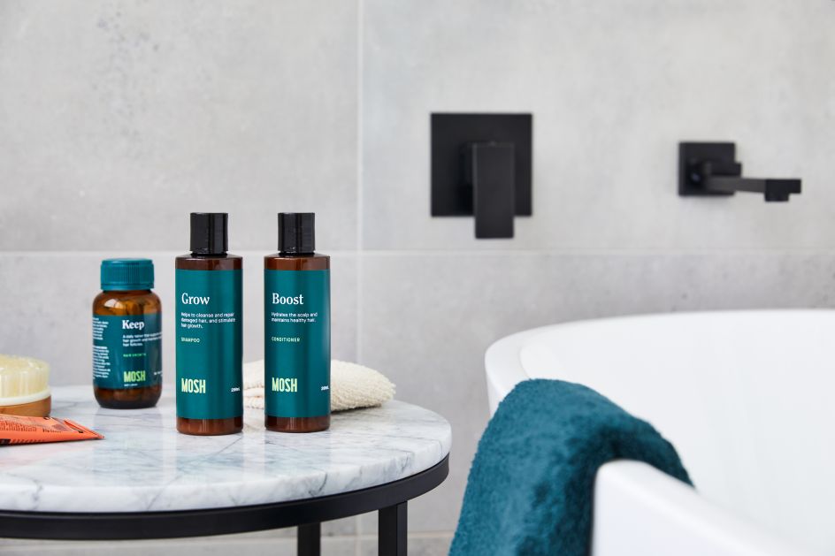
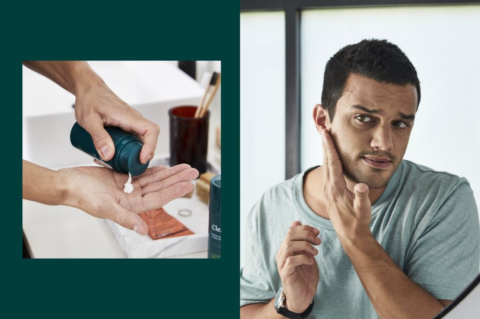
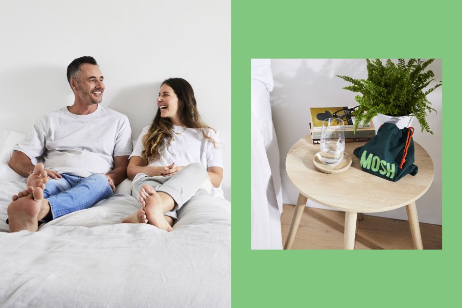
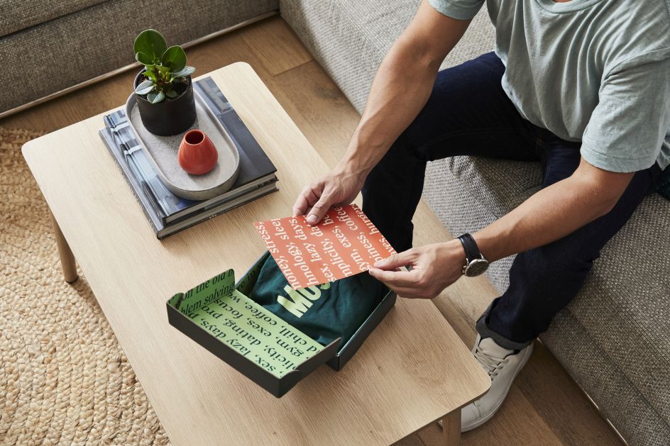
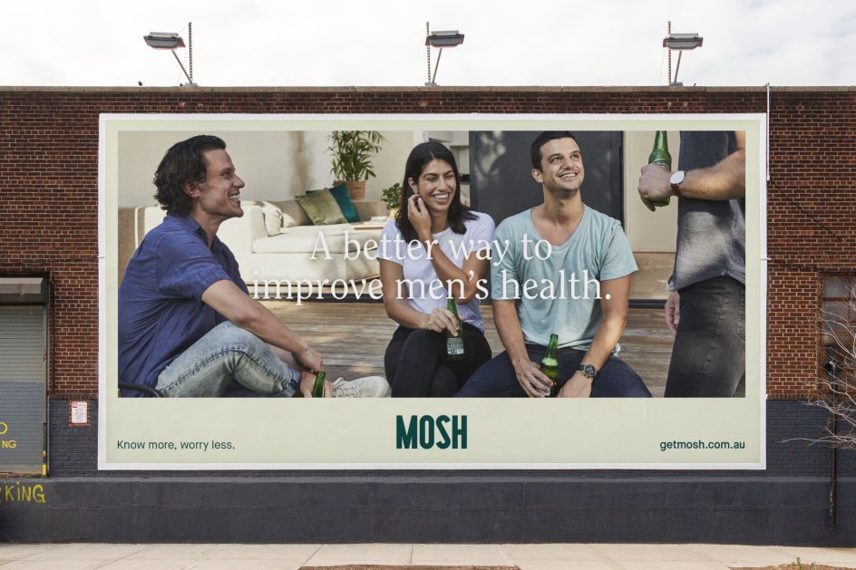
Moving away from the typical idealised lifestyle imagery, Universal Favourite collaborated with photographer Benito Martin to produce images capturing real-life moments within the home that feel relatable. Each shot perfectly illustrates how and when men might need Mosh and how the brand could easily slip into their lifestyle.
"Our aim is to disarm people; we want them to feel safe with us. It was important to create down-to-earth images that would help them connect with the brand," explains David Narunsky, co-founder of Mosh.
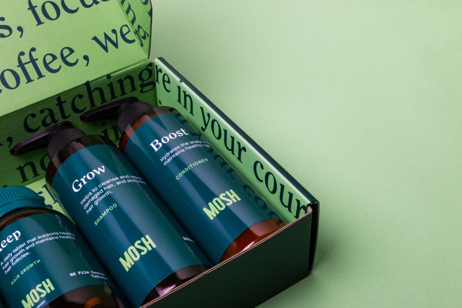
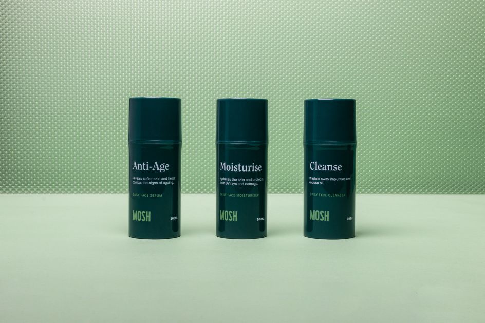
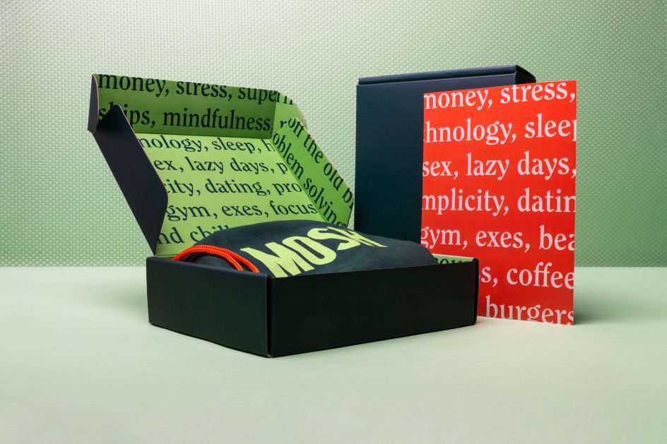
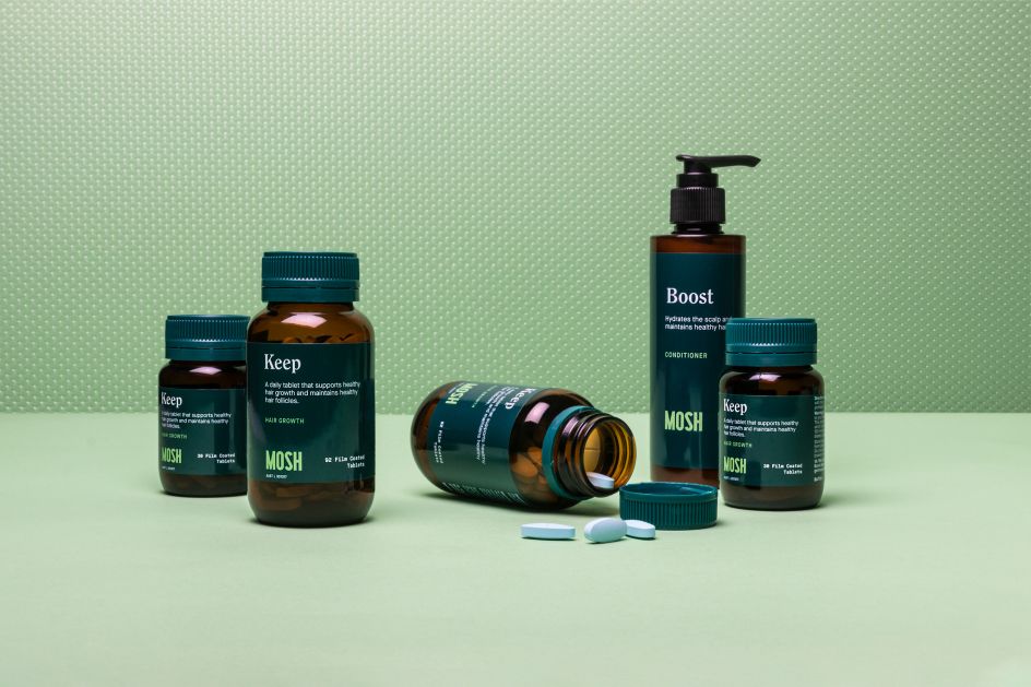
As for the packaging, its stripped-back design lets the product shine. But it doesn't take itself too seriously, as some of the brand's humorous tone is carried over into the mailer, delivering a "sweet brand moment" and reminding the customer that "Mosh has his back".
"We wanted men to access these products privately at their own convenience, but at the same time we wanted to encourage people to talk about these kinds of health issues more openly and to convert it into a non-taboo issue," says David. "We wanted the customers' experience with our product to feel reassuring and empowering."


 by Tüpokompanii](https://www.creativeboom.com/upload/articles/58/58684538770fb5b428dc1882f7a732f153500153_732.jpg)


 using <a href="https://www.ohnotype.co/fonts/obviously" target="_blank">Obviously</a> by Oh No Type Co., Art Director, Brand & Creative—Spotify](https://www.creativeboom.com/upload/articles/6e/6ed31eddc26fa563f213fc76d6993dab9231ffe4_732.jpg)


