Dr. Oetker's Gen Z-centric designs for an LA 'artisanal dessert experience'
Baking brand behemoth Dr Oetker has opened Pudu Pudu, a new artisanal dessert store in Los Angeles, with designs by UXUS. The global hospitality and retail design agency was tasked with designing the brand concept, interiors and visual merchandising for Pudu Pudu, which aims to "transform pudding for the next generation".
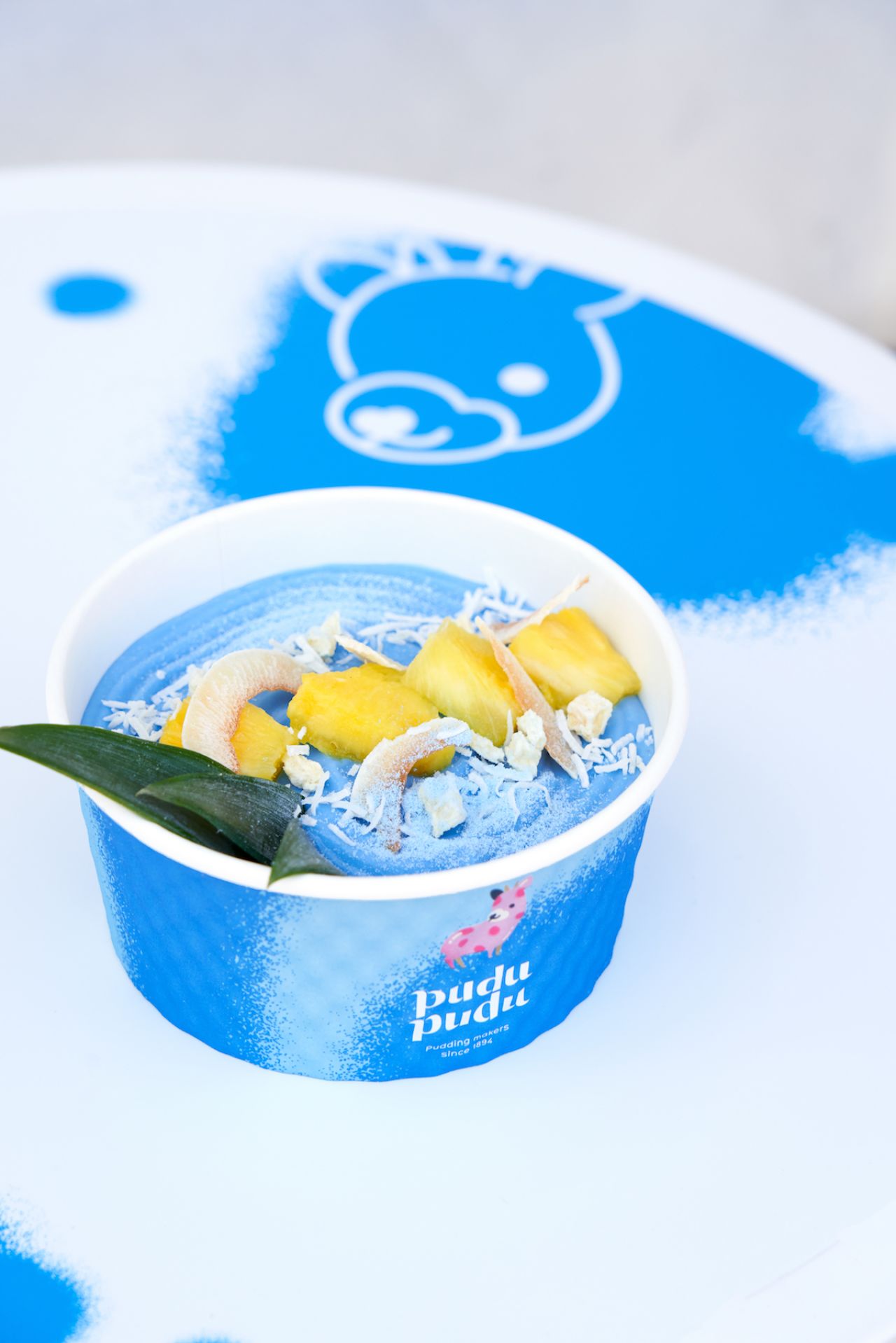
Pudu Pudu at Abbot Kinney Blvd Courtesy UXUS Photography (c) ONWD Collective
Pudu Pudu is said to be "inspired by the spirit and legacy of Dr Oetker" in the sense of his belief in bringing people together through food. The concept takes the "original pudding recipe" and reimagines it for Gen Z and millennial consumers as a "bold, imaginative and unexpected flavour adventure".
With the young target audience in mind, the design of the space takes in playful visual elements to form an "immersive world for pudding making" that's both emotive and encourages social media sharing through the outdoor seating, colourful design elements and navigation.
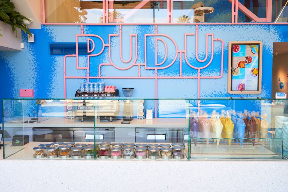
Pudu Pudu at Abbot Kinney Blvd Courtesy UXUS Photography (c) ONWD Collective
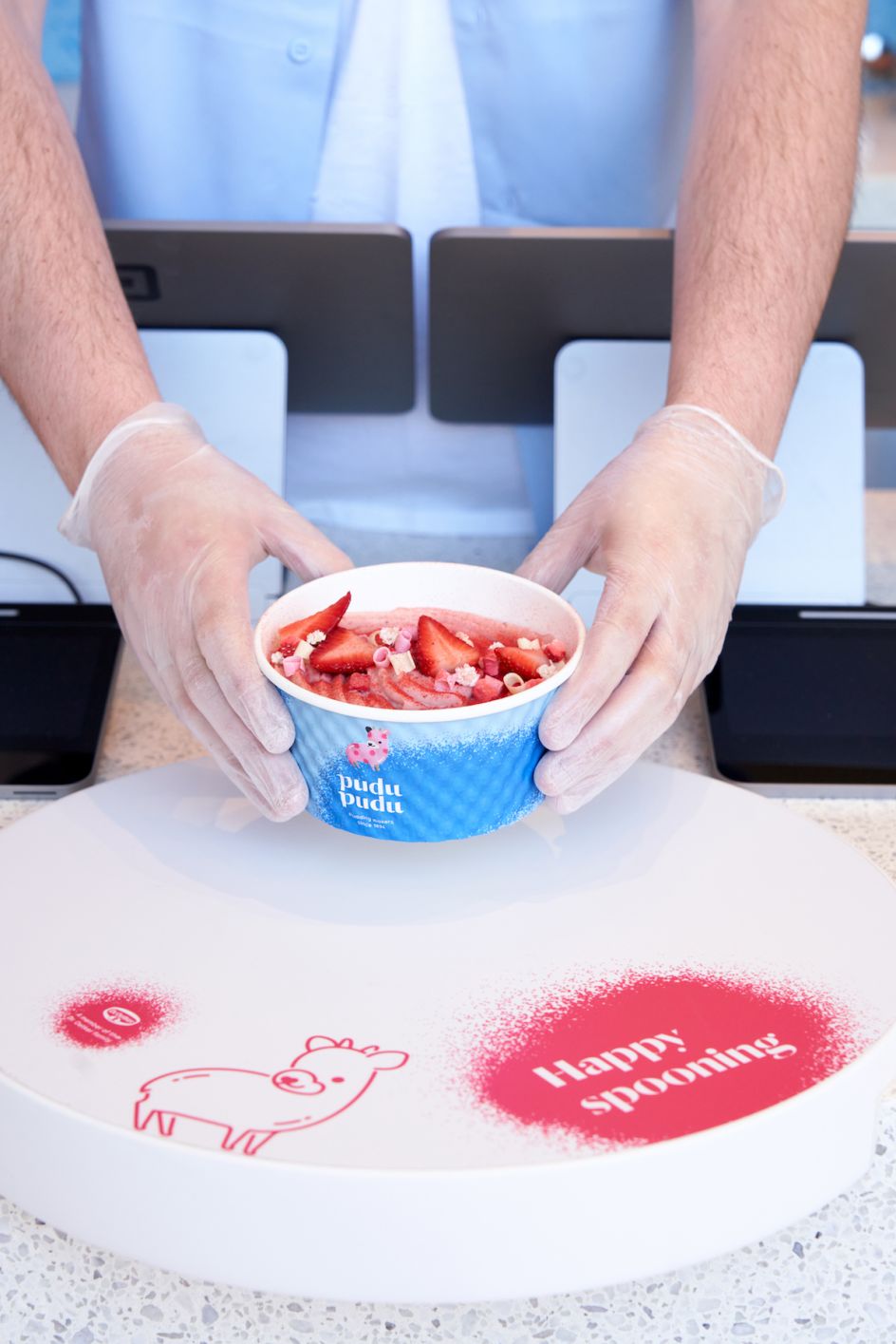
Pudu Pudu at Abbot Kinney Blvd Courtesy UXUS Photography (c) ONWD Collective
"Working with the Dr Oetker team five key pillars were defined and formed the basis for the brand DNA: Delicious, Welcoming, Unexpected, Bold and Playful," says George Gottl, co-founder and chief creative officer at UXUS. "We used these pillars to guide us in delivering a modern, clean aesthetic with a playful twist in which natural, neutral materials create a backdrop for the bold and exciting pudding flavours and fun toppings."
A Pudu mascot was created to act as a representation of the brand's creativity; while the space as a whole was "designed to celebrate the puddings as works of art by focussing on the making process and creating contrasts and balance between each visual element," Gottl adds.
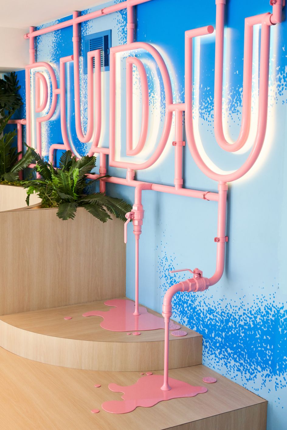
Pudu Pudu at Abbot Kinney Blvd Courtesy UXUS Photography (c) ONWD Collective
The look and feel of the store are based around the idea of being a social space where "puddings can initiate connections," says UXUS. The modern design language is used across the space, which includes concrete flooring; a "puddle of pudding" design; tiered wooden seating; neutral materials and graphic backdrops that form a branded landscape with pudding as the focal point. The back wall showcases the Pudu logo in pink piping to create an eye-catching branding interior feature.
"Created for a global audience, Pudu Pudu is designed to be both a sophisticated and fun brand, with a catchy, easy to pronounce name that characterises the playful personality," says Chris Wittkampf, senior lead graphic designer at UXUS. "The logo uses the cute brand mascot, the Pudu, contrasted with refined typography with bold cut-outs. The primary brand colour, blue, is 'sprayed' graphically throughout the space, adding fun energy to the concrete industrial envelope of the interior."
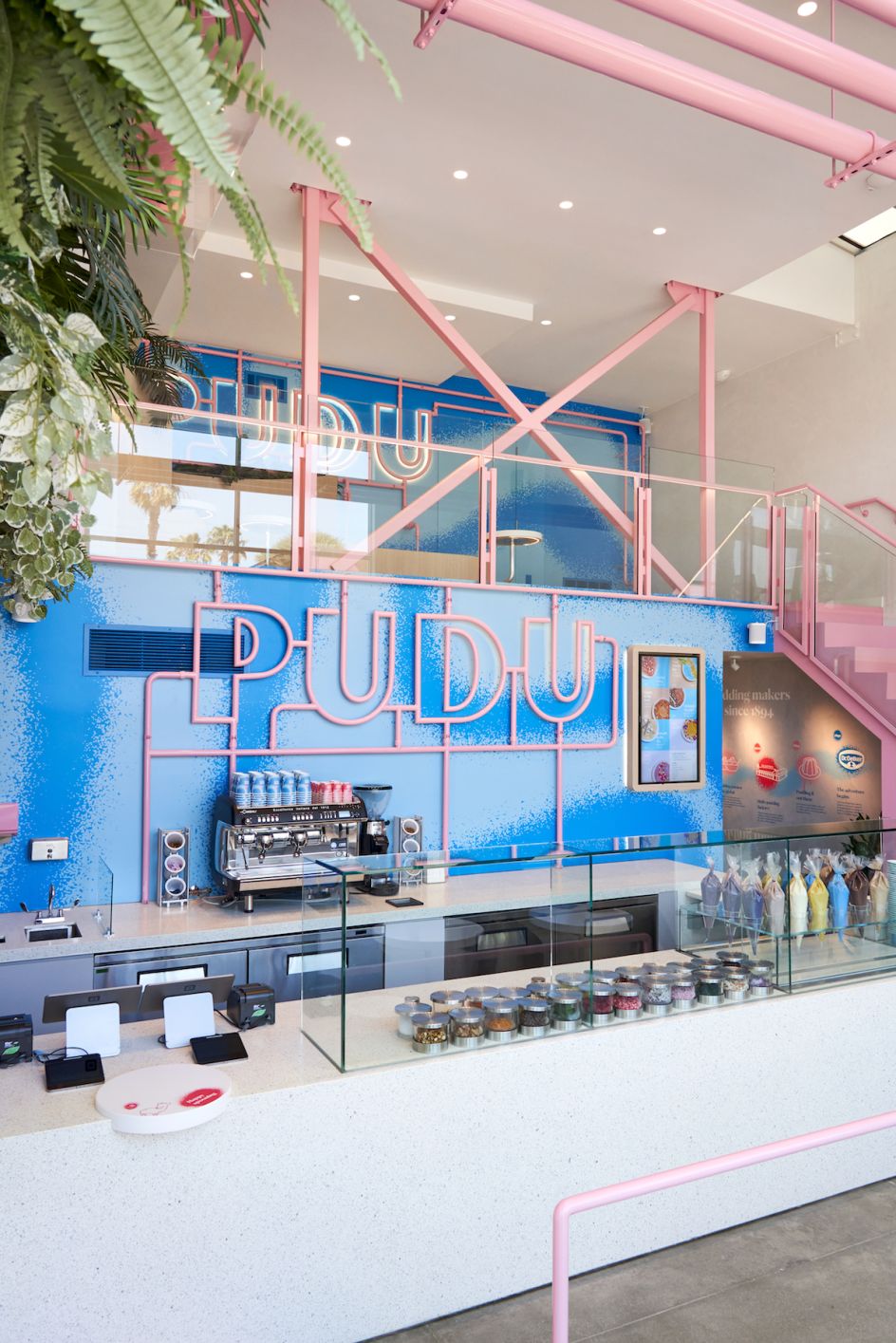
Pudu Pudu at Abbot Kinney Blvd Courtesy UXUS Photography (c) ONWD Collective
UXUS worked with lighting company Nulty, which created a lighting scheme that uses a combination of bright and focused lights to create a sense of fun and further the idea of the"immersive" environment.
The UXUS team's designs for the LA store, look to act as a scalable model that will be internationally relevant, with a view that this will be a universal design language that could be rolled out globally.
Pudu Pudu LA, which facilitates dining in as well as takeaway, opened its doors in March on Abbot Kinney Boulevard, Los Angeles.
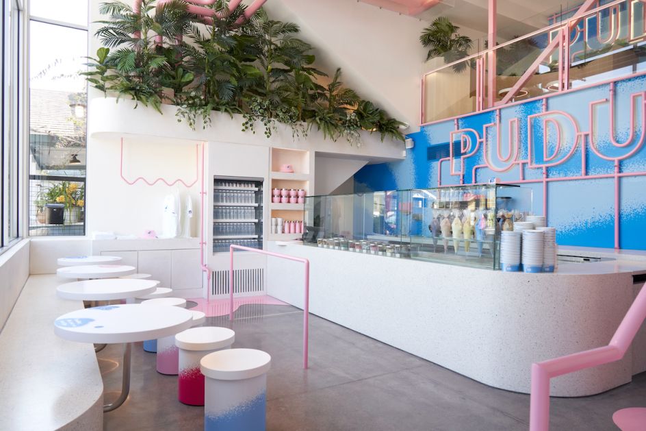
Pudu Pudu at Abbot Kinney Blvd Courtesy UXUS Photography (c) ONWD Collective
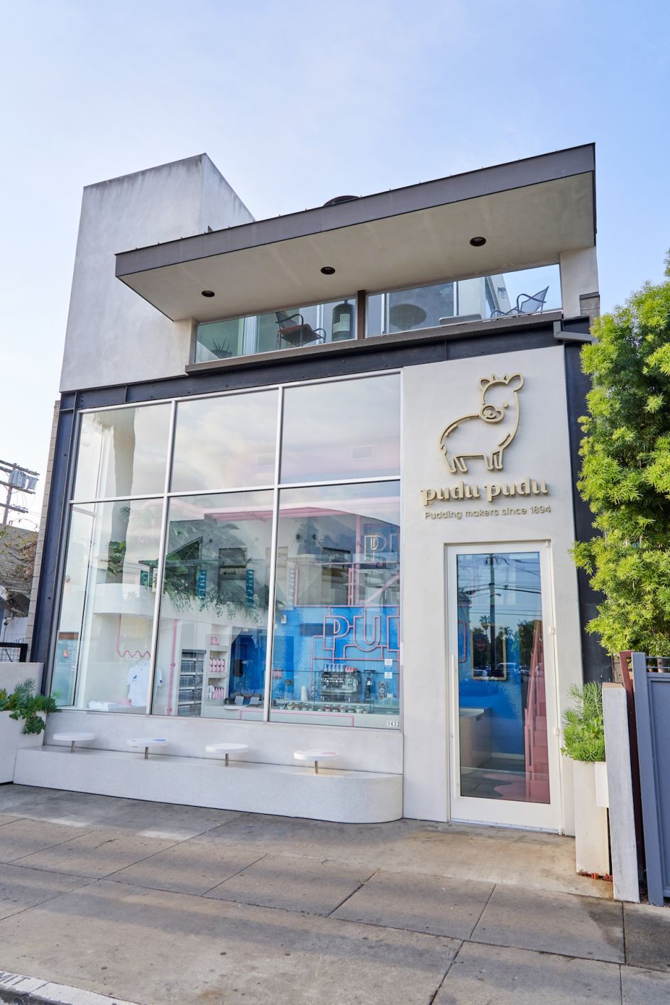
Pudu Pudu at Abbot Kinney Blvd Courtesy UXUS Photography (c) ONWD Collective


 by Tüpokompanii](https://www.creativeboom.com/upload/articles/58/58684538770fb5b428dc1882f7a732f153500153_732.jpg)


 using <a href="https://www.ohnotype.co/fonts/obviously" target="_blank">Obviously</a> by Oh No Type Co., Art Director, Brand & Creative—Spotify](https://www.creativeboom.com/upload/articles/6e/6ed31eddc26fa563f213fc76d6993dab9231ffe4_732.jpg)


