Vertigo looks to simplicity in its rebrand of Melbourne creative community resource
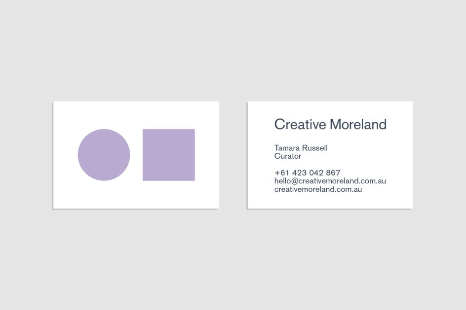
There's a definite nod to the Bauhaus school's graphic design style in Melbourne-based agency Vertigo's new identity for Creative Moreland, a community resource for creative businesses and artists.
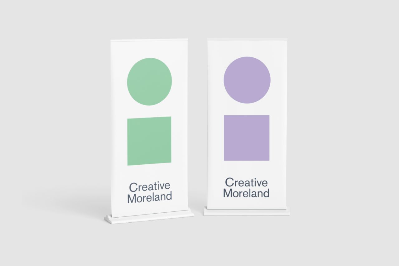
The agency was appointed to create a new visual identity and brand strategy, working across print design for collateral and social media strategy, too. According to Vertigo, it used a "simple and memorable visual narrative" that aims to "appeal to established businesses, connect with new ones, and endure into the future as Moreland continues to grow in population and creative success. "
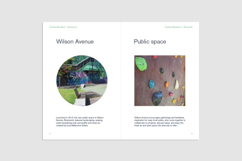
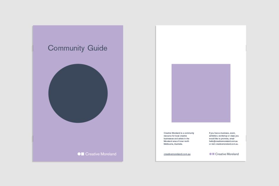
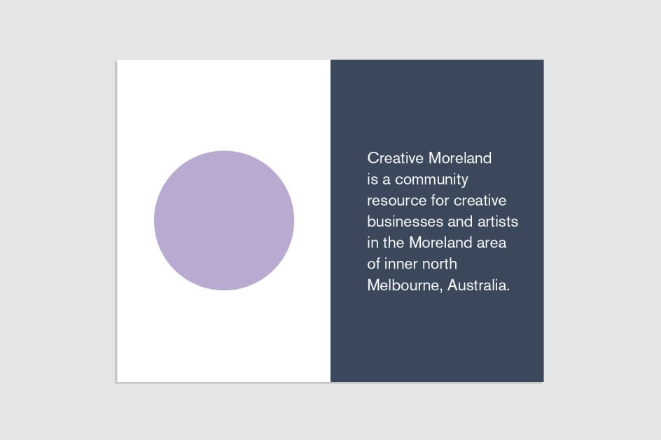
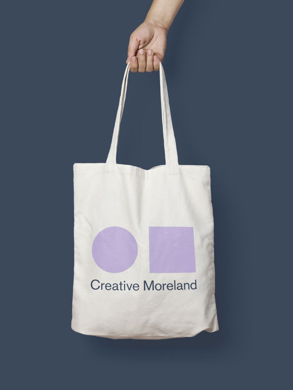
The new look is based around two shapes, a circle and a square, which act as an adaptable visual reference point across touchpoints including stationery, online and on marketing materials, where they act as a frame for photographic imagery.


 by Tüpokompanii](https://www.creativeboom.com/upload/articles/58/58684538770fb5b428dc1882f7a732f153500153_732.jpg)


 using <a href="https://www.ohnotype.co/fonts/obviously" target="_blank">Obviously</a> by Oh No Type Co., Art Director, Brand & Creative—Spotify](https://www.creativeboom.com/upload/articles/6e/6ed31eddc26fa563f213fc76d6993dab9231ffe4_732.jpg)


