&Walsh disrupts the 'stuffy' wine landscape with a 'non-snobby' identity for Stompy
&Walsh is behind a new identity for Stompy, a personalised wine subscription service founded by college friends Stephen Wong and Andy Williams in 2020.
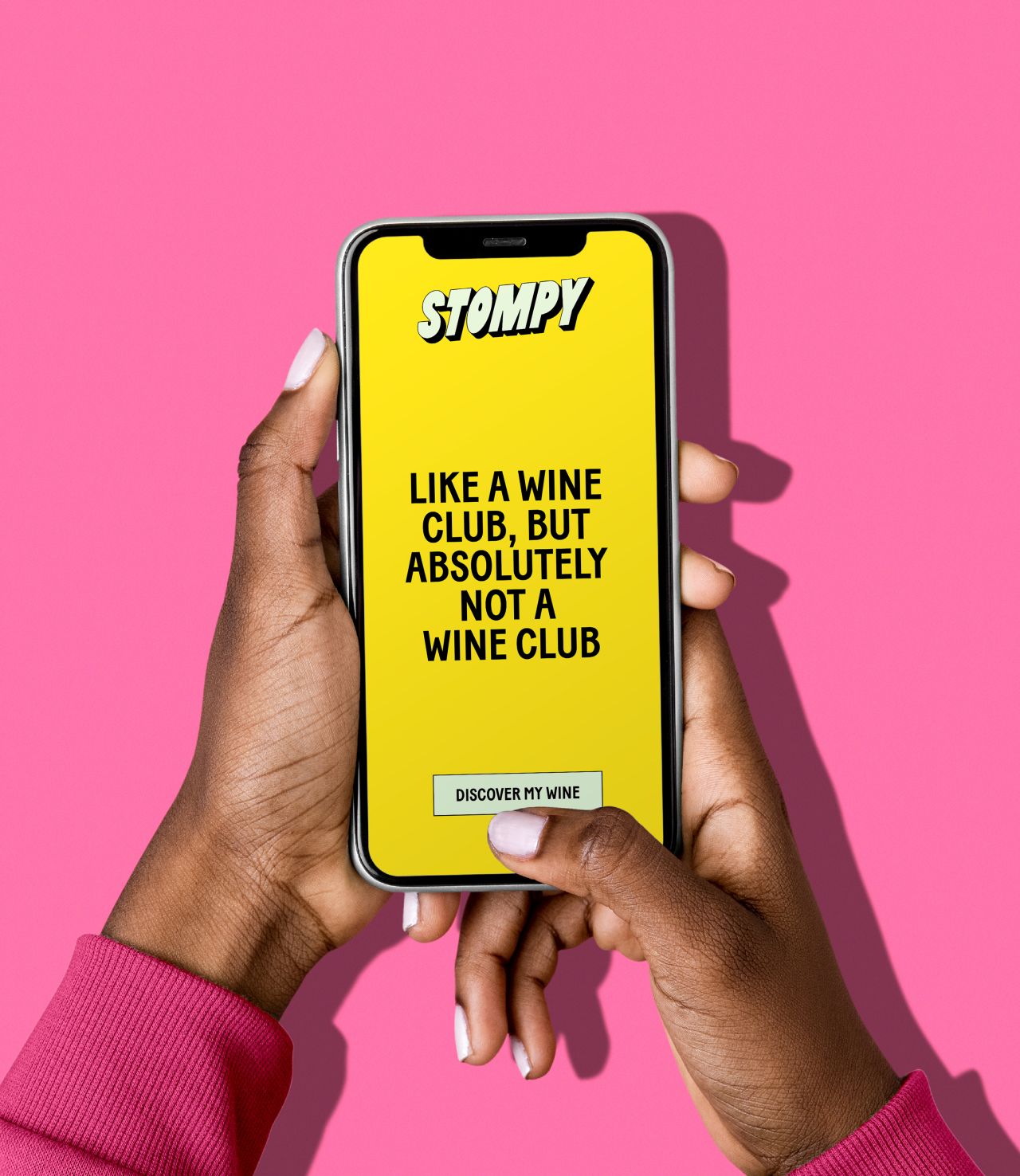
The work by Jessica Walsh and her team hopes to challenge the "stuffy" nature of the wine buying experience by championing "doing wine your way" expressed through bold type, bright colours and humorous illustrations.
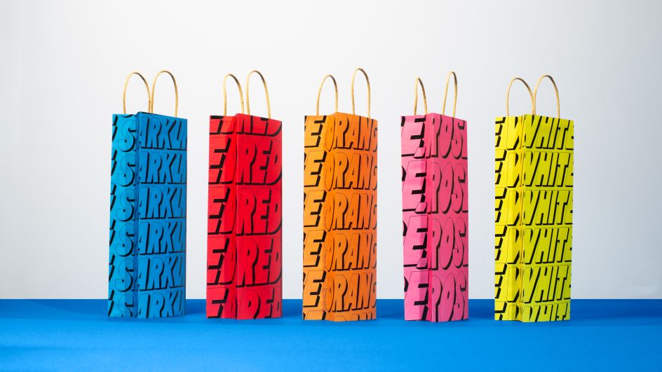
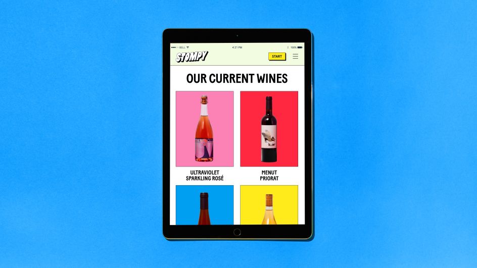
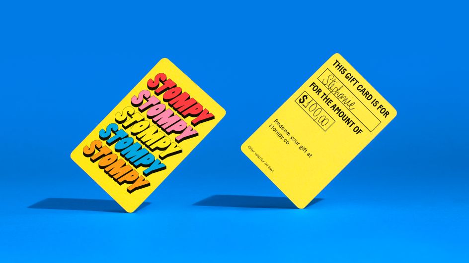
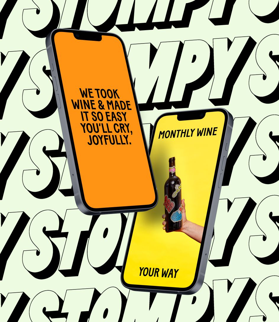
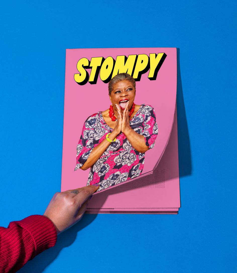
At its heart, Stompy's new typographic logo is inspired by the art of grape stomping. Playful in its manner, the extruded type is transformed into repetitive patterns throughout the identity, alluding to the brand's different categories of wine. As well as serving as useful patterns within Stompy's product photography, they're also designed to help orient wine buyers, allowing them to quickly identify the type of wine they are browsing.
But the real point of this fresh look is to make wine less intimidating to those of us who don't know what we're drinking. "In the brand direction, we explored visual cues that challenge the stuffy, snobby stereotypes surrounding wine and instead open up great wine to more great people," explains Jessica Walsh. "Our work aims to inspire wine noobies (and aficionados) to sip more and snob less!"
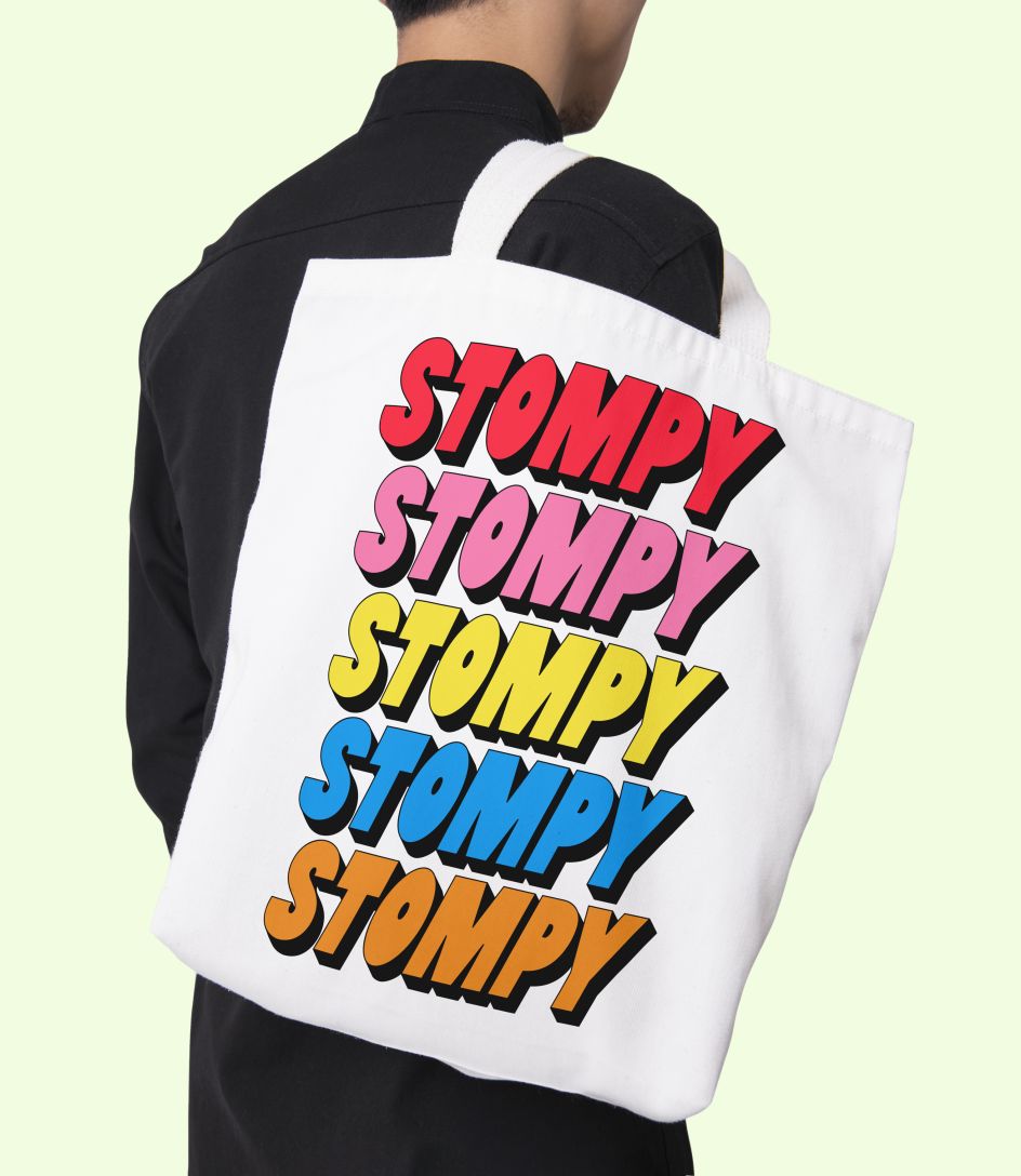
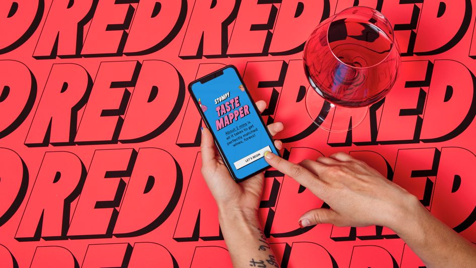

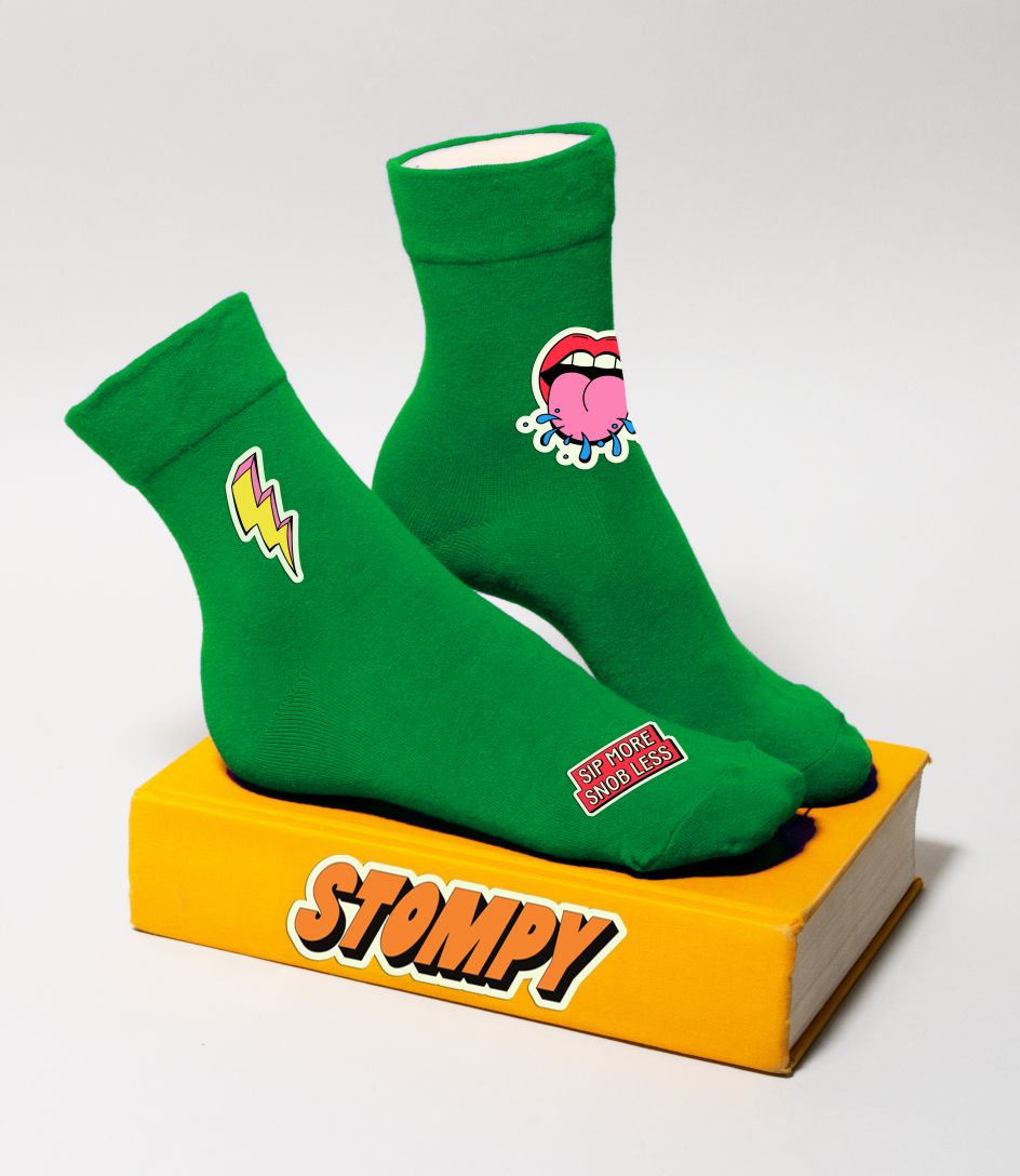
That down-to-earth feeling has also been achieved through playful illustrations by Finnish artist Tommy Tarvonen, transformed into a set of fun stickers. "They help bring in joy and show that Stompy doesn't take itself too seriously," adds Jessica. The happiness continues in the copy and website design, too. "The wine matching quiz, for example, uses fun and relatable terminology anyone can understand."
"The landscape of wine is often serious and stuffy," Jessica continues. "From the way you talk about wine, to the way you buy it, to how you drink it; it's often filled with serious rules and complicated language. The Stompy brand is about breaking down those expectations and letting people feel free to enjoy wine your way – whether in a solo cup or a fancy wine glass."
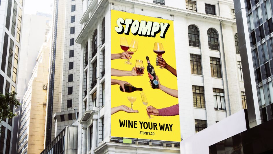
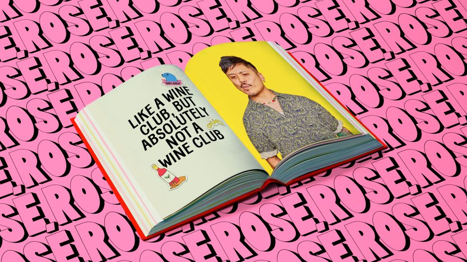
&Walsh's identity for Stompy has been rolled out across all its packaging, digital and social channels, photography, and more. We especially love the copy, 'Like a wine club, but absolutely not a wine club'. See the identity at work over at Stompy.co.




 by Tüpokompanii](https://www.creativeboom.com/upload/articles/58/58684538770fb5b428dc1882f7a732f153500153_732.jpg)

 using <a href="https://www.ohnotype.co/fonts/obviously" target="_blank">Obviously</a> by Oh No Type Co., Art Director, Brand & Creative—Spotify](https://www.creativeboom.com/upload/articles/6e/6ed31eddc26fa563f213fc76d6993dab9231ffe4_732.jpg)


](https://www.creativeboom.com/upload/articles/ab/ab0784d61fe640df9f201accfe2844015bd254a3_732.jpg)
