Yorgo&Co. creates new logo for a new men's fragrance by Hermès
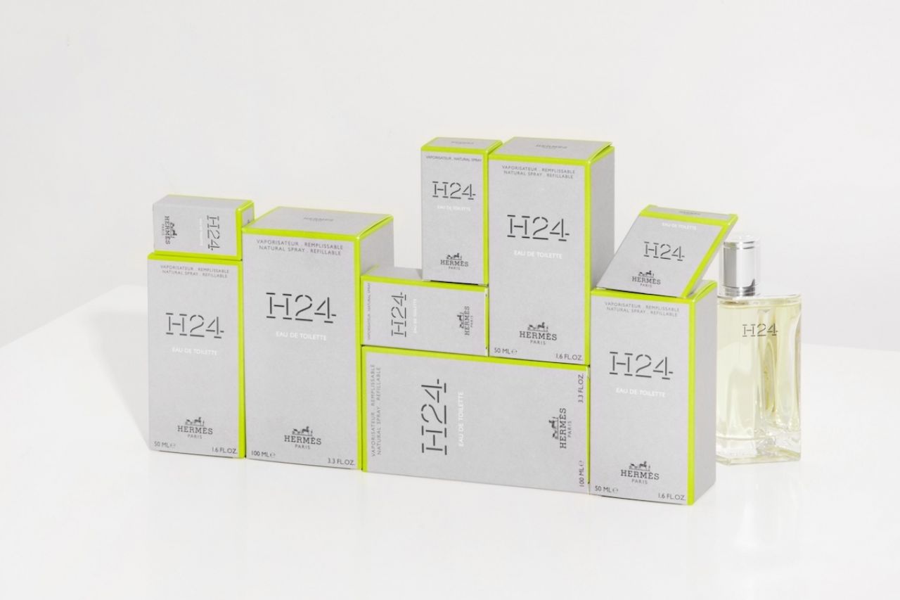
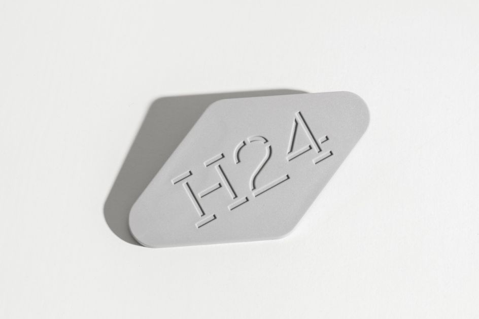
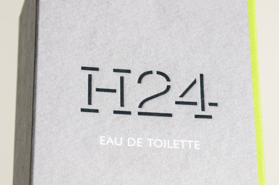
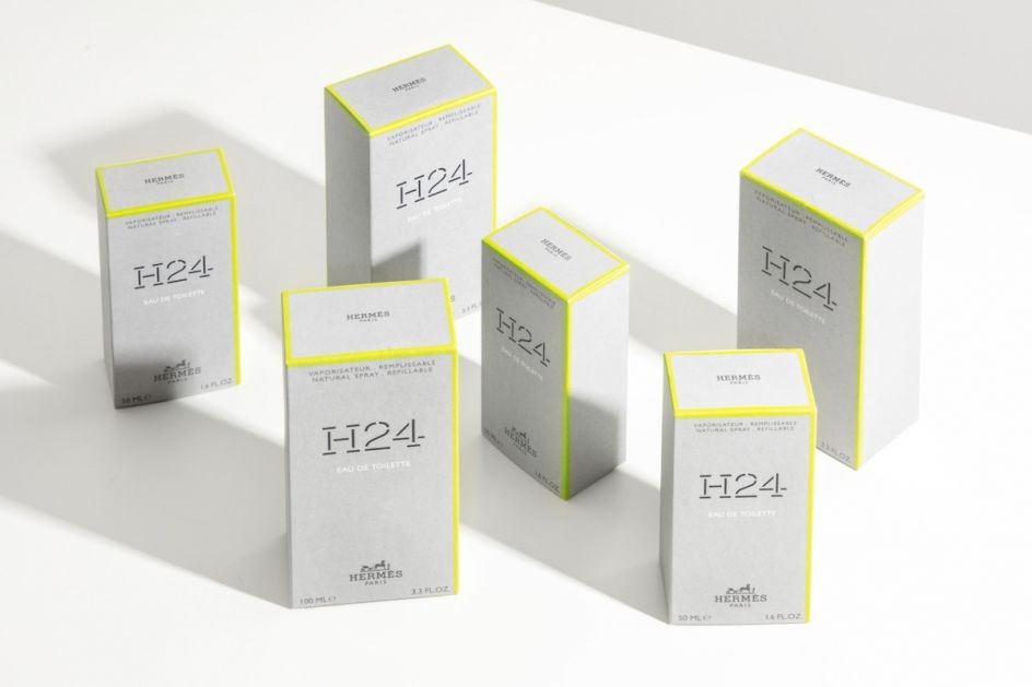
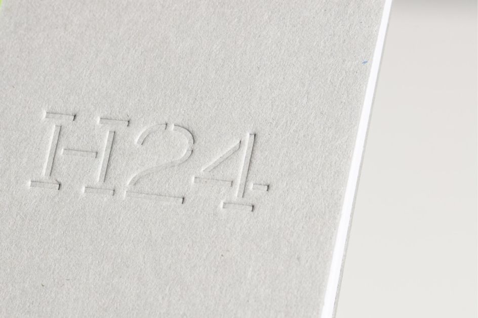
Yorgo&Co has designed a bespoke typographic logo for H24, Hermès' new men's fragrance.
Based in Paris, Yorgo&Co is a multidisciplinary creative studio founded in Pari led by Yorgo Tloupas and headed by studio director and co-founder Emmanuelle Beaudet, works with several luxury clients including Yves Saint Laurent, Louis Vuitton, Kenzo and Emporio Armani; as well as creating logos campaigns, digital content, books, signage, magazines, and typefaces for numerous other clients across music, booze brands, publishing and more.
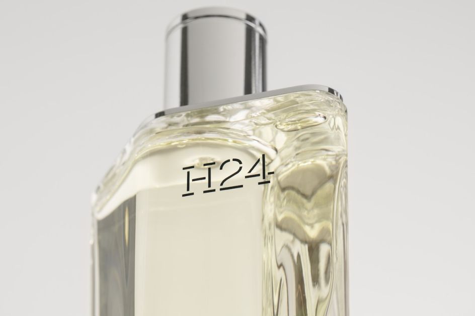
The studio was commissioned by Hermès right from the start of the fashion brand's development of H24" even before Hermès designed the bottle", says Yorgo&Co, and was invited to smell some of the first iterations of the fragrance by Christine Nagel in advance. This formed part of the inspiration for the typographic logotype.
"Creating a new perfume is a long process," says Yorgo&Co. "As is often the case, the final name isn't decided until quite late in the process, so we designed a font with which we could spell out different names whilst maintaining the modern and subtle feel of the project."
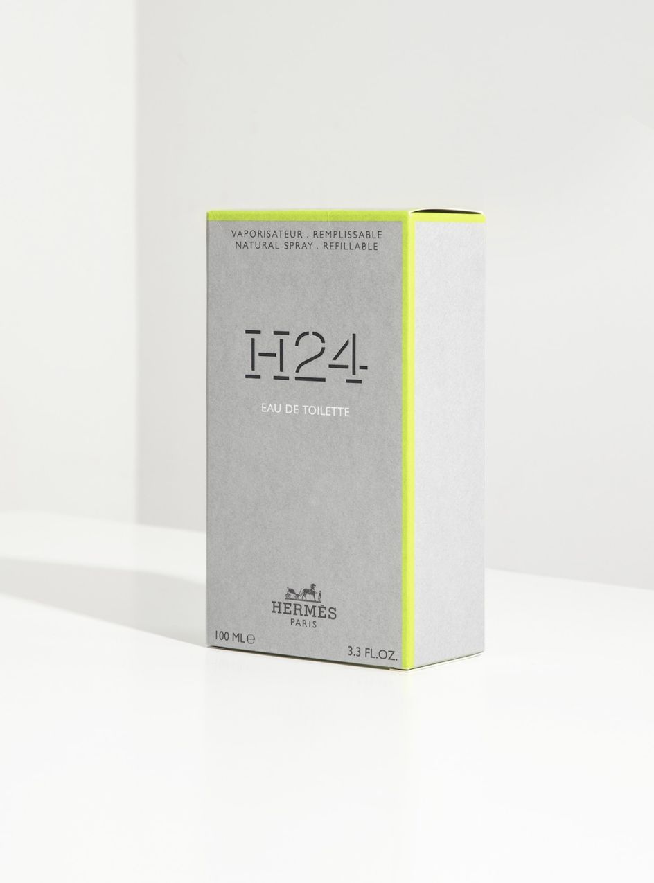
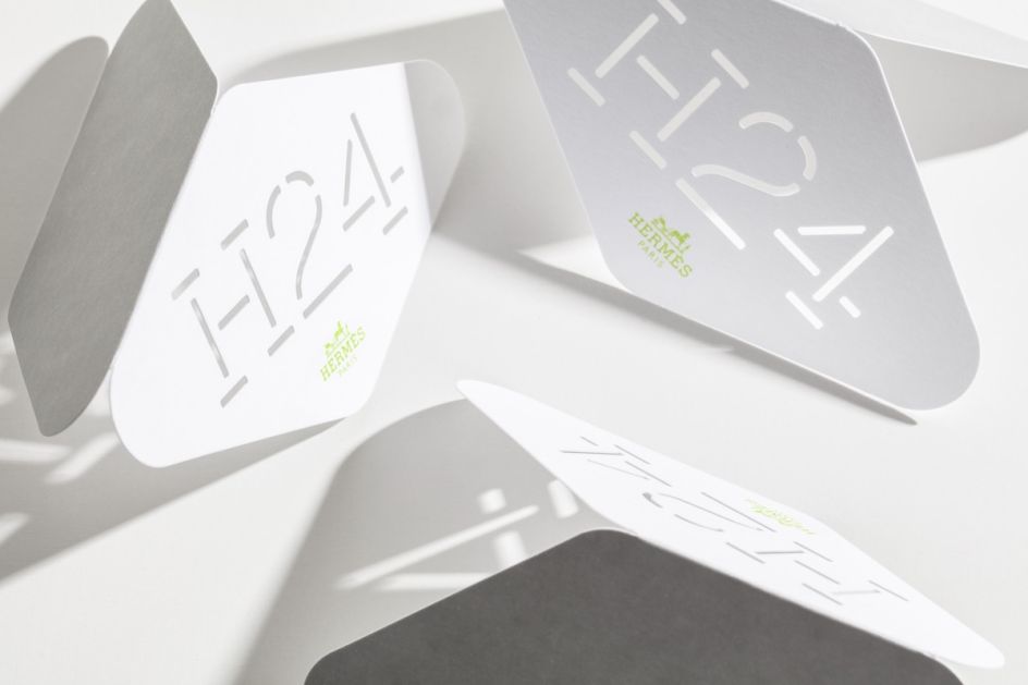
The stencil-like logotype pays tribute to Hermès' vast historical graphic archives, which are housed at the brand's private museum at 24 rue du Faubourg Saint Honoré in Paris. The studio also visited the Hermès archives in Pantin, where it found many sources that inspired the stencil logo's marriage of lightness with more mechanical elements.
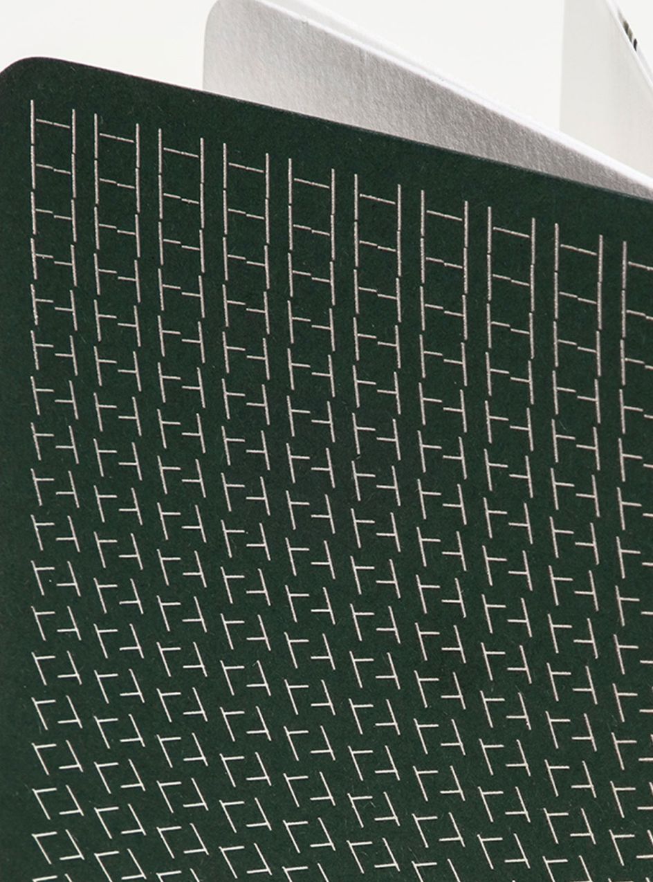
And the logo, packaging, digital patterns and sales tools "are all created to echo the fresh masculine tones of the fragrance," the studio adds.
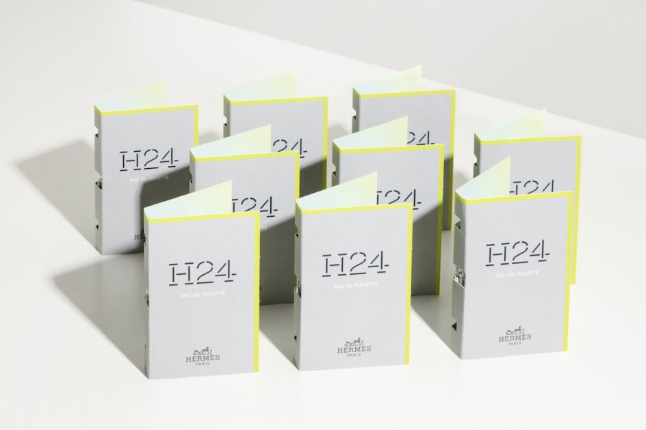
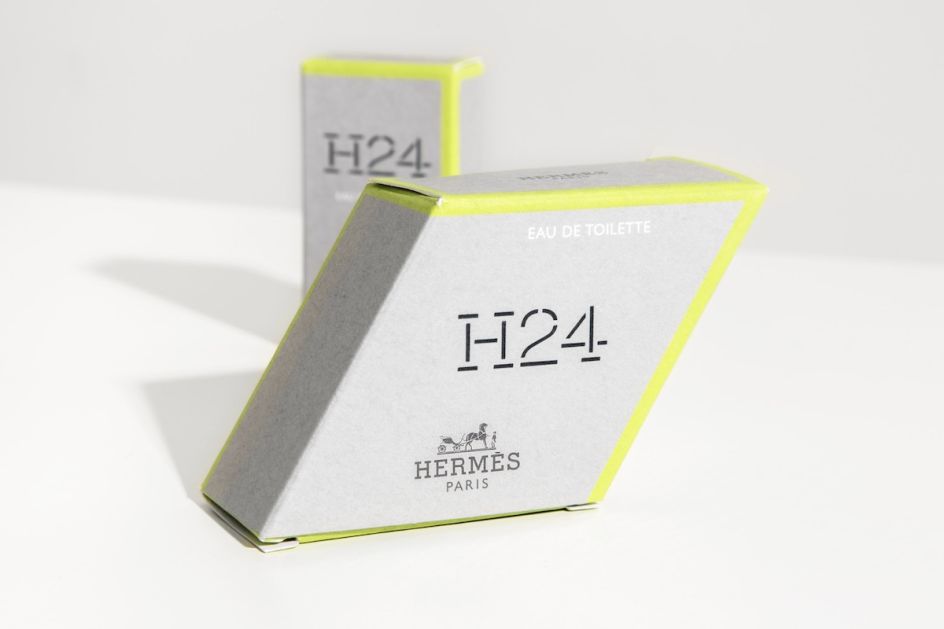
As well as creating the logotype, Yorgo&Co. was also involved in the choice of colours, the design of the boxes and the creation of a set of sales tools – some of them using the stencil principle to spray a trace of the logo. It also created digital animations that "play with the lozenge shape of the bottle, mixing it with the H of Hermès."


 by Tüpokompanii](https://www.creativeboom.com/upload/articles/58/58684538770fb5b428dc1882f7a732f153500153_732.jpg)

 using <a href="https://www.ohnotype.co/fonts/obviously" target="_blank">Obviously</a> by Oh No Type Co., Art Director, Brand & Creative—Spotify](https://www.creativeboom.com/upload/articles/6e/6ed31eddc26fa563f213fc76d6993dab9231ffe4_732.jpg)


