'A clear human touch': Grilli Type's Pinterest Sans perfectly balances charm and functionality
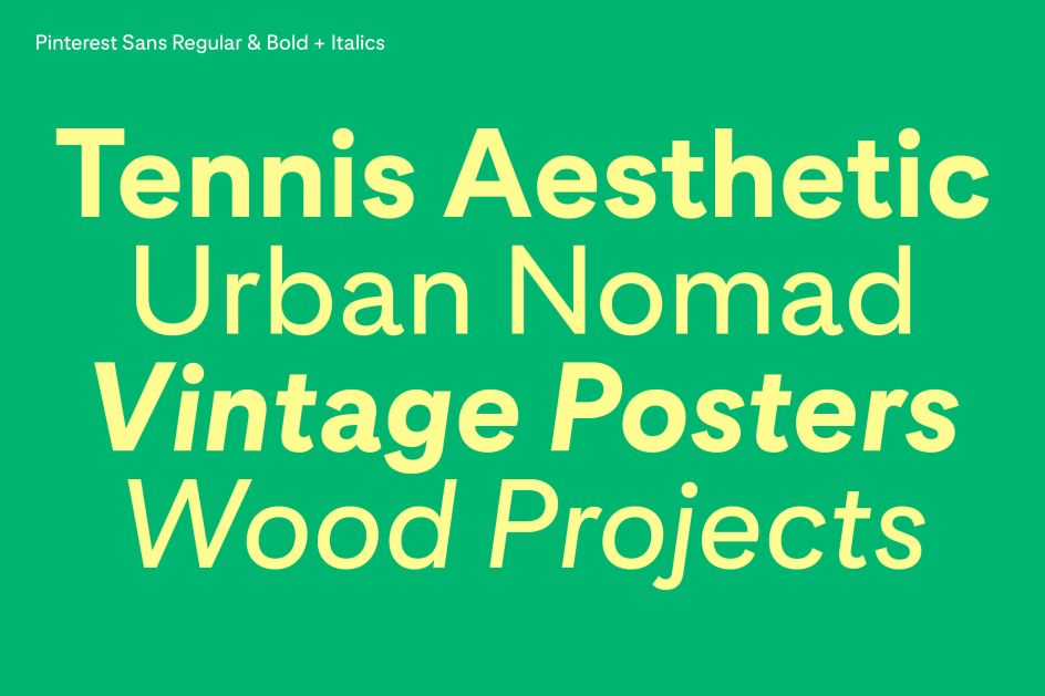
Providing the typographic mortar cementing Pinterest's new visual refresh, Swiss type foundry Grilli Type has produced the bespoke typeface, Pinterest Sans, working directly with Pinterest, as part of the company's visual brand unification directed by design studio Made Thought.
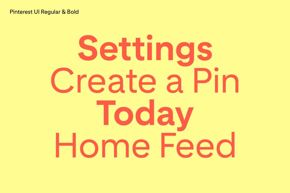
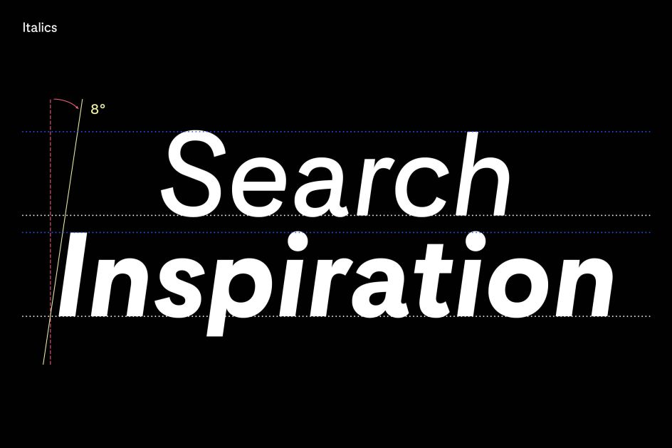
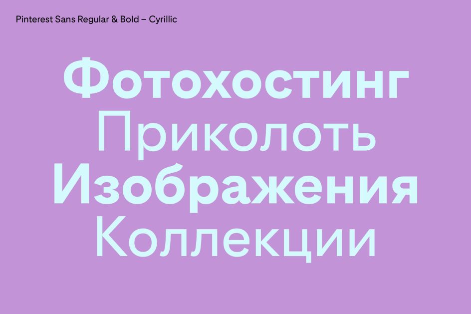
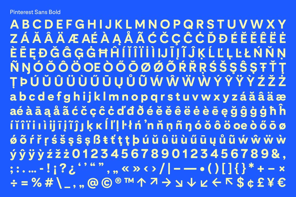
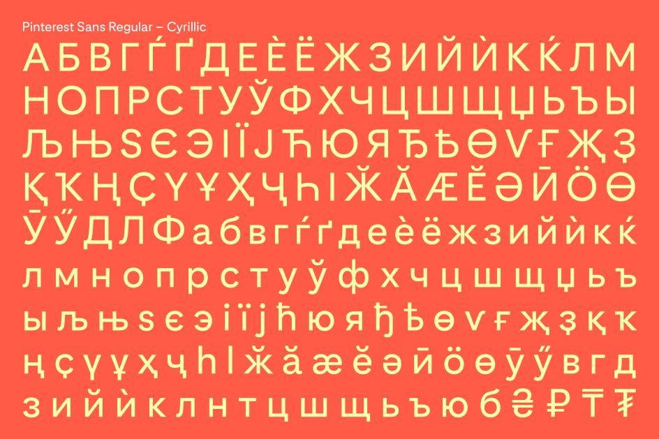
Crafting Pinterest Sans, as well as Pinterest UI for increased digital legibility and two styles of its own, the outcome of the project is outstanding, including four weights as well as the due expansion of the family to support Cyrillic, Greek, Vietnamese, and Japanese script.
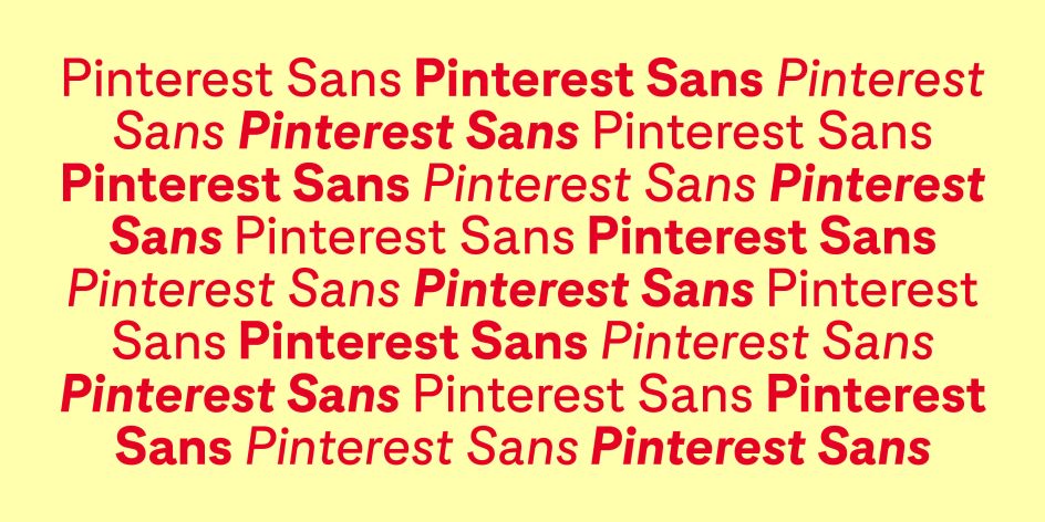
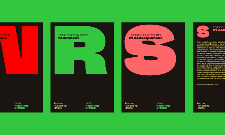
In a showcase of Grilli Type's meticulous practice and astonishing attention to detail, Pinterest Sans finds the minutiae of its inspiration in geometric and calligraphic sans serif typefaces, with the goal to create an importantly distinctive typeface that treads the line between character and legibility.
Achieving that and then some, Pinterest Sans manages to be a total typographic work-horse whilst simultaneously avoiding the dry and uninspiring tropes associated with neutral, hard-working typefaces. Clean, concise and characterful, Pinterest Sans is comfortable and effortless – exuding a recognition and familiarity as if we've been privy to this typeface our whole lives.
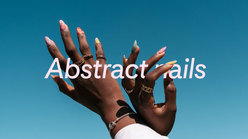
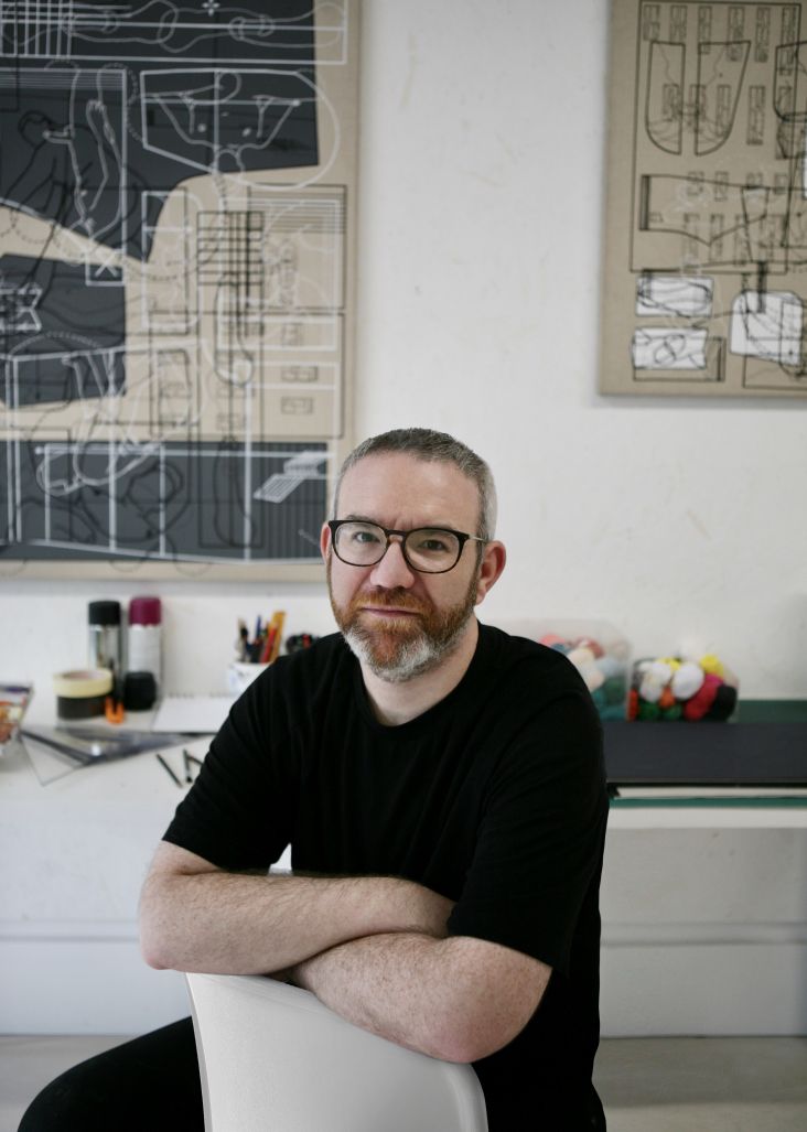
"We don't think that charm and functionality should be mutually exclusive," Grilli Type's Co-founder Noël Leu explains, "in fact, these two aspects are closely linked together." Suggesting that typefaces both have to be legible and expressive to convey a message, Noël notes that this topic is an ongoing, long-running conversation at Grilli Type, with decisions made and conclusions drawn through "micro and macro" design alterations.
This notion of communal conversation and creative partnership is incredibly significant across Grilli Type, both in terms of individual type families, the likes of Pinterest Sans, and in their physically collaborative elements. "We often place a lot of importance on the individual whether it's a sports team or a typeface," Noël explains, responding to what his favourite glyph of the typeface was.
"We like to look at them as a team of glyphs that only works collectively with their other teammates," Noël adds, indicating that by picking out a single character, its individual construction doesn't stand out drastically. "I'd say what makes Pinterest Sans special is the combination of functional geometry with a clear human touch," Noël adds, warmth and character similarly apparent in their somewhat mindful role within the design process.
"We see our job not only as designers but also as mediators between the world of brand identity and typographic expression," he explains, working side by side with Pinterest to create the brief put out into the world – including the strategic, functional and aesthetic goals for the typeface. "We had frequent presentations centred around enabling their design team to make informed design decisions from the overall design direction," Noël concludes, "down to the small details of specific characters."
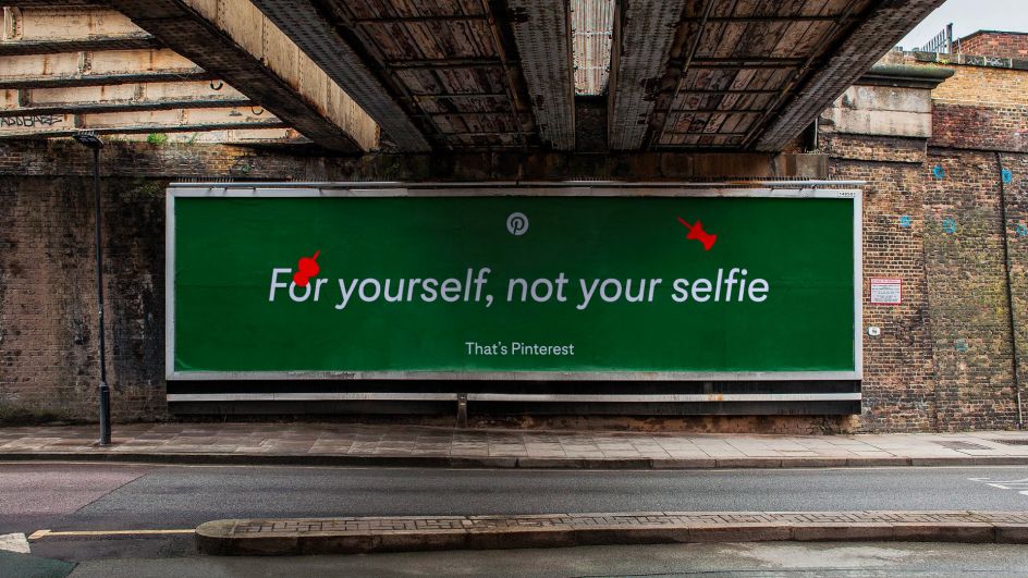


 by Tüpokompanii](https://www.creativeboom.com/upload/articles/58/58684538770fb5b428dc1882f7a732f153500153_732.jpg)


 using <a href="https://www.ohnotype.co/fonts/obviously" target="_blank">Obviously</a> by Oh No Type Co., Art Director, Brand & Creative—Spotify](https://www.creativeboom.com/upload/articles/6e/6ed31eddc26fa563f213fc76d6993dab9231ffe4_732.jpg)


