A Pride-themed series of screenprints commissioned by Facebook to celebrate Pride
Facebook has partnered with Austin, Texas studio In-House International to create a series of posters to celebrate Pride, each one by a different LGBT+ designer.
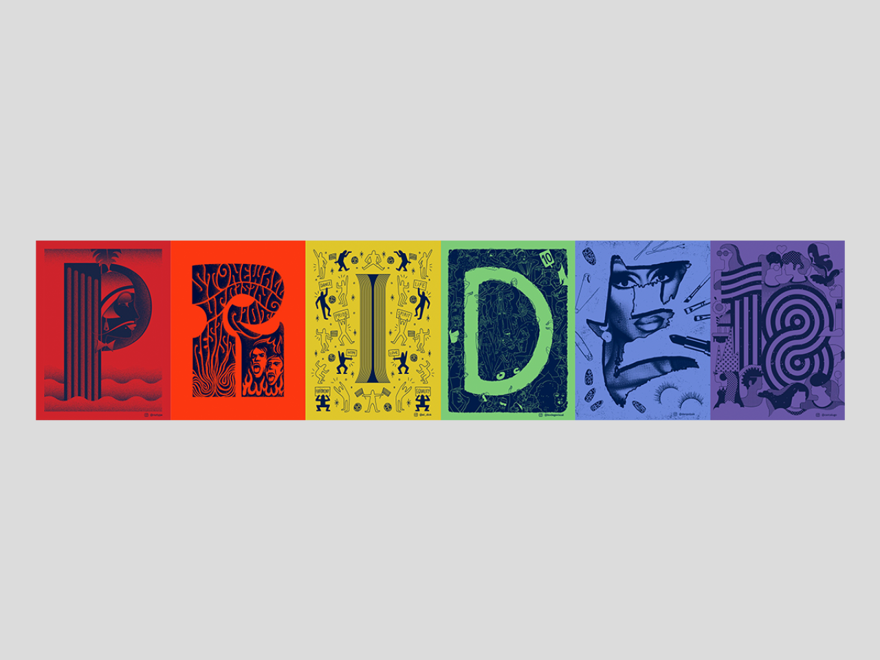
Facebook Pride 2018. All images courtesy of Facebook
Featuring work by Resistenza Type (Giuseppe Salerno & Paco González), Ximena Jimenez, Lauren Dickens, Claudia Aparicio-Gamundi, Dan Polyak and Carlos Castro-Lugo, the six individual prints spell out a single letter or number from "Pride18" and focus on different design disciplines.
Rather than develop the letters separately, the designers entered a collaboration process across borders and time zones. Over four conference calls, designers jointly decided on a conceptual approach and workshopped their posters from initial rough drafts through to their final designs. The process itself proved valuable to the designers.
"Brainstorming with the team helped us make our idea stronger and made us feel more confident in it," said Giuseppe Salerno and Paco González, the first collaborators behind the project. "Also, there was such a good vibe where we felt that it was allowed to give feedback and advice. We hope to repeat this experience."
As for the posters themselves: letters are organised chronologically, so the set is a stroll through generations of Pride all the way to the present day. "P" is set in the 1930s. "R" jumps to the '60s, "I" is set in the 1970s, "D" is late '80s, "E" is set in the 1990s and so on. The selection for the subject matter on each poster had to fulfil two criteria: to be culturally or historically meaningful for the era and that the artist creating the work feels a connection to the subject matter.
"Pride means having to courage to be yourself," said Lauren Dickens. "It's an understanding that hard battles have been fought, and it’s a promise to keep fighting for those that are still striving for equality and acceptance."
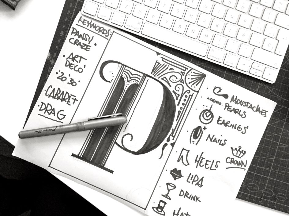
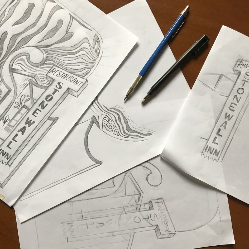
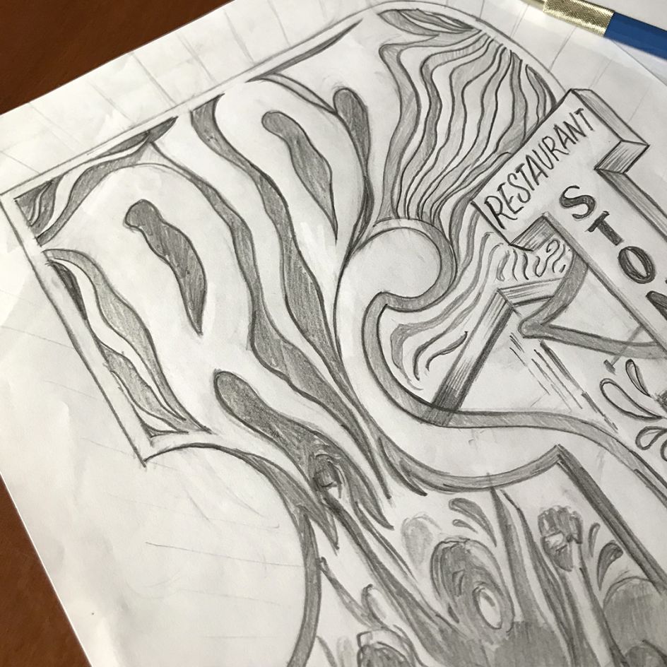
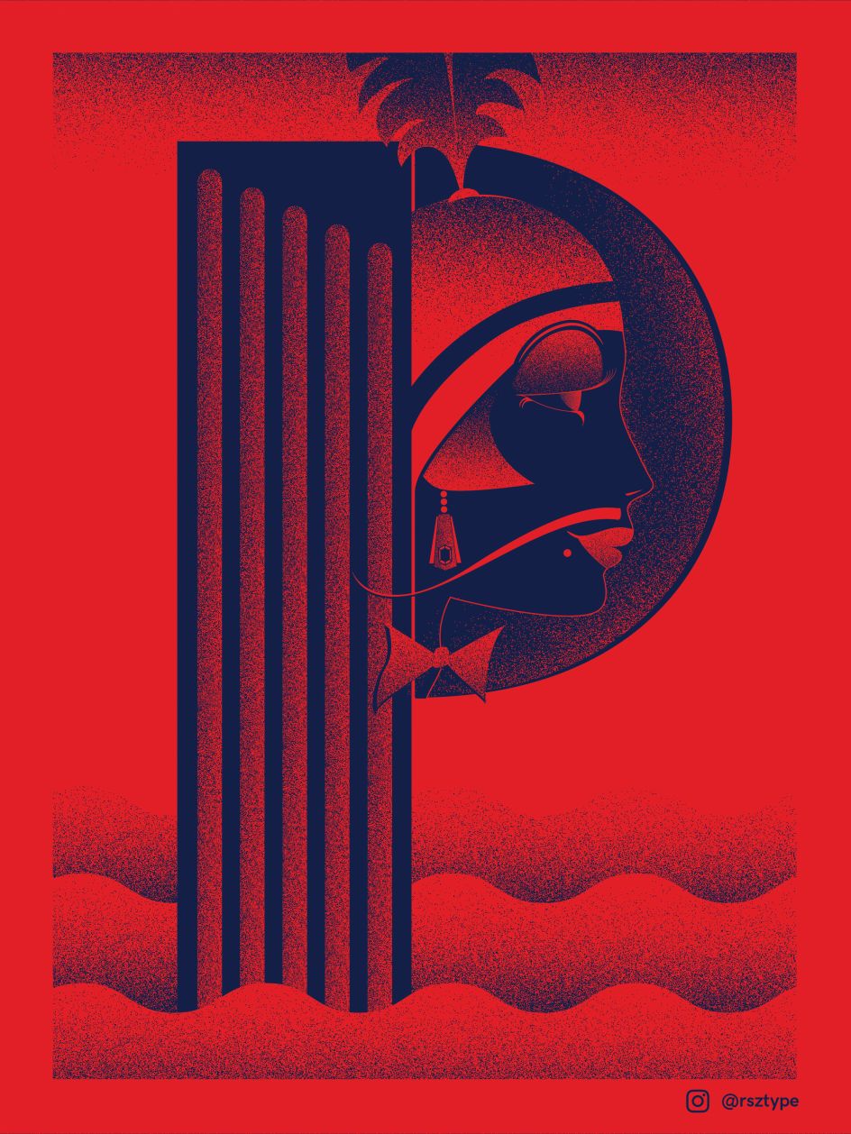
Giuseppe Salerno and Paco González of Pansy Craze-Era Glamour
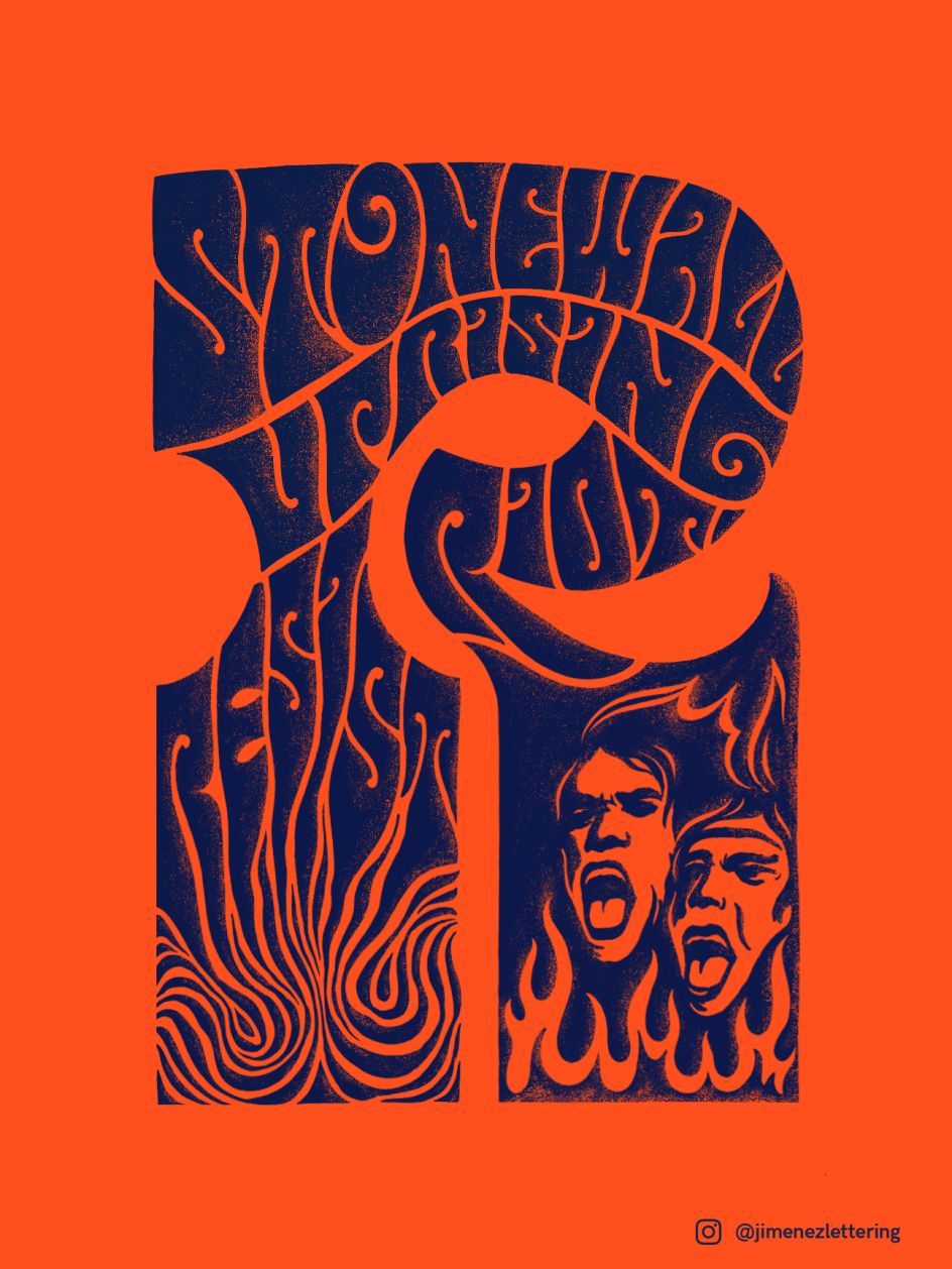
Ximena Jimenez on the Power of Unity and the Stonewall Uprising
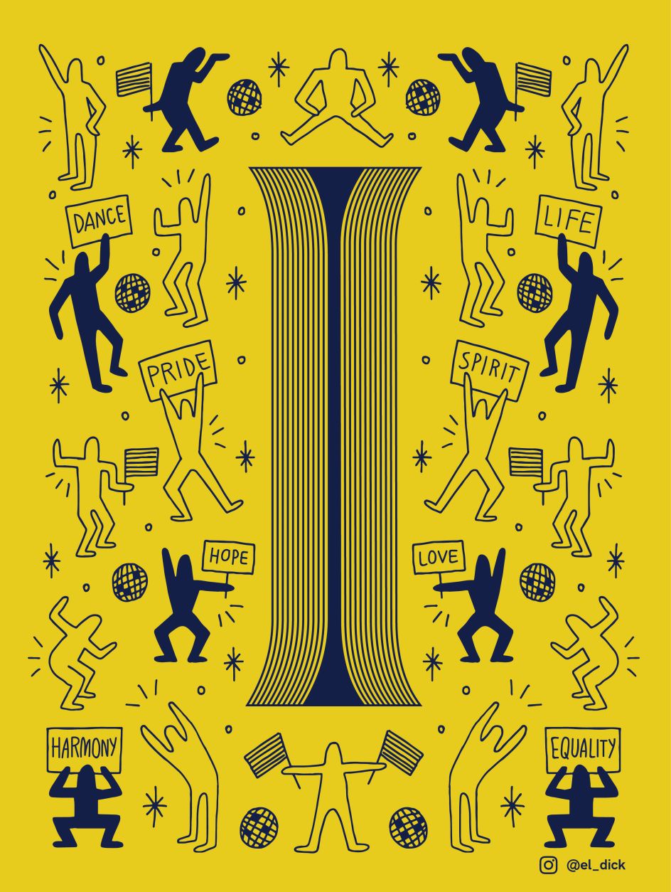
Lauren Dickens on Why Being Yourself is a Radical Act
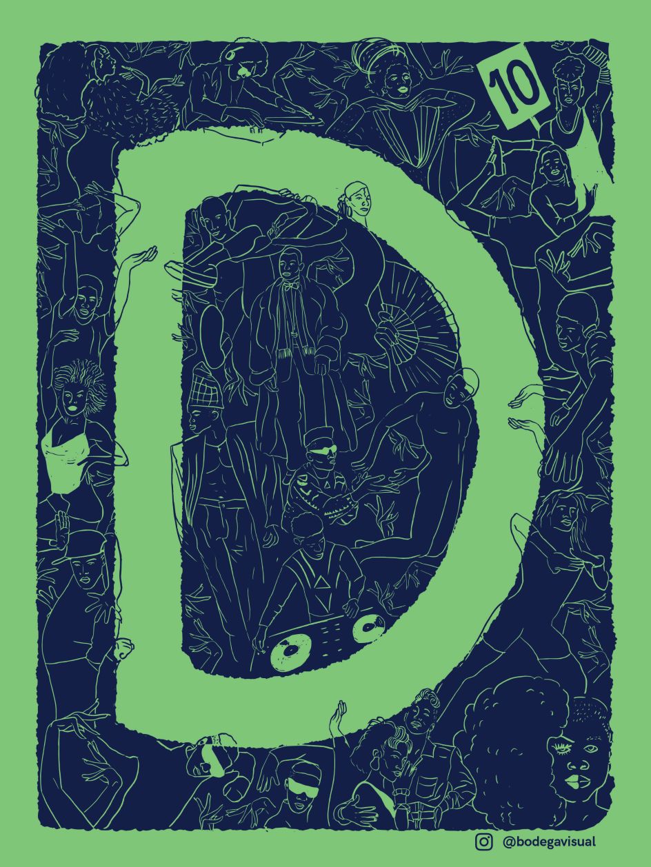
Claudia Gizell Aparicio Gamundi on Pride and Privilege
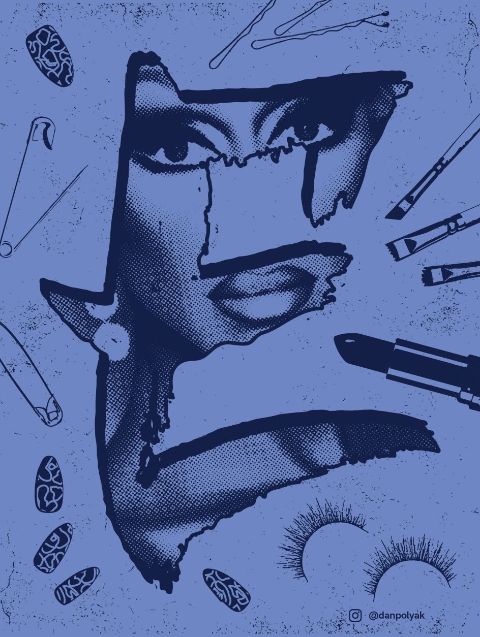
Dan Polyak on Confidence, Community and Year-Round Pride
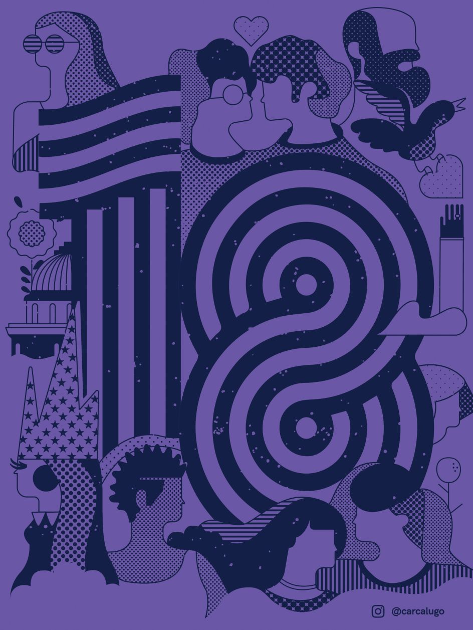
Carlos Castro Lugo on Bullying, Pride and Inclusiveness


 by Tüpokompanii](https://www.creativeboom.com/upload/articles/58/58684538770fb5b428dc1882f7a732f153500153_732.jpg)

 using <a href="https://www.ohnotype.co/fonts/obviously" target="_blank">Obviously</a> by Oh No Type Co., Art Director, Brand & Creative—Spotify](https://www.creativeboom.com/upload/articles/6e/6ed31eddc26fa563f213fc76d6993dab9231ffe4_732.jpg)


