An exciting glimpse inside Squarespace's new home in New York's West Village
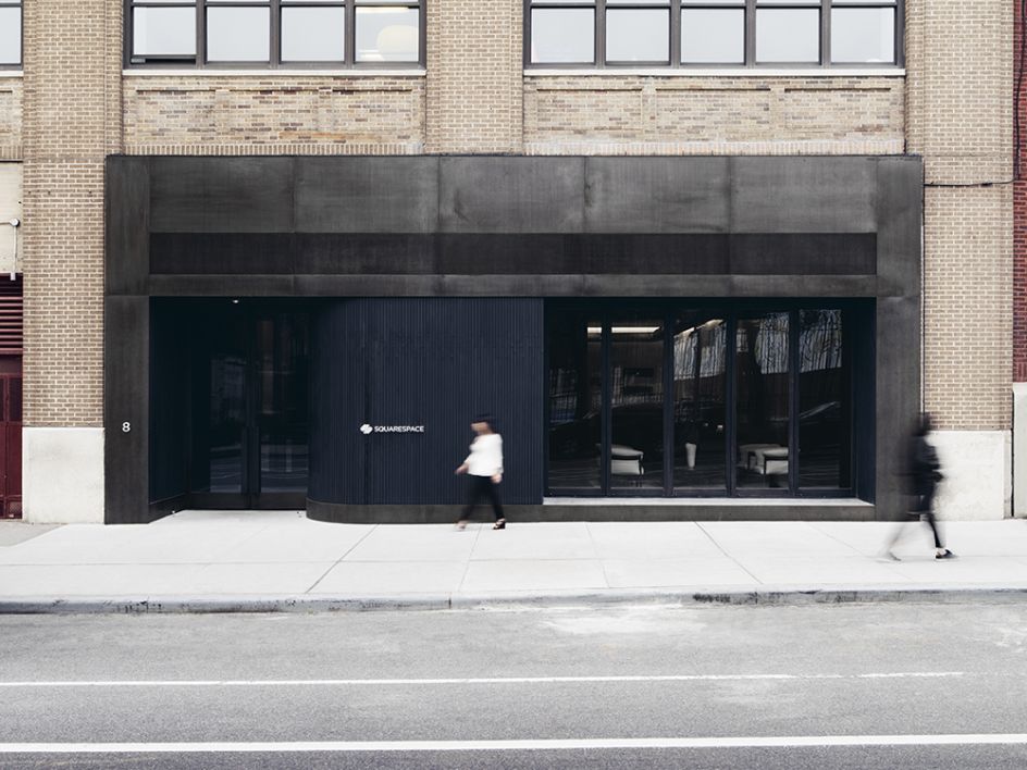
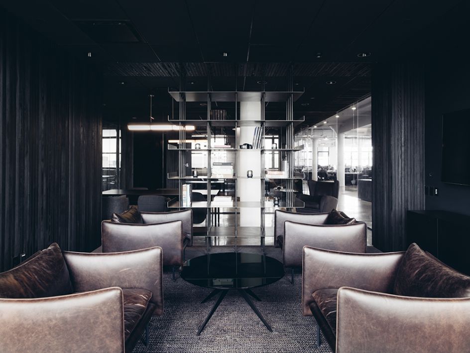
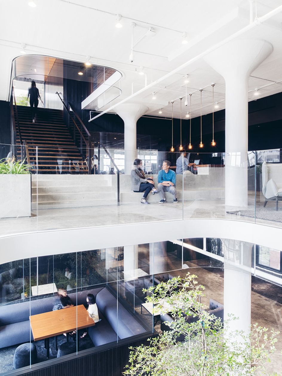
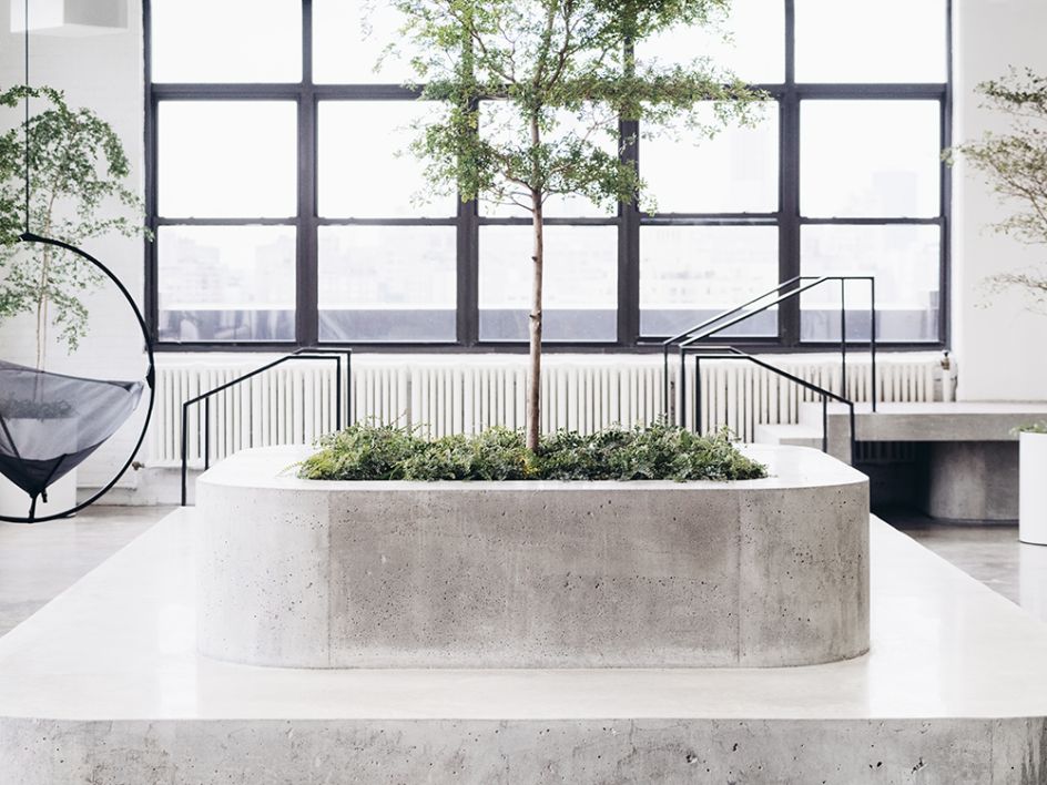
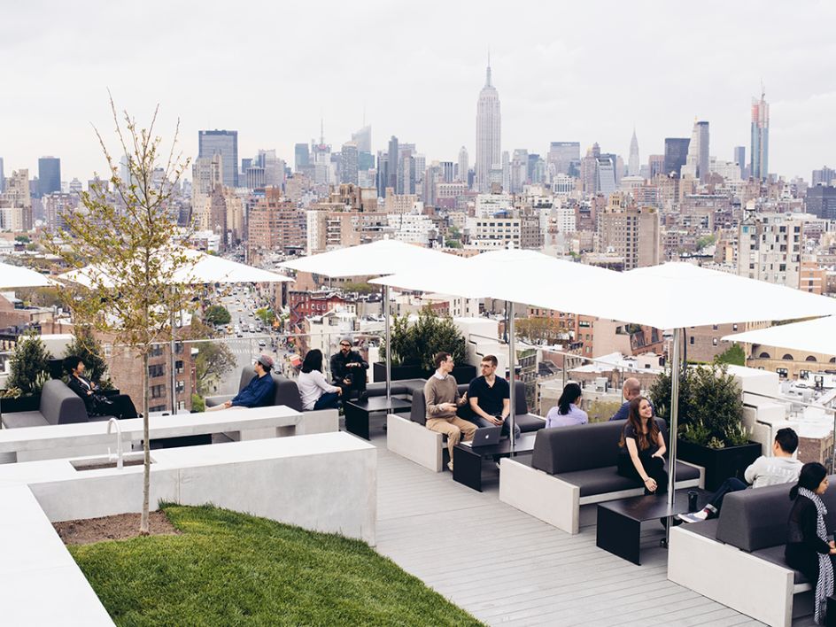
Squarespace has just moved to beautiful new headquarters in New York's West Village. Located in the historic Maltz Building with its own dedicated lobby and roof deck, the new 98,000 sq. ft. space is spread out over three floors and mimics the website building tool's clean and minimalistic aesthetic.

The building, which originally served as a manufacturing hub in the Printing House District, once played an important role in disseminating information and producing print material throughout the mid-20th century. Now, decades later, Squarespace is carrying that torch by allowing more people to express their ideas freely on the web.
Whilst most tech companies have attempted to combine their workplaces with adult playgrounds, Squarespace has taken a slightly different approach. We spoke to Squarespace Founder & CEO Anthony Casalena to find out more...
What was on your wish list when searching for a new workspace?
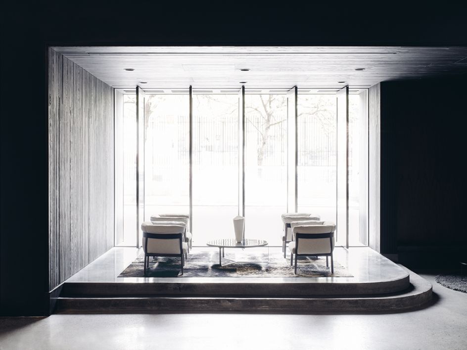
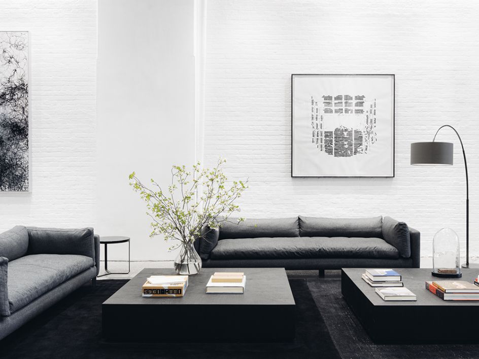
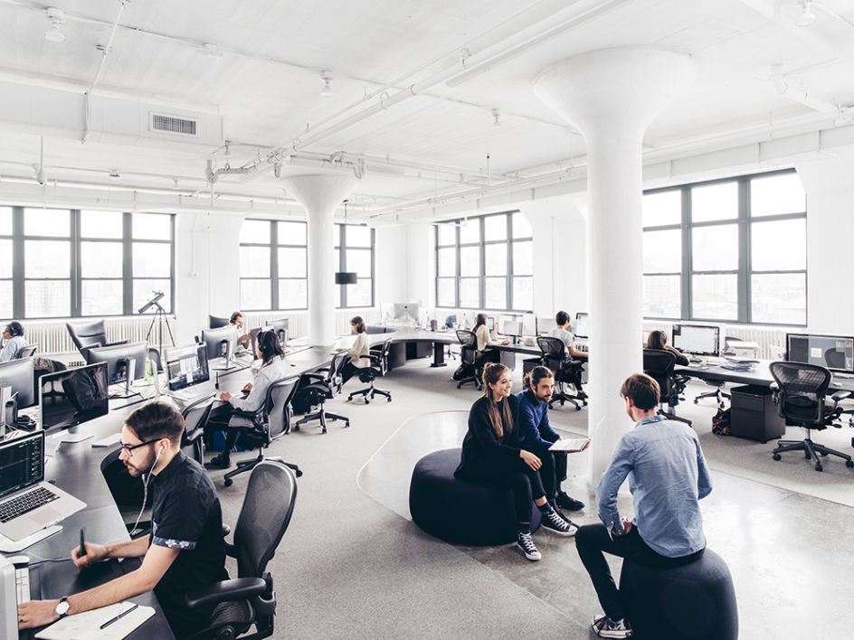
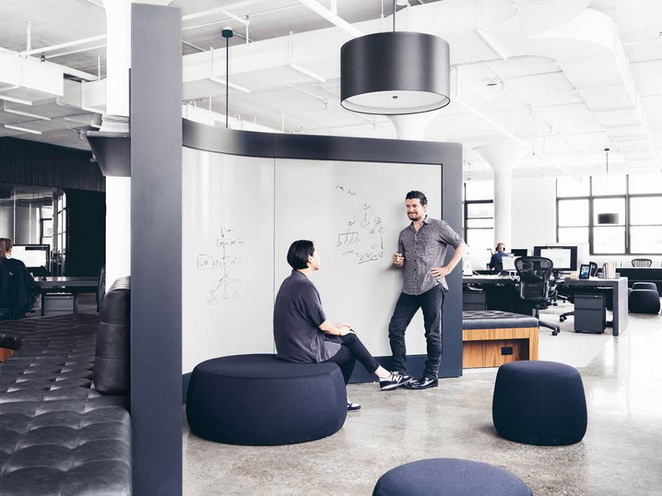
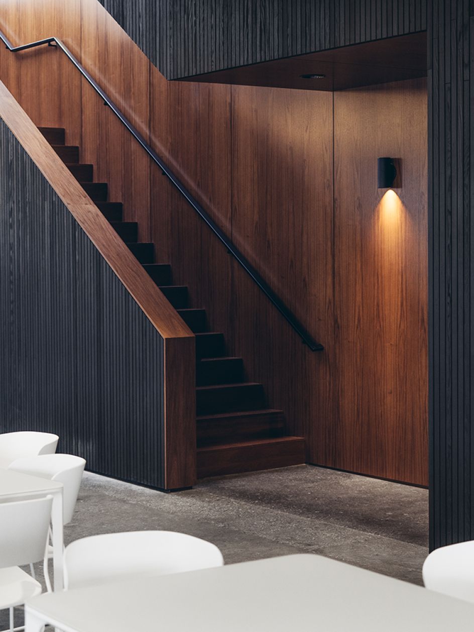
We’ve always taken great care and pride in our workspaces — it’s part of our DNA. Two things stand out: first, we wanted a space with varying textures, richness, and warmth, that stayed true to our design and brand aesthetics. Secondly, we wanted our new office to improve how various teams could collaborate. Before we moved, we were spread out across four different offices in Soho, and I knew we needed needed communal spaces where people could comfortably meet and brainstorm. This new office achieves both.
What makes your new home special?
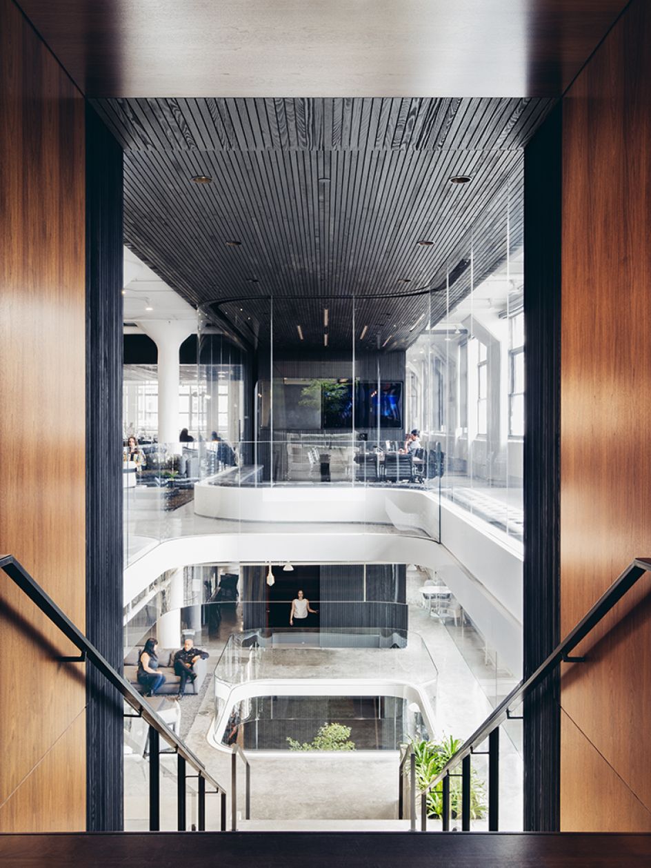
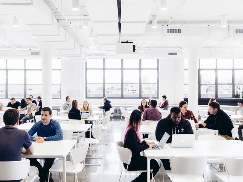
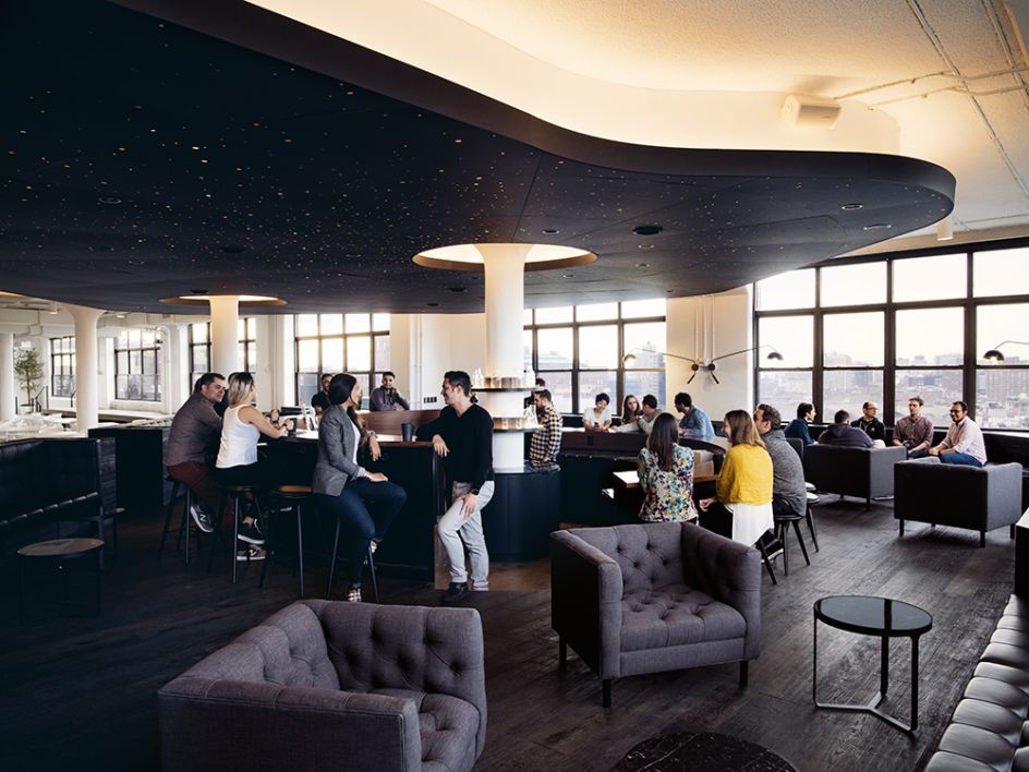
The design of the office is not only beautiful but functional as well. One of Squarespace’s brand values is 'design is not a luxury', and this office embodies that perfectly. The space is organised like a building within a building. Black slat walls surround a central core that consolidates enclosed space including mechanical space, vertical circulation, pantry, restrooms and meeting rooms. The workstations and informal collaborative spaces are all situated in the sunlit perimeter, democratising the view of the breathtaking city skyline.
Also, given Squarespace’s dedication to cutting-edge technology, even the lighting in the office plays an integral role to the design. The area lights use smart bulbs with a programmable micro-chip, an innovative lighting system from Ketra that allows the lighting colour and intensity to be controlled by a single application.

What do you hope to get out of your new space?
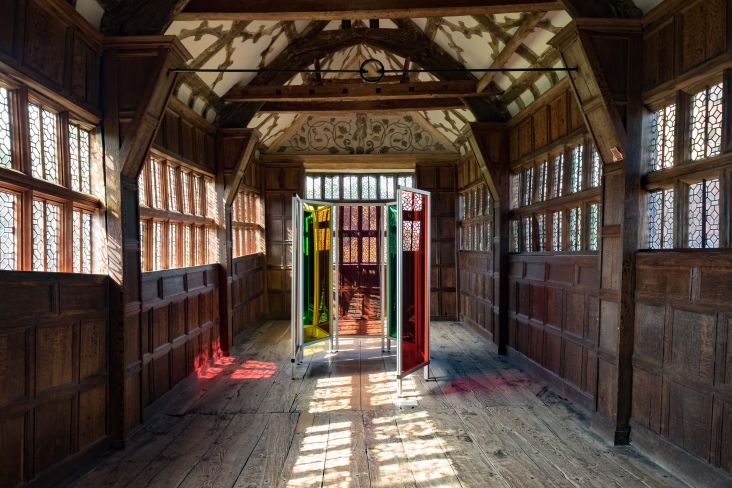
Our goal was to create an environment in which creativity, comfort, and collegiality could coexist. Moreover, as a company known for its dedication to design, we wanted to ensure that our new office reflected our identity. We’ve transformed our lobby – once an old loading bay – into an entryway that celebrates the work of some artists we admire, including Emil Lukas, a Squarespace customer.
How else are you hoping the space will benefit the company?
Just as we wanted the office to represent Squarespace’s identity in a cohesive way, we want the office itself to be a comfortable and productive work environment. The design of the new office has already streamlined our processes and made us even more efficient. We work best at Squarespace when we work together to solve problems creatively, and having everyone under one roof has already helped tremendously.

Do you have any favourite parts to your new headquarters? Tell us more.
There are so many beautiful elements to the space that I can’t pick just one favourite. However, we do have a breathtaking view of the city skyline, from the roof deck and the entire office. The buildings in the West Village are quite low, so it’s incredible getting the opportunity to see an unobstructed view of the city’s skyline.
Have you got an inspiring workspace?
Our popular Studio Tours give our audience a sneak peek inside creative workspaces across the globe. From tiny home studios and co-working spaces to some of the world's leading agencies and creative brands – we love to find out what your office looks like.
Think you've got something great to show us? Email the details and a few sample photographs of your workspace to [email protected].


 by Tüpokompanii](https://www.creativeboom.com/upload/articles/58/58684538770fb5b428dc1882f7a732f153500153_732.jpg)

 using <a href="https://www.ohnotype.co/fonts/obviously" target="_blank">Obviously</a> by Oh No Type Co., Art Director, Brand & Creative—Spotify](https://www.creativeboom.com/upload/articles/6e/6ed31eddc26fa563f213fc76d6993dab9231ffe4_732.jpg)


