Wildish & Co's hip branding reinvents the private members club for the modern era
Female-founded and Shoreditch-based Curve Club is a new type of private members club. Wildish & Co reveal how it seamlessly blended its branding and interior design.
Private member clubs have a reputation for being elitist, old-fashioned and full of fusty old men. But things are changing.
Curve Club was founded by a fully female team, including CEO Rosie Dallas, co-founder of rental platform Fat Llama. And they turned to creative agency Wildish & Co to create branding that would sell the concept of a different kind of club.
The new 'founders only' private members club is located in east London's hip Shoreditch district and bears the strapline "authentic, ambitious founders".
"Curve Club is a place where digital technologies, physical materials and living things meet," explains Sam Fresco, founder of Wildish & Co. "It thinks about tech in the most romantic sense: as a means to connect with one another."
Concept and influences
Wildish & Co.'s brief for the branding was centred on the idea of 'physical meets digital'. The club itself marries these two worlds through things like NFT artworks and a members-only community-based app, and the look and feel had to also straddle both spaces.
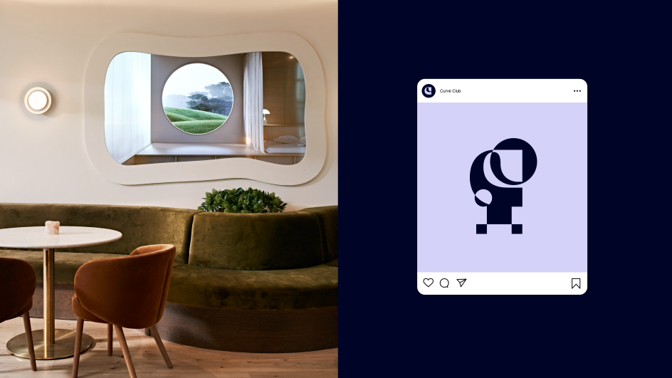
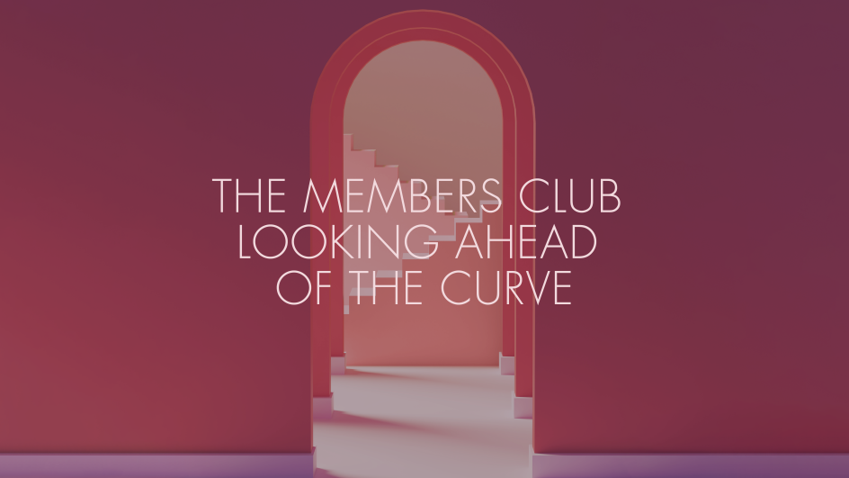
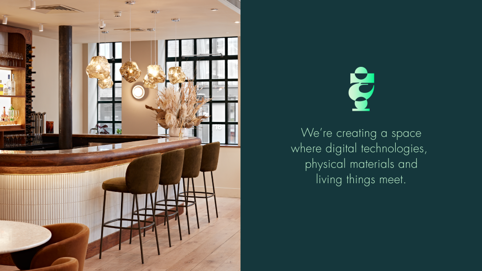
The club is billed as a "luxurious clubhouse for people busy turning their dreams into reality," a further nod to the blurring of different worlds: digital and physical, dream-like and reality.
Wildish & Co. started out by looking into things like computer games, where digital worlds were informed by physical sites and vice-versa. "We looked at various nostalgic and romantic territories for inspiration," says Wildish & Co. creative director Jake Allnutt.
"The final branding was mostly informed by references from modernist 3D art, digital sculptures, 3D still-lifes and digital architecture," he adds, citing the work of CG artist Fernando Gasperin.
In an unusual twist for a branding project, the designs would directly play into the club's interior design. Elements of the logo, for instance, have become sculptural forms based on 3D renders that can be accessed digitally.
"We built a really fun render in which a user could scroll through a doorway into the digital club," explains Wildish & Co. brand partner Harm Kerkhof. "Once through the doorway, lots of 3D shapes merged together into the Curve Club logo, which stood front and centre. It really captured the essence of the fluidity of concept and the merging of both worlds."
He adds that the name Curve Club also "massively" informed the identity in its fluidity, further enhancing "the idea of seamlessly moving between both spaces".
Logo and typography
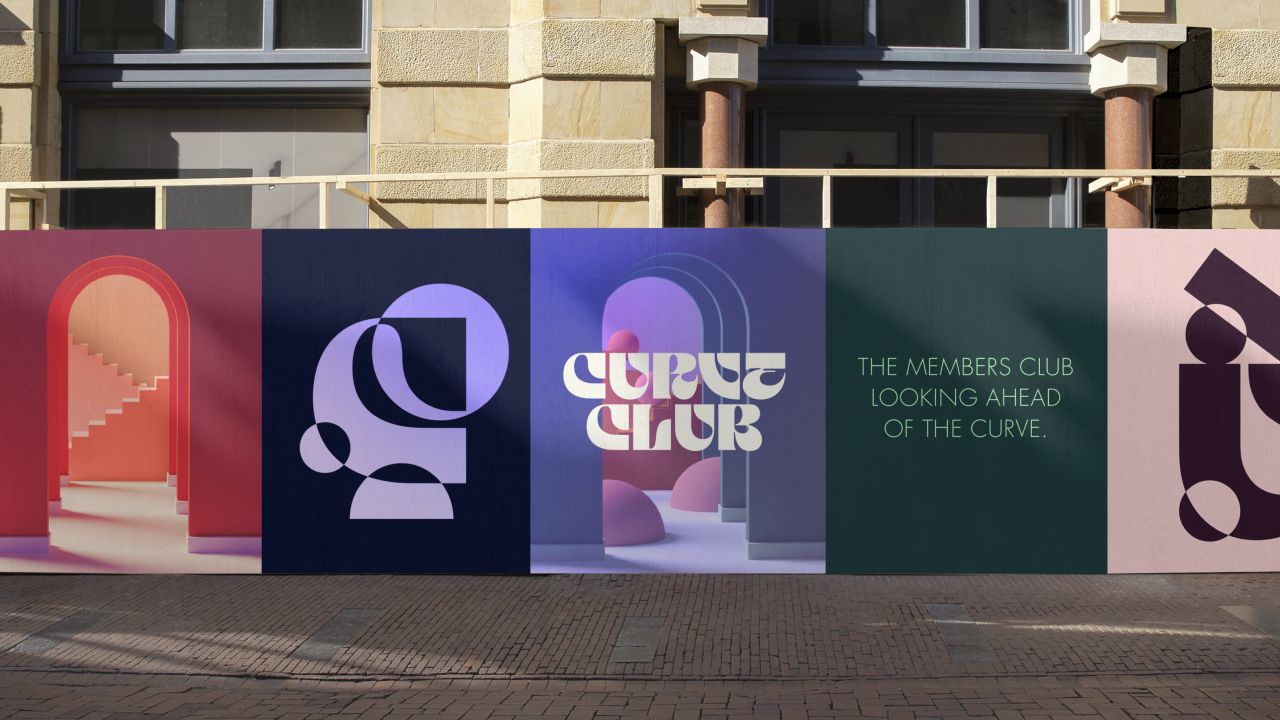
The all-uppercase Curve Club logo uses a lightly customised version of Taklobo Display by French font foundry Blaze Type.
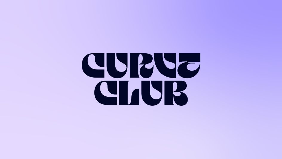
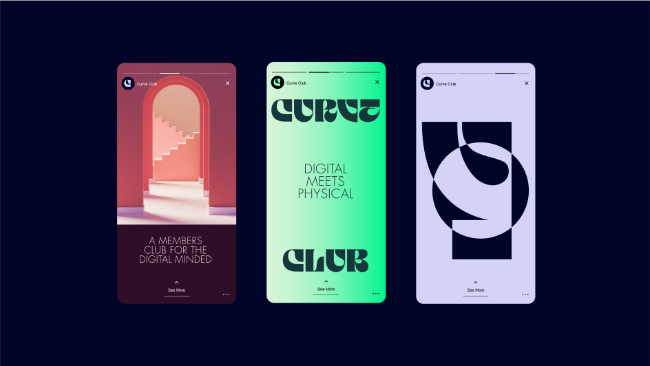
"This was chosen for the way its letterforms resemble a moving, living, dynamic thing," says Fresco. "It also perfectly encapsulates the timeless nature of Curve Club – futuristic, yet nostalgic." The logo also appears in animated forms to further bring the brand and its curves to life.
For headlines and body copy, the new identity uses Futura Std Light – chosen for its clean, legible lines – as a foil to the more decadent type of the logo mark. "Futura also evokes a retro modernism which we felt worked well for Curve Club," says Fresco.
Physical space
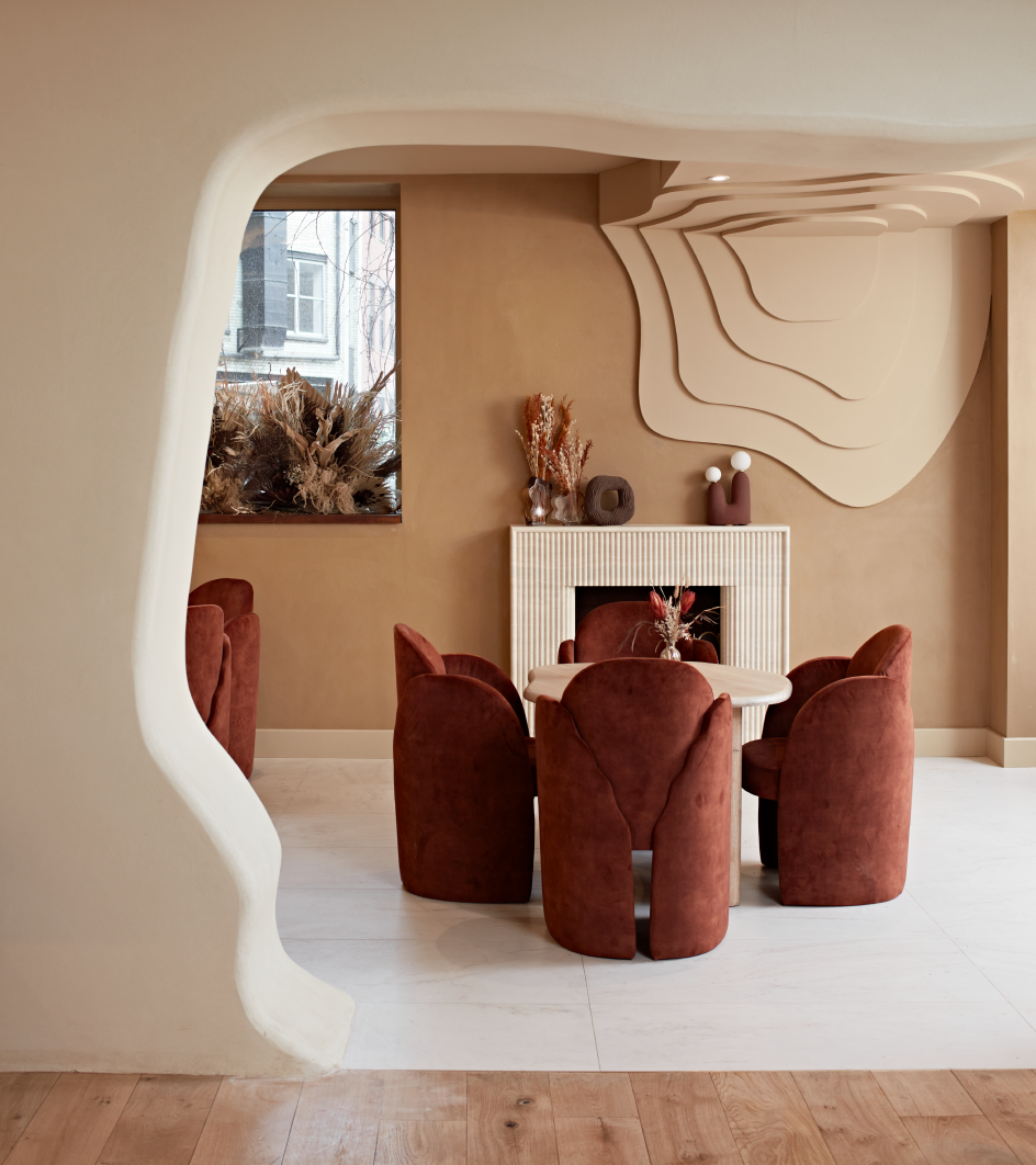
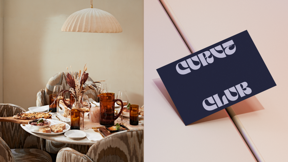
The club's physical space itself is designed around tactility, dialling up elements that look to evoke nature's own curves and lines. As such, the Curve Club brand colours use gradient pairings of eight different shades of green, pink, purple and blue chosen for their nods to more natural organic tones.
"The paler pink, stone-like tones are the primary brand colours: they look to bring the 'outside in' for the physical space and help deliver the Curve Club experience," Fresco explains.
"The dark blues and burgundy are used to punctuate the palette but avoid classic 'tech' tropes: the colours are more in line with a hotel or high-end hospitality than a modern-day start-up."
Digital meets physical
The team worked hard to ensure that the physical design of the club and its digital branding reflected and complemented each other. "This was a really interesting project for us in having to marry the physicality of the space with its firmly digital-first mindset," says Wildish & Co managing director Sam Fresco.
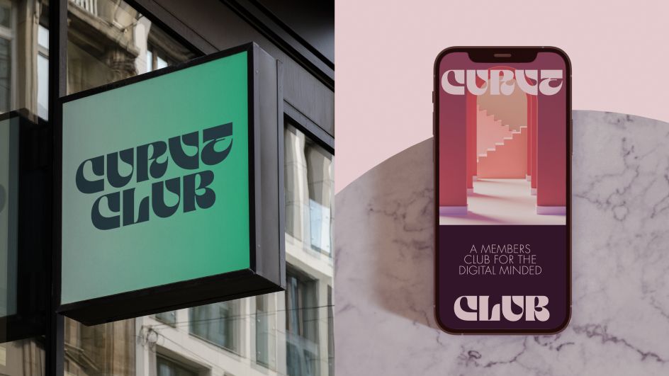
Arched door-like shapes are central to the branding across two and three dimensions, referencing the idea of entering a distinct Curve Club portal, whether online or in person. Brand photography was selected to further amp up that idea of otherworldly or dream-like states.
"The photography looks to blend digital art and reality, offering a sense of escapism and somewhere new, unspoiled, and not-yet experienced since Curve Club is a new breed of clubhouse – something that blends two worlds to become something entirely different," says Fresco.
"It was great to work on an identity that balances art and design but which is still playful in spirit," he adds. "The client was genuinely looking to do something different, and which looks to the future – something ahead of the curve."
Curve Club in Shoreditch is now open and accepting applications, and its Soho branch will launch later in 2023.


 by Tüpokompanii](https://www.creativeboom.com/upload/articles/58/58684538770fb5b428dc1882f7a732f153500153_732.jpg)


 using <a href="https://www.ohnotype.co/fonts/obviously" target="_blank">Obviously</a> by Oh No Type Co., Art Director, Brand & Creative—Spotify](https://www.creativeboom.com/upload/articles/6e/6ed31eddc26fa563f213fc76d6993dab9231ffe4_732.jpg)


