Ping pong tables that spring to life with AR and celebrate the sport's signature moves
Art of Ping Pong and London-based design agency Campbell Hay have collaborated on eight uniquely designed ping pong tables, inspired by the theme of opposing states. The graphics capture some of the signature moves from the sport and are further brought to life through animation and augmented reality.
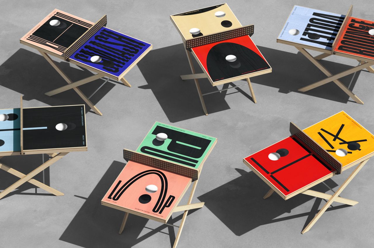
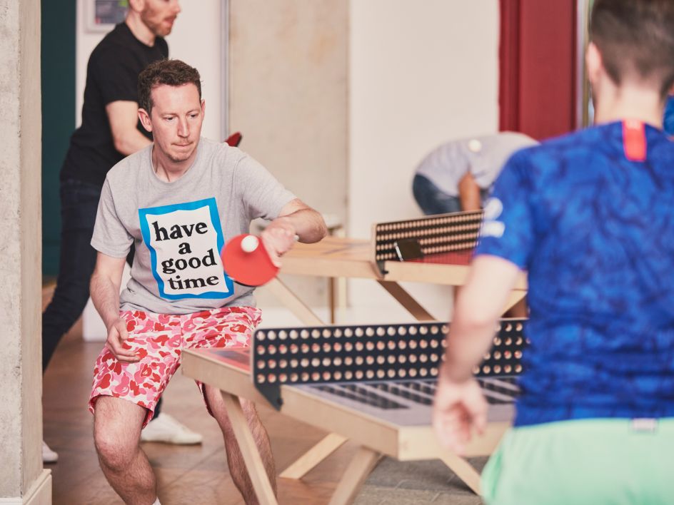
Currently on view at Islington Square in London, the distinctive tables express the joy of ping pong through vibrant colours, bold and animated typography. Simply use the accompanying Instagram filter and you'll be able to watch the tables bounce, smash and block. Two of the tables have been permanently installed there and anyone can use them, while six smaller 'ArtTables' are displayed in The Gallery at Islington Square when not in use.
"The opportunity to use design and ping pong to bring people back together after the year of social distancing we've been through was such a unique one," says Charlie Hay of Campbell Hay. "We really wanted to see how far we could push the concept."
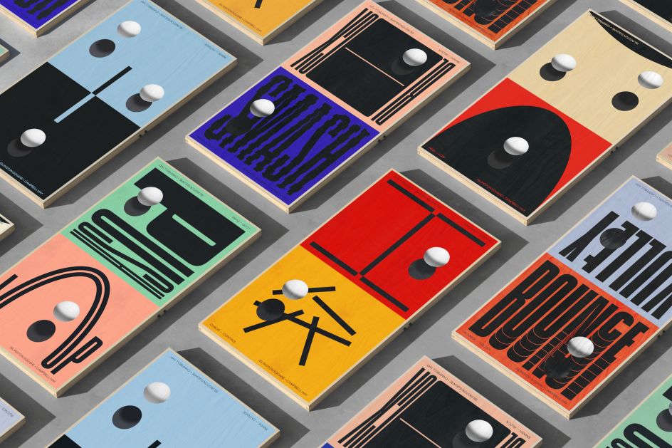
Wai Ming Ng, design lead on the project, adds: "We started with the idea of expressing signature moves and the dynamic nature of ping pong through typography. As we were discussing this idea in the studio we then naturally connected it with the idea of opposites as in ping pong you always play against an opponent. It made sense and the idea of opposing states could then be applied to broader themes related to the game and it opened up the possibilities for the creative as well.
"We researched existing moves in ping pong and paired the ones that could be played against each other. In the end we designed four typographic tables that express signature moves specifically and four abstract tables that are related to the game in a broader sense."
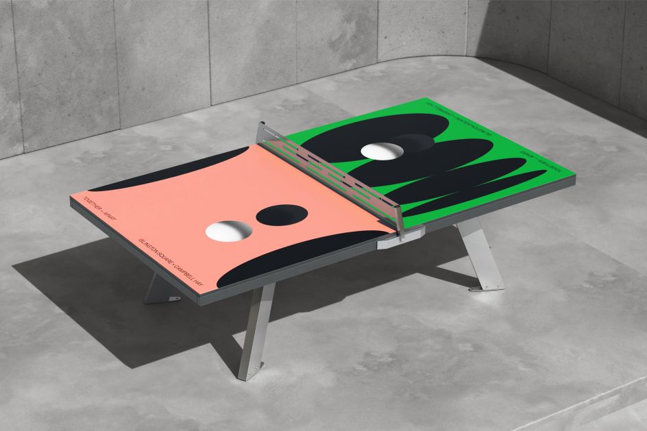
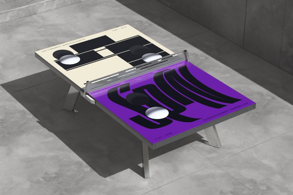
To bring the ideas to life, Campbell Hay began with static designs, but as the team were designing the graphics for the various tables, the "typographic designs became really animated in their static form as they were expressing dynamic moves," says Wai Ming. "It then made sense to push this even further and bring the designs to life through animation and the use of AR."
The translation from static design to animation was "easily made", according to Wai Ming. "Whilst working on the static versions, I animated the typography in my head first in order to reflect the dynamic ping pong moves, this process then led to the final static designs."
The chosen typeface was Coign by Colophon Foundry, as Campbell Hay needed something flexible to fit the various words into a square format. But this was only a starting point, as Wai Ming explains: "Each word was altered and designed in a way to express the meaning of the word and really bring the ping pong move to life." A bright and vibrant colour palette was also applied to reflect the "fun and dynamic nature of a ping pong game".


 by Tüpokompanii](https://www.creativeboom.com/upload/articles/58/58684538770fb5b428dc1882f7a732f153500153_732.jpg)


 using <a href="https://www.ohnotype.co/fonts/obviously" target="_blank">Obviously</a> by Oh No Type Co., Art Director, Brand & Creative—Spotify](https://www.creativeboom.com/upload/articles/6e/6ed31eddc26fa563f213fc76d6993dab9231ffe4_732.jpg)


