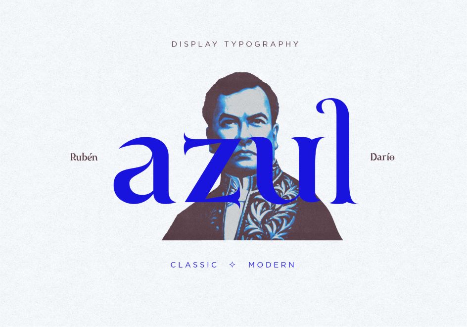
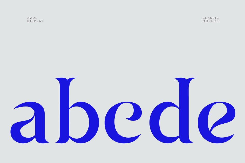
Azul is a classic-modern display typeface inspired by the Nicaraguan poet Ruben Darío
Designer Dainin Solis unveils his imaginative typographical proposal: a unique display font inspired by a Spanish-language legend.
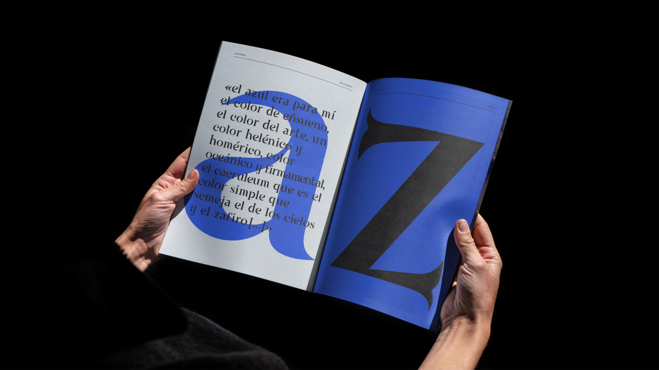
Who doesn't love an original and fresh typography project? All the better to reinvigorate your design projects and give you new ideas. And Azul is a great example that recently came to our attention.
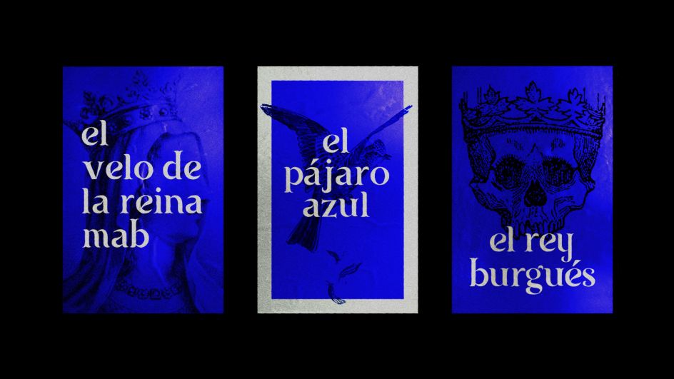
This typographic proposal was created by Dainin Solis, a logo and identity designer based in Nicaragua. Although it's based on a Roman structure, its strokes and terminations give it a classic, refined and stately appearance.
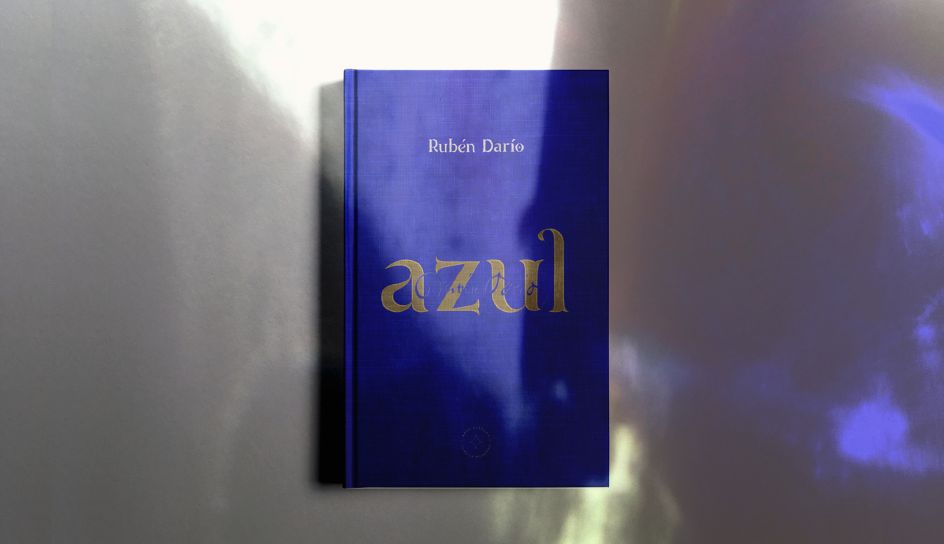
According to Daniel, Azul was inspired by the ornamental details in the diplomatic uniform worn by Nicaraguan poet Rubén Darío in front of the court of Alfonso XIII in Madrid, Spain. (That might sound a little obscure to English speakers, but Darío had a great and lasting influence on 20th-century Spanish-language literature and journalism as the father of the Modernismo literary movement.)


Daniel designed it during an intensive workshop titled 'Diseño tipográfico para dummies' [Typographic design for dummies], led by the designer and typographer Edwin Moreira. "From the first session, Edwin set us the ambitious challenge of designing 36 typographic signs of display character in just six, two-hour classes over five weeks," Daniel recalls.
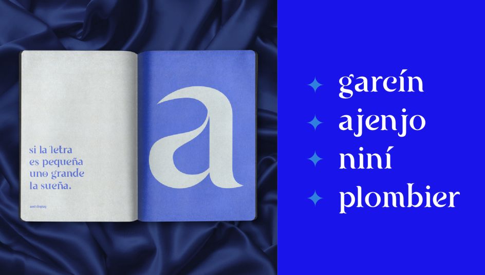
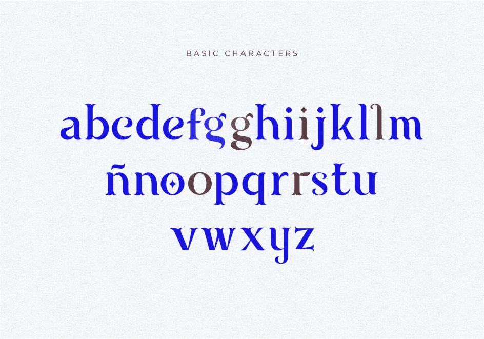
"Throughout the workshop, I developed the lower case characters, some upper case exercises, and a couple of punctuation marks. Also, I designed key visuals to show the typography specimen and test Azul Display in action.
"I love how this first version of the typeface turned out," he adds. "And although it still needs refinement, I'm excited to see what we accomplished in such a short time.
"I'll keep giving it love and working on the rest of the glyphs to complete the family. I thank Edwin for his willingness to share his knowledge, advice, detailed feedback and supervision, from the initial sketches until the final result."


 by Tüpokompanii](https://www.creativeboom.com/upload/articles/58/58684538770fb5b428dc1882f7a732f153500153_732.jpg)


 using <a href="https://www.ohnotype.co/fonts/obviously" target="_blank">Obviously</a> by Oh No Type Co., Art Director, Brand & Creative—Spotify](https://www.creativeboom.com/upload/articles/6e/6ed31eddc26fa563f213fc76d6993dab9231ffe4_732.jpg)




](https://www.creativeboom.com/upload/articles/d3/d3d5436e37126a9065227e6e0d3f2d50c79604cc_732.jpg)
