BrandMe bakes a smile into Lotus Biscoff brand identity
The Belgian biscuit brand's new wordmark is curved, while hints of laughter are evident in some of the bespoke typography characters.
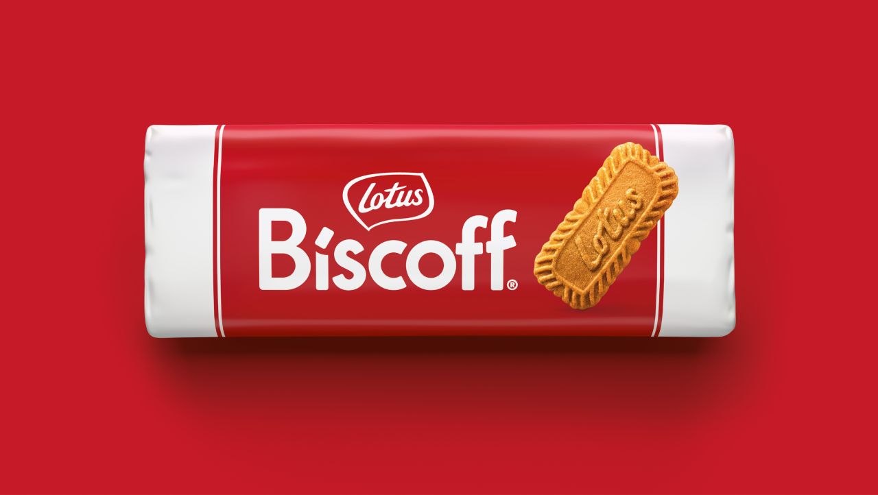
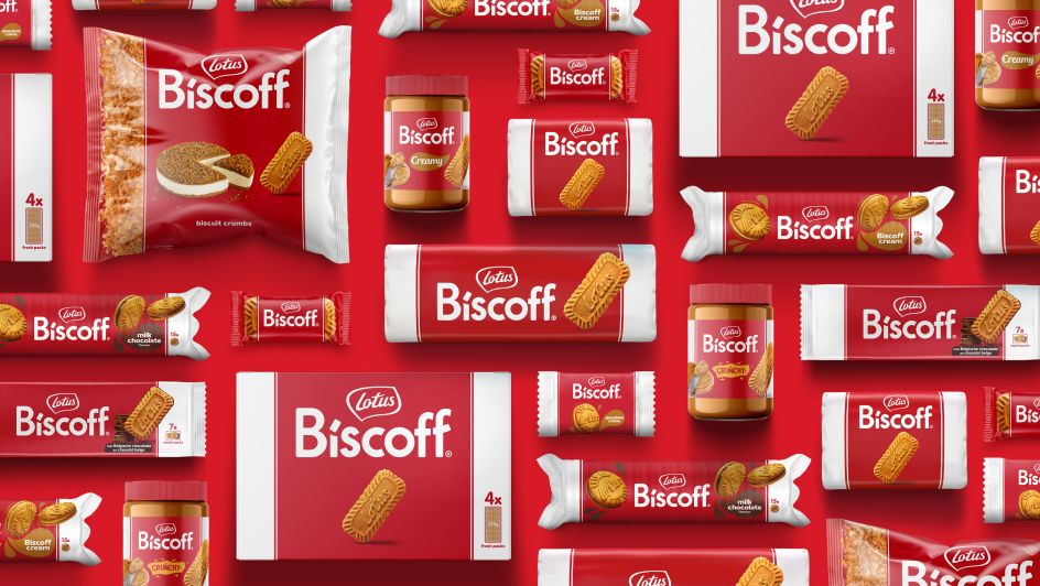
Much-loved Belgian cookie brand Lotus Biscoff has revealed its new brand identity by BrandMe. It includes a new bespoke typeface curved in the shape of a smile and restructured on-pack compositions that foreground product imagery.
The redesign comes as Lotus Biscoff moves into a crucial period of global growth, and a strong brand is required to support it. The focus was to "unify the brand globally and drive a stronger, more distinctive brand identity to reinforce global recognition", according to BrandMe client partner Erin Tucker.
Lotus Bakeries was already familiar with the London-based studio from their work on the nākd bars redesign. From this, introductions were made to the Lotus Biscoff team, and BrandMe succeeded in winning the project.
Every creative will know the pressure of working with such an iconic brand with a big cult following. BrandMe was well aware of the need to be sensitive to any reactions to change.
Protecting Lotus Biscoff's relationship with its passionate consumers was crucial to getting this work right. BrandMe did this by giving "a lasting impression that supported the love for the brand, retaining the delicious taste Biscoff is known for", says Tucker.
"We built on rich brand equity but were single-minded in our approach. We dialled up the essence of Biscoff's personality and celebrated the brand's joy and positivity."
A core asset in the new identity that embodies this positivity is the typeface. BrandMe associate creative director Charlotte Elder describes it as "a natural place to start" in creating a welcoming feel throughout the brand.
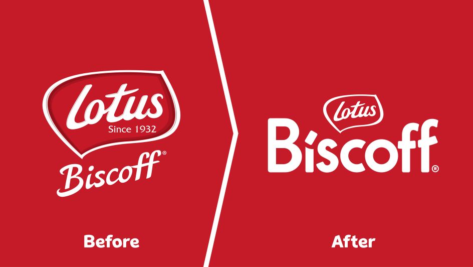
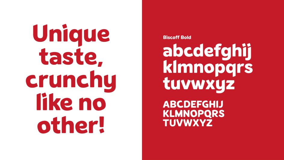
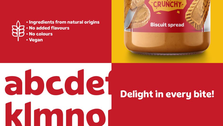
The simplified logo was designed with a smile in mind, featuring curves and a bold, impactful style while avoiding sharp edges. Looking in detail at the typeface, you might see hints of laughter in the lowercase' e' at the lowercase 'e'. At the same time, the twisting titles of the 'i' add "a characterful quirk and provides a playful link to the Biscoff identity", says Elder.
She adds: "We wanted to make sure it represents the warmth and friendliness of the brand".
Since Biscoff already has a strong personality and many iconic elements, BrandMe wanted to retain a level of consistency and recognition for existing consumers, particularly through the packaging. Elder notes how the "iconic cookie" and the "unapologetic, confident red" are key equities for the brand that must be preserved.
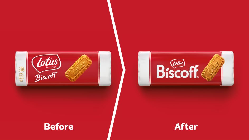
When these elements are paired with the joyful charm of the new identity, the result is "a semiotic smile on the pack that reinforces the brand's positivity," says Elder. The most notable change to the packaging is the positioning of the cookie, which now overlaps the red and white detailing to help it stand out and bring greater impact on shelves.
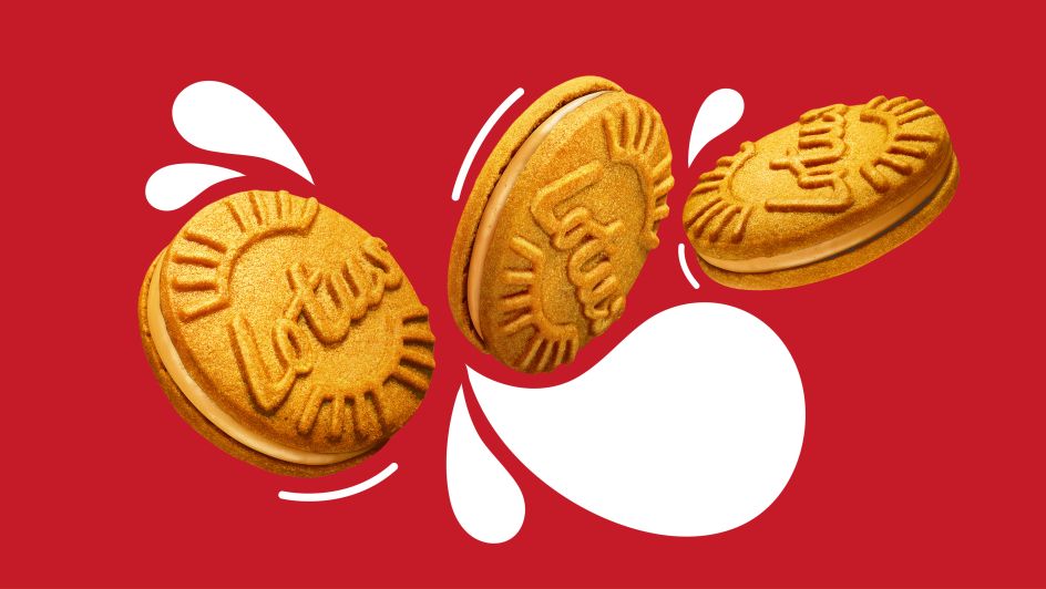
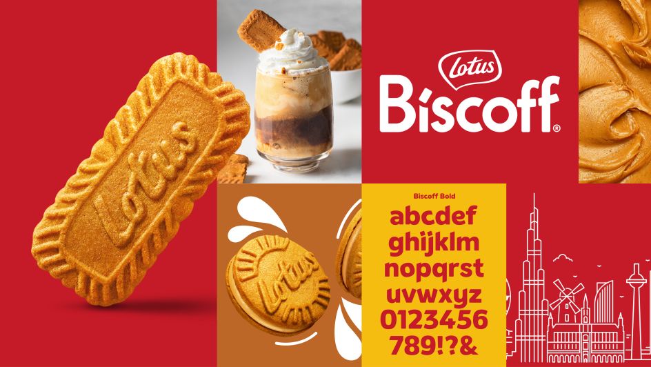
Another challenge with this project was that different markets had different versions of the identity. In some countries, Lotus was the focus and more well-known than Biscoff, while in others, the brand was led by the Biscoff brand name.
"We were asked to create a brand identity that enabled global consistency while expressing the bright, playful aspects of Biscoff's personality", Tucker explains. The studio was ultimately tasked with balancing reassurance and recognition of Lotus's rich heritage.
Tucker adds: "Lotus and Biscoff were fighting for attention, and we wanted to allow Biscoff to take the lead."
BrandMe says it was "a fantastic opportunity" and that the design team was "excited by the challenge" and appreciated being trusted to redesign such a well-loved global brand.


 by Tüpokompanii](https://www.creativeboom.com/upload/articles/58/58684538770fb5b428dc1882f7a732f153500153_732.jpg)


 using <a href="https://www.ohnotype.co/fonts/obviously" target="_blank">Obviously</a> by Oh No Type Co., Art Director, Brand & Creative—Spotify](https://www.creativeboom.com/upload/articles/6e/6ed31eddc26fa563f213fc76d6993dab9231ffe4_732.jpg)


