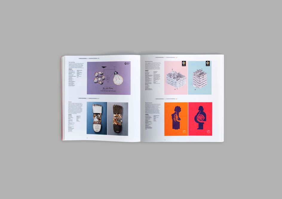
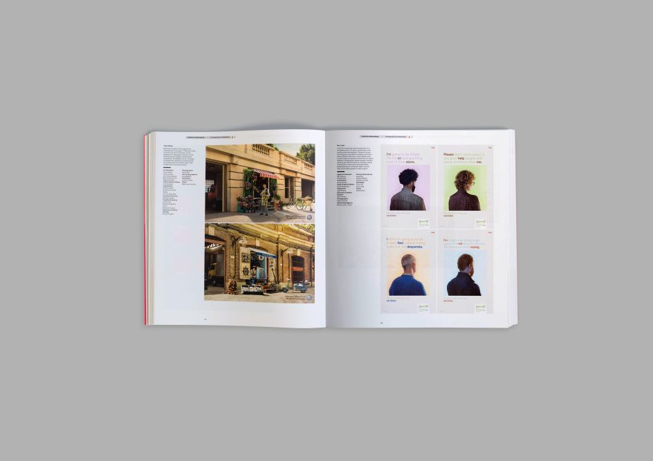
D&AD unveils 2016 annual comprising a collection of the best in design and advertising
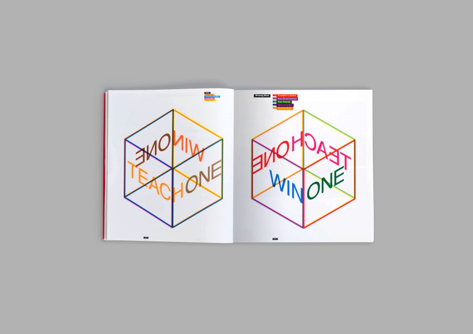
Although you may already be familiar with the D&AD annual, you haven't yet been acquainted with its new format for 2016. In his year as president, Andy Sandoz has positioned the brand at the forefront of the future of design, abiding by the mantra “win one, teach one", which in its simplest form, challenges all awarded creatives to look at how they got to where they are, and help to teach the next generation about what it takes to make amazing, awe-inspiring work.
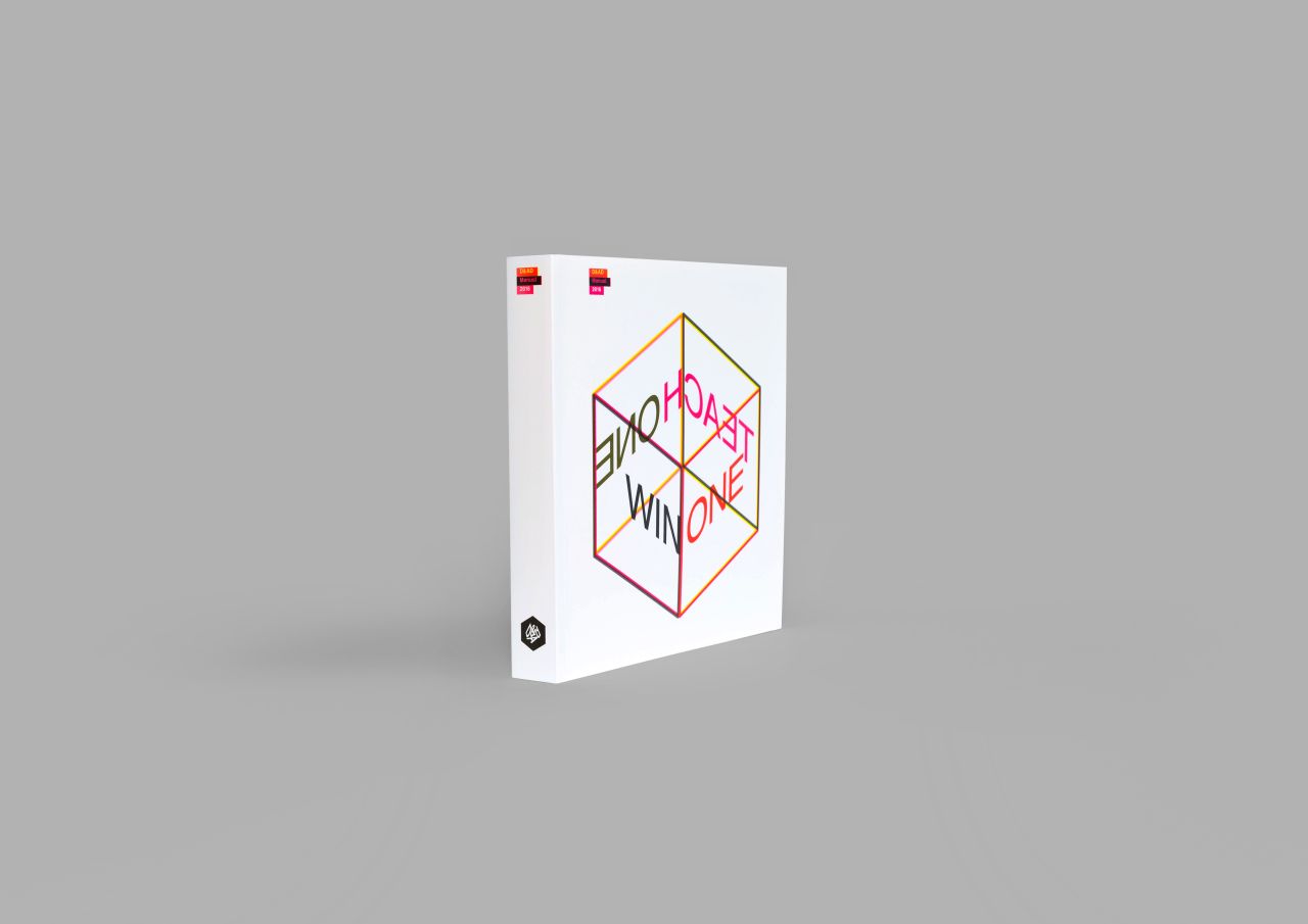
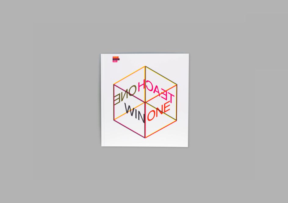
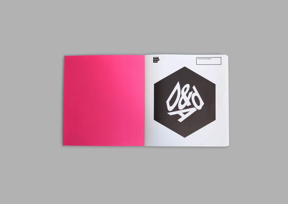
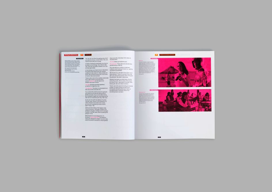
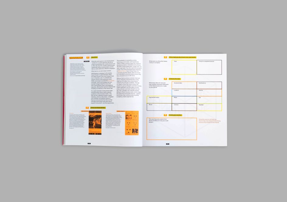
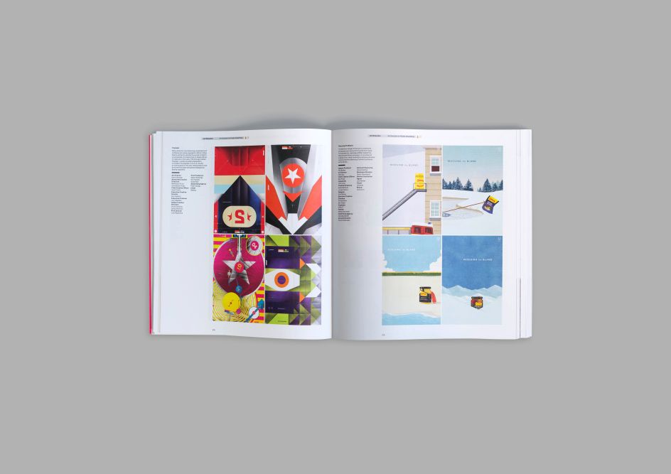
His final act as President has been to reinvent the Annual. Renamed the Manual, this year for the first time the Annual isn’t just a record of the best awarded creative work from 2016, it also asks the reader to think about what this work can teach us.
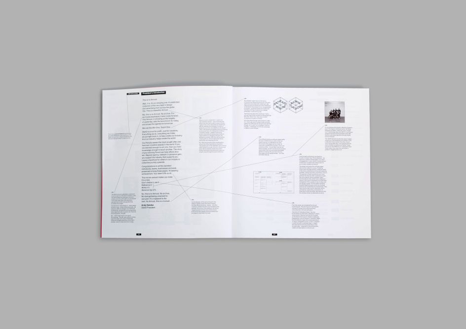
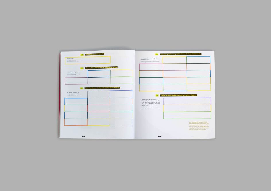
It features interactive exercises created by B+A (formerly known as Ben&Andrew), based on lessons from Christopher Ball, Patrick Collister, Nick Eagleton, Thea Frost, Al MacCuish and Andy Sandoz himself.
"This year’s book is best read with a sharpened pencil and an open mind, so that notes can be taken and questions answered. It’s time to go back to school."
On the new Manual format, Andy Sandoz commented: “This is no Annual. Well, it is. It’s an amazing one. A celebrated collection of the very best in design and advertising from across the globe. No dust-gathering ornament to last year. It’s a signpost to the next. No Annual, this is a manual.”
“Our Pencils remain the most sought after and hard won creative awards in the world. If you are talented enough to win one, then you hold knowledge enough to teach another. The story of your winning Pencil can help others also win. Beyond agency, network or personal gain, you support the industry that supports you. Leave a handhold for others in our industry’s collective journey upwards.”
“Congratulations to all the awarded individuals, teams, businesses and work preserved among these pages. A towering achievement. Your talent lifts us all. This not-an-annual makes you taller. It is a tool. Don’t shelve it, use it. Reference it. Write in it. Stand on top of it.”
This year’s Annual was designed by Lucienne Roberts, an independent design practitioner of studio LucienneRoberts+, with a publishing venture on the side. And for the third year running, D&AD’s partners Hogarth provided the retouching, colour management and general reprographics for the book. Discover more at dandad.org.


 by Tüpokompanii](https://www.creativeboom.com/upload/articles/58/58684538770fb5b428dc1882f7a732f153500153_732.jpg)


 using <a href="https://www.ohnotype.co/fonts/obviously" target="_blank">Obviously</a> by Oh No Type Co., Art Director, Brand & Creative—Spotify](https://www.creativeboom.com/upload/articles/6e/6ed31eddc26fa563f213fc76d6993dab9231ffe4_732.jpg)


