Future Docs' sector-defying identity by Unfound aims to get more students through med school
After a turbulent few years for the NHS, Future Docs is on a mission to bolster its workforce by coaching students through competitive med-school applications with an intuitive and accessible brand and website.
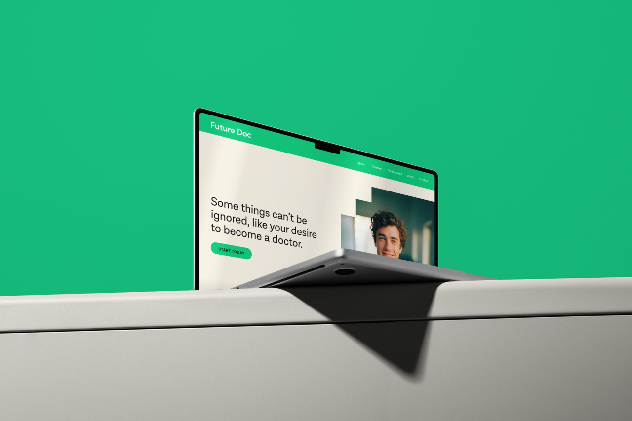
Brand design studio Unfound has developed a new identity and website for Future Doc, an educational platform that aims to help future doctors get into and get through medical school. Led by an ownable colour, custom icons and a "reassuringly confident" tone of voice, the new identity looks to take Future Doc to the next level in supporting the turbulent healthcare system in the UK.
Getting onto a medical course at university is not only difficult but extremely competitive, with only 16% of undergraduate applicants and 2% of graduate applicants being accepted. Future Docs offers a 93% success rate for guiding future doctors into med school, which Unfound creative director Jay Topham describes as "a valuable and compelling service, not just for budding doctors, but for the future of healthcare".
In the past few years, the NHS has been at the forefront of our nation's consciousness and made media headlines, not always for positive reasons. Almost exactly four years ago, the Covid-19 pandemic began, and since then, there have been countless doctors' and nurses' strikes, never-ending waiting lists, and a chronic lack of funding for our healthcare system.
More recently, in the budget announcement on 6 March, Chancellor Jeremy Hunt confirmed an additional £2.5 billion of day-to-day revenue funding for the NHS in England in 2024/25, as well as £3.4 billion in capital investment to boost NHS productivity through AI, digital and other tech-related investments.
A financial upturn may well take NHS in a new, more positive direction. However, Future Docs can also make a difference with its bottom-up approach, bolstering its workforce by making medical education more accessible, but not without the right creative and strategic direction.
While there are some brands already operating in this space, Unfound Studio set out to "avoid the conventions of the category", such as clinical blue hues, "childish illustrations", and "transactional language", according to Topham. Competitors came across "more like textbooks than tech platforms", he says, but Future Doc wanted to convey the "emotive side" of med school, from fears of failure and parental pressures to overcoming setbacks.
To set Future Docs apart from the crowd, Unfound led with imagery, which was initially produced using artificial intelligence so that students could see themselves in the brand's communication. Students can see themselves in a graduation gown or wearing a doctor's coat on their first shift, adding another layer of motivation, but they can also see the flip side where they might struggle with studying. The whole idea centres around making students feel heard and being transparent throughout the Future Docs guidance process.
Going deeper into the brief, Unfound Studio had several core aims for the new identity: to increase brand equity as a leading business, to implement consistent communications, and to position Future Docs as the go-to university personal mentoring service within five years.
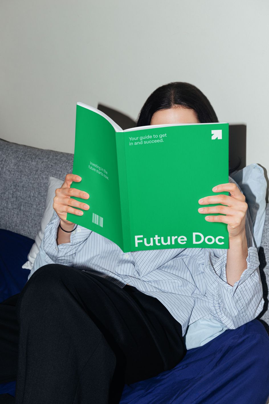
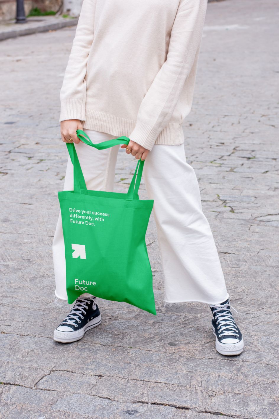
In response, the studio introduced an ownable green hue as the brand's lead colour- an antithesis to the sea of conventional blues in the space. Unfound also designed four custom icons to signal growth, journey, testimony, and study, which are used to sign-post Future Docs and steer users toward specific topics depending on their needs.
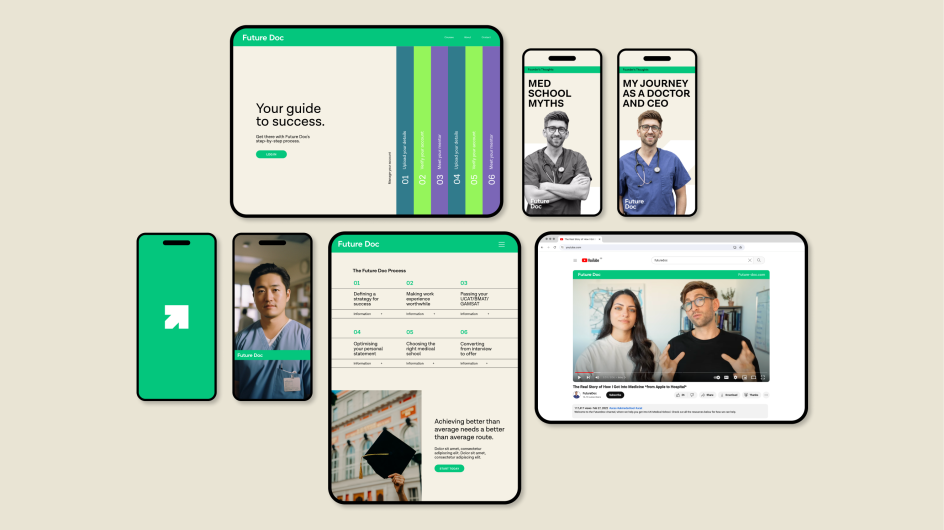
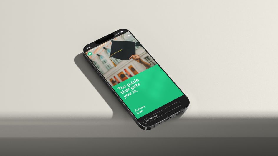
The tone of voice was hugely important for this rebrand, so the studio crafted a verbal language that was "reassuringly confident" with "no ifs, buts and maybes", says Topham. Recognising the challenges that students face and building their confidence in the face of those challenges was key to devising the right tone of voice, he adds, explaining how the brand leverages "short impactful statements to inspire people to believe they can achieve".
Unfound Studio was also responsible for Future Docs' website, which was designed around the idea of building "a prominent brand for prominent candidates" and being "visibly better in all the right places", says Topham. A "one-size-fits-all" approach would have fallen flat with this project, as the brand needed to be able to flex across marketing channels with distinct characteristics.
"From intuitive web layouts that guided students through step-by-step processes to attention-grabbing social thumbnails that felt recognisably Future Docs, this project led with a digital-first approach", Topham explains.
One of the main challenges for the studio was reflecting Future Docs founder Dr Ashley Hilton's ambitions for a bold growth trajectory by future-proofing the business model. Topham says the identity work "pushed the concept into a territory that may not have felt particularly familiar for the client to form assets and ideas that could evolve for those future disciplines and subjects".
As a result, the brand toolkit that the studio created can be flexed across medical courses while also considering other sectors and subjects that the platform might cover as it grows, such as Future Lawyer or Future Architect.


 by Tüpokompanii](https://www.creativeboom.com/upload/articles/58/58684538770fb5b428dc1882f7a732f153500153_732.jpg)


 using <a href="https://www.ohnotype.co/fonts/obviously" target="_blank">Obviously</a> by Oh No Type Co., Art Director, Brand & Creative—Spotify](https://www.creativeboom.com/upload/articles/6e/6ed31eddc26fa563f213fc76d6993dab9231ffe4_732.jpg)


