Grato Marker is a 'charmingly wobbly' new typeface by TypeMates and designer Teja Smrekar
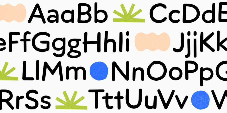
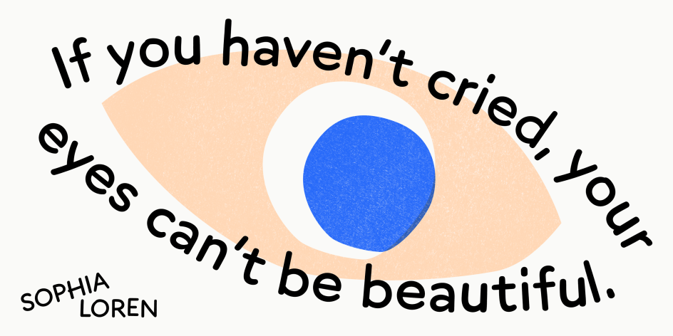
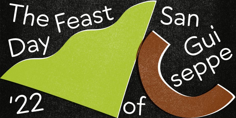
German foundry TypeMates has just released Grato Marker, a new typeface that it describes as a "handwritten expression of geometric idea". Made in collaboration with designer Teja Smrekar, it's a playful mix of geometry and informality with handmade forms that feel "charmingly wobbly" yet remains clear and legible, even at small sizes.
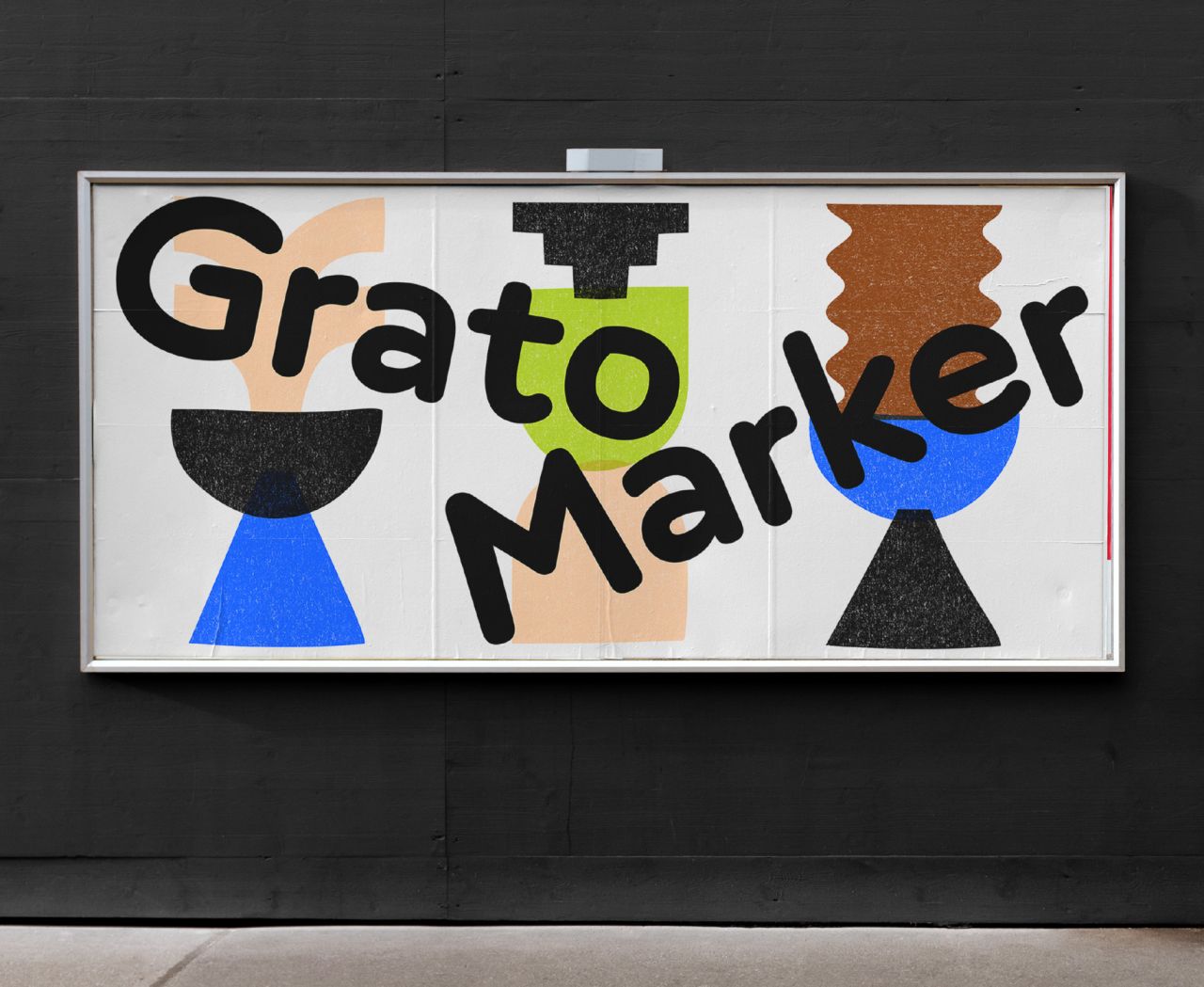
Pitched as a companion to TypeMates' Grato Classic and Grotesk, it "lets vertical strokes tilt and its baseline bounce as it plays with letter sizing," explains the foundry. And although it's deemed a "great sidekick" to any "sober sans", it's a typeface that's independent in its own right with heaps of personality and expression.
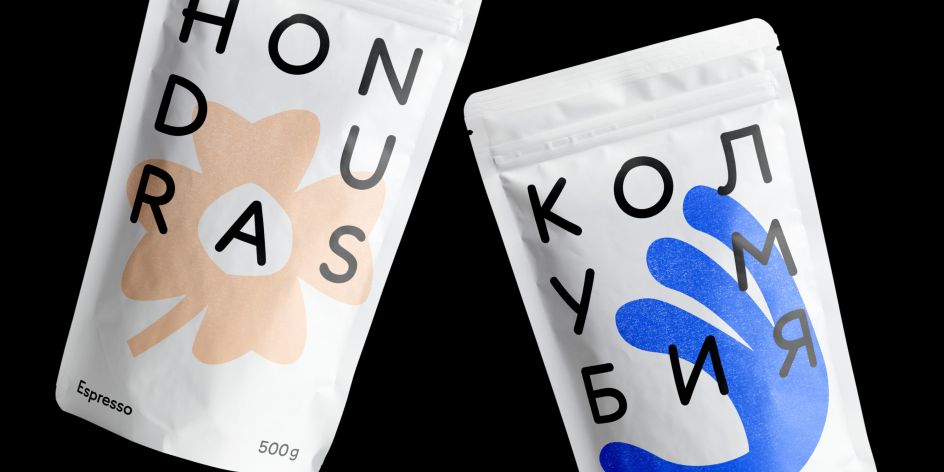
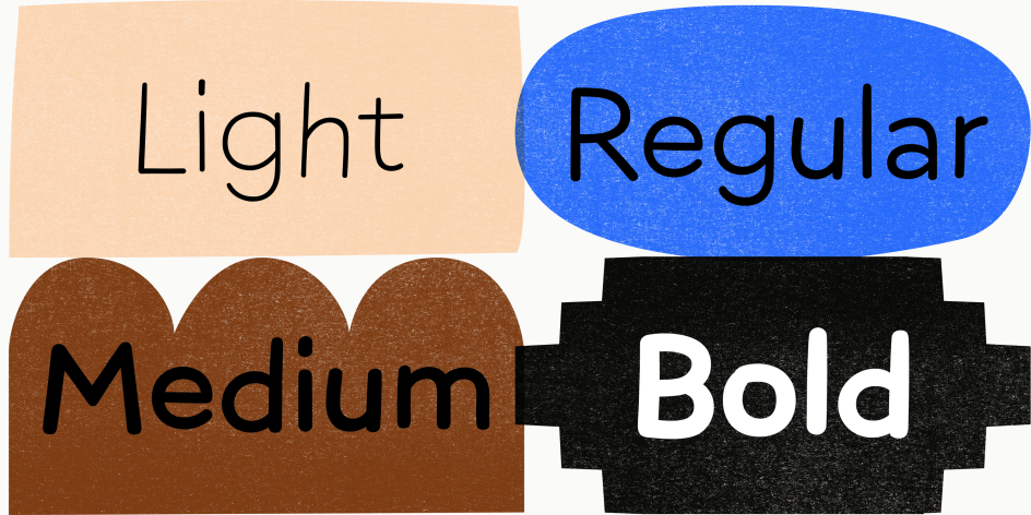
Like real markers, Grato Marker has a compact set of weights: four weights, from light to bold. While three stylistic sets fine-tune Grato Marker's cheerful text image: one for a serifed 'l', another for a single-story 'a' and unhooked 'j' and 't', and a third set for a distinctive, two-storey 'g'. And despite its seemingly casual attitude, the typeface supports Latin, Greek and Cyrillic languages as well as more than 270 languages including Vietnamese.
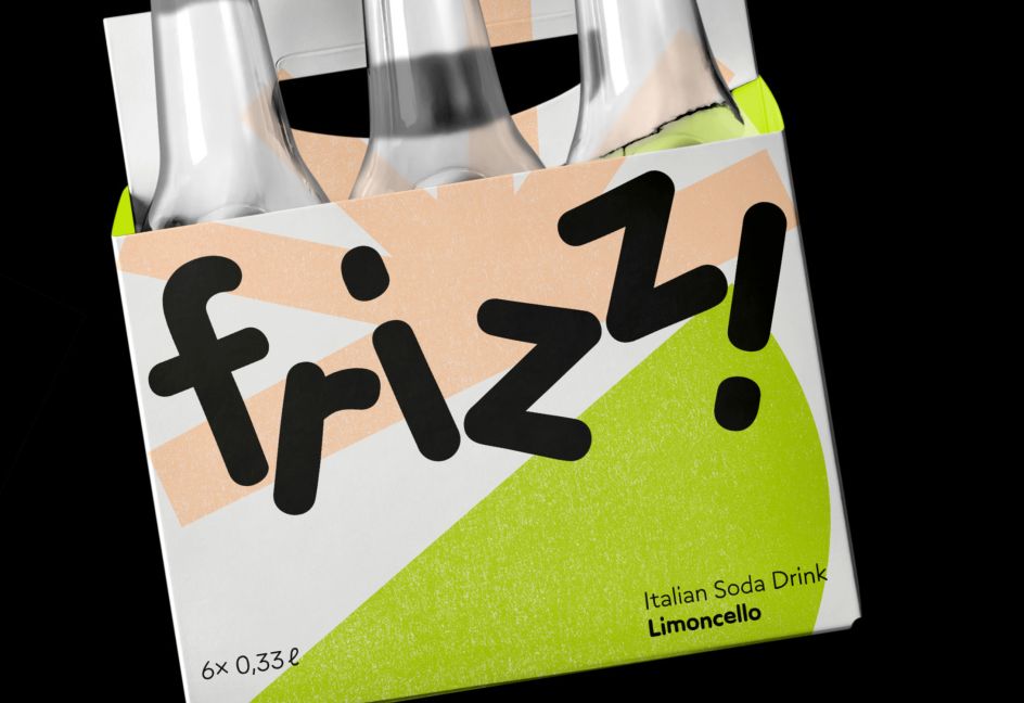
With a decent balance between playful and professional, TypeMates thinks Grato Marker is a "powerhouse" for children's books, "open-hearted" packaging and more casual brands.
Slovenia-based designer Teja Smrekar, who collaborated with TypeMates on the typeface, says: "Crafting handmade typefaces is a big passion of mine. When Jakob invited me to collaborate on the Grato Marker project I felt super excited to put my hands to work on it. In bringing his vision of a handmade Grato to life, Jakob was the typographic conductor and I was the lead violin in typo orchestra, focusing on craftsmanship and setting the tone for the family."
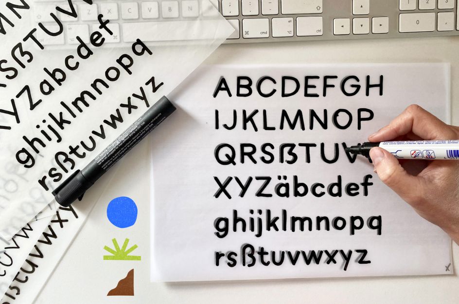
The project began with an exploration workshop. "Our intention was to find the most suitable writing tool for the task. We considered two methods: writing tools such as markers and pens, or digital writing," Teja explains. On looking at more traditional methods, Teja researched variables such as speed, pressure and the intensity of ink flow. A couple of questions came up during the process. "We considered how 'smooth or rough' the letters should be? We asked how much contrast should they have? Should we keep straight lines or make them more wiggly? But those were the easy questions to answer. The challenging part was translating the gestures from one medium to another. In the move from analogue to digital how should we preserve the essence of the form?"
On the digital side of things, Teja and Jakob tested two options: writing with pen pressure and without it. "It was obvious the version with a pen pressure worked better because it better resembled actual writing," she says. In fact, the pair decided to choose digital writing with pen pressure as a method for creating the typeface family. "It was more convenient and it produced results closer to the look we had in mind," Teja adds.
As the challenge was to design an "interpolatable non-connected handdrawn typeface", Teja began with the light weight. "It was less challenging to write than the bold I added later," she says, "and between the two I interpolated regular and medium weight."
But that was easy in comparison to sorting out the points between the masters. "As you know, a typeface isn't only a-z: there are numerals, symbols and more," Teja explains. "Keeping that in mind I had to sort out more than 1,000 glyphs per master. I couldn't say one glyph was particularly difficult to make compatible. It was the fact that there were so many to sort out. And many many points. Ugh, that was something!"
Grato Marker is now available to purchase as a family or as individual weights, starting from €45.99, all via www.typemates.com.
"One day I would love to walk into a food store and see Grato Marker being used on packaging," Teja continues. "I could imagine it on a Greek yoghurt, on a cereal box or in a store catalogue. It could be used in combination with Grato's Geometric Suite or any other typeface that requires a companion with a handmade flavour.
"Being the first violin in the typo orchestra was a rewarding experience with a steep learning curve. We combined our skills and transformed them into a harmonious and pleasant concert."


 by Tüpokompanii](https://www.creativeboom.com/upload/articles/58/58684538770fb5b428dc1882f7a732f153500153_732.jpg)


 using <a href="https://www.ohnotype.co/fonts/obviously" target="_blank">Obviously</a> by Oh No Type Co., Art Director, Brand & Creative—Spotify](https://www.creativeboom.com/upload/articles/6e/6ed31eddc26fa563f213fc76d6993dab9231ffe4_732.jpg)


