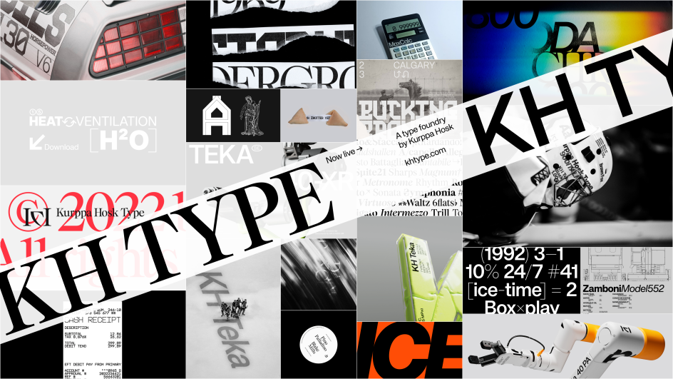
We're big fans of Swedish brand agency Kurppa Hosk: they've always got inventive, boundary-pushing work on the go, such as their type designs for the synthesiser Superlative, which we reported on a couple of years back. And now they've launched their own type foundry, KH Type, offering both retail and bespoke typefaces.
In launching KH Type, Kurppa Hosk aims to honour the agency's typographical heritage while making their independently designed retail typefaces available to license. The aim is to help companies amplify their brands and increase distinctiveness.
To kick things off, there are four retail typefaces to choose from, including KH Teka, KH Giga, KH Shutter and KH Interference. The interactive website will allow you to test these different typefaces in all sizes, colours, and variations.
KH Teka
KH Teka is a modern grotesque with a rigid approach to how curves, details and metrics are applied. It was created in collaboration with different designers at Kurppa Hosk, which heavily influenced the result: a versatile workhorse of a typeface. It is truly a "by designers, for designers" kind of typeface.
KH Giga
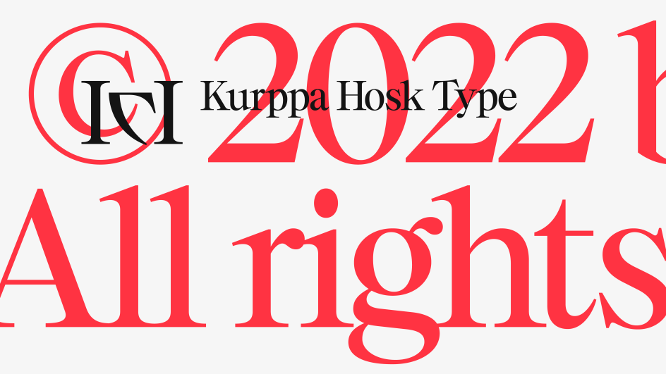
KH Giga is a display serif intended for large-scale use and is designed with exaggeration at its core. The details, such as the serifs themselves, are intended to shine when scaling up the font size. Because of its exaggerated features, it is less appropriate for body text use and comes to life when used for expressive headlines, wordmarks or logotypes.
KH Shutter
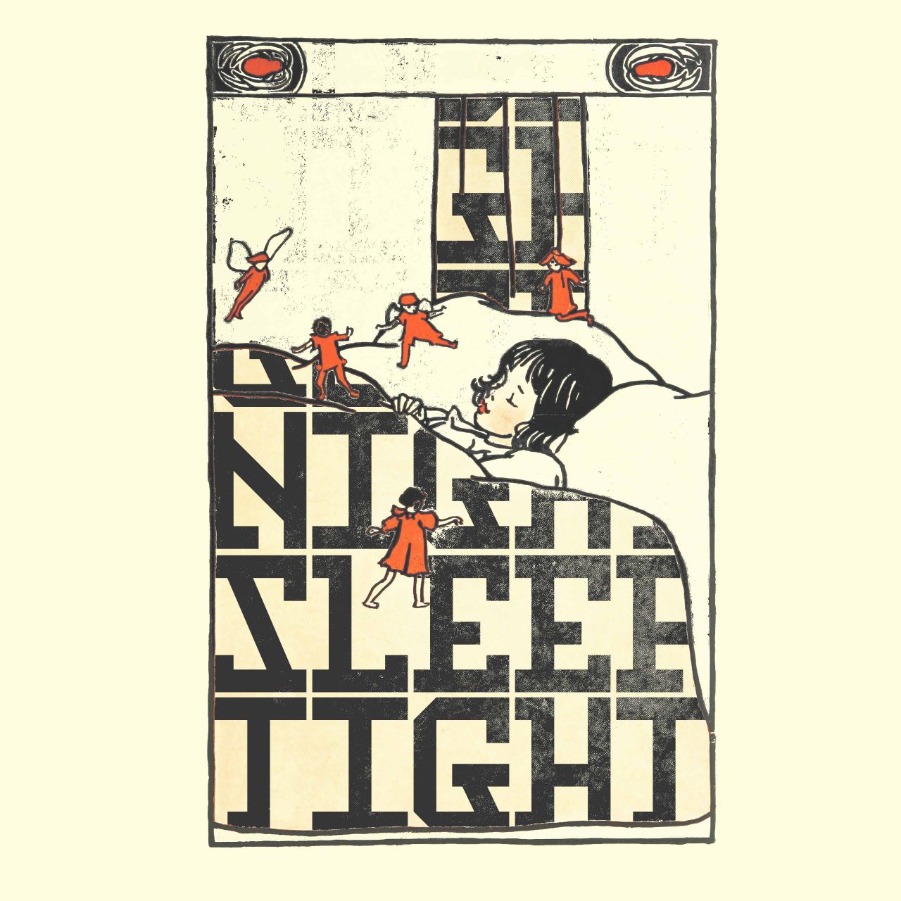
KH Shutter is an expressive, upper-case-only monospaced display typeface inspired by the characteristics of the Hebrew alphabet. It is strongly connected to the DNA of Thomas Kurppa's designs, incorporating geometrical construction, 45° angles and unexpected solutions. It was originally designed as a proposal for the identity design for a photography exhibition at Fotografiska in New York.
KH Interference
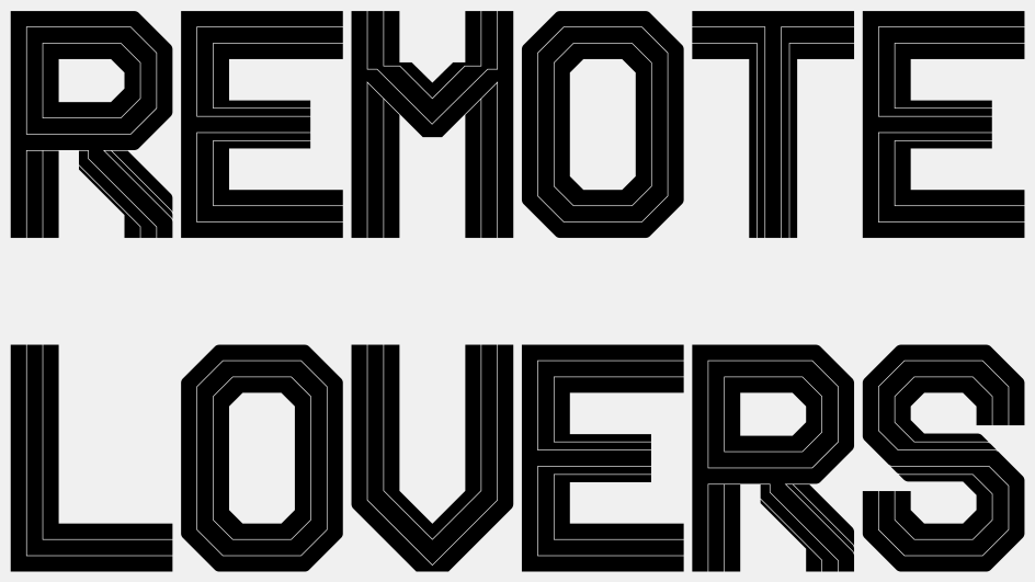
KH Interference is an uppercase-only monospaced typeface inspired by primitive letter shapes. Influences from both the analogue world, like printing on receipts and ticket stubs, as well as from the digital world, like the pixelated type found on low-res screens, shine through. It is designed on a 45° grid, and the corners of the outer shapes are rounded while the corners of the inner shapes are straight.
Helping brands stand out
In many ways, launching a type foundry of their own isn't a huge stretch for Kurppa Hosk. Typography has long been closely linked to the core of Kurppa Hosk's work, which is characterised by creating brands with distinct and clear design DNA that ensures all brand elements speak the same language across all touchpoints.
Because of their strong belief in the power of typography, Kurppa Hosk often devotes a lot of effort to ensuring a characteristic typeface, sometimes also developing bespoke brand typography as a part of their clients' brand toolboxes.
"In a world cluttered with content and messages, it's the brands with distinct and coherent expressions that will stand out," says senior type designer Jakob Ekelund. "That's why Kurppa Hosk has always put typography front and centre when designing identities and experiences for brands. Typography can become a powerful tool through which a brand's voice and personality are presented.
"We believe that the potential of typography in ensuring a distinct and strong brand expression across the full brand universe is often underestimated," Jakob adds. "With the launch of KH Type we wish to stress that typography should play a bigger part in design conversations and in the creation of brands.
"With KH Type our retail typefaces are available for license, and we hope this will allow creatives, designers and agencies to further explore the word of type. But also create space for exciting new collaborations and dialogues."


 by Tüpokompanii](https://www.creativeboom.com/upload/articles/58/58684538770fb5b428dc1882f7a732f153500153_732.jpg)


 using <a href="https://www.ohnotype.co/fonts/obviously" target="_blank">Obviously</a> by Oh No Type Co., Art Director, Brand & Creative—Spotify](https://www.creativeboom.com/upload/articles/6e/6ed31eddc26fa563f213fc76d6993dab9231ffe4_732.jpg)



](https://www.creativeboom.com/upload/articles/fc/fc51b7be78cf05cb896bc8cf90785d67072b855b_732.png)
