Koto rebrand of Glassdoor helps boost the platform 'where work talk gets real'
Glassdoor is on a mission to make workplaces healthier and more transparent. A new identity crafted by Koto provides a welcome injection of visual vigour to the global platform.
Glassdoor is a website where current and former employees anonymously review companies. It describes itself as "a thriving community for workplace conversations, driven by a simple mission: helping people everywhere find jobs and companies they love".
For the past 15 years, Glassdoor has championed workplace transparency through millions of ratings, reviews, salaries, and insights. Now brand and digital studio Koto has unveiled a refreshed brand identity for the platform.
The updated verbal and visual identity, combined with an enhanced product experience, emphasises the importance of community by bringing behind-the-scenes conversations into the spotlight.
The rebrand coincides with the launch of a new mobile app and web experience, allowing users to seamlessly navigate between insights, jobs, and workplace conversations, facilitating real-time networking, advice, and connections on various work-life topics.
Brand concept
Koto is a brand and digital agency with studios in Berlin, London, Los Angeles, New York, and Sydney. Founded in 2015 by Caroline Matthews, James Greenfield and Jowey Roden, their clients include Airbnb, Amazon Music, Discord, Fiverr, Pleo, Qonto, Skyscanner, Sonos, Uber Eats, Venmo, and WhatsApp.
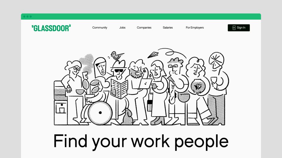
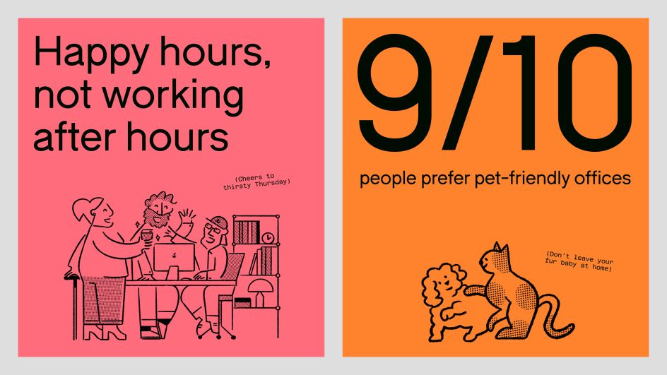
Koto's new branding aligns with the company's reimagined mission of creating a healthier, more transparent work community for all. The brand idea of "your work people are here" highlights the significance of the relationships formed throughout one's career.
From this brand idea, Glassdoor honed the tagline "Where work talk gets real," encapsulating the essence of their platform as a space for authentic and meaningful conversations about work experiences. A new vibrant colour palette, playful illustrations, animations, and an encouraging tone of voice all reflect this idea.
The result is a streamlined product experience where every interaction on Glassdoor aims to foster authentic discussions on important subjects such as equal pay, workplace diversity, and life beyond work.
Visual makeover
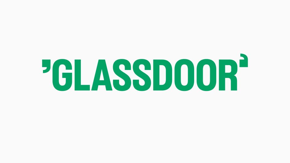
Koto gave Glassdoor's visual identity a significant makeover to align with the brand strategy. The new logo brings to life the Glassdoor positioning (as the centre of workplace conversations) with "gd" shaped quotations flanking the wordmark.
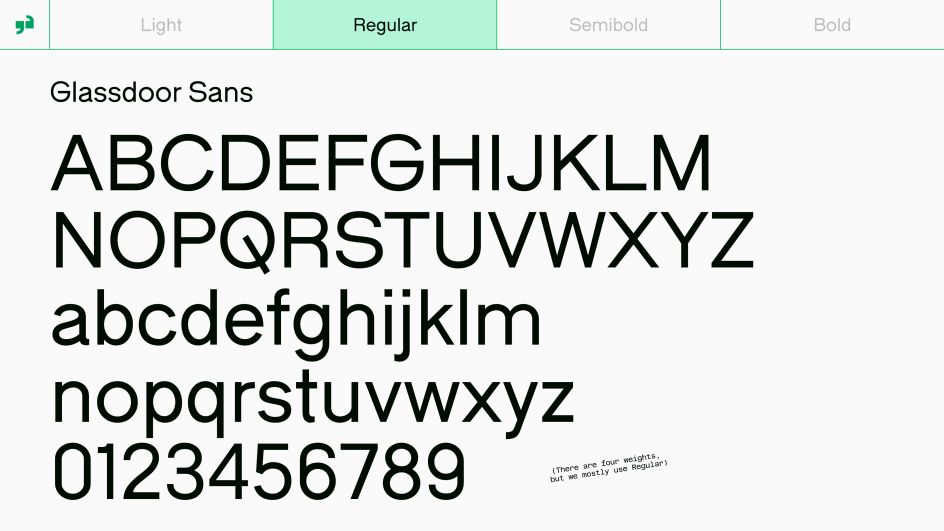
The uppercase treatment of the type is fresh and gutsy, swinging open when animated as a nod to Glassdoor's name. Working closely alongside Amber Weaver at TYPE01, Koto partnered with Giulia Boggio to create a custom typeface called Glassdoor Sans, a geometric sans-serif that features quirky characteristics inspired by office vernacular.
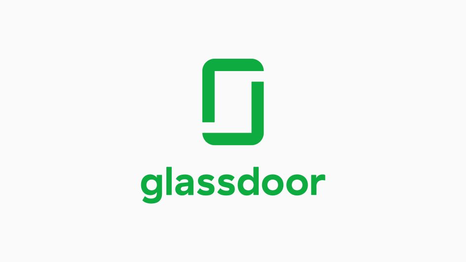
Previous logo
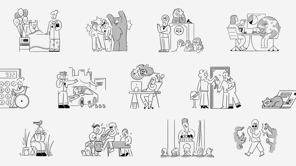
To further the aspect of community, Koto partnered with Josep Puy to create a sophisticated and playful illustration library for product and marketing that visualises the key themes of conversation, diversity, anonymity, and collaboration. These illustrations will be used across various brand, marketing, and product touch-points.
The icon system has been designed to reflect the concept of "staying open," featuring icons with intentionally missing pixels that symbolise transparency and openness. To enhance the digital product experience, Glassdoor will now feature custom emojis that add personality and expressiveness to user interactions.
Data visualisation
In line with the incredible amount of data Glassdoor offers its users, Koto needed to find a direct and engaging approach to data visualisation. The new brand system highlights the most salient data through fresh infographics, illustrative storytelling, and a motion system inspired by the product experience: typing, scrolling, and revealing. All these thoughtfully crafted visual elements contribute to the engaging brand identity of the new Glassdoor.
Throughout the rebranding journey, the Koto and Glassdoor teams have embraced an inclusive design process, staying true to Glassdoor's values of transparency and collaboration. After each creative presentation, Koto curated a creative overview to share with the wider Glassdoor team using its new community features.
This "Glassdoor Open Design" forum encouraged discussions and revealed valuable feedback from Glassdoor employees and members of the design community alike, fostering engagement and maintaining transparency throughout the entire rebranding process.
"Our work with Glassdoor was focused on creating a holistic brand that exudes confidence and open-mindedness, amplifying users' voices through transparent conversations and real workplace insights," says Deanna German, creative director at Koto. "We wanted to represent the evolution of Glassdoor from being a destination for insights to a thriving community for real workplace conversations.
"By strategically positioning the brand and designing a visually captivating identity, we have empowered Glassdoor to own its brand experience and thrive in its next growth phase. The logo, typography, illustrations, icons, and unique brand voice act as powerful amplifiers of Glassdoor's mission, reflecting their commitment to participating in a healthier and more transparent work community for all."


 by Tüpokompanii](https://www.creativeboom.com/upload/articles/58/58684538770fb5b428dc1882f7a732f153500153_732.jpg)

 using <a href="https://www.ohnotype.co/fonts/obviously" target="_blank">Obviously</a> by Oh No Type Co., Art Director, Brand & Creative—Spotify](https://www.creativeboom.com/upload/articles/6e/6ed31eddc26fa563f213fc76d6993dab9231ffe4_732.jpg)


](https://www.creativeboom.com/upload/articles/bc/bca64f0003ea18084a2d90e59bf9bd1b3cb71223_732.jpg)
