New LogoArchive issue brings to life the Japanese feeling of Akogare
Designer Richard Baird has worked with fellow designer Hugh Miller on the fourth collaborative issue of the LogoArchive zine.
LogoArchive is a publication and resource that "documents the forms, form language and meaning-making that developed out of mid-century modernist identity programs," in the words of its creators. It started as an Instagram account and has since evolved into a series of zines.
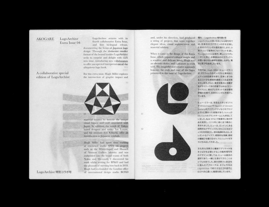
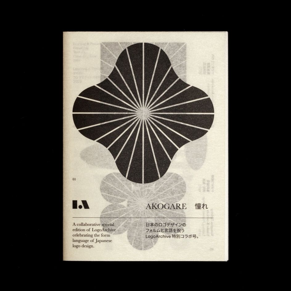
The Extra Issue miniseries uses a distinctive smaller bound booklet format to the usual LogoArchive publications, and involve new collaborators to offer "unexpected interpretations on the ubiquitous logo book," according to Baird.
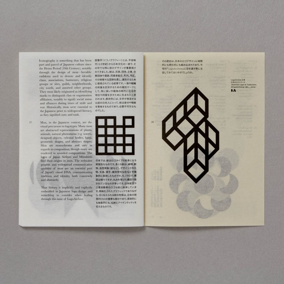
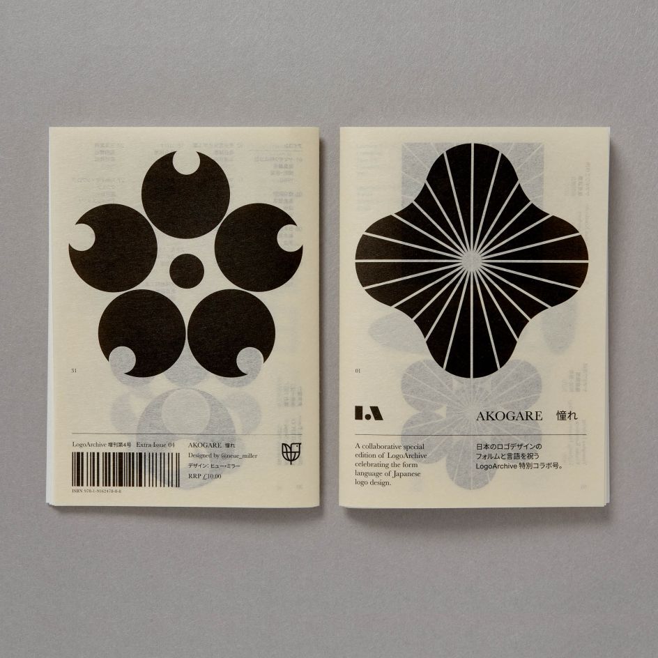
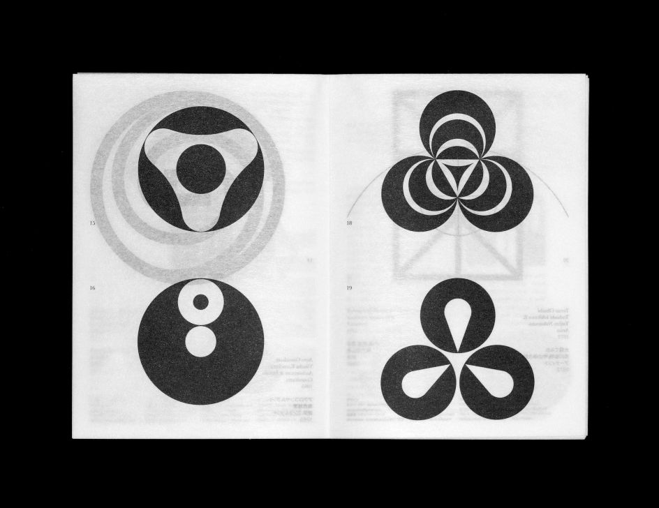
This time, it's the turn of Hugh Miller: the most recent Extra Issue came out in December and marks the first time there's been a bilingual LogoArchive issue. The zine documents the forms of Japanese logo design from 1960 to the 2000s. According to Baird, Miller "orchestrates graphic impact and material nuance to honour the unique visual legacy and craft associated with Japan."
He adds: "The zine intends to evoke–through materials, processes, form, content and 'atmosphere'–'akogare', a deep feeling of respect and admiration for those I look up to, and a feeling of never being able to reach the same level. For me, this is Japanese designers and publications such as IDEA and Graphic Design, and the works of Igarashi, Tanaka and Nagai. The zine is a gift, as Japanese designers and publications gave to the West. I hope, through its materiality, it also delivers a bit more nuance."
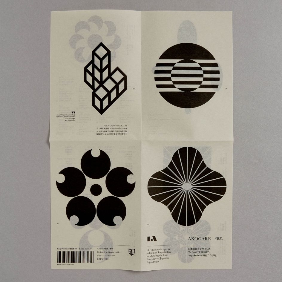
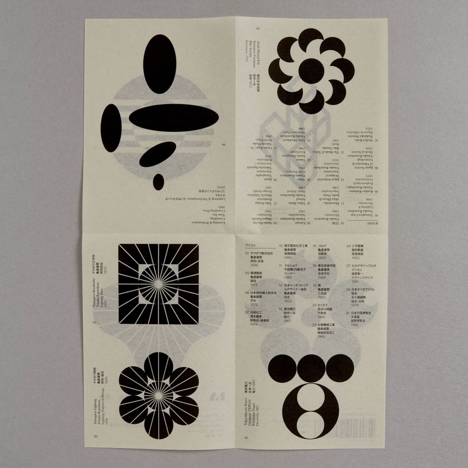
This zine is based around that aforementioned Japanese concept Akogare, which is pretty tricky to directly translate to English, we're told. The format of the LogoArchive means that Baird and Miller could try to express it not just through words, but with logos, paper, process and assembly, too. Better express its meaning.
Baird pitched the idea to Miller that what was needed was to help Western audiences better understand the idea of Akogare. It's described as "a deep feeling of respect and admiration one may feel for someone they greatly look up to." Usually, this is directed towards "someone more talented," says Baird, and the feeling of akogare is "tinged with the understanding of one's own shortcomings and the knowledge that the same level of talent is unattainable." As such, it's imbued with a strange sense of yearning. "The zine seeks to make concrete abstract concepts, generate an atmosphere and attempts to evoke akogare in its readers as they unfold the booklet," says Baird.
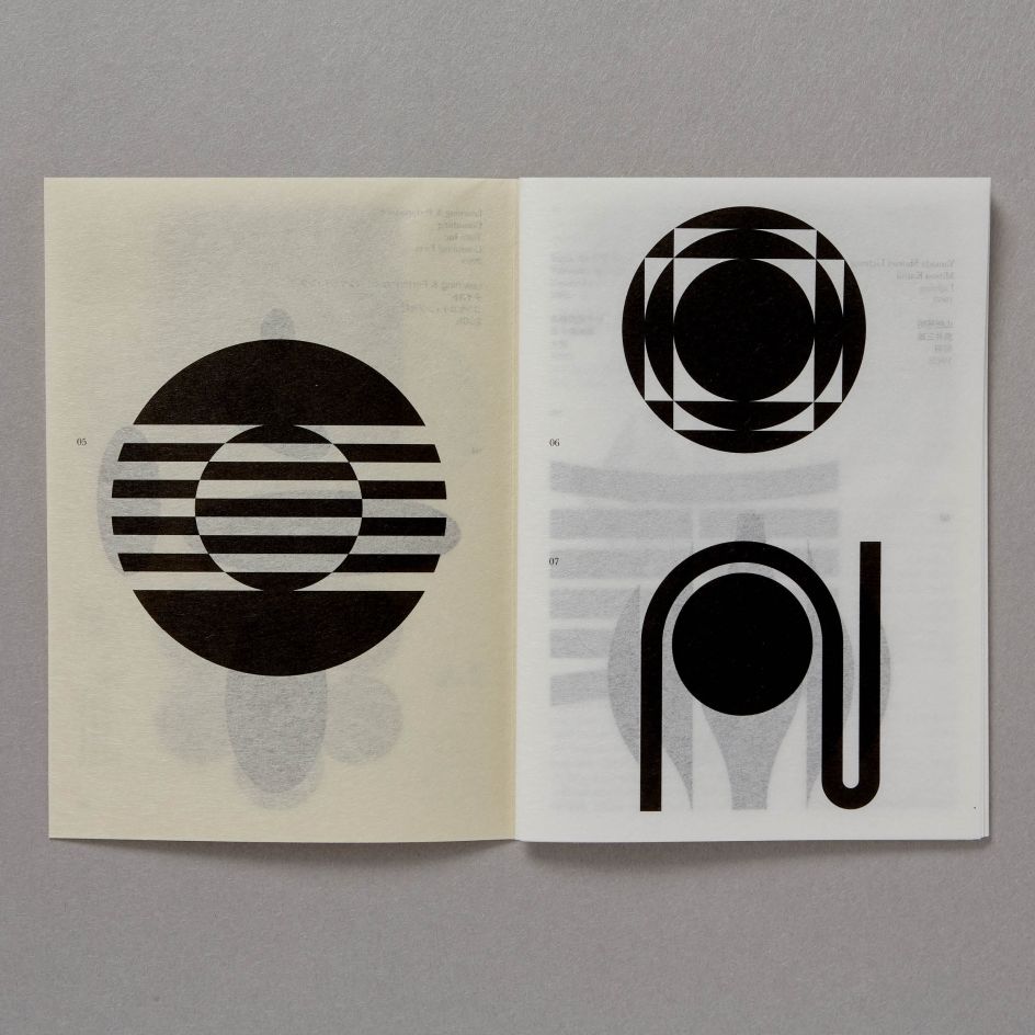
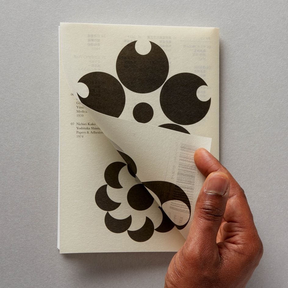
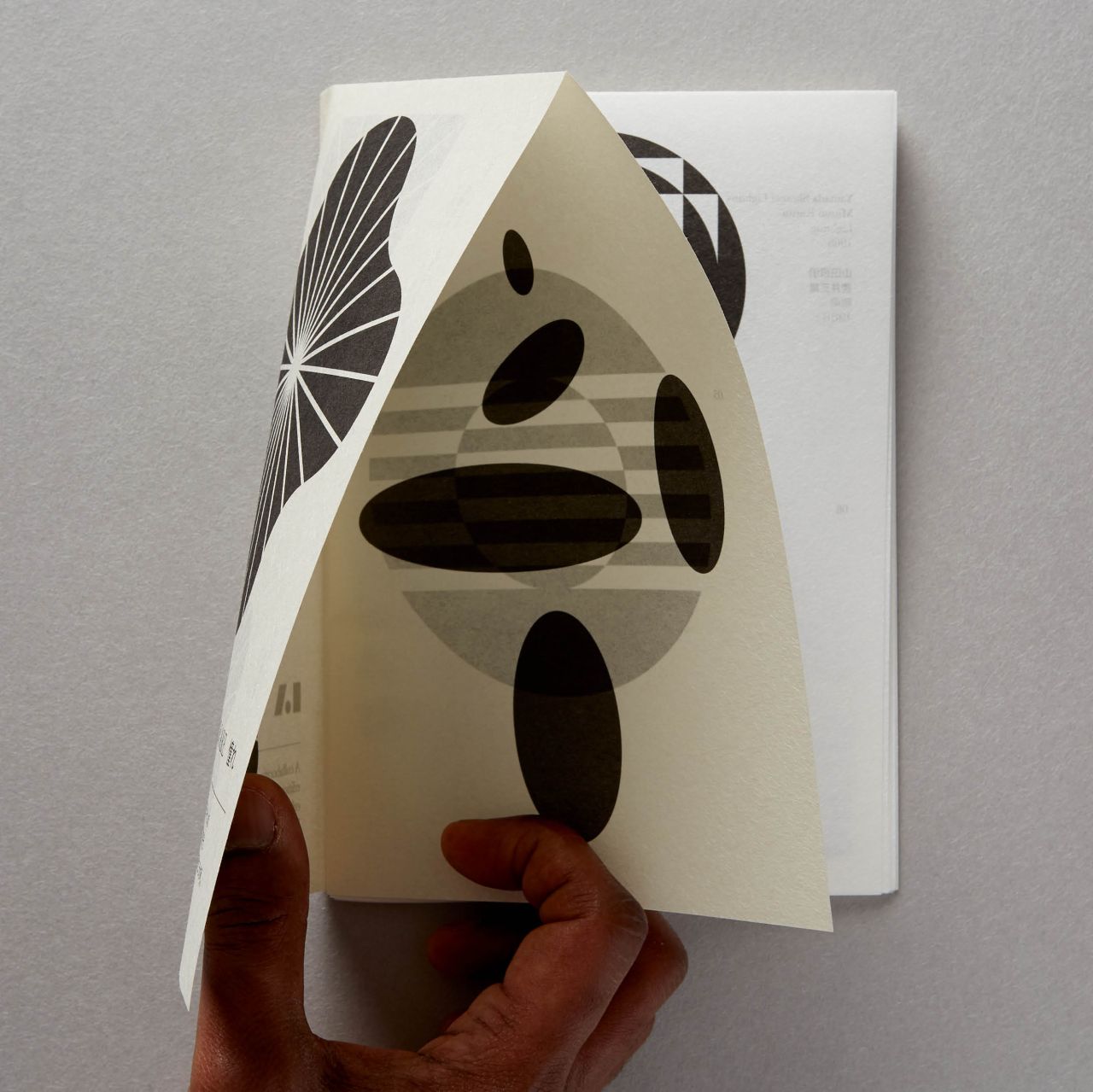
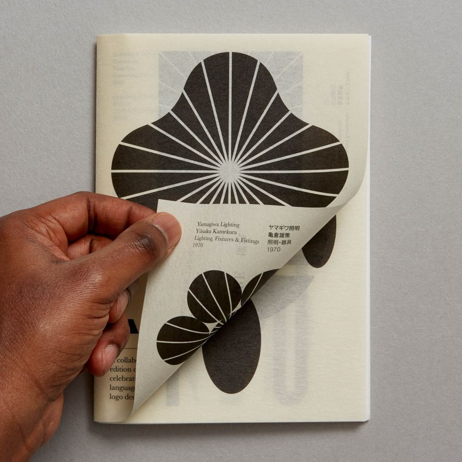
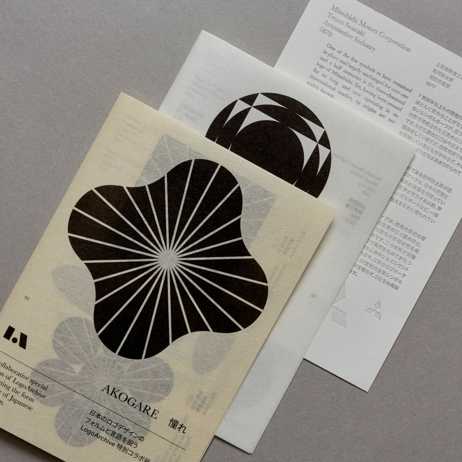
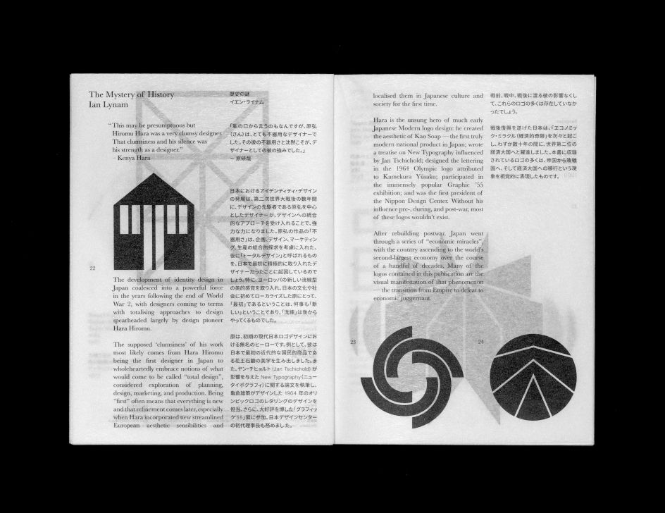
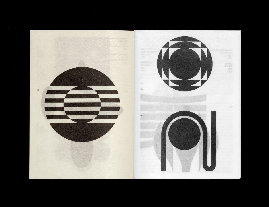
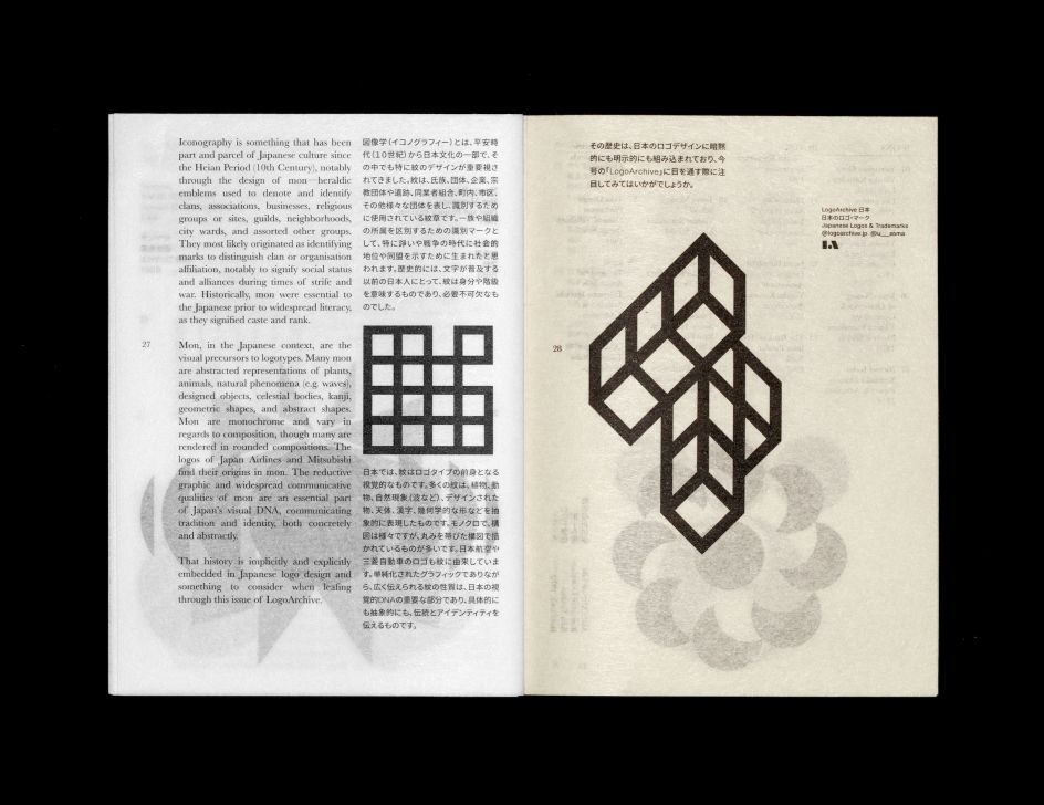
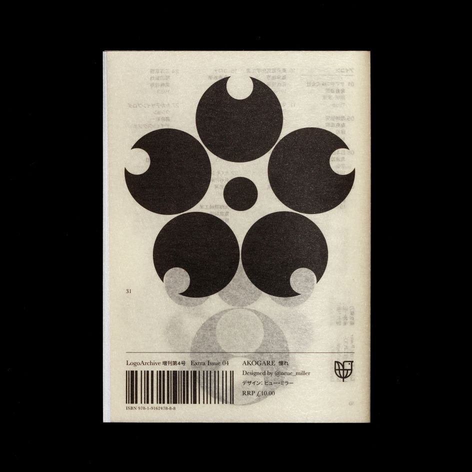
A key design detail is the booklet's application of a light Japanese paper to create a layered topography of symbols. The design aims to create the feeling of a continuous story, reflecting the idea that logos themselves were not designed in isolation, but build on a legacy.
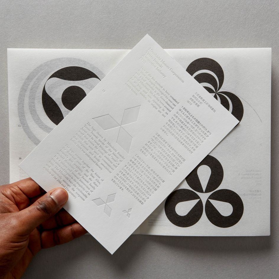
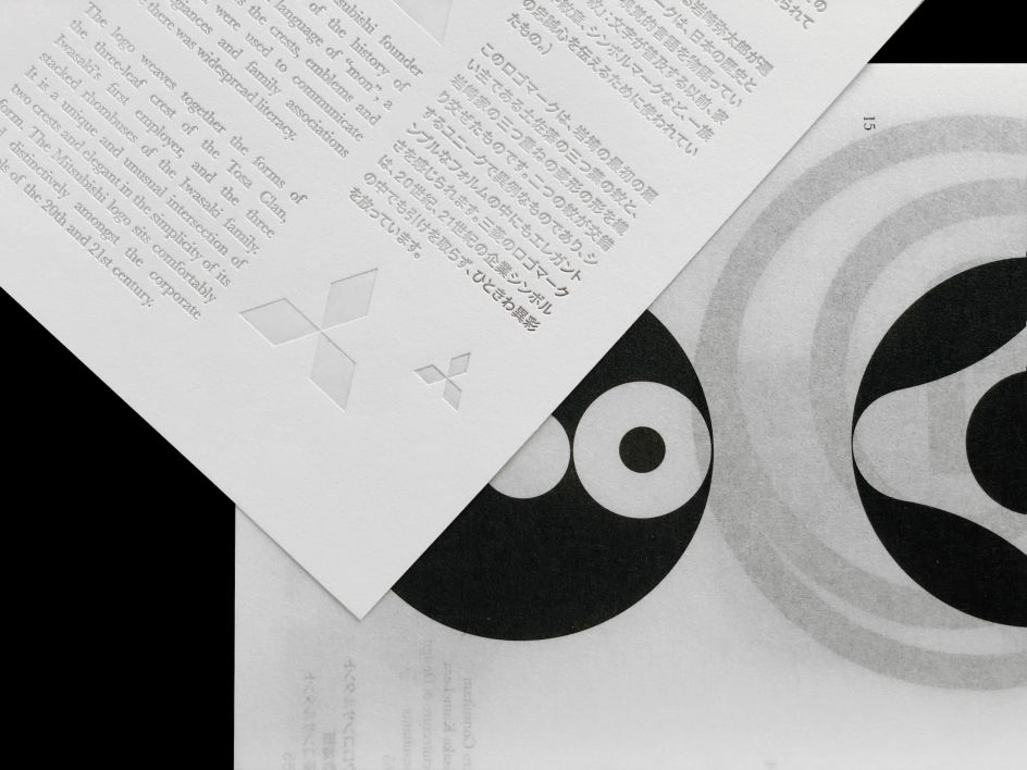
A special insert, telling the story of the Mitsubishi logo, employs a heated die applied to Takeo Pachica, creating a semi-transparent effect, with light revealing the text. This use of light draws on nature and natural phenomena as a recurring reference in Japanese design.
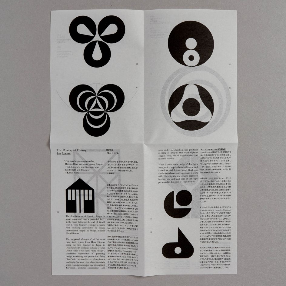
The zine takes the form of a booklet comprises of three A3 sheets of Takeo Tela G.F Smith paper folded down to A5. The form references the Japanese Lamp design by fashion stalwart Issey Miyake. "We've internationally used show-through to complete the picture. Thus the booklet becomes a layered object that can be unfolded, deconstructed and understood in different ways," says Baird.
Alongside the bi-lingual texts by Ian Lynam and Iori Kikuchi, the zine includes a collection of Japanese symbols and an insert that uses heat embossing to make the paper semi-transparent and tell the story of the Mitsubishi logo. It is published by BP&O.


 by Tüpokompanii](https://www.creativeboom.com/upload/articles/58/58684538770fb5b428dc1882f7a732f153500153_732.jpg)


 using <a href="https://www.ohnotype.co/fonts/obviously" target="_blank">Obviously</a> by Oh No Type Co., Art Director, Brand & Creative—Spotify](https://www.creativeboom.com/upload/articles/6e/6ed31eddc26fa563f213fc76d6993dab9231ffe4_732.jpg)


