Lost in the museum? dn&co designs a new wayfinding system and map for the V&A
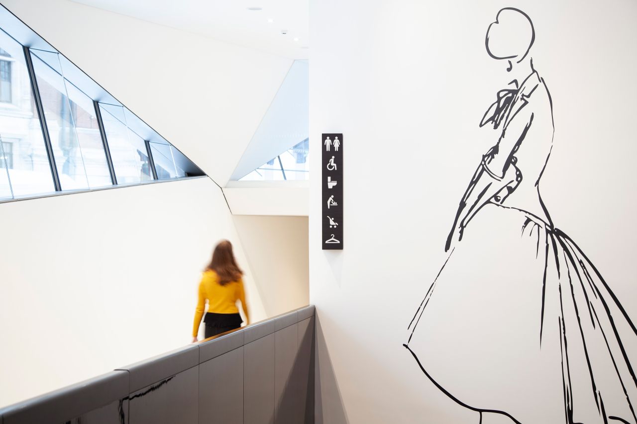
dn&co has designed a new "wayfinding" system and map for the V&A, helping millions of visitors navigate seven miles of gallery space inside the iconic London museum.
All images courtesy of dn&co
Of the four million people the V&A welcomes each year, some are first-time visitors, some are regulars. Some are happy to wander and explore; others go with a specific goal in mind – to see a specific object, or an exhibition they have tickets for. Many don’t know what to expect. With seven floors across three interconnected historic buildings, five temporary exhibition spaces, four shops and three cafés, you can imagine why a navigational system was so important.
But it's not just about practicality; the new design by dn&co befits the V&A’s collection and its Grade I listed surroundings, using quality materials in line with the building's architecture.
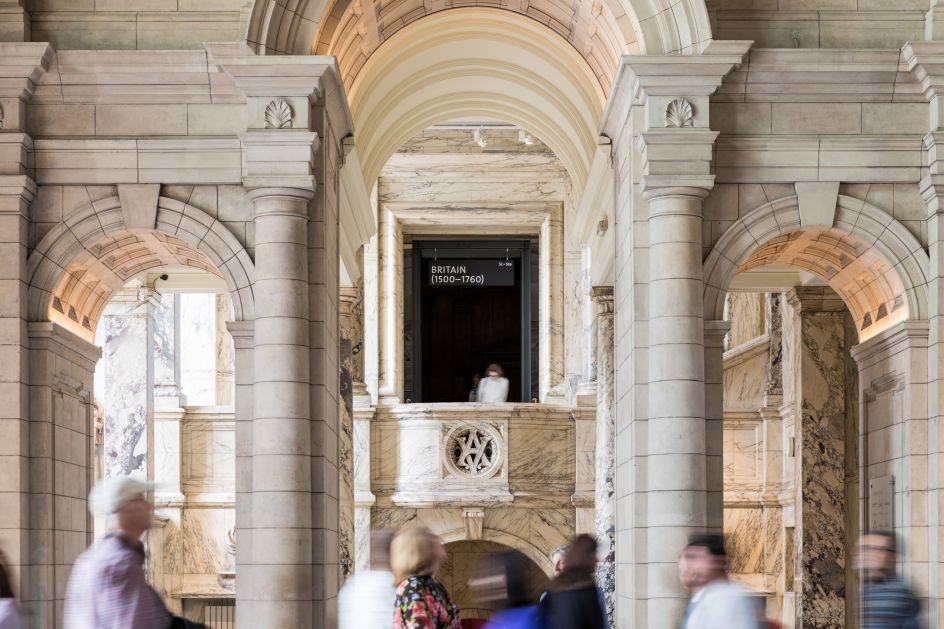
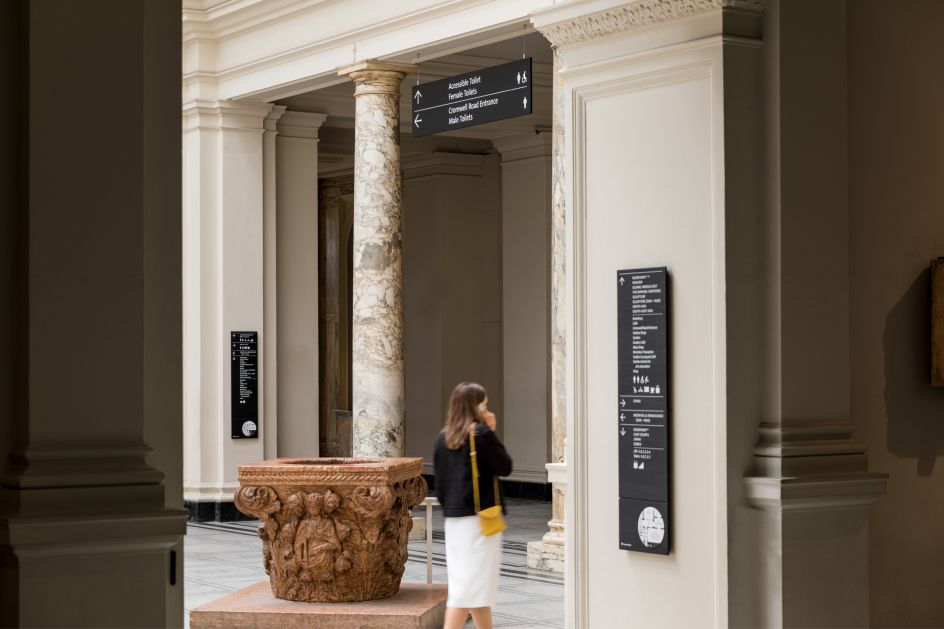
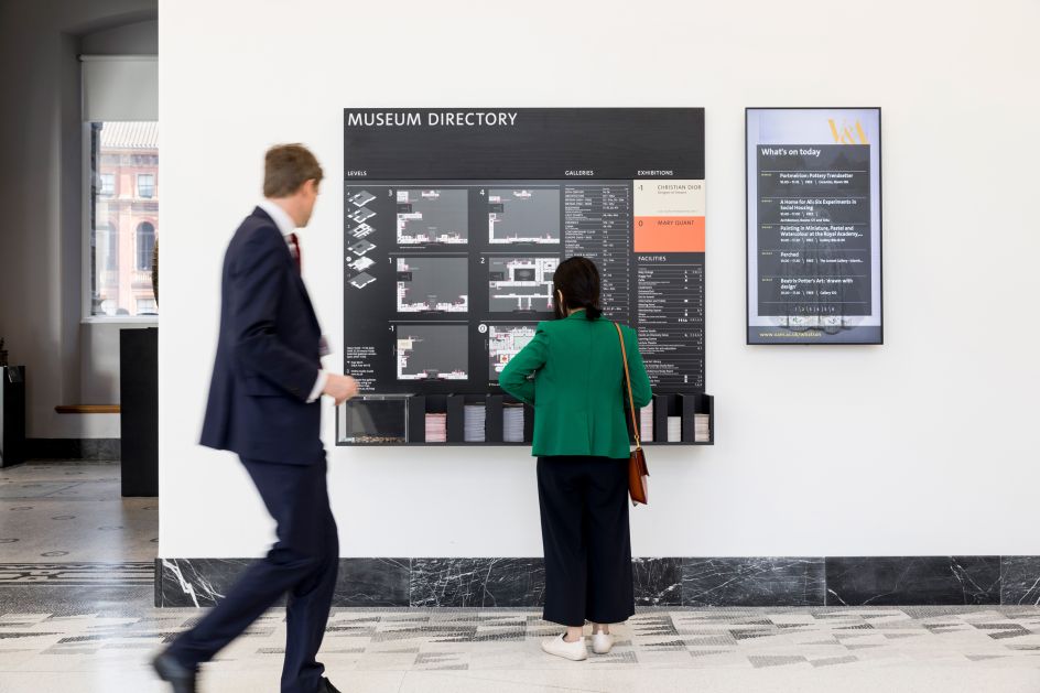
Made from tulipwood, dyed black and stripped from any extraneous colour except to highlight ticketed exhibitions, the signs convey a sense of quality and permanence, without competing for attention. Colour acts a beacon, drawing those who have paid for an exhibition through the ground floor to their destination.
One of the most significant elements of the strategy, while also one of the most discreet, was the renumbering of the floors at the V&A. Based on a more coherent sequence, the new numbering reinforces the perception of the museum as one building and makes it seem more manageable within a single visit.
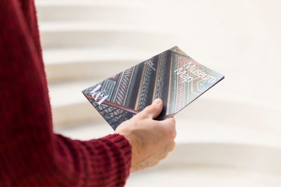
Another key component was a new map. Informed by archival research, the new dn&co design is more legible, compact and easier to carry around. Crucially, it's designed to work in a digital environment as well as in print.
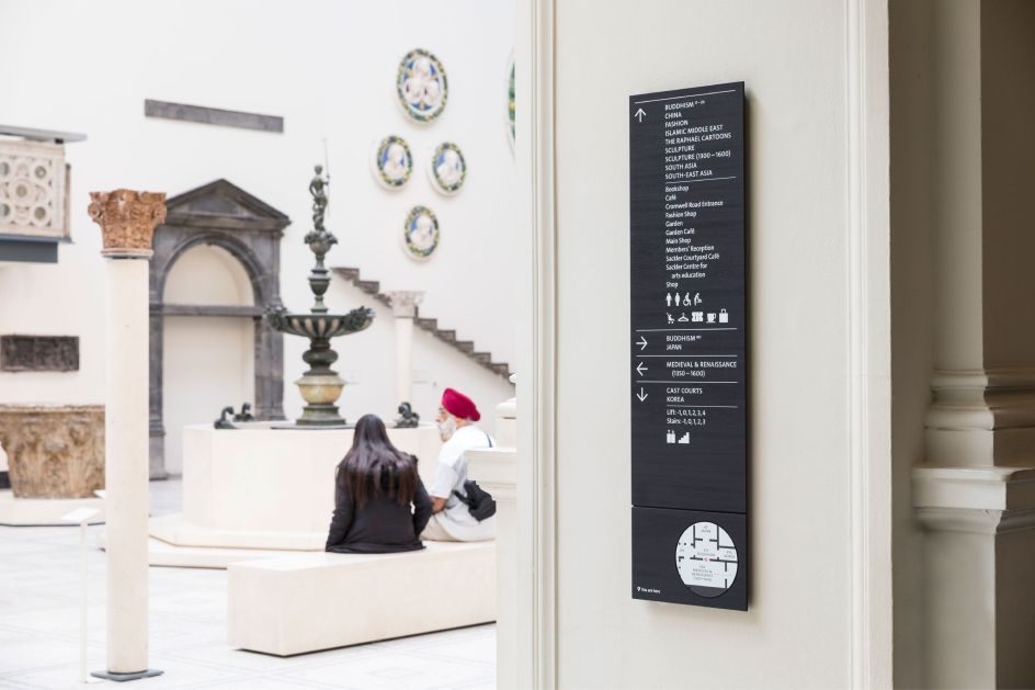
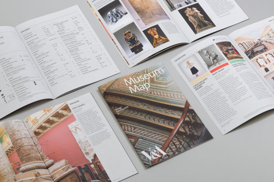
Patrick Eley, creative director of dn&co says, "Wayfinding is not a static process, it’s a dynamic one. It’s concerned with the way people move through spaces, and the cues they follow. Signs are one of those cues; architecture itself is another, as we are innately guided by it. And what architecture! The V&A is a monumental environment, airport-scale, but richly detailed with no one space the same as another. Our design had to live comfortably in this world-leading museum of art and design and to do so it treads a careful line."


 by Tüpokompanii](https://www.creativeboom.com/upload/articles/58/58684538770fb5b428dc1882f7a732f153500153_732.jpg)


 using <a href="https://www.ohnotype.co/fonts/obviously" target="_blank">Obviously</a> by Oh No Type Co., Art Director, Brand & Creative—Spotify](https://www.creativeboom.com/upload/articles/6e/6ed31eddc26fa563f213fc76d6993dab9231ffe4_732.jpg)


](https://www.creativeboom.com/upload/articles/1d/1dbe6b0a2476f6465c577a4b36575ee4b1bf30a4_732.jpg)
