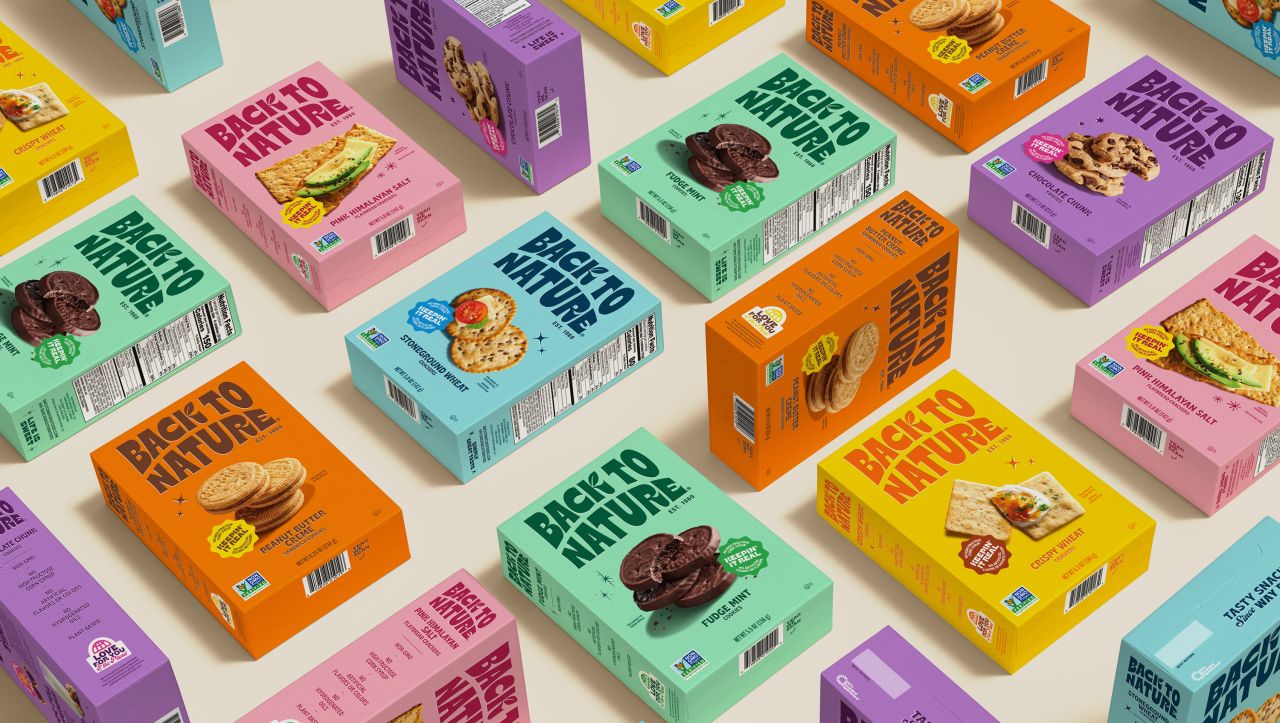
LOVE brings West Coast vibes to its bold refresh for Back to Nature
After more than six decades in business, the American snack brand turned to the Manchester studio to revitalise its identity and help it stand out in an increasingly saturated market.

Manchester-based creative agency LOVE has unveiled a vibrant new identity for US snack brand Back to Nature. The work, which includes a packaging portfolio redesign, builds on the company's heritage and laid-back West Coast roots but adds a modern refresh.
Let's face it, anyone familiar with the brand will know it's renowned for remaking classic snacks with better ingredients for those of us who prefer tasty, junk-free options. But if we're honest, it was perhaps looking a little tired. And so LOVE was briefed to revitalise it and achieve all the usual magic: drive consumer awareness among the increased competition and stand out on the shelf.
At its heart, the brand features a refreshed logo inspired by the Californian sunrise – one that includes Back to Nature's iconic leaf as a tribute to its "pioneering role in the natural food movement", with bold and chunky typography leaning into vintage-style sign writing, reminiscent of old-school screen prints. The accompanying colour palette is striking and sits nicely with fresh product photography that gives its packaging a nice jolt – all while reminding us of the taste and quality of the product with features that appeal to new audiences.


There's also a new tagline, 'Tasty Snacks Since Way Back', which definitely implies that some laidback surfer on a beach somewhere uttered those words. This is all successfully paired with a confident, easy-going tone of voice that continues to highlight the brand's rich history in the space while making it more approachable and current. It certainly feels like a clever mix of retro and modern, one that channels that easy-breezy spirit of 1960s California, where Back to Nature was dreamt up over six decades ago.
Interestingly, the packaging overhaul spans over 30 product SKUs, including cookies, crackers, nuts, and granola. It includes a palette of vivid, punchy colours, each chosen for its visual links to the West Coast. One can simply imagine the palm trees, stretches of golden sand and beautiful sunsets and wonder how they sprung to mind. There's also a whole suite of key brand assets to help support the system, such as bold stickers designed to ramp up brand personality.
"I'm so pleased to show this sunny new brand to the world," says Jennifer Jorgensen from Back to Nature. "We set out with huge ambitions, and we've delivered. Not only have our packs got incredible on-shelf standout, but our brand has such depth, too. It's been a long road, but I'm endlessly proud of the work that has been done, and I can't thank LOVE enough for breathing some life back into our beloved brand."


It must be a real "heart in mouth" moment when an established brand undergoes such an overhaul, particularly when it's already considered a sector winner. However, one must never rest on their laurels when so much competition springs up, and consumer habits change. As such, the rebrand for Back to Nature was guided by consumer research, clearly indicating where the market is heading and how it might engage loyal customers and attract new audiences.
"Our greatest strength is taking a brand and understanding its roots, figuring out what makes it authentic, and moving it forward. So, when Jennifer and team approached us with the opportunity to overhaul Back to Nature, we knew we could deliver," says David Palmer from LOVE. "From Manchester to the US, this has been a mammoth effort that has enveloped all corners of the agency, and we're immensely proud of the outcome."


 by Tüpokompanii](https://www.creativeboom.com/upload/articles/58/58684538770fb5b428dc1882f7a732f153500153_732.jpg)

 using <a href="https://www.ohnotype.co/fonts/obviously" target="_blank">Obviously</a> by Oh No Type Co., Art Director, Brand & Creative—Spotify](https://www.creativeboom.com/upload/articles/6e/6ed31eddc26fa563f213fc76d6993dab9231ffe4_732.jpg)


