Gretel overhauls design of online learning platform MasterClass
MasterClass, billed as "the streaming platform where anyone can learn from the world’s best across a wide range of subjects", has been redesigned by New York-based branding studio Gretel.
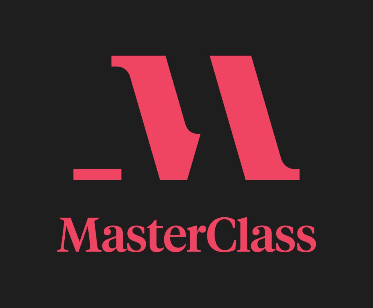
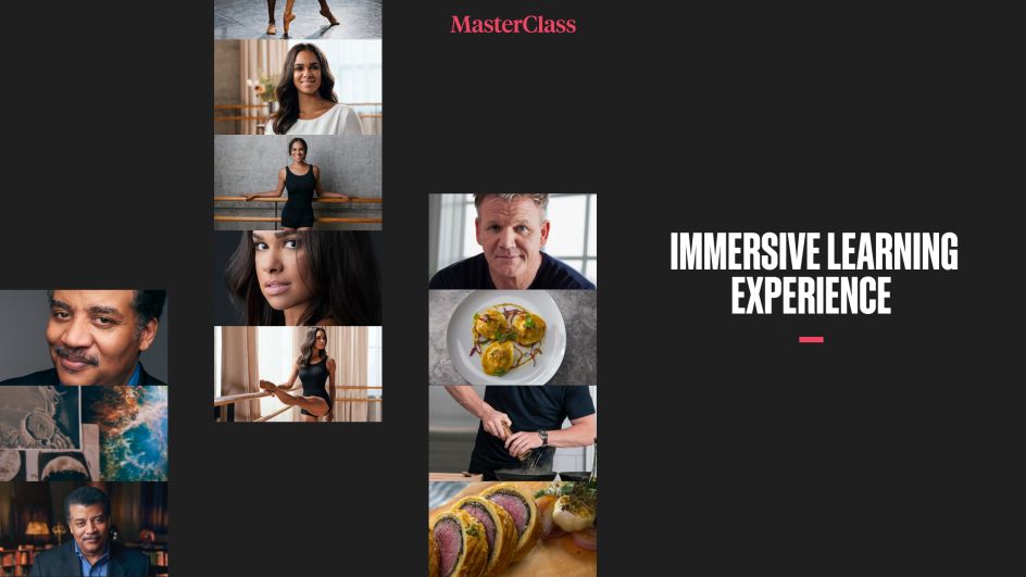
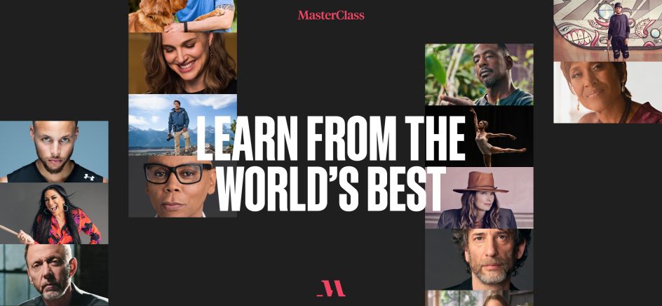
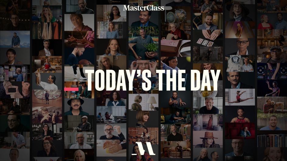
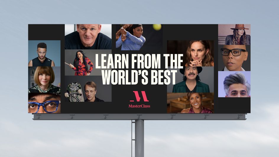
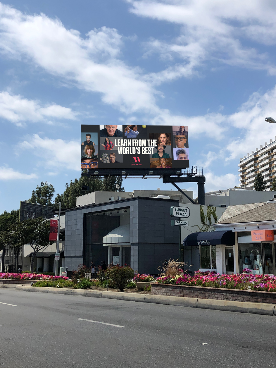
The studio was responsible for the creative development and execution of the redesign and saw Gretel create a modular framework for the design system that incorporates moving and static assets. According to Gretel, the new look is "a dynamic mix of bold and contemporary styles"; and it looks to build "on the notion of cinema, sophistication and captivating visuals."
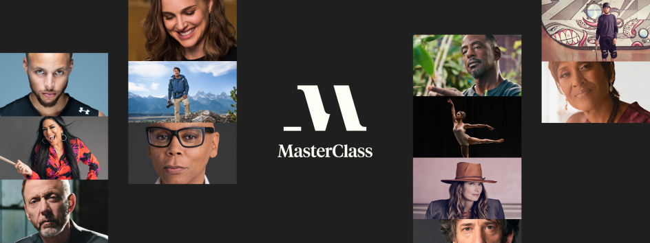
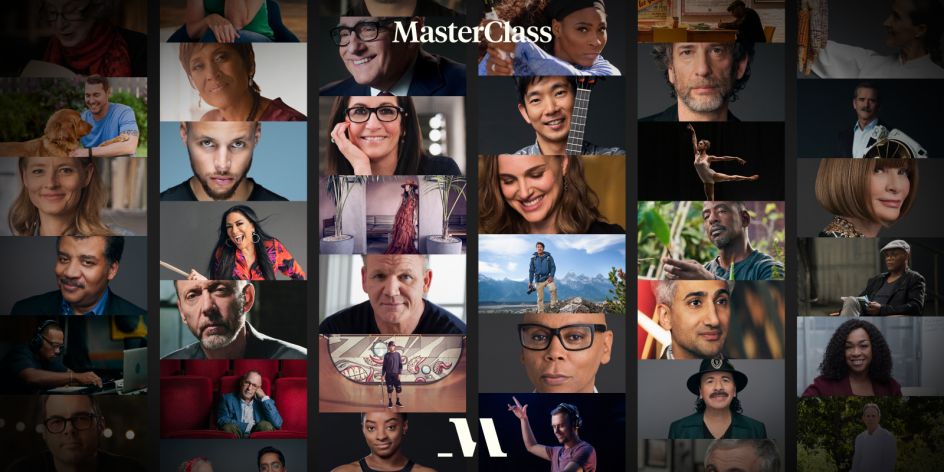
MasterClass first launched in 2015 with a subscriber model offering annual membership that gives users access to classes across the arts, entertainment, style, writing, gaming and more from instructors including Anna Wintour, Neil Gaiman and RuPaul.
"We came on board to help the brand and marketing mirror the elevated offering and motivate subscribers to see the potential and the value in a subscription," says Ryan Moore, Gretel's executive creative director. "The system we’ve created together is dynamic, accessible, and built for further iteration."
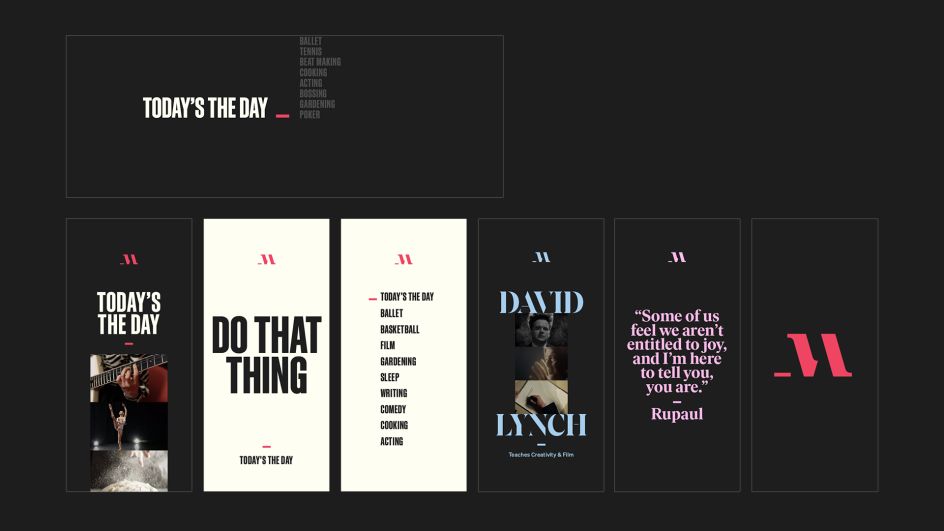
David Schriber, CMO of MasterClass, adds, "It’s not about a new design, it’s about evolution. MasterClass has moved into mainstream culture, and the brand’s transition from product to household name has never been more apparent than in the past year. We wanted to create a contemporary identity connected to culture that each member and instructor could own along with us."
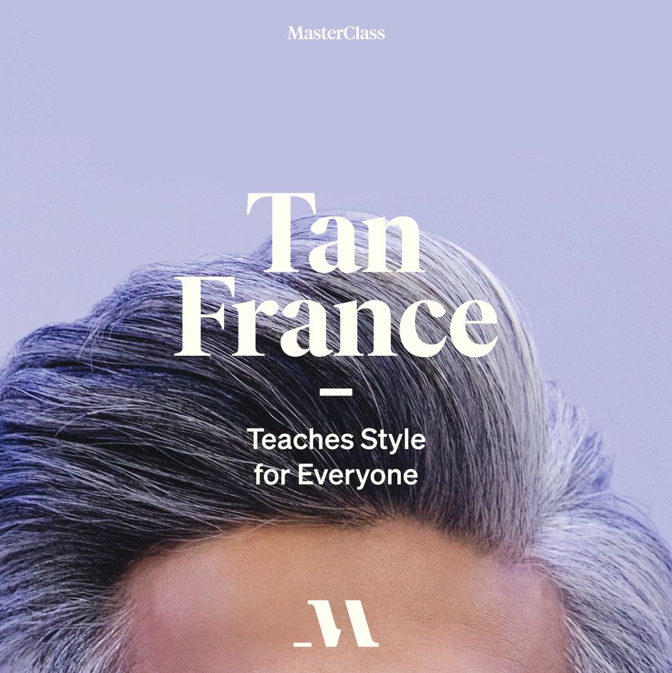
The new design aims to underline the idea of users being able to "fill in the blanks", in a nod to "critical thinking and purposely leaving room for interpretation," says Gretel. The new logo design now bears an underscore, shown throughout the platform to convey that idea of potential and the learning of a new skill.
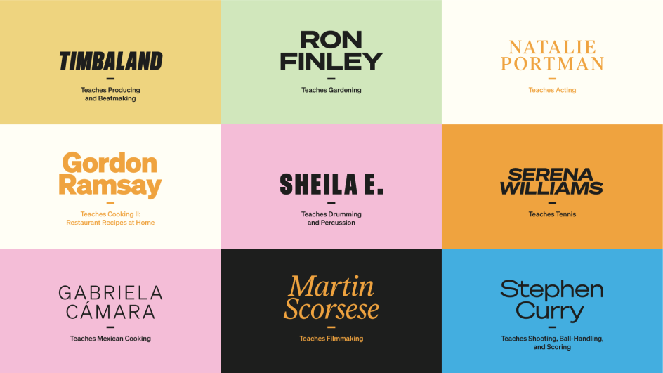
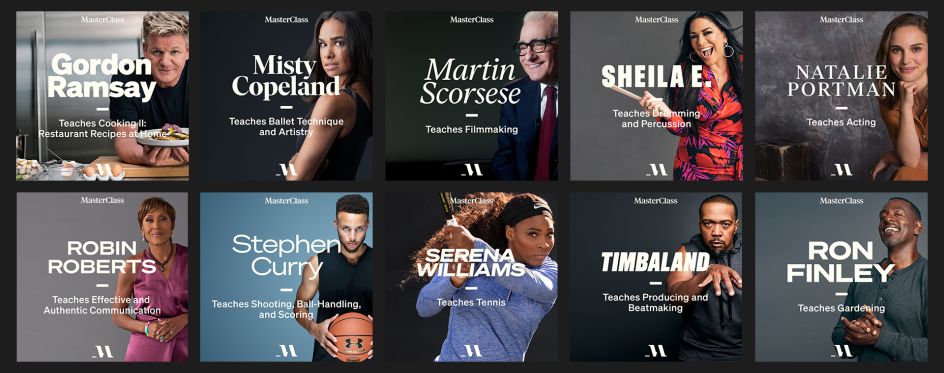
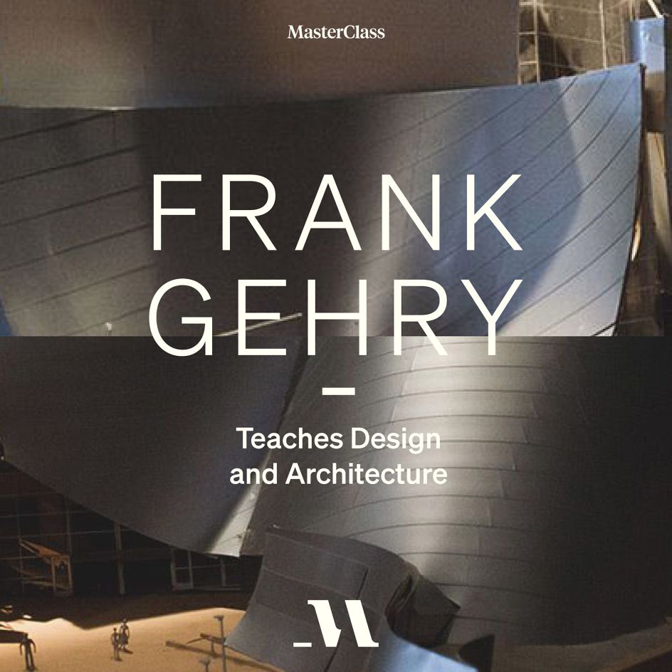
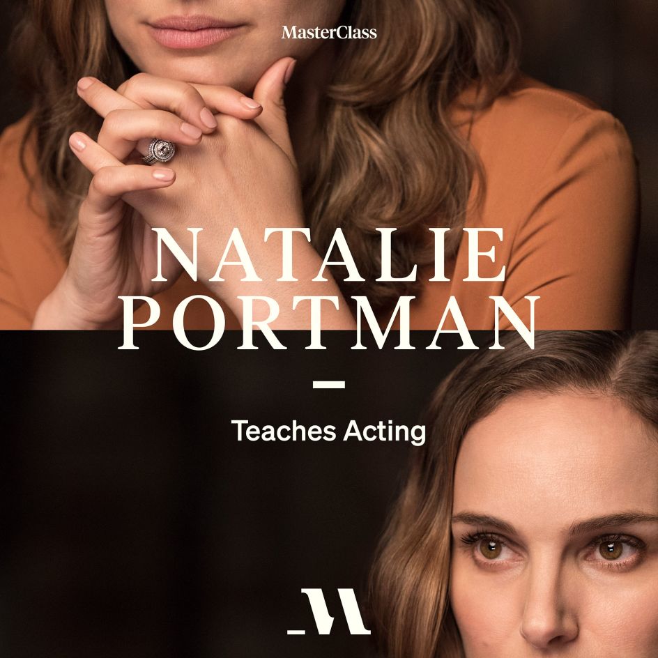
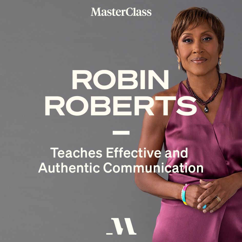
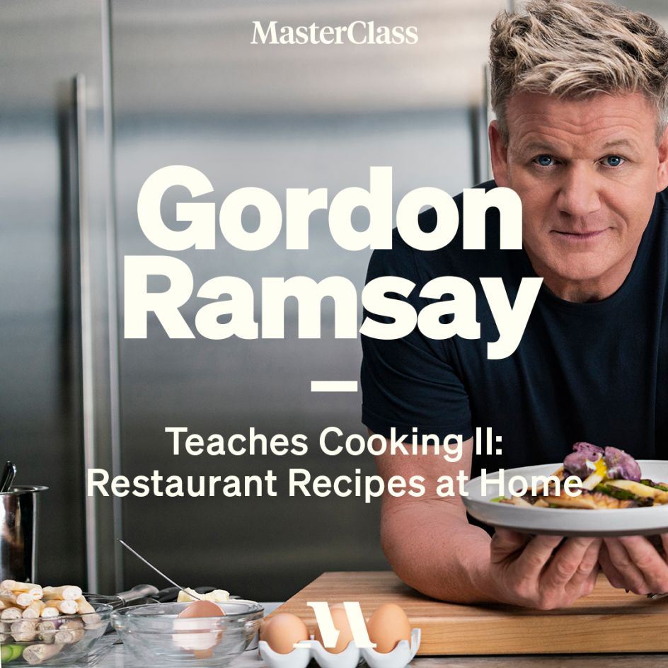
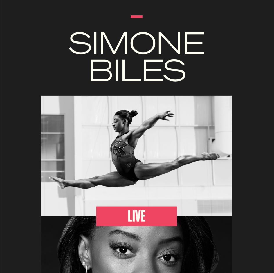
The typography uses various serif styles and different weights; while the former monochrome colour palette is now accented with additional vibrant tones. To illustrate the diversity of MasterClass' instructors and classes, each instructor now has their own unique visual identity comprising their own logo, font and colourway.



 by Tüpokompanii](https://www.creativeboom.com/upload/articles/58/58684538770fb5b428dc1882f7a732f153500153_732.jpg)


 using <a href="https://www.ohnotype.co/fonts/obviously" target="_blank">Obviously</a> by Oh No Type Co., Art Director, Brand & Creative—Spotify](https://www.creativeboom.com/upload/articles/6e/6ed31eddc26fa563f213fc76d6993dab9231ffe4_732.jpg)


