New book One Shilling is a glorious celebration of vintage British football programmes
It's been four years since Matthew Caldwell, a senior designer at DixonBaxi, began collecting football programmes from the 1960s to the 1980s. Now 1 Shilling is being turned into a book to celebrate the once must-have printed companion to the beautiful game.
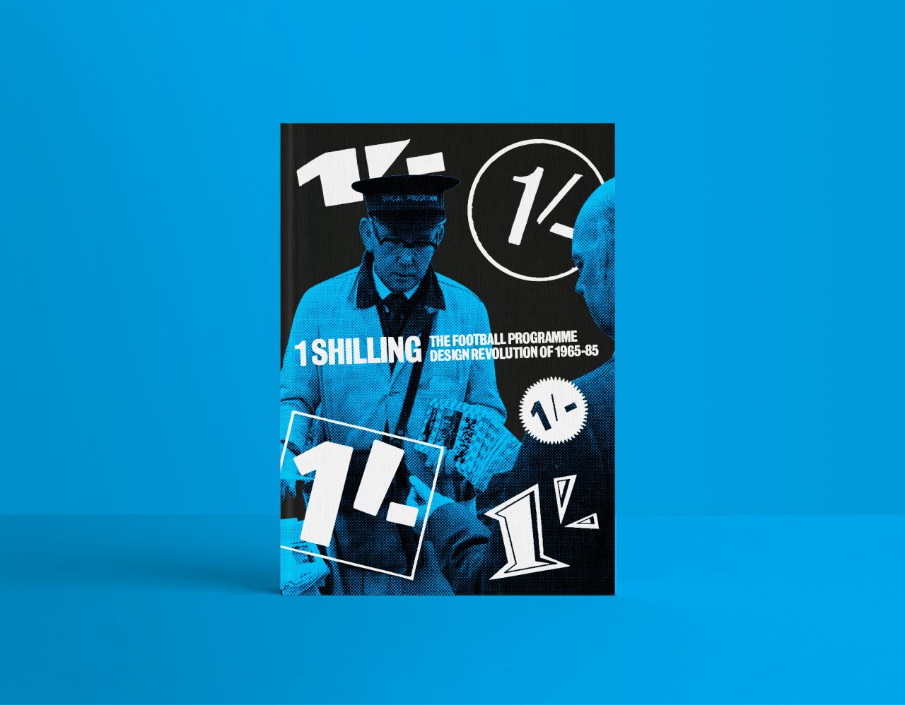
Currently on Kickstarter, 1 Shilling: The Football Programme Design Revolution of 1965-85 promises to "break new ground as it digs deep into the rich history of an astonishing era of football programme design" and uncover the stories of their creators. Expect designs from more than 40 British football league clubs, taking you on a nostalgic trip into the past when a new generation of designers had burst onto the scene, fresh out of art school and off the football terraces. "They wielded a new visual language," explains Matthew, "creating covers and layouts which rebelled against club's chairmen, with typefaces sampled from the album sleeves of their favourite bands."
You can understand the appeal. But it was, in fact, Matthew's father who sparked the idea for the project in 2018. "It started as a way to document my dad's freakishly large football programme collection, accumulated over 50 seasons of following Aston Villa – he's the reason we can afford Coutinho's wages! After a couple of Instagram posts, I quickly realised that people loved these designed, beautiful bits of stapled paper – especially when we researched the stories behind each design. It wasn't long before we had enough info and scans to put together a book!"
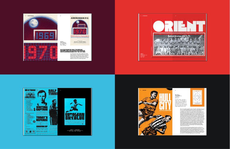
What is it about football programmes that Matthew loves so much? "Programmes have this incredible ability to take you back to a time and place," Matthew tells Creative Boom. "Even if you've not been to the games, you can almost hear the fans' chants echoing from the pages. You also get a real sense of the club's atmosphere – whilst the names of local businesses who took advantage of advertising slots give us an idea about that town or city's industrial past. But it is the visual quality of these programmes that makes me love collecting them so much. Bold colours, brave compositions, outrageous typography – these programmes were born out of an era of football before the oil barons and oligarchs took over the clubs and turned them into businesses. Designers had fewer boxes to tick – just one rule, make it cool, and make the other fans jealous! What's not to love?"
The book also boasts Alan Dein as co-author, an oral historian and award-winning radio documentary presenter. "I thought that my dad was a serious collector," says Matthew, "until I met Alan Dein, the Mr Guggenheim of programme collecting! He discovered my Instagram page and got in touch, saying how much he loved how we documented the collection and that he'd love to meet up. Conveniently, the London Programme Fair was scheduled for the following month, so off we went to bond over some yellowing pieces of paper with rusty staples. After five minutes of browsing, Alan, a social historian by trade, had already found himself a rare copy of a Torquay programme he had been looking for for years. Why? It famously had a Sex Pistols 'Anarchy in the UK' tour poster advertisement. It was impossible to find online because of Sex Pistols fanatics. Alan found it for a quid at this fair. It was at that point I realised I had met a genius."
Matthew tells us how Alan's knowledge of programmes is invaluable, having lived the era they focus on in the book: "Unlike to myself who only dreams of what it must have been like on the terraces in the mid-70s," he says. "Our two focus areas have made for a unique take on football programme history – graphic design and social history and running hand in hand throughout."
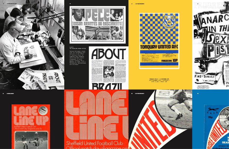
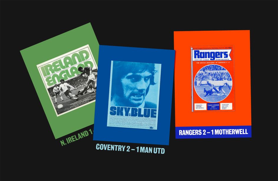
One could say that the pair are documenting an essential part of graphic design and sporting memorabilia history, too, as matchday programmes are no longer obligatory and are sadly in decline. "When the programme was first introduced, in the late 1800s, they were essential forms of communication – showing the line ups, league standings and even the odd article about last weekend's away game," Matthew continues. "Today, however, there is an infinite number of ways to attain your matchday information, long before you even reach the stadium. But one thing programmes can do that Instagram posts cannot is transport you back to a moment in time, back to the incredible goal you witnessed, or the three pies you devoured at halftime. Yes, programmes are in decline, but they may just need a re-evaluation or a revolution! Hopefully, this book can kickstart that creative resurgence!"
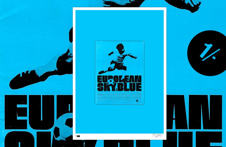
Of all the programmes in Matthew's collection, he pitches the Coventry City vs Bayern Munich programme from 1970 as his favourite. "It was for a fixture in the Inter-Cities Fairs Cup, designed by legendary programme designer John Elvin. We turned it into a poster as one of our Kickstarter rewards – I think there are still a few left! The cover boasts a menacing silhouette of the late Gerd Müller, centred on top of the copy European Sky Blue, set in one of Elvin's favourite typefaces, Neil Bold. It just oozes class!"
If 1 Shilling sparks something in you and you'd love to see Matthew and Alan's book brought to life, you can back the project on Kickstarter today and also follow the collection on Instagram.


 by Tüpokompanii](https://www.creativeboom.com/upload/articles/58/58684538770fb5b428dc1882f7a732f153500153_732.jpg)


 using <a href="https://www.ohnotype.co/fonts/obviously" target="_blank">Obviously</a> by Oh No Type Co., Art Director, Brand & Creative—Spotify](https://www.creativeboom.com/upload/articles/6e/6ed31eddc26fa563f213fc76d6993dab9231ffe4_732.jpg)


