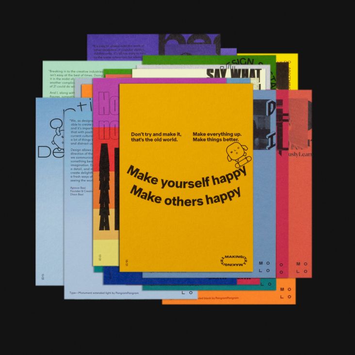
Pangram Pangram's sexy new foundry website and its latest release, Right Gothic
Pangram Pangram is having a moment of late with the launch of its refreshed foundry website and the release of a gorgeous new font inspired by early pre-Swiss sans typefaces, which were often referred to as "serifs without serifs". Here, we chat with its founder about this and more.
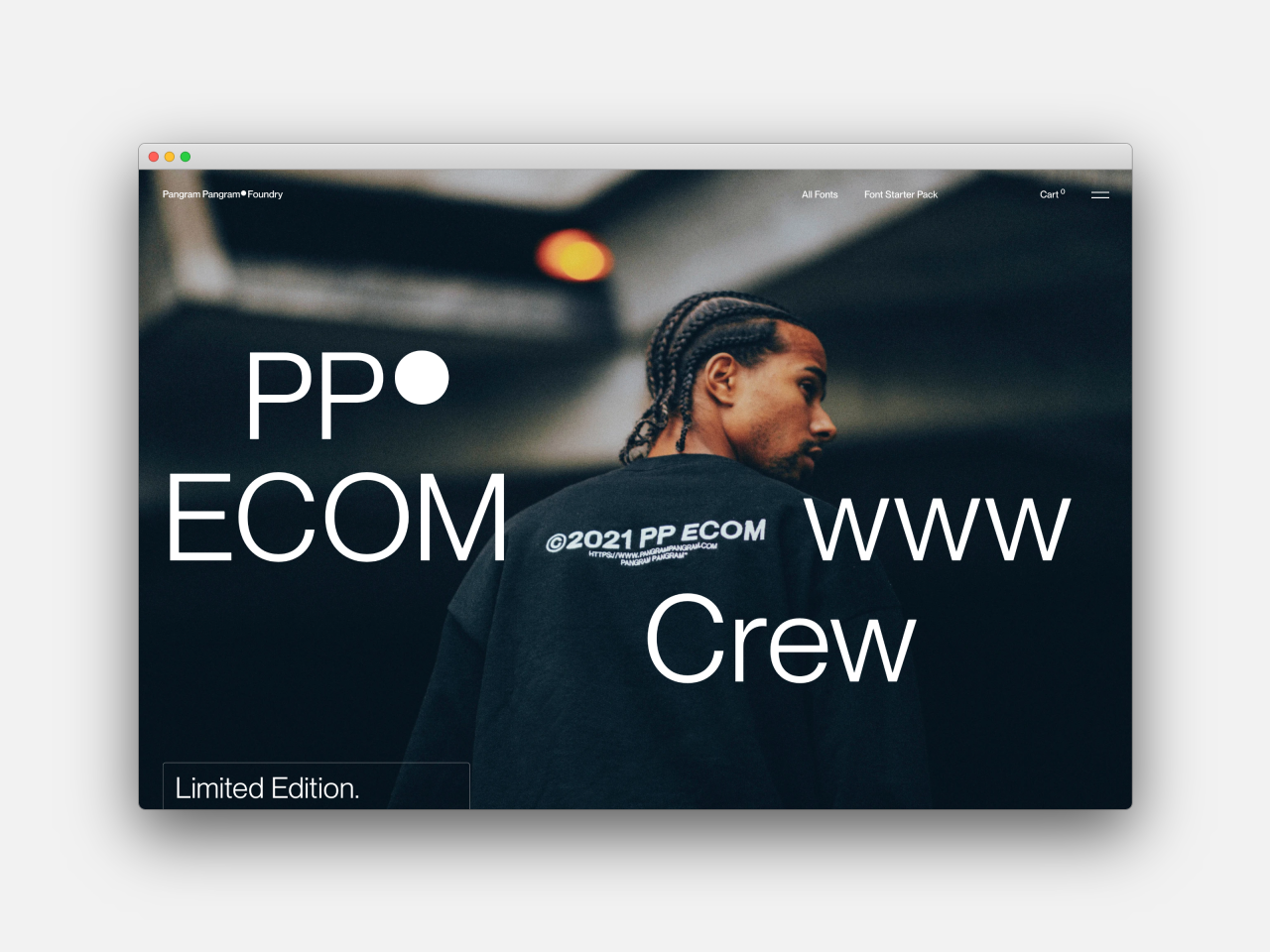
Pangram Pangram began as a passion side project by Mat Desjardins back in 2015. "I was a freelance graphic designer at the time and when I got a little downtime at the end of 2017 I decided to give this 'side project' a real go which is when the previous site was officially launched, I also introduced new collaborators and a blog," he tells Creative Boom. "As a graphic designer, getting quality fonts to try was always a bit of a hassle so when creating the foundry I wanted to facilitate the access to the foundry's fonts by giving them for free so designers can download them and try them fully in their projects."
And give them for free he does. Mat and his team allow designers to "try before they buy", so they can see the foundry's fonts in action. "Better fonts usually equals better projects so everyone, including designers, clients and agency, is happy," he says.
What's changed since then is the addition of lots of new ideas and concepts, new fonts, and new collaborators. "The foundry has grown but the core values will always remain the same: helping the design community as much as possible," he says. With that ethos in mind, Mat's blog has evolved into The Pangram Paper where he and his team write about different creators, their crafts and the industry at large.
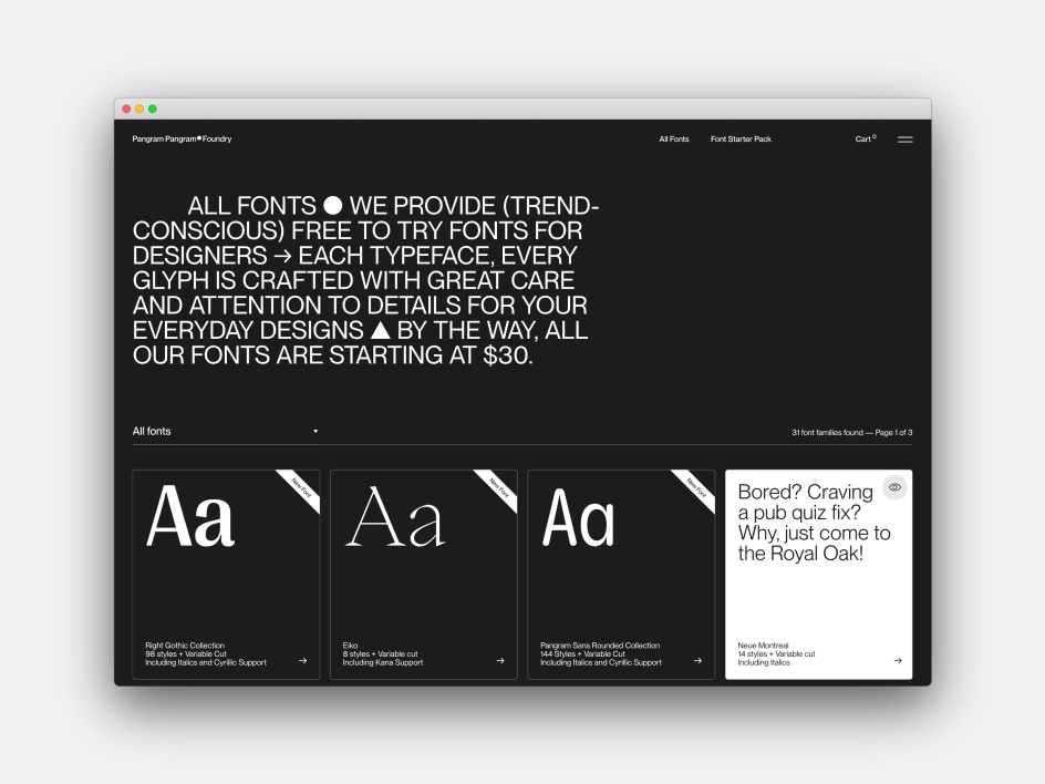
What's been their most popular font to date? "It's hard to pinpoint one because they all have their moments! But if I look purely at traffic, I would say Neue Montreal and Editorial New are amongst the top ones," Mat says.
As for the new website design for his foundry, Mat believes it was long overdue. He worked with the people at the Montreal agency, Locomotive following their design and build for a microsite for the Editorial New font. "We wanted to go with something that was a bit more of a blank canvas since each font is really different and have their own voice," Mat says of the brief. "We wanted the overall design to be subtle, minimal and not take too much visual space. The typefaces are the real actors here. We also wanted to refine the user experience and add more depth to each page by adding a 'font in use' section, amongst other things."
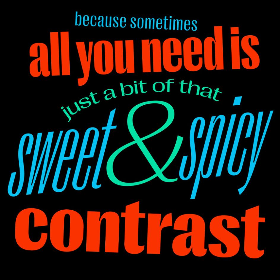
Right Gothic
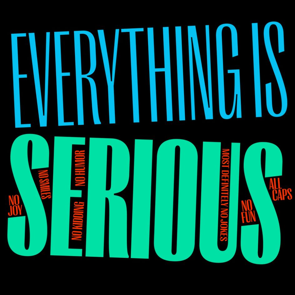
Right Gothic
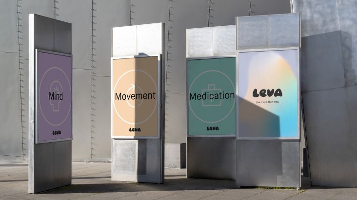
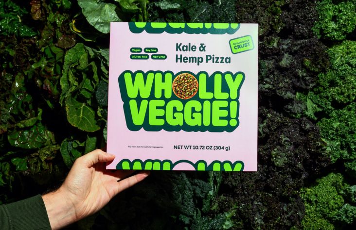
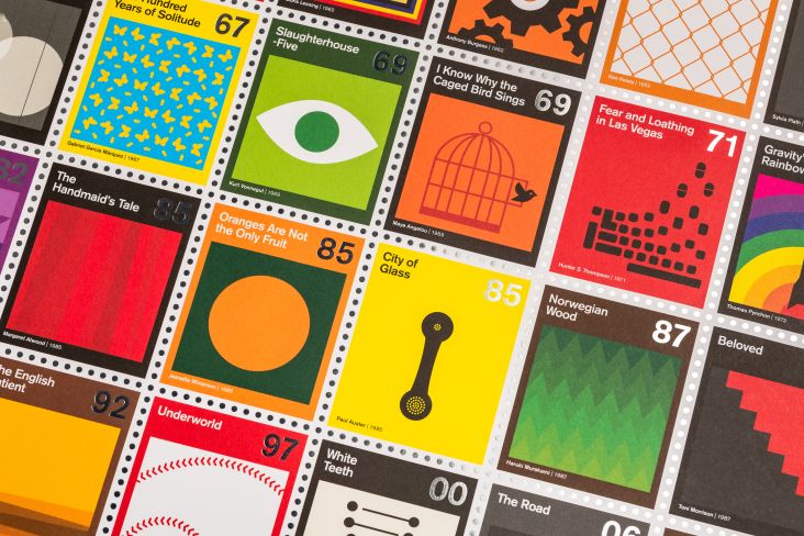
Right Gothic is Pangram Pangram's latest release: a large multi-purpose variable type family. With smooth ink traps, a contemporary feel yet familiar letterforms, it's a modern sans serif font that has a slight serif feel. It also happens to be Right Grotesk's more "contrasted sister" – an earlier release by the foundry. "It has a unique voice with distinct details," says Mat. "Compared to Right Grotesk, it has a low contrast between thick and thin strokes. The word 'Gothic' in its name refers to the genre of early pre-Swiss sans typefaces, which often were sort of 'serifs without serifs'," he adds.
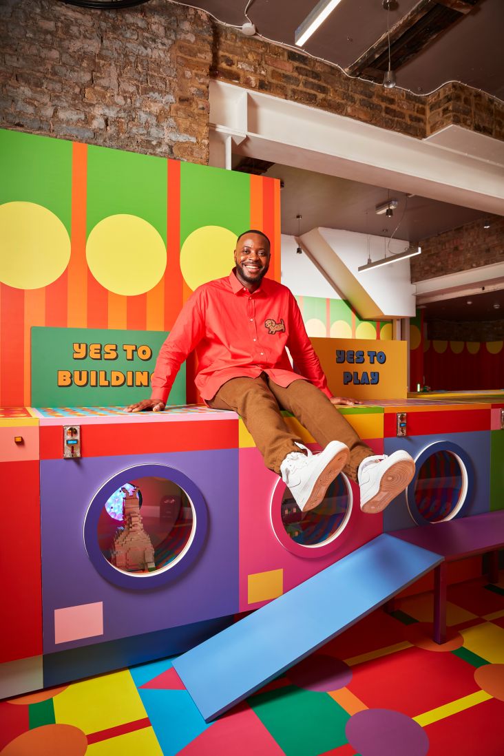
This solid workhorse with 98 fully variable styles feels happy and optimistic, too. Possibly reflective of our times and a need to embrace some positivity in the coming months. "I think it is more on the display and playful side while retaining its sister's workhorse features so I can definitely see this typeface being used in more relaxed contexts," Mat says. "Even the visuals have a certain sarcastic tone to them."
Try out the new font for free at pangrampangram.com. You might also be interested in the affordable Font Starter Pack, priced at just $27 and available to all.


 by Tüpokompanii](https://www.creativeboom.com/upload/articles/58/58684538770fb5b428dc1882f7a732f153500153_732.jpg)


 using <a href="https://www.ohnotype.co/fonts/obviously" target="_blank">Obviously</a> by Oh No Type Co., Art Director, Brand & Creative—Spotify](https://www.creativeboom.com/upload/articles/6e/6ed31eddc26fa563f213fc76d6993dab9231ffe4_732.jpg)


