Parkinson’s UK gets an overhaul to better reflect community needs today
Parkinson's UK unveils a bold new look with help from Red Stone. Focusing on 'living well today', the refreshed identity combines accessibility, personality, and purpose to support those living with the condition.
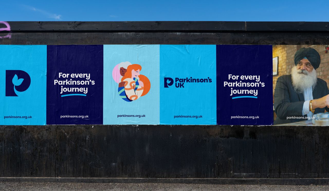
London creative agency Red Stone has teamed up with Parkinson's UK to give its brand a bold new look that's all about meeting the needs of the Parkinson's community today. As the fastest-growing neurological condition globally, affecting around 153,000 people in the UK alone, the charity wanted an identity that better reflects its mission to ensure every person living with Parkinson's can live better right now.
The creative process began with an understanding of the lived experiences of the Parkinson's community. Red Stone staged workshops and interviews and even joined local events, connecting with over a thousand people. What they discovered was powerful: while breakthroughs for tomorrow matter, so do the small victories people achieve each day. This insight drove the new proposition: Parkinson's UK is "Pushing for better. Right here. Right now".
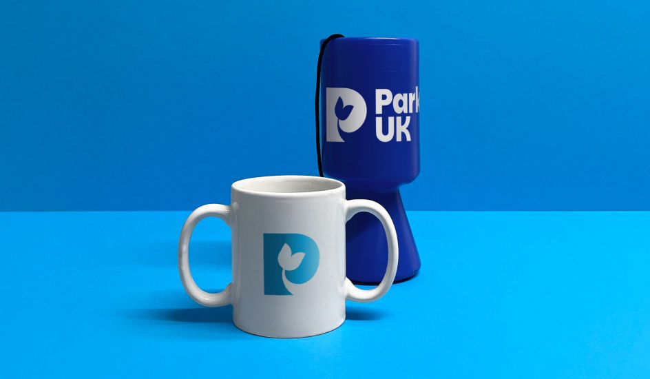
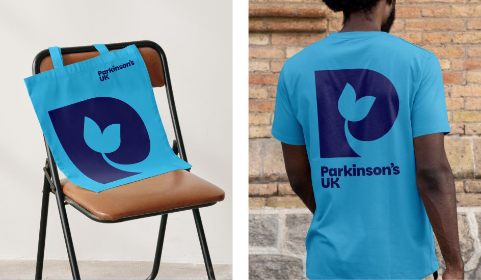
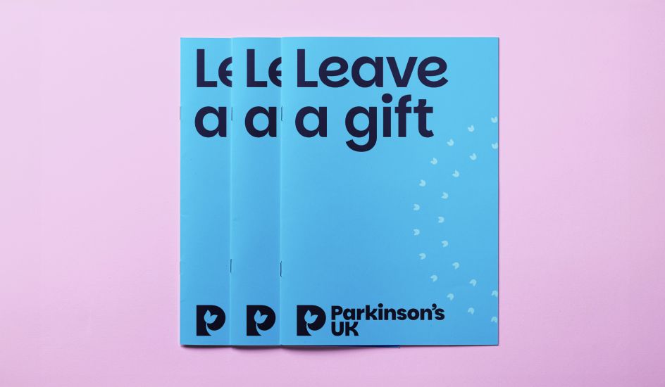
At the heart of the rebrand is a striking new symbol inspired by the Parkinson's tulip – an emblem recognised around the world. It sits comfortably in the negative space of the 'P', acting as a unifying icon for a condition that presents over 40 different symptoms and defies easy definition. The result is a design that feels personal, inclusive, and rooted in the charity's history while looking to the future.
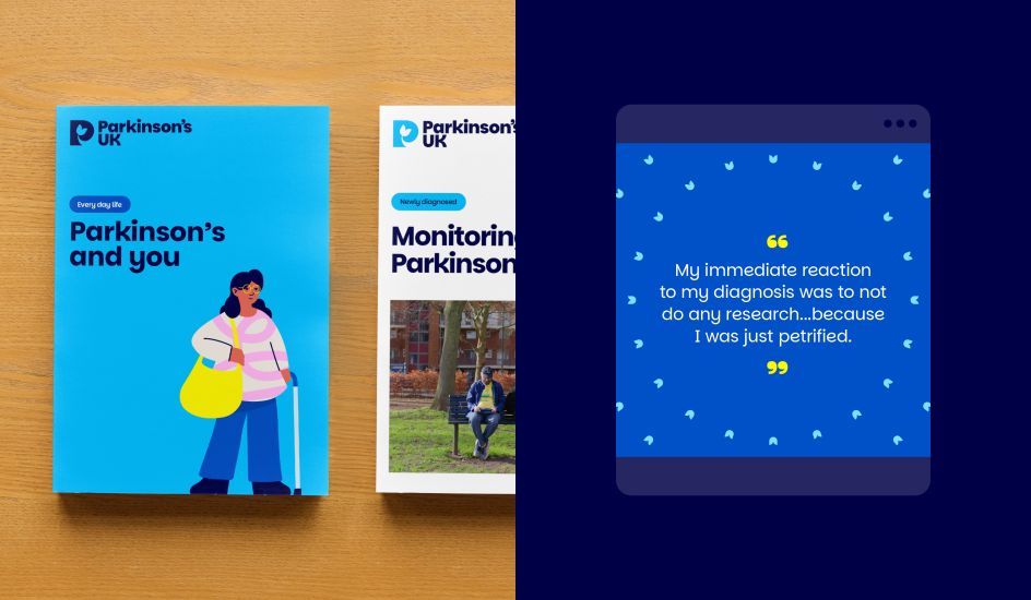
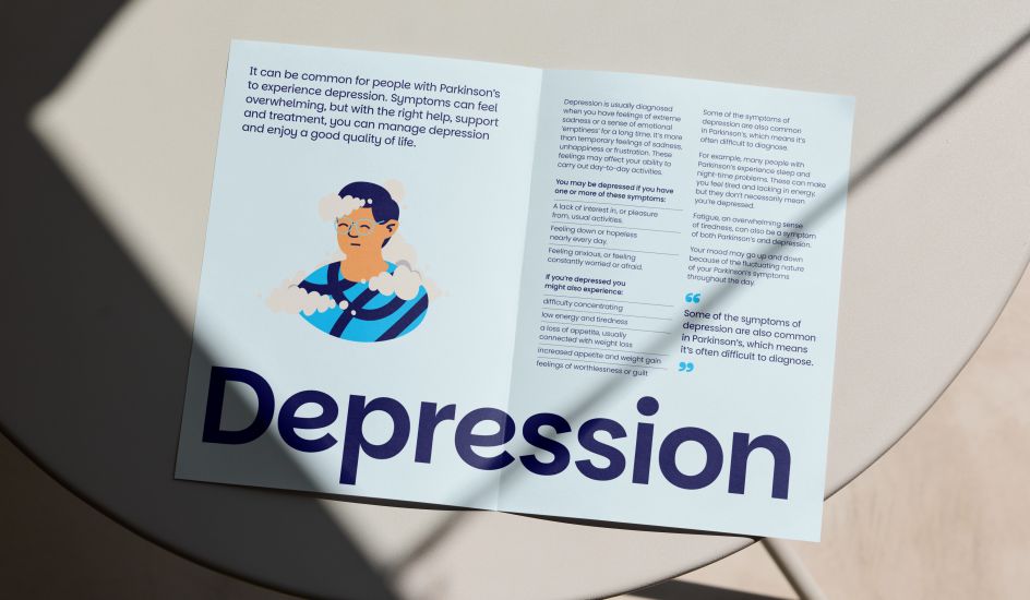
Accessibility was another cornerstone of the project. Red Stone developed a custom typeface, cleverly dubbed Parkinsans – a playful nod to its purpose – to bring the brand's voice to life. It's approachable, quirky, and full of character – just like the community it represents. Even better, it's now available as an open-source typeface on Google Fonts, making it truly for everyone.
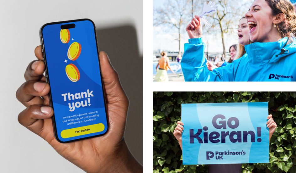
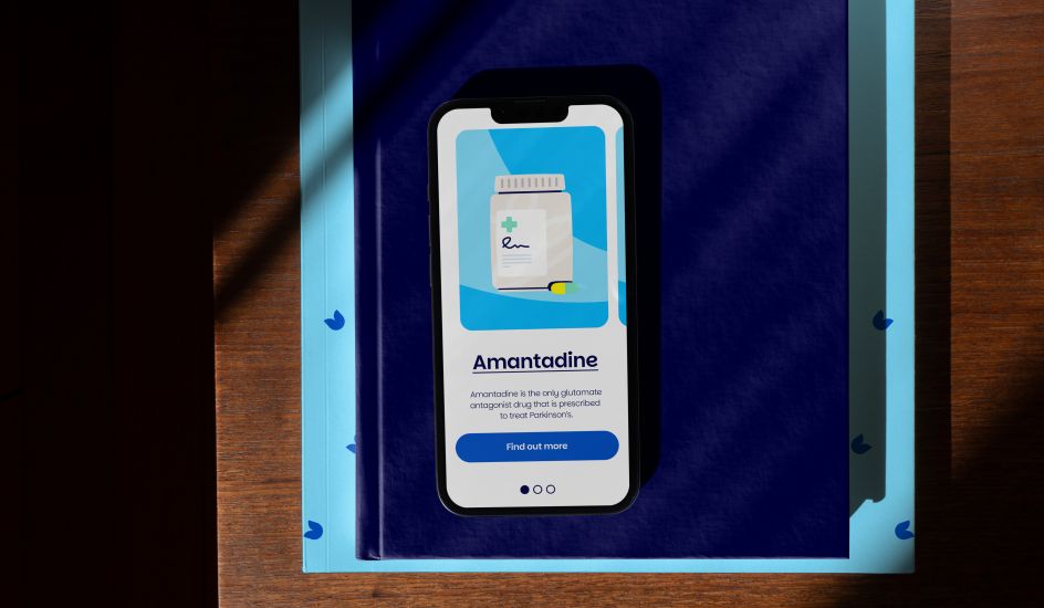
The refreshed brand goes beyond visuals. It gives Parkinson's UK a gutsy new tone of voice, with a personality defined by energy and determination. A dynamic colour palette of various blue hues –complemented by a secondary range of vibrant pink, yellow, and green –an adaptable design system and a fresh approach to illustration means the charity can tell its story with honesty and warmth. Everything is designed to be easy to use, empowering the organisation and its supporters to connect with the wider community. It's worth noting that everything – from the illustrations to the typography – was developed in-house at Red Stone.
"With a strategy focused on living well with Parkinson's today, we knew our brand had to live up to that promise," says Juliet Tizzard from the charity. "Thanks to Red Stone's expertise and the incredible input from the Parkinson's community, we've created something that reflects their wants and needs. It's a brand that unites and empowers, helping us to have a positive impact right now."
"This was all about the people," adds Chris Davis at Red Stone. "After speaking to so many individuals affected by Parkinson's, we created a brand that everyone can rally behind. It's packed with personality, and we're excited to see it in action."
This rebrand is more than just a facelift – it's a call to action and a vital part of the charity's three-year strategy to help people live well today. For a condition as complex and challenging as Parkinson's, the new identity is gusty, inclusive, and full of heart – championing breakthroughs, strengthening community connections, and celebrating everyday wins.


 by Tüpokompanii](https://www.creativeboom.com/upload/articles/58/58684538770fb5b428dc1882f7a732f153500153_732.jpg)


 using <a href="https://www.ohnotype.co/fonts/obviously" target="_blank">Obviously</a> by Oh No Type Co., Art Director, Brand & Creative—Spotify](https://www.creativeboom.com/upload/articles/6e/6ed31eddc26fa563f213fc76d6993dab9231ffe4_732.jpg)


