Pentagram gives the Bard a contemporary edge by mixing historical and modern type
How do you design an identity that keeps the Bard relevant yet timeless? A fresh new look for the Shakespeare Theatre Company by Pentagram's Marina Willer and her team is a masterclass in merging traditional with modern.
Marina Willer was asked to rebrand the award-winning theatre in Washington DC to mark a new era for the company as it welcomes Artistic Director Simon Godwin and Executive Director Chris Jennings to its fold. Established in 1970, the theatre presents classic productions across a multitude of genres, bringing them to life in a provocative, imaginative and accessible style.
With Shakespeare obviously at its core, the company puts on plays of national and international relevancy – exploring various profound themes with complex characters and heightened language – all through a contemporary 21st-century lens. Its core belief is that theatre acts as "collective storytelling and shared witnessing" and is essentially a force for good.
Recognised as an art leader in DC, the company has received more than 100 Helen Hayes Awards but has also gained a national reputation for its thought-provoking productions. It's also in a unique position, as its plays address issues including recent tensions around power and race that are very close to home but still very much relevant on a global scale. You could say it embodies Shakespeare's much-quoted observation that 'All the world's a stage'.
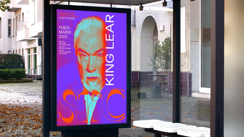
With this in mind, Marina's brief was to create a new identity that expressed the ongoing relevance of Shakespeare, but one also enhanced by the contemporary spin that the theatre brings to the Bard's timeless stories. For instance, it frequently presents Shakespeare's classic texts with a fresh angle, highlighting topics such as diversity, inclusivity and tolerance whilst reflecting on universal themes including love, power, greed, life, death and many more.
Building on the theatre's vision of 'Vital Stories Audaciously Shared', Marina proposed a creative expression centred around a central idea of the "interplay between a broad range of dimensions", including classic and contemporary, artist and audience, stage and digital, entertaining and learning, intimate and collective, real and unreal – as a way of "reimagining stories from the past for audiences of the future".
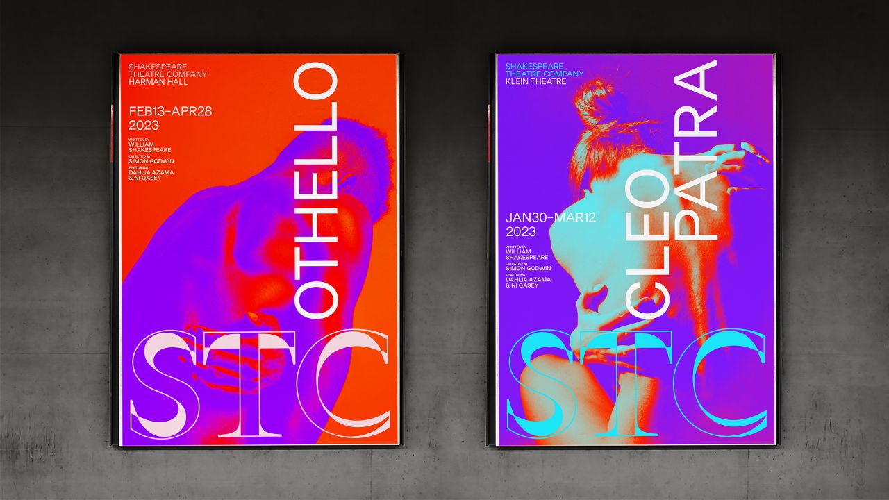
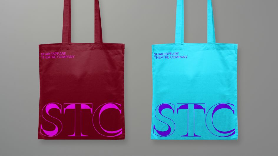
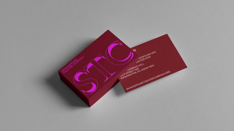
Inspired by this very notion of interplay, Marina and her team designed a brand language centred around a logo overlapping historical and contemporary type, which then plays on the tension between these two forms. The acronym 'STC' is used as a shortcut in contrast to the longer wordmark: "This is to establish a more approachable connection with audiences and deliberately move away from the more academic or inaccessible perception that many people have of Shakespeare," explains Marina.
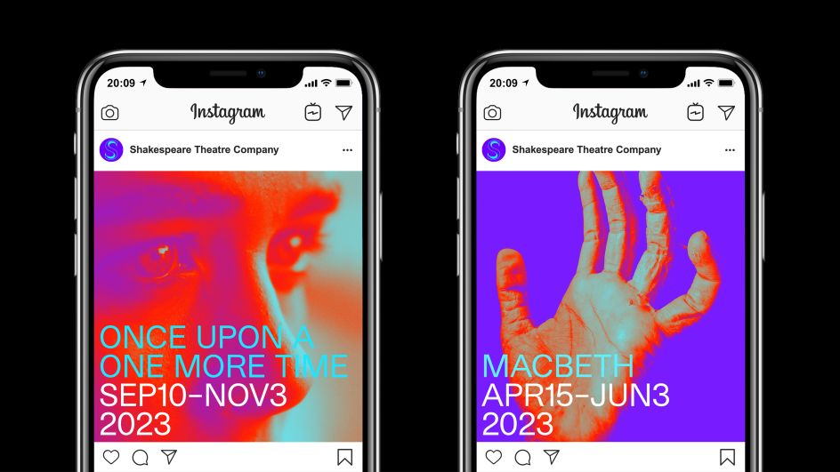
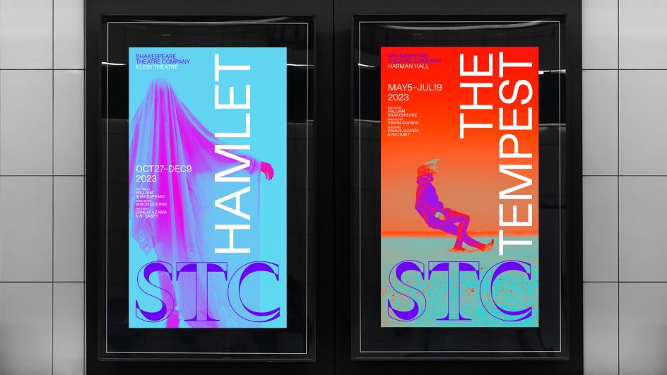
Designed to appeal to a contemporary audience, electric tones and dynamic imagery are combined to bring new light and energy to the classic stories. While the supporting typography is modern, functional and neutral to "avoid the temptation to become illustrative". The photography used throughout ranges from electric tones to more natural everyday imagery that documents the wide-ranging activities of the company.
"The power of shared experience means that theatre can create an impact like no other art form, and the new visual language created by Marina and the team gives us an evocative and haunting glimpse into the impactful experiences that STC consistently creates," says Pentagram.


 by Tüpokompanii](https://www.creativeboom.com/upload/articles/58/58684538770fb5b428dc1882f7a732f153500153_732.jpg)

 using <a href="https://www.ohnotype.co/fonts/obviously" target="_blank">Obviously</a> by Oh No Type Co., Art Director, Brand & Creative—Spotify](https://www.creativeboom.com/upload/articles/6e/6ed31eddc26fa563f213fc76d6993dab9231ffe4_732.jpg)


