Take a look at the exciting new home of D&AD
If you're going to celebrate and nurture creative excellence, and award the world's very best in design and advertising, you'd better have a home to be proud of. That's certainly something D&AD can confirm with its new offices and event space on Cheshire Street in London.
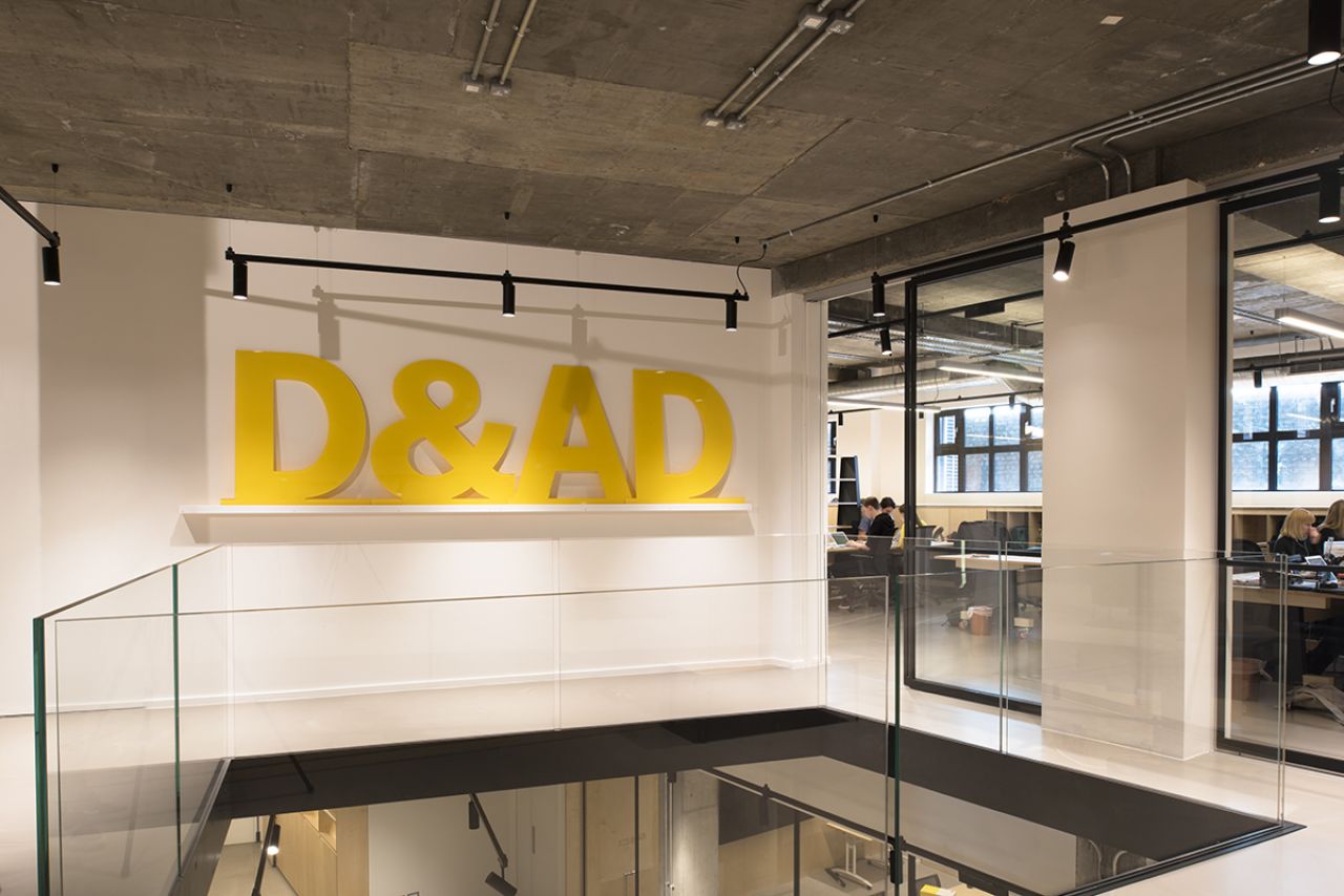
But as a charitable organisation, the obvious approach has been a modest one. The starting point was an 8,000 square feet empty concrete shell spread over two floors with high ceilings and generous proportions. The site takes the lower ground and basement of a beautifully restored Victorian building that claims a long strip of the street.
D&AD wanted the working environment to be flexible for staff and also to enable people to be fully immersive when events and exhibitions take place.
Calling on the talents of Brinkworth, the architect introduced bold interventions to connect the two volumes of space, combining the functionality of the office and reception upstairs with the event space below. Throughout the project, sliding glass doors have been installed to allow the spaces to adapt to the wide range of activities you can expect.
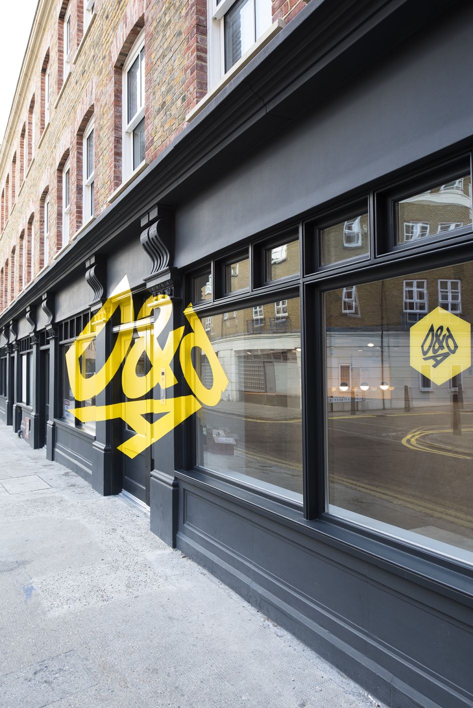
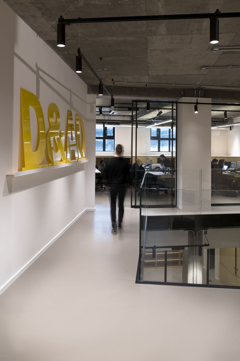
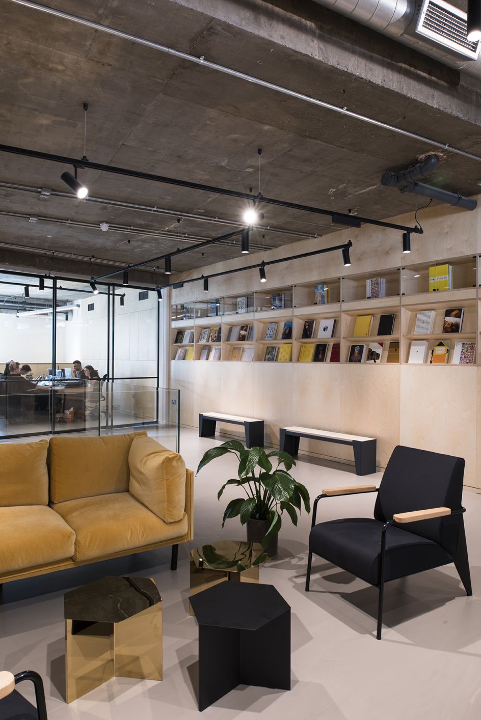
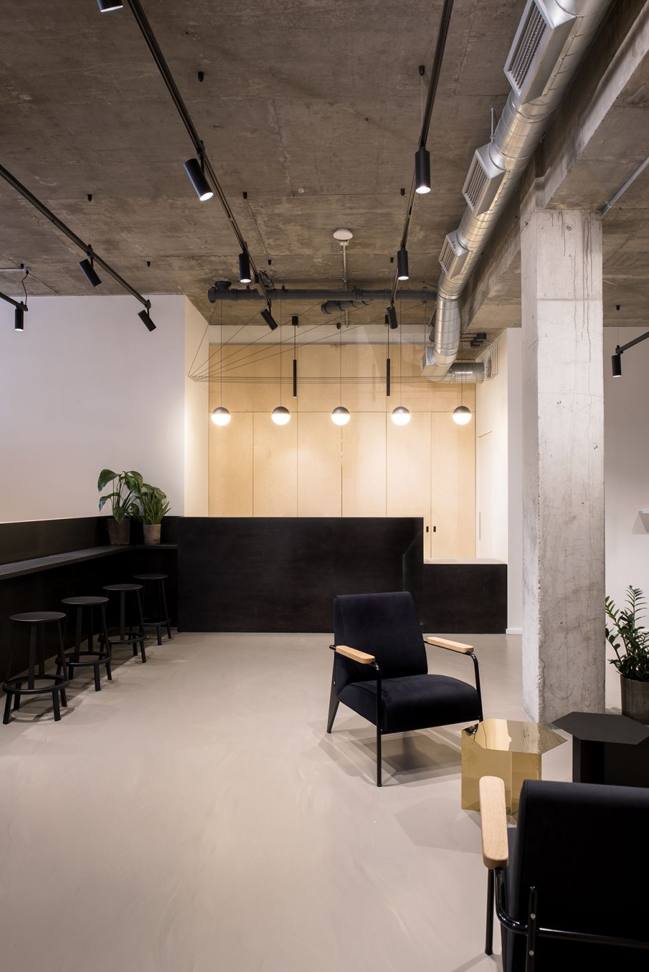
On entering at street level, you immediately land on a short walkway with a solid plywood balustrade. A large drop beyond the balustrade's edge encourages a pause to appreciate views across the main staircase void to the lower ground reception and office area.
Once you've descended down a short stair to this level, it is apparent that the solid balustrade is just the tip of a vast wall that wraps around the staircase to the space below. A large void has been cut into the reception floor to further connect the two levels with vistas between them and to allow abundant light into the basement.
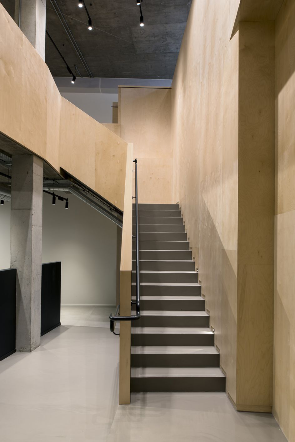
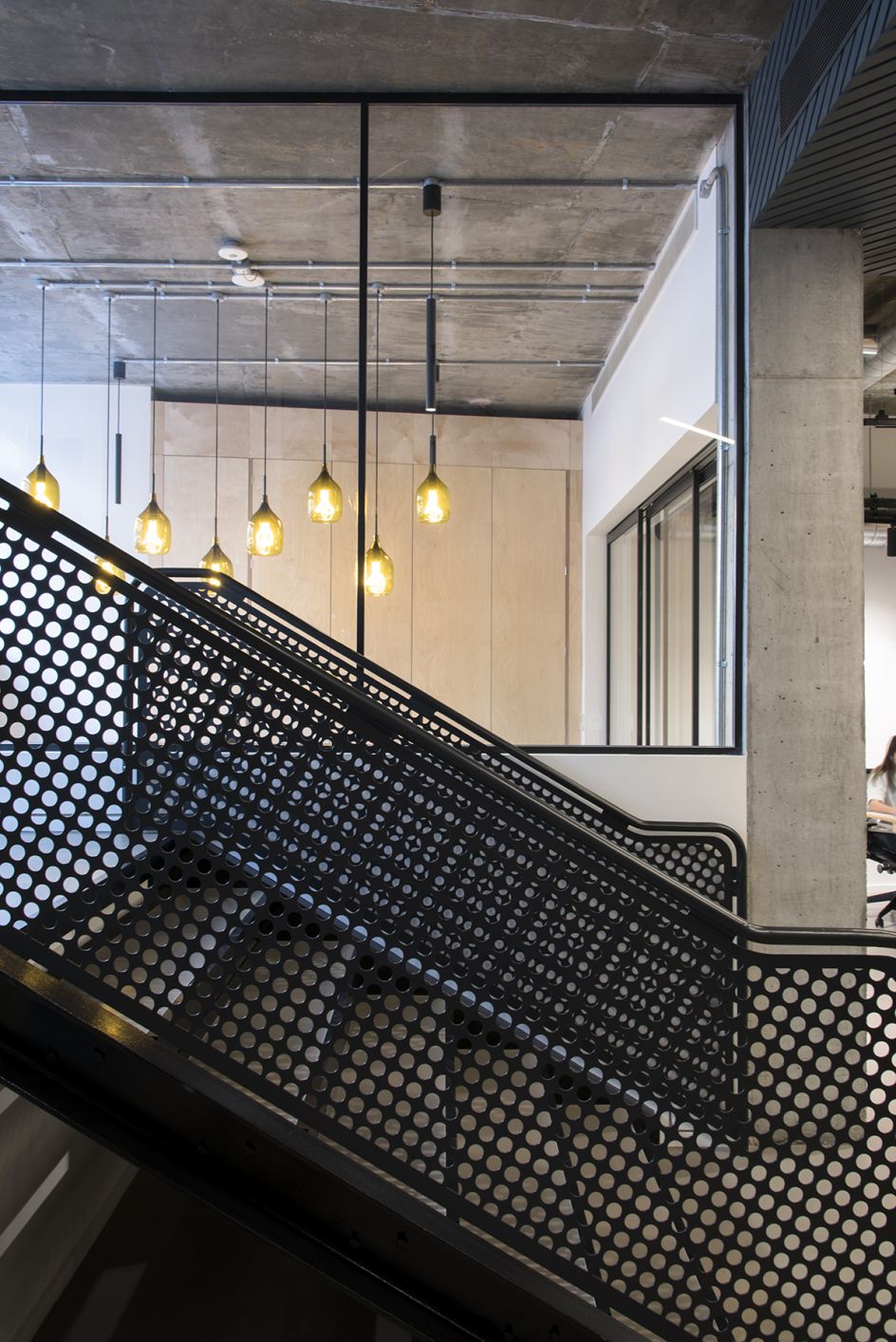
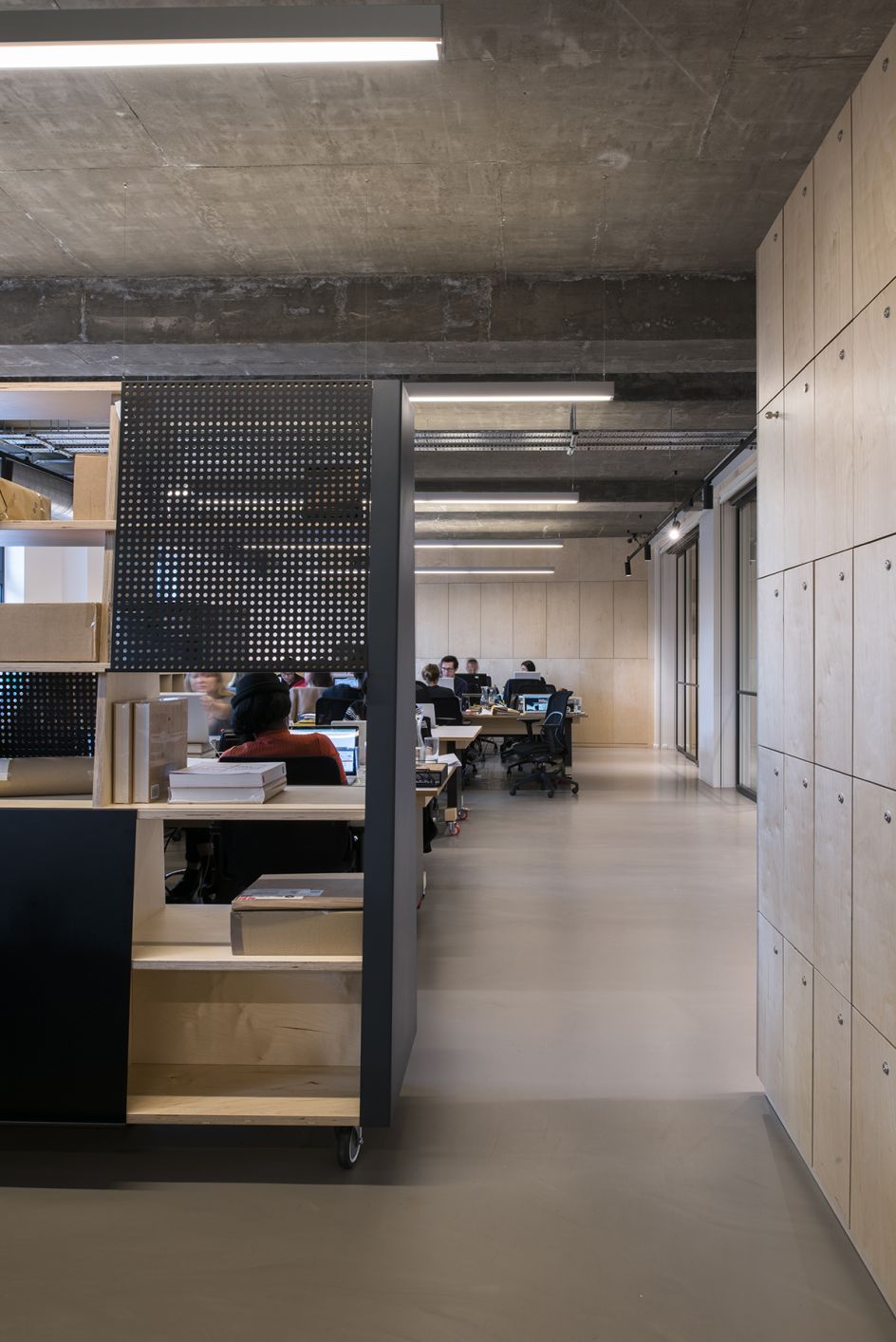
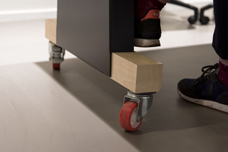
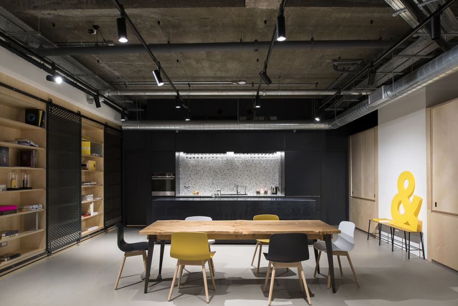
Of course, as a charitable organisation the design needed to be modest and hardworking. The materials selected reflect this approach, using cork, plywood, steel, pegboard and painted white walls. The general feel is utilitarian yet still comfortable and welcoming.
The one introduction of colour to the design is the signature bright yellow from the famous D&AD pencil awards. Hidden within the inside of the cupboards, a surprise flash of colour is revealed when opened.
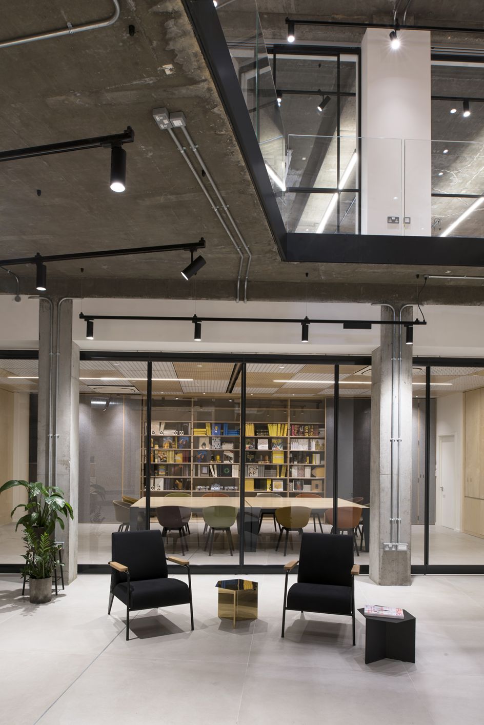
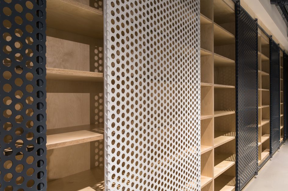

The reception desk has a layered detail cut out in the shape of half a pencil which will glow with hidden lighting inside. The reception has custom made bookcases integrated into the walls, to house the complete collection of the D&AD Annuals, which will add meaningful colour and texture.
In the basement, the event space has bleacher seating, to a casual auditorium feel, and the large board room at the back can be opened up to blend the two.
Furniture designer Carl Clerkin joined Brinkworth to collaborate on this particular project and developed the freestanding furniture elements, adding some delightful details and discreet humour.
D&AD is settled in the space and its team is already planning events for the next few months. Check out the website at www.dandad.org for further updates.


 by Tüpokompanii](https://www.creativeboom.com/upload/articles/58/58684538770fb5b428dc1882f7a732f153500153_732.jpg)


 using <a href="https://www.ohnotype.co/fonts/obviously" target="_blank">Obviously</a> by Oh No Type Co., Art Director, Brand & Creative—Spotify](https://www.creativeboom.com/upload/articles/6e/6ed31eddc26fa563f213fc76d6993dab9231ffe4_732.jpg)







](https://www.creativeboom.com/upload/articles/b3/b3e8aa93551248abf7815c7bf1b18772ea917f2c_732.jpg)
