The Foundry Types launches new Wim Crouwel typography 'collaboration'
London-based type design studio The Foundry Types has created the new Fernhout font, which is effectively a posthumous collaboration with revered Dutch graphic designer, type designer, and typographer Wim Crouwel.
Heavily inspired by Swiss Modernist design, Crouwel, who died in 2019, designed several iconic typefaces such as New Alphabet and Gridnik and created an extensive body of work for the Stedelijk Museum in Amsterdam, where he established his reputation for radical, grid-based design.
The Foundry Types has a long-standing collaboration with Wim Crouwel and his family. In 1996, Crouwel appointed the studio to create digital fonts from his experimental alphabets, resulting in the Architype Crouwel collection of typefaces.
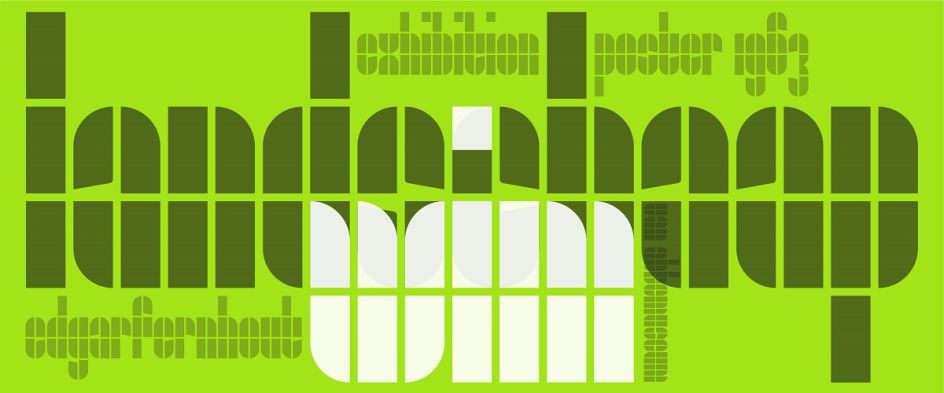
The latest collaboration between the two parties, Fernhout, is a display face is based on the simple primitive forms, rectangles, and quarter-circles Crouwel created for the catalogue and poster for a 1963 exhibition at Van Abbemuseum celebrating 20th-century Dutch painter Edgar Fernhout.

"Just like Crouwel's lettering, his posters and catalogues are unique," says Stuart de Rozario, The Foundry Types director and designer. "All vary in style and execution, often displaying humanity within his strict modular grid vision: systematic, logical, but crafted by hand and with a keen eye."
Fellow Foundry Types designer and director David Quay adds, "Wim never envisaged his designs to go on to be used as complete typefaces, and would often be taken aback to know people would want to use them in their own design projects."
The Foundry Types expanded the 'edgarfernhout' lettering to include a fuller character set with the full Roman alphabet in lowercase, as well as figures and punctuation glyphs. The Foundry Types says its "objective was simple: to create a clear expansion of the Crouwel' Edgar Fernhout' letterforms that seamlessly integrates with Wim's vision and philosophy."
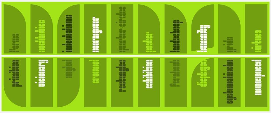
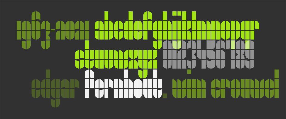
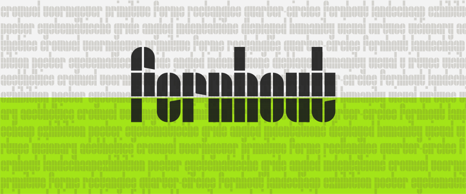
The Fernhout typeface consists of just a single weight with a very limited character set due to its elemental forms.
The studio adds that its ethos throughout the design process was "clarity, integrity, and authenticity". As such, the constructed 'Edgar Fernhout' letterforms consist of a simplistic rectangle block system, two columns wide and four oblongs tall with circled segments and angled indentations. "Although the glyph shapes are playful and simple – these basic forms often throw up challenging, complex problems and limitations," says the studio.
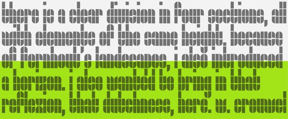
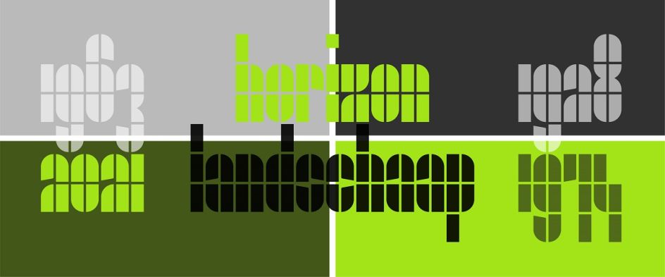
"The purist, basic forms of Fernhout offer little scope to break the grid without diminishing the overall visual virtues. Crouwel's carefully devised grid often allowed many glyphs to design themselves, but complex glyphs with diagonal strokes, [such as] k, s, x, z, 2, 4, 5, 7, needed to be stripped back and simplified. Characteristics within the letterforms also threw up a few dilemmas – how to design an 'i' and 'j' dot along with readable punctuation?"
The Foundry Types' solution was to introduce another element in keeping with the original's design approach: a square. This new shape allowed the designers more freedom to express the concept in a more refined way. "Problematic junctions to the centre section of the 3 and 8 were the trickiest to achieve. A double quarter-circle was added to allow these glyphs to be easily recognisable," the studio adds.


 by Tüpokompanii](https://www.creativeboom.com/upload/articles/58/58684538770fb5b428dc1882f7a732f153500153_732.jpg)


 using <a href="https://www.ohnotype.co/fonts/obviously" target="_blank">Obviously</a> by Oh No Type Co., Art Director, Brand & Creative—Spotify](https://www.creativeboom.com/upload/articles/6e/6ed31eddc26fa563f213fc76d6993dab9231ffe4_732.jpg)


