Tokyo Dome City's colourful new identity shows off the potential of variable fonts
Design studio &Form has created a new visual identity for the capital of Japan's entertainment complex, Tokyo Dome City, which expresses its diverse potential through an exciting range of colourful variable fonts.
Made up of an amusement park, a sports arena, the world's largest roofed baseball stadium, and many more facilities, Tokyo Dome City is a sprawling entertainment complex based in the heart of the Japanese capital. And as part of an overall renewal project taking place between 2023 and 2024, it's just been given a visual update courtesy of &Form.
Built around flexible formats that "transcend the boundaries between analogue and digital", the new identity also unites the various design elements of the diverse city under one system. This ensures that a certain level of consistency can be maintained even across different screen sizes found throughout the complex. And thanks to an innovation called Adaptive Identity System, the new visual identity can easily be rolled out across the entire facility.
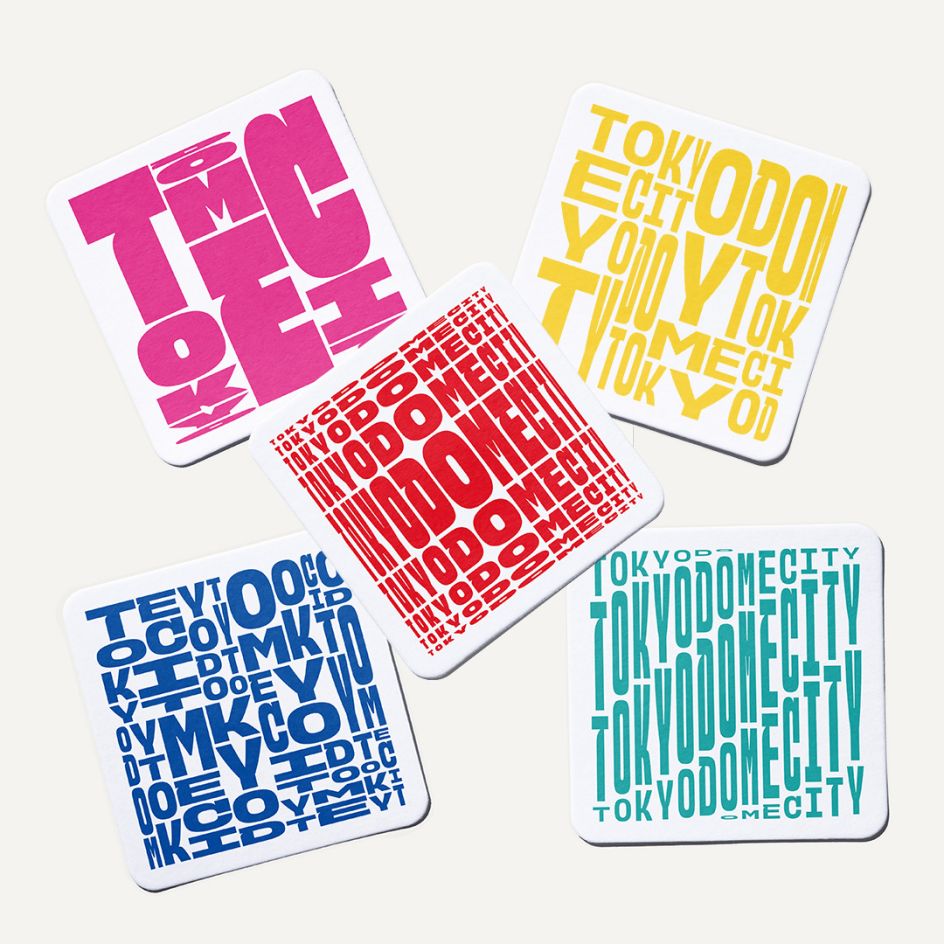
The decision to embark on a redesign aimed to create a sense of unity that was previously lacking in the city. It was also felt that the previous look of the complex did not deliver when it came to originality. "To address these concerns and create a new and memorable experience for customers, we proposed an identity system including digital signage, logos, motion graphics, merchandise, and sound within the facility," says &Form.
"We have established four core experience values as the overarching theme: 'Exciting', 'Playful', 'Relaxing', and 'Modern'. The goal is to develop a highly scale-able and comprehensive identity design that can adapt to changing times while resolving the existing challenges."
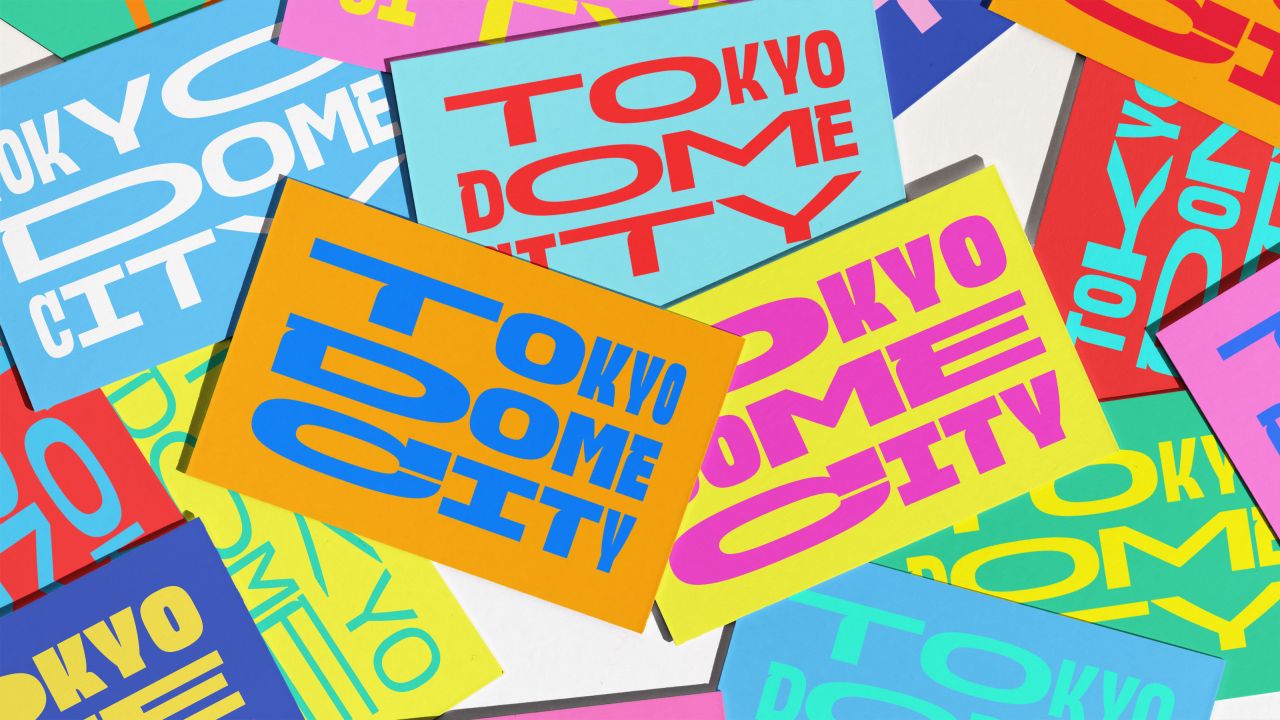
The main component of the new identity is an original variable font with a world-class wide variable range. Not limited to a fixed shape or a single colour, this font perfectly expresses Tokyo Dome City's diverse offerings to visitors. Powered by software developed in-house, the variable grid design allows creatives to adapt their visuals to any ratio or shape.
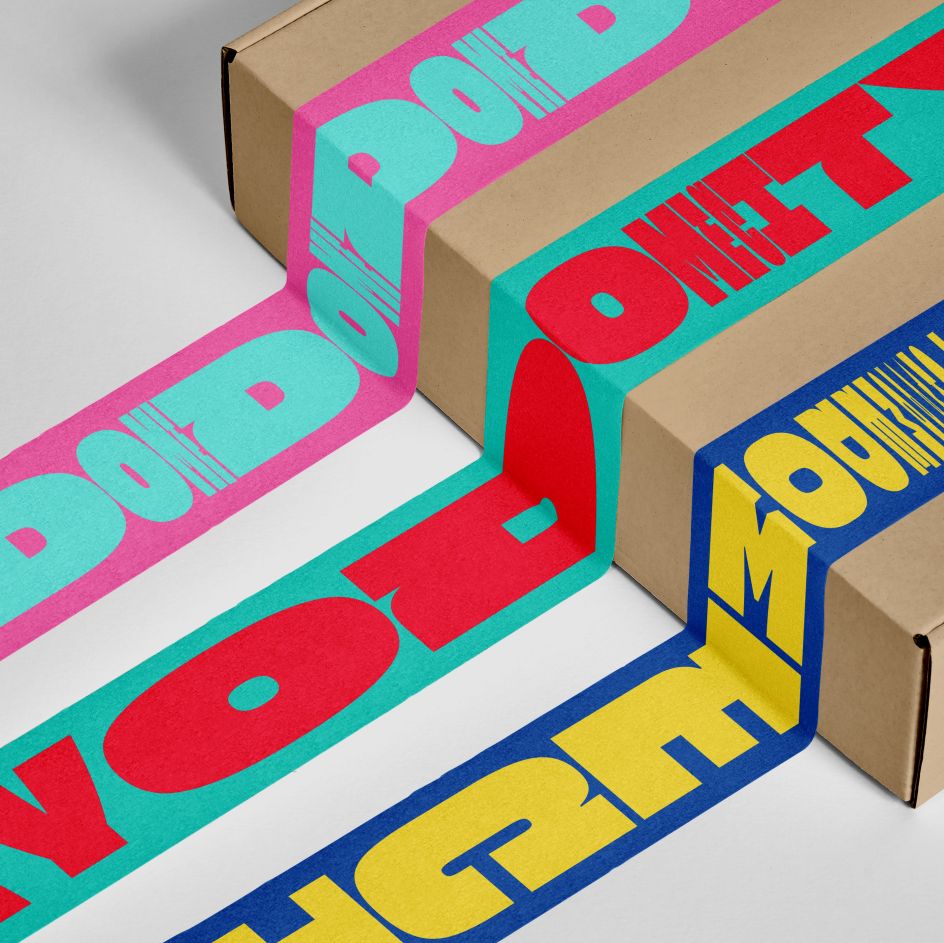
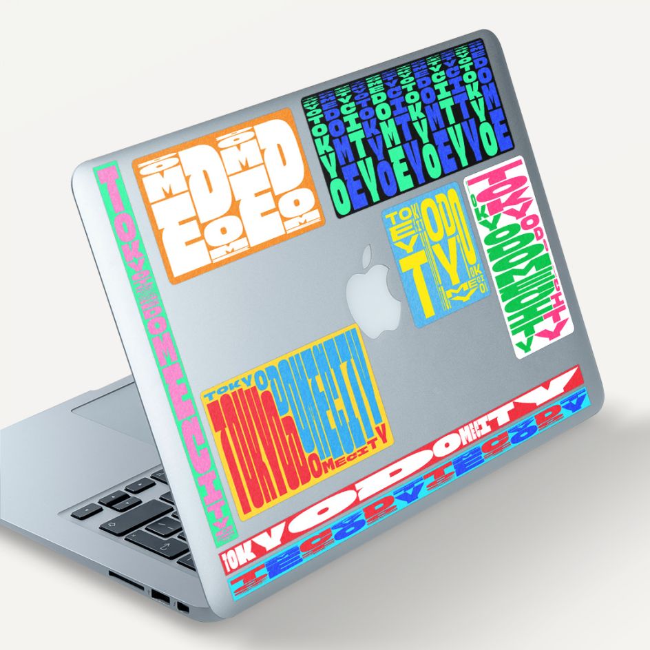
"We have developed an original variable font that is the first of its kind and dynamically adapts to the diverse experience values of Tokyo Dome City," adds &Form. "It skillfully captures the sporty elements of Tokyo Dome, the main facility, and the playful nature of various entertainment venues, all presented in a casual yet impactful sans-serif font."
By their nature, variable fonts allow characters to be freely stylised within a set parameter of values. These allow them to play with thickness, colour and font to dazzling effect, with the letter shapes forming mesmerising patterns that communicate the vibe of whatever destination they're advertising.
Created in collaboration with type designer Toshi Omagari, &Form has managed to create an original variable font that not only varies in character thickness but also features a broad range of movement along each of the three variable axes of width and height.
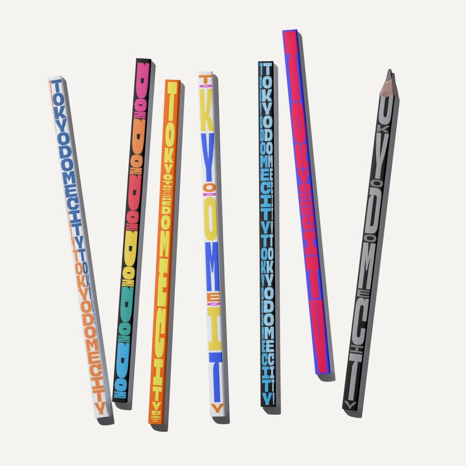
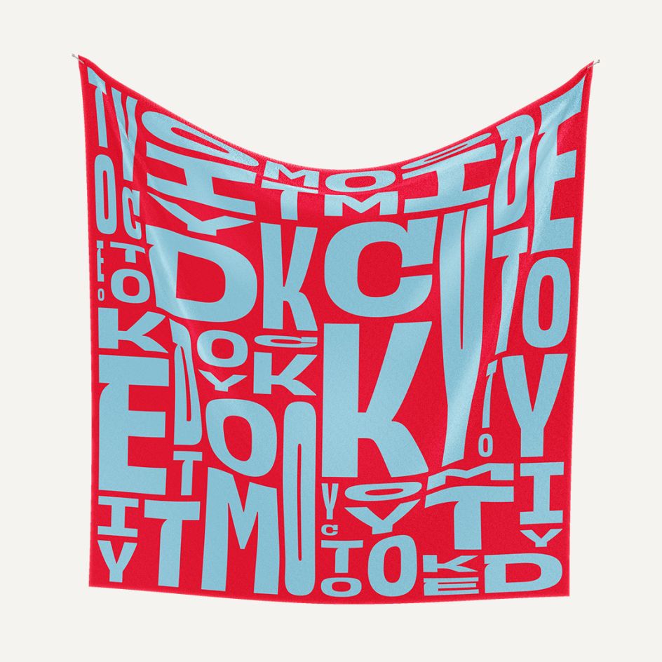
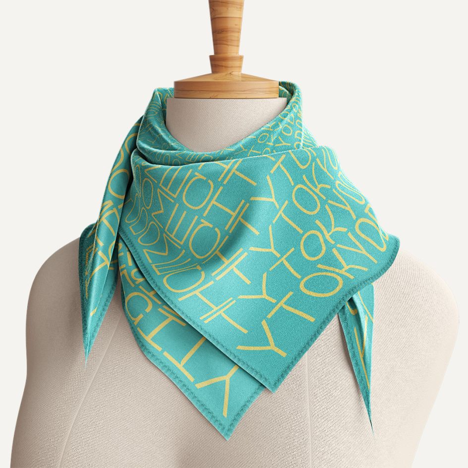
Elsewhere, a new original font can also be seen in the Tokyo Dome City logo. This represents the single rich city and all the facilities and visitors that intersect with it. "By using custom developed software to create the design without limiting it to a fixed shape or one colour, the diversity of Tokyo Dome City is infinitely expressed, and the design is familiar to customers of a wide range of age groups," adds the studio.
The new identity isn't just limited to the screens found throughout the city, though. Thanks to a wide variety of visual designs based on specific purposes and specifications, &Form has been able to apply it to physical products such as T-shirts, bags, scarves and more.
"The scalability offered by this approach allows us to create a unique 'city' identity for Tokyo Dome City, seamlessly blending moving images and static graphics," it concludes. "The result is a visually captivating and exhilarating worldview that knows no bounds."


 by Tüpokompanii](https://www.creativeboom.com/upload/articles/58/58684538770fb5b428dc1882f7a732f153500153_732.jpg)


 using <a href="https://www.ohnotype.co/fonts/obviously" target="_blank">Obviously</a> by Oh No Type Co., Art Director, Brand & Creative—Spotify](https://www.creativeboom.com/upload/articles/6e/6ed31eddc26fa563f213fc76d6993dab9231ffe4_732.jpg)


