Uncommon rebrands Fifa as EA Sports FC
Uncommon Creative Studio has created a new look for EA Sports FC, a new digital platform replacing Fifa that reveals "a first glimpse of the interactive future of football," according to Uncommon. Buck created the new motion design.
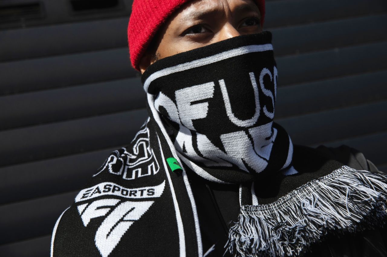
EA Sports FC will become a platform for creating and innovating "new football experiences", it continues, "connecting hundreds of millions of fans through console, mobile, online and esports products".
Uncommon says the triangle-shaped logo that it created for the platform was "hiding in plain sight," drawing inspiration from the "iconic player control indicator that appears above every athlete in every match".
According to Uncommon, the triangle is a "dominant shape in football culture", and it felt perfect for the project in the way it could represent the sport in multiple dimensions.
"The triangle has been waiting patiently on the bench for over 30 years, and it's time to finally unleash it," says Uncommon. "It's a shape that has transformed the game repeatedly from passing patterns to set plays. The triangle has revolutionised the game as we know it. And it's set to do it again — as the inspiration for the biggest football club on the planet."

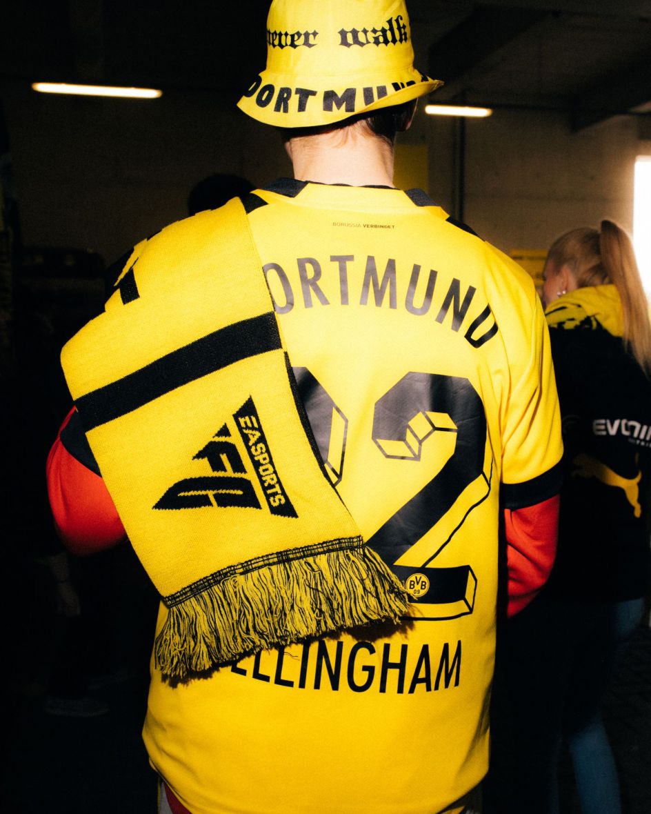
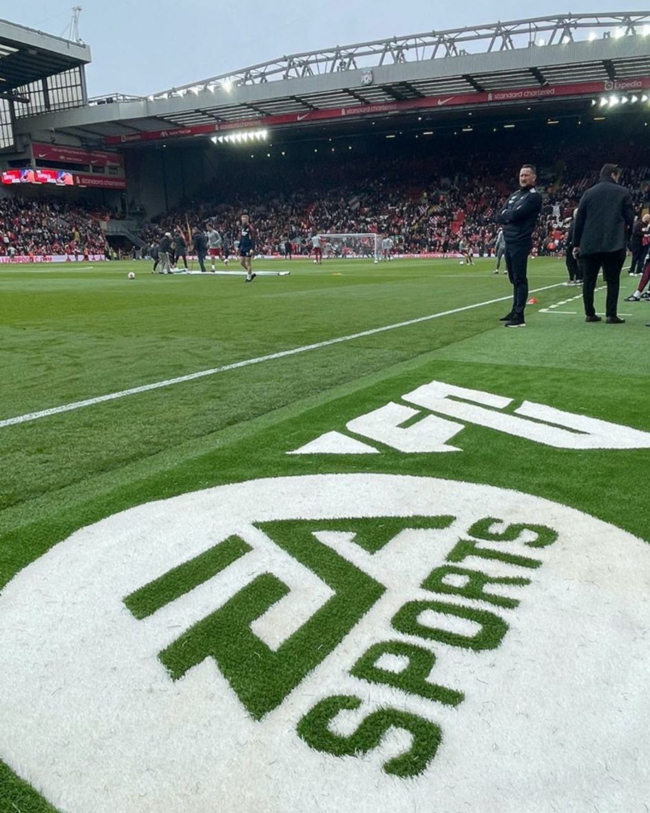
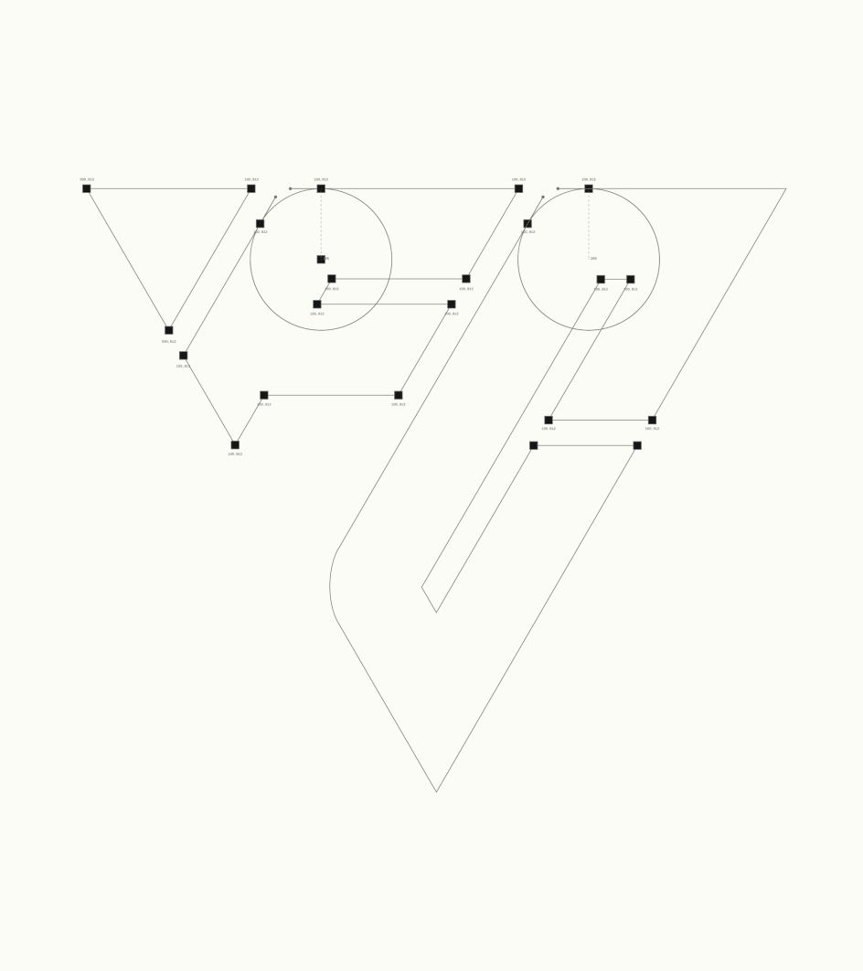
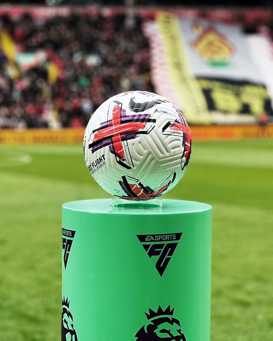
The shape can also be found across EA Sports' football experiences throughout the past decades, "from the isometric angles of our very first 8-bit experiences and the triangular polygons that make up every pixel of our most modern games, as well the iconic player control indicator that appears above every athlete in every match," as Uncommon puts it.
"For the logo, we teased out a fundamental icon rooted in all aspects of the beautiful game. A symbol of power that's literally in the hands of those who control it," adds Haider Muhdi, design director at Uncommon.
"A distinctive form that's been part of the gameplay (DNA) from the very start, right up to the present day. Hiding in plain sight for almost 30 years, the inverted triangle became our playmaker. Forging the EA Sports FC identity directly through it and then building a prolific design system around it."
The triangle is also embedded in the isometric grid system that informs the entire design system. The two custom brand typefaces offer a distinctive lettering system and enable huge pop versatility across various branding applications.


One font is inspired by the 'Cruyff turn' (an evasive dribbling move used in football and named after Dutch player Johan Cruyff), which Uncommon's type designers used to guide the structural forms of the character stems. The letterforms' ink traps adhere to the triangular grid system.
Meanwhile, the other typeface was inspired by Brazilian footballer Marta. The serif font boasts simple typographic forms and was created for use across editorial communications and "elevated brand moments". Both fonts include multilingual settings and can be used with scripts including Latin and Arabic.
The new brand colours looked to reflect the fact that EA Sports FC is "a club for everyone", with a palette that's universal across football and which can "act as a canvas for the multicoloured nature of tribal football fandom," says Uncommon. The main hues are dubbed Boot Black and Chalk White, while the field itself informs the supporting colours, Pitch Green and Forest Green.
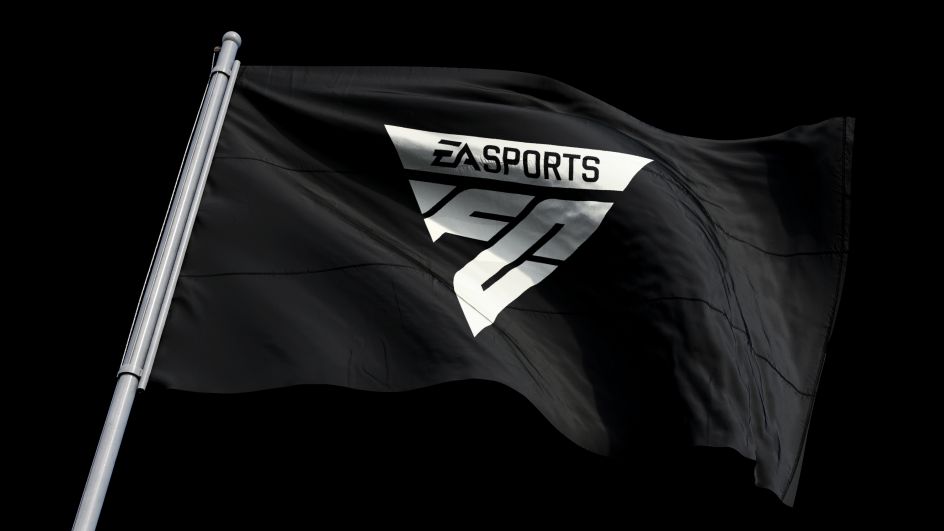
The colour palette and typography alike will be used across the brand's digital and physical assets and into motion with design by Buck. The moving assets also build on the triangle shape at the heart of the new branding and are inspired by the game itself.
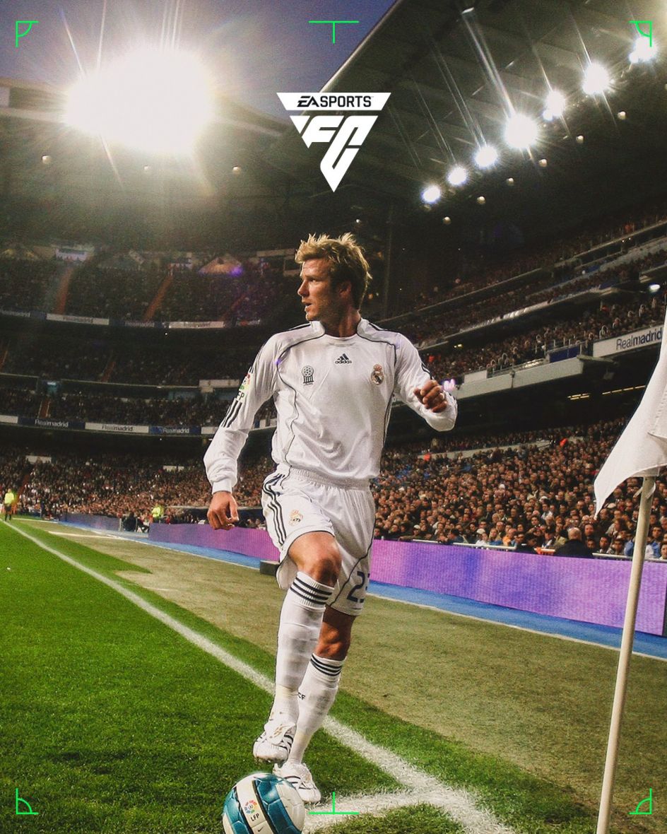
Uncommon also developed a new photography style for the branding, which puts fans in the heart of the game – this imagery will be rolled out across all brand touchpoints later this year.


 by Tüpokompanii](https://www.creativeboom.com/upload/articles/58/58684538770fb5b428dc1882f7a732f153500153_732.jpg)


 using <a href="https://www.ohnotype.co/fonts/obviously" target="_blank">Obviously</a> by Oh No Type Co., Art Director, Brand & Creative—Spotify](https://www.creativeboom.com/upload/articles/6e/6ed31eddc26fa563f213fc76d6993dab9231ffe4_732.jpg)


